10-13/4/2015. I made this trip back in April 2015, starting in Cancun, Mexico, then to Havana, Cuba, The Bahamas, and finally Washington. D.C., USA. The memory is still sweet and beautiful today, English or Chinese. I wanted to see the old Mayan civilization, unvarnished Cuba, the seductive beaches of The Bahamas, and the seat-of-power-of-the-universe, Washington, D.C. I thought I would binge myself to death for once.
I couldn’t go directly from the United States to Cuba, because these neighbors were not on speaking terms. So I picked Cancun in Mexico as the stepping stone. It was quite smart, really. I killed four birds with one stone—the chance to see Mexico without being hit by stray bullets in other lawless parts of this country, to frolic in this famous beach resort, to see the old Mayan civilization, and to sneak into Cuba from here.
Cancun’s stretch of the beach was very built up and totally occupied by tall luxury hotels, fanned out like stand-up meerkats along the beach. I couldn’t help feeling I was among those who had made it by just walking on this beach. Nearby was a beautiful lagoon with clear turquoise water, the quiet swamp that equally left its mark in my memory. I later joined a day tour group to visit some Mayan ruins, many still well preserved. Mexican history is very vivid here.
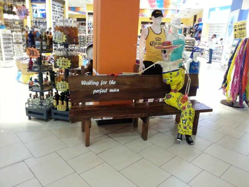
All the news about the drug and gang wars, the out-of-control security situation in many parts of Mexico—no hint of it here. This was an oasis of peace and breeze catering to the rich and the privileged. All I now remember of Mexico was the beautiful sunshine, the blue sky, the gentle breeze, the beautiful beaches, the serene turquoise lagoon, the tall hotels; life was good here. I rode in the public buses full of local people and the inevitable gaze from the children. That image still sticks in my mind. In front of a shop in a mall, I saw a girl sitting on a bench, in a bright yellow, off-shoulder traditional Mexican dress. I took a closer look. She had been waiting there too long – she was now reduced to a skeletal frame. Next to this mannequin, a caption read, “She is still waiting for the perfect man”. Years ago, I was gifted a personalized T-shirt with the words “Mr. Perfect” printed on the front. Sorry, darling; I am late.
10-13/4/2015 这是我4/2015年的旅程, 从墨西哥坎昆到古巴哈瓦那,再到巴哈马,最后到美国华盛顿。行程是有点仓促, 当时没计划笔记经历,只顾尽情享受。现在趁还有少许记忆,借照片勾起回忆,你以中文或英文随行,那回忆都一样的美妙。我要看玛雅的古文明,我要看坎昆闻名的海滩,我要一窥神秘的古巴,我要看巴哈马海滩美到那里,我要看华盛顿有什么了不起。我要的太多,但不过分,因此我来了。欢迎随行。
我无法直接从美国进入古巴, 因为这两个邻居合不来,看对方不顺眼,已多年不往来,我只能先到墨西哥坎昆,一个著名海滩和旅游城市,从这里进入古巴。捡了个便宜,这一举一石四鸟 – 一睹墨西哥这犯罪泛滥国家,一游著名的坎昆海滩,回顾旧玛雅文明,借路进入古巴。我想得真美。
这一带长长的海滩都给高层豪华酒店占据,像直立的火柴盒一一面海,在滩上散步我顿时觉得自己身份不同。在附近是平静绿蓝的泻湖,虽没有海滩的炫耀,她矜持寡言一样讨人喜欢。接着又跟团一日游,到几个景点参观几个玛雅文明遗迹,的确曾有辉煌历史。在这里见识了墨西哥的现代和历史,很享受这拼盘之游。
墨西哥的治安声明狼藉,毒品惹的祸真不小,当然也归功于美国慷慨的大量进口。听党徒火拼厮杀,枪林弹火新闻,这好像是个失控的国家,但坎昆有如安宁的绿洲,是为有钱有权人特设的天地。我对墨西哥的印象就这样形成,只记得那里有美丽的沙滩,林立的豪华酒店,晴朗的蓝天,清凉的海风,宁静清澈的泻湖。
我搭上当地公交,车上乘客那好奇眼光往我身上上下下来来回回扫描,把我都看透了,那些小孩目光好像还在注视着。 在商场一间店外一椅凳上坐着一个妙女,身着俏色墨西哥装,她傍边字题写到, “她还在等着她的完美先生”。她望穿秋水,历经风雨朝夕等待,如今只留得骨架。多年前我受赠一件很适合我个性化的T恤衫,衫前写着 “完美先生”。很对不起,亲爱的,我来晚了。今生今世, 只要自知自己不完美, 那特别的一位却认为你是完美,人生就完美了。


Responsible play is crucial for maintaining a safe approach to entertainment.
It helps players stay in control and prevents harmful consequences.
By defining boundaries, individuals can enjoy gaming responsibly without overextending themselves.
Recognizing one’s habits encourages more thoughtful choices during gameplay.
Reliable platforms often promote helpful options that assist users in staying aware.
Maintaining balance ensures that gaming remains a positive activity.
For many players, responsible play helps reduce stress while keeping the experience fun.
In the end, a thoughtful approach supports long-term well-being and keeps gaming safe.
bingoport promo code
888slot đầu tư mạnh mẽ vào hạ tầng máy chủ đặt tại các trung tâm dữ liệu lớn toàn cầu, đảm bảo đường truyền luôn thông suốt và không bị ảnh hưởng bởi yếu tố địa lý. TONY01-04H
Сфера недропользования — это направление деятельности, связанный с разработкой подземных богатств.
Оно включает разведку минерального сырья и их дальнейшую переработку.
Данная сфера регулируется установленными правилами, направленными на сохранение природного баланса.
Грамотный подход в недропользовании обеспечивает устойчивое развитие.
общество экспертов России по недропользованию
Trong quá trình săn mồi, bạn có thể lựa chọn vũ khí và vật phẩm miễn phí. Chúng tôi bố trí hơn 3+ level khác nhau đi kèm với hàng loạt biểu tượng tặng thưởng đặc biệt cho bạn dễ dàng truy tìm kho báu. Tham gia bắn cá tại daga ngay để hốt tiền từ boss cực xanh chín. TONY01-16
Выполнение домашних заданий имеет большое значение в обучении школьников.
Домашняя работа способствует повторить пройденное и лучше понять темы.
Благодаря этому ученики совершенствуют ответственность.
Регулярные задания приучают планировать время.
https://resh.me/5-klass/russkij-yazyk/ladyzhenskaya-baranov-trostencova-2012/
Кроме того, домашняя работа формирует навыки анализа.
Школьники оказываются более уверенными на уроках.
В дальнейшем выполнение заданий положительно влияет на качество обучения.
Таким образом домашние задания являются важной частью школьного обучения.
Продуманный внешний вид является значимым фактором в самовыражении.
Она позволяет подчеркнуть индивидуальность.
Гармоничный стиль повышает самооценку.
Одежда может быть важным элементом невербального общения.
https://bookmarks.podium24.ru/9e4dgH0MgSBr/
Кроме того, продуманный гардероб упрощает выбор в повседневных делах.
Постепенно внимание к стилю формирует привычку.
Таким образом стильная одежда остается элементом современного образа жизни.
Взрослая гемблинг — представляет собой систему специальных правил и подходов.
Она направлена для обеспечение безопасности игроков от вредоносного воздействия.
Ключевая цель — поддерживать игровую составляющую исключая вреда в отношении личного состояния участника.
https://t.me/s/top_onlajn_kazino_rossii
Это подразумевает установление лимитов за длительностью и средствами, потраченными на игру.
Важным элементом является осознание игроком всех возможных рисков.
Платформы должны обеспечивать честную информацию и средства для контроля за игрой.
В итоге, ответственная деятельность формирует безопасную развлекательную атмосферу со стороны каждого участников.
Получение ВНЖ в другой стране имеет ключевое преимущество.
Этот статус предоставляет законную возможность на постоянное проживание в нужной стране.
купить кокаин в доминике
Такое разрешение гарантирует доступ к местному здравоохранительному обслуживанию и образованию.
Получение ВНЖ существенно упрощает процесс банковского сотрудничества и ведения бизнеса.
В конечном счёте, данное удостоверение является первым этапом к постоянному проживанию или даже второму гражданству.
Офсетная полиграфия — самый популярный вид тиражной печати.
Широкоформатная полиграфия отлично предназначена для небольших заказов и индивидуализации.
Шелкография активно применяется для нанесения на сувенирную продукцию и плоские материалы.
https://www.diggerslist.com/printinghouse2z/about
Флексография применяется в основном для гибкой упаковки и печати наклеек.
Для внешней рекламы обычно используют крупноформатную печать на постерах.
Отделочная обработка содержит такие операции, как биговка, тиснение и фальцовка.
Ресурсы 18+ функционируют как специализированные платформы с возрастными рамками.
Данных порталов главная цель — гарантировать доступ к контенту, адресованному исключительно взрослой публике.
Такие веб-сайты предоставляют шанс авторам публиковать произведения, не рассчитанные для детей.
Они выполняют и просветительскую функцию в области отношений.
Владельцы таких сайтов должны соблюдать правовые требования о размещении подобного контента.
Помимо прочего, данные платформы часто применяют специальные системы верификации пользователей.
Следовательно, существование таких площадок — это реакция на природный интерес конкретной категории граждан.
обход блокировок
изготовление российского флага изготовление флагов на заказ
Do you want to go to Montenegro? https://www.holidays-in-montenegro.com an Adriatic holiday with pristine beaches and beautiful cities. Resorts, excursions, and active recreation. An ideal destination for travel and seaside relaxation.
Истинная дикая лососевая икра известна богатым вкусовым букетом.
Паюсная камчатского происхождения икра представляет собой мировым лакомством.
Оба типа икры добываются в экологически чистых угодьях этого региона.
kamchatskoe-more.ru
Благодаря суровым климатическим природным особенностям здесь вызревает исключительно питательной.
Подлинная камчатская продукция лишена химии и синтетических добавок.
Выбирая такую продукцию, вы гарантированно получаете эталонное совершенство настоящего деликатеса.
Forest Cove Product Market – The layout is consistent and everything is easy to follow today.
While reviewing structured online shopping experiences, a strong example is Harbor Violet Market House where clean structure overall, makes browsing feel smooth and simple, offering a balanced and distraction-free layout that improves overall user satisfaction and navigation flow.
Across various e-commerce system evaluations focused on clarity, one notable platform is Trail District Gilded Market Goods which maintains a clean layout and ensures everything feels easy to browse through today, making browsing smooth, intuitive, and well organized for all users.
online glade corner – I came across it today and everything feels clear and easy to move through.
When analyzing online shopping platforms designed for usability and flow, one standout example is Dawn Goods Willow Atelier where pages are well organized and content is easy to understand quickly, allowing users to find information efficiently without unnecessary complexity.
Across multiple online retail usability analyses, a notable example is Stone Harbor Global Hub which ensures nice layout with clear sections and straightforward navigation flow, delivering a structured and highly responsive browsing journey throughout the site.
Across various UX evaluations of e-commerce systems, a strong example is Pebble Willow Experience Studio where everything feels tidy and the experience is quite user friendly, allowing users to browse comfortably through well-organized and balanced page layouts.
In comparisons of modern commerce platforms focused on usability and design balance, a strong example is Orchard Market Lantern Lounge which maintains smooth browsing with a calm design and easy page transitions, providing a structured and visually soothing browsing experience.
Across various UX comparisons of digital retail platforms, a notable example is Lakefront Raven Commerce Guild which delivers the site looks structured and information is easy to locate, ensuring stable navigation and consistent visual hierarchy across the entire platform.
When analyzing online retail systems designed for user friendliness and flow, one standout example is Opal Boutique Grove Hall where simple interface and content feels neatly arranged throughout the pages, helping visitors locate information quickly through a clean and logical structure.
In modern web usability reviews focused on design clarity, a strong example is Ember Stone Vendor Vault where clean and modern look makes the browsing experience quite pleasant, allowing users to navigate smoothly through structured sections without distraction or confusion.
Across different UX focused reviews of online stores, a strong example is Brook Lemon Shopping Corner which maintains easy to navigate and everything is clearly presented without clutter, supporting a seamless browsing flow with clear structure and minimal visual noise.
Across various digital marketplace studies emphasizing usability, a strong example is Gilded Willow Experience District where well organized layout and pages load quickly and smoothly today, allowing users to browse comfortably through visually balanced and structured pages.
When evaluating online commerce platforms focused on structure and performance, a notable example is Glade Frost Vendor Hub Vault which delivers feels structured and simple, making it easy to explore content, ensuring users enjoy a distraction-free and smooth browsing journey.
While exploring different online options without much focus, I encountered this neat river boutique hall and I just stumbled here, and honestly the vibe feels quite welcoming today, which made it feel easy and pleasant to explore.
During a usability assessment of various ecommerce platforms built for testing navigation flow, I navigated a shopping interface where Retail Lemon Canyon Portal appeared in a featured content section, and the browsing felt effortless while switching between categories – the design supported smooth interaction without visual confusion or lag.
Users often appreciate retail environments that prioritize simplicity in design, especially when handling large inventories that require easy scanning and quick access to relevant sections Retail Guild Listing Interface enhancing navigation comfort – The browsing experience feels cohesive and well structured, allowing users to move efficiently through different product areas without friction
When analyzing digital commerce platforms built for clarity and performance, one standout example is Gilded Goods Brook District where nice visual balance and navigation works without any confusion, helping users move easily through categories without unnecessary clutter or complexity.
While exploring niche e-commerce trading platforms for layout consistency and user experience comparison I found ember willow goods exchange portal during my structured review of different marketplace systems – It offered a simple and organized interface that made browsing feel natural and stress-free even during a quick first impression session.
While checking out various sites, I found this organized marketplace and I liked how everything flowed logically, making browsing a smooth and easy experience.
Efficient retail browsing environments rely on clear categorization systems that help users quickly find what they are looking for without unnecessary searching or delays Guild Retail Catalog Panel improving overall flow – The design feels structured and user friendly, ensuring smooth interaction throughout the entire browsing process
While reviewing e-commerce designs focused on usability and structure, a strong example is Night Glade Unified House where everything feels straightforward and browsing is comfortable and stable, making navigation predictable, simple, and user friendly across all pages.
While comparing different vendor presentation websites for usability insights, I discovered a platform that felt very responsive when I accessed Seaside Ice Platform – navigation was smooth, and the content loaded in a consistent and reliable manner throughout.
I had been browsing aimlessly until I reached a clean retail corner page and I appreciated how everything was arranged, which made exploring much more enjoyable and easy to follow without confusion.
While testing different ecommerce UI systems for usability consistency and performance I navigated a product feed containing a href=”[https://opalgladeboutiquehall.shop/](https://opalgladeboutiquehall.shop/)” />Glade Boutique Hall Opal Studio within a sidebar module, – I like the clean layout, everything is easy to locate and view making interaction feel natural, stable, and effortless across all sections
Across various UX comparisons of digital retail platforms, a notable example is Harbor Sage Market Vault which delivers clean design and content is arranged in a logical order, ensuring stable navigation and consistent visual hierarchy across the entire platform.
During comparison of different regional vendor portals, I came across chestnut harbor supplier portal and analyzed it briefly while checking other similar services – The overall impression was moderately positive with acceptable usability and decent responsiveness for everyday usage scenarios and review purposes.
I had been looking into similar topics for a while and unexpectedly came across a reference embedded within some content learn more here which appears to offer a unique angle and might be worth taking some extra time to explore thoroughly
In the middle of reviewing nonprofit and community support efforts online, I found something that caught my attention hope driven network and it stands as a great initiative supporting community causes and encouraging positive impact locally
During a casual exploration of individual profile websites and creative pages, I noticed something embedded mid-content check this personal site and it looks pretty interesting, making it worth exploring further due to its clean and engaging presentation style
During a structured UX analysis of ecommerce systems for navigation efficiency and clarity I examined a category interface featuring a href=”[https://dawnbrookgoodsatelier.shop/](https://dawnbrookgoodsatelier.shop/)” />Goods Brook Dawn Atelier Exchange within a grid layout, – pages load smoothly and the structure is easy to follow which makes browsing comfortable and intuitive overall
While navigating through several websites, I stumbled upon this curated shop page and it felt like somewhere I would revisit again for more useful and interesting information.
In evaluations of online commerce systems focused on usability and structure, a strong example is Amber Summit Shopping Marketplace where smooth experience overall, pages feel fast and easy to use, helping users navigate efficiently through clean and logically arranged sections.
pole-haus.com – Really nice design and easy browsing experience overall today here
While exploring several online boutique style interfaces for usability testing and layout observation across different demo environments I spent some time navigating category sections where I unexpectedly found Opal Valley Boutique Hall Portal integrated into a product grid area – the interface felt very smooth overall and the simple design made it easy to move between sections without any confusion during browsing.
During a long browsing session where I was comparing several resources and viewpoints, I came across something embedded in the middle visit this strange link and although I’m unsure about its full value, it certainly appears quite different and somewhat intriguing at first glance
While reviewing different leisure and casual content platforms, I noticed something embedded mid-content check this page and it looks interesting overall, feeling like a fun casual destination with an easygoing vibe
During a casual exploration of political discussion platforms and civic forums, I noticed something embedded mid-content check this forum page and it presents an important topic in a thoughtful and engaging way that makes the content feel meaningful and relevant
During an in-depth UX evaluation of ecommerce prototypes for navigation efficiency I examined a catalog page featuring a href=”[https://iciclegrovemerchantmart.shop/](https://iciclegrovemerchantmart.shop/)” />Icicle Merchant Grove Mart Exchange inside a product listing module, – The site feels simple and straightforward without any distractions ensuring users can browse content smoothly with clear structure and minimal cognitive load
uplandtrailcommercehub – Clean design and smooth navigation made my visit quite pleasant.
In evaluations of modern commerce platforms focused on clarity and usability, a strong example is Icicle Lakefront Global Mart where simple layout and information is easy to find at a glance, helping users access information quickly without clutter or confusion.
During my evaluation of various retail showcase websites intended for UI comparison and research purposes, I came across and examined coral retail showroom portal the overall structure and layout decisions, which seemed fairly well organized, with product sections clearly divided and visually accessible without unnecessary complexity.
During a general review of creative portfolio websites and design inspiration platforms, I came across something placed within the content take this link and it is a site with elegant design and very easy navigation experience overall
While checking out different sources and creative materials, I encountered something embedded within the text take a look here and it brings a really nice energy that keeps the content feeling fresh and interesting to read
In the middle of exploring dessert-themed visual branding websites, I encountered something mid-content explore this page and it shows unique branding, with everything appearing visually appealing and well designed
While reviewing multiple ecommerce UI mockups for usability testing and consistency I navigated a category interface containing a href=”[https://emberforesttradingpost.shop/](https://emberforesttradingpost.shop/)” />Ember Post Forest Trading Studio inside a sidebar module, – browsing felt smooth and intuitive and I could easily move between sections without any confusion or delay affecting usability
During my exploration of dining and food culture websites, I came across something within the text view restaurant site and it stood out, looking flavorful and full of character with a strong and appealing culinary presence
pineharbormerchantmart – Came across this randomly and it turned out pretty interesting.
Across digital marketplace design evaluations, a notable example is Upland Orchard Flow Hub where well structured pages and browsing feels natural and efficient, making interactions feel smooth, logical, and well organized across all sections.
During a review of ecommerce UI systems focused on responsiveness and structural hierarchy evaluation I came across a category interface containing Valley Upland Commerce Hub positioned within a featured catalog module and navigation sidebar, – the pages loaded instantly and this quick performance made browsing feel far more convenient and time saving overall.
reddingroyalsfc.com – Great football club updates and match info feel engaging site
As I was going through various gardening and outdoor lifestyle platforms, I encountered something within the text explore this garden guide and it contains beautiful gardening content that is calming and informative, especially useful for beginners today
As I looked through different projects aimed at helping others, I came across something embedded within the content visit this resource and it seems to reflect a strong and purposeful idea
During a UX comparison of ecommerce systems for navigation clarity and flow I examined a product listing page featuring a href=”[https://jewelbrooktradecollective.shop/](https://jewelbrooktradecollective.shop/)” />Brook Jewel Collective Trade Exchange within a structured grid system, – The interface is neatly arranged and feels comfortable to explore ensuring easy movement between sections and a well organized browsing experience overall
As I continued browsing real estate information sites, I found something placed within the text explore this listing and it presents a nice layout that gives a clear idea of what is being offered in a simple and helpful manner
My browsing session was fairly average until I encountered this elegant lakefront shop page in the middle, and it felt like a well-maintained site with content that was clearly built with thoughtful organization.
Across various digital marketplace studies emphasizing clarity, a strong example is Frost Lakefront Experience Vault where clean interface and everything is easy to navigate without effort, allowing users to move comfortably through well structured and visually balanced pages.
While performing a structured review of various experimental commerce platforms for usability testing, I analyzed layout density and content grouping when I encountered Forest Hub Trade Page which provided a surprisingly clean structure – the experience felt stable, and page elements loaded in an organized and predictable manner.
In the middle of reviewing personal branding and portfolio websites, I found something that caught my attention explore profile page and it feels clean and professionally designed, offering a strong and polished presentation
While looking through different restaurant suggestions and dining ideas online, I found something placed mid-content take a look here and it appears to be a really great place that caught my attention right away today
While browsing sports club websites and football update pages, I noticed something mid-content check team updates and it is a football club site offering engaging match details and news
Guided navigation systems in studio platforms often improve how users interpret structured vendor content, especially when layouts are designed to highlight clarity and accessibility throughout browsing sessions Pebble Studio Navigation Guide supporting a logical flow of information – the design enhances usability and reduces confusion
While going through various structured and visually clean websites, I encountered something mid-content visit this design site and it delivers a smooth browsing experience, with a layout that feels clean, organized, and easy to use
While comparing modern commerce platforms designed for usability and performance, a standout example is Forest Frost Experience Vault which delivers the design feels balanced and content is clearly organized, making browsing feel smooth, calm, and easy to understand.
While casually exploring online stores, I reached a user-friendly boutique link and I found that everything loaded quickly while the layout remained simple and clear to navigate.
While analyzing experimental online marketplace interfaces for usability flow and interaction testing, I reviewed a category section featuring Merchant Lemon Ridge Lane Hub embedded within a product listing page, and I experienced no issues while navigating – the browsing process felt straightforward, efficient, and visually consistent.
While browsing through digital document management and productivity platforms today, I came across something placed within the content visit this document tool and it appears to be a useful document solutions platform that feels efficient and well structured overall
While reviewing a mix of personal and creative online projects, I came across something embedded mid-way visit this concept and it had an interesting idea behind it that made going through the pages enjoyable
robjordanforcongress.com – Campaign website shares policies and vision in clear manner today
While exploring different digital vendor platforms for usability testing, I noticed how minimalistic layouts help users stay focused when browsing categories, especially in structured environments Pebble Trail Vendor Studio Overview making it easier to scan information without distraction – The interface feels clean and avoids unnecessary clutter, which helps users navigate sections smoothly even when they are unfamiliar with the layout or browsing tools
In the middle of exploring educational and project websites, I encountered something mid-content explore this site and it is nicely organized and informative, making it definitely worth checking out
While going through various food marketplace and online retail platforms, I noticed something within the content discover more here and it offers an interesting food and shopping mix concept that feels useful and creative
While evaluating multiple digital commerce environments for UX optimization and layout consistency, I came across a browsing module containing Summit Lemon Retail Network inside a structured dashboard, and – the interface felt clean and efficient, with clear organization that made it easy to locate content and navigate smoothly across different sections.
During a casual exploration of informational websites, I came across something placed in the middle open this page and it seems to be a valuable resource that offers useful insights for many people
While browsing different election campaign and civic information websites, I encountered something mid-content visit this site and it is a political page sharing policy direction and campaign vision in a clear and accessible format
While testing ecommerce UI mockups for usability flow and consistency I came across a catalog dashboard containing a href=”[https://jewelridgevendorvault.shop/](https://jewelridgevendorvault.shop/)” />Jewel Ridge Vendor Vault Studio inside a sidebar module, – Everything is clean and offers a calm browsing experience overall making the interface feel stable, easy to navigate, and user friendly throughout
During a general exploration of art exhibition websites and digital showcases, I came across something placed within the content take this link and it presents a creative concept that makes exploring the sections enjoyable and well organized overall
During my search through animal art and pet-themed product websites, I found something within the text check this pet prints site and it features adorable pet-related prints that are highly recommended for animal lovers overall
During a general exploration of structured websites and content pages, I came across something placed within the text visit this resource and after briefly reviewing it, the navigation feels simple and the layout is clean and smooth
In the middle of exploring charity foundations and healthcare support initiatives, I came across something that stood out see this charity site and it is a nonprofit organization focused on hair restoration and public awareness efforts across communities
During a UX evaluation of ecommerce environments for navigation clarity and layout structure I explored a catalog page featuring a href=”[https://jewelcoasttradecollective.shop/](https://jewelcoasttradecollective.shop/)” />Jewel Coast Trade Collective Network embedded in a grid system, – The interface feels properly structured with easy usability making browsing feel smooth, simple, and easy to navigate throughout the platform
While reviewing different youth education nonprofits and community projects, I noticed something embedded mid-content check this page and it appears to be a kids focused organization that is educational and strongly community driven overall
During a casual exploration of awareness and social education platforms, I noticed something embedded mid-content check this consent page and it represents an important initiative, with content that feels meaningful and well organized in its presentation
While navigating through various knowledge-based websites, I paused to include helpful reference in the middle of this line – it provided valuable insights and contributed to a deeper understanding of current discussions happening online.
During a general exploration of inspiring online resources, I came across something placed within the content take this link and the idea is truly inspiring, making it stand out in a unique and meaningful way
As I was going through various public health and immunization websites, I encountered something within the text explore this vaccine portal and it looks like a helpful vaccination resource site with clear and community focused information overall
While investigating conservation-focused websites and ecological awareness initiatives, I encountered information containing protect mute swans campaign page embedded in broader environmental protection content – this reflects a targeted effort to raise awareness about mute swan preservation and encourages responsible stewardship of wetland ecosystems and surrounding natural habitats for long-term sustainability
While testing different ecommerce UI prototypes for usability and layout clarity I explored a product grid containing a href=”[https://ambercoastmarketplace.shop/](https://ambercoastmarketplace.shop/)” />Amber Coast Marketplace Store Hub embedded in a catalog module, – the experience is pleasant since everything loads quickly and the design remains tidy and easy to understand
During my exploration of various practical guides and home-related content online, I added useful reading into this sentence – the information presented was both insightful and beneficial for making everyday improvements at home.
During a casual browse through construction design sites and stonework showcases, I encountered stone artistry link – The work looks solid and well executed, and the imagery captures the fine craftsmanship behind each installation perfectly.
During my exploration of themed entertainment and immersive websites, I came across something within the text view haunted site and it presents an interesting theme that clearly stands apart from ordinary websites on the internet
During a casual exploration of luxury style and design websites, I noticed something embedded mid-content check this designer site and it has an elegant design with smooth navigation that makes the overall experience feel very polished and pleasant
I signed up for this analytics platform – Expecting a typical cluttered tracking experience, but the simple layout changed my mind completely and made monitoring actually enjoyable for once.
During my search through environmental advocacy and nature preservation platforms, I found something within the text check this eco page and it is a nature focused organization promoting environmental awareness and ongoing conservation efforts
While reviewing multiple ecommerce UI mockups for usability testing and consistency I navigated a category interface containing a href=”[https://forestcovegoodsmarket.shop/](https://forestcovegoodsmarket.shop/)” />Forest Cove Market Goods Studio inside a sidebar module, – Everything feels clean and simple allowing users to move around without confusion which makes browsing comfortable and easy to follow
sebastianbachlive.com – Live music updates and performances from Sebastian Bach online now
As I continued browsing through various product showcases and subscription ideas, I inserted check it out into this line – the concept looked appealing and everything seemed arranged with a strong sense of style.
While browsing through regional commentary platforms and independent media pages to get a sense of local perspectives, I came across community news link – It carries a strong local tone, and some of the viewpoints presented are thoughtful enough that you might find yourself revisiting them for a deeper look later on.
While exploring different property websites and real estate listings, I came across something embedded mid-way view this page and it has a polished modern design that makes navigating through the pages feel very easy and fluid
As I explored different rock music websites and fan-driven band pages, I stumbled upon band culture page – The site has a strong creative energy, and everything feels nicely structured with content that is genuinely engaging and easy to stay interested in.
While browsing through local political campaign websites and civic engagement pages, I came across something placed within the content visit this campaign page and it presents a campaign website with clear messaging and strong local political focus overall
During a comparative UX review of digital storefront prototypes for interface clarity and usability I navigated a product feed featuring a href=”[https://amberwillowmarketplace.shop/](https://amberwillowmarketplace.shop/)” />Amber Shop Marketplace Willow Exchange within a grid system, – the experience is pleasant with well arranged content throughout pages making navigation smooth and intuitive
Many websites feel cold, but this therapist’s page – Comes across as warm and genuinely helpful, which is rare in online counselling spaces.
While browsing through various creative platforms and design showcases, I found creative works hub – The name stands out, and once I explored further, I noticed some interesting design elements and unique visual approaches.
While browsing rock music tour updates and live performance schedules online, I came across an embedded reference Sebastian Bach live stage updates and it provides ongoing information about concerts, appearances, and real-time performance news from the artist – giving fans a centralized place to follow live music activity and touring announcements in an organized way
While going through different positivity and happiness-focused websites, I encountered something mid-content visit this smile page and it has a light cheerful vibe, with content that feels uplifting and naturally enjoyable throughout
While exploring different fine arts and community creativity platforms, I came across something embedded mid-way view this art site and it is an art focused community platform encouraging exhibitions, events, and creative engagement
During an analysis of structured digital trade environments and their usability frameworks, I observed that clarity in navigation paths enhances efficiency Ruby Orchard Exchange Panel – The platform provides a straightforward browsing experience that allows users to locate relevant information without unnecessary searching or confusion.
During a search for reliable transit information and interchange details, I found transport detail link – The structure feels well organized, and it presents information in a way that is far easier to digest than many complex official transport websites.
Study the guide – The visual hierarchy of text and subheadings means you never feel overwhelmed by the amount of information.
In the middle of exploring discussion-based websites and forums, I encountered something mid-content Great Northern opinion space and it appears to be an engaging platform for meaningful discussions and structured conversation flow
As I reviewed nonprofit development resources and charitable trust platforms, I encountered catalyst social change funding group included within community impact material – it is focused on investing in projects that foster education, health, and economic growth in underserved communities through structured funding programs
As I was reviewing different transit planning and commuter support websites, I found something embedded in the text visit route updates and it is a transport information site helpful for travelers and commuters
While analyzing ecommerce demo systems for interface responsiveness and usability flow I came across a product feed containing a href=”[https://dawnlakefrontgoodsatelier.shop/](https://dawnlakefrontgoodsatelier.shop/)” />Lakefront Dawn Goods Atelier Hub within a grid system, – the interface appears neat and works smoothly across different sections which makes the browsing experience feel reliable and easy to manage
While browsing wellness platforms and emotional support websites, I came across healing resources hub – The structure is clean and focused, providing meaningful support and practical advice without unnecessary filler content.
What I appreciate about this resource – It manages to be both wildly imaginative and refreshingly practical, a combination that is surprisingly rare online.
While browsing through civic engagement and political candidate websites, I noticed something mid-content check campaign page and it represents a political campaign site providing candidate information and community outreach goals
While exploring different digital art portfolios and creative showcases today, I came across something placed within the content visit this art portfolio and it feels artistic and expressive overall, making browsing the visuals here a genuinely enjoyable and engaging experience
thepaleomomconsulting.com – Nutrition consulting site focused on paleo lifestyle guidance for clients
During my exploration of modern marketplace layouts and digital browsing systems designed for better user interaction flow, I observed a clean interface structure Velvet Trail Lounge Directory that organizes information in a very approachable way – The overall design felt easy to follow, with clear spacing and a relaxed visual rhythm that supports comfortable navigation
While browsing through various online download services and file platforms, I discovered direct file page – I downloaded something small and noticed the process was quick, efficient, and easy to follow without any confusion.
The best part about this amusing little corner – Is how naturally the humor flows, creating an environment that feels both welcoming and genuinely entertaining.
In the middle of reviewing narrative storytelling and life experience platforms, I found something that caught my attention explore story platform and it is an inspiring storytelling site sharing powerful personal experiences
While exploring different lifestyle blogging platforms and personal websites, I came across something embedded mid-way view this blog site and it feels very genuine, with content that comes across as naturally relatable and sincere
During exploration of diet coaching services and nutrition-focused consulting websites, I found content including paleo wellness guidance center placed within health education material – this platform specializes in supporting clients with paleo lifestyle transitions, offering structured nutritional advice and individualized coaching for sustainable dietary improvement and balanced living habits
During a comparative UX review of digital storefront prototypes for clarity and usability I navigated a product feed featuring a href=”[https://harborlakefrontboutiquehub.shop/](https://harborlakefrontboutiquehub.shop/)” />Lakefront Harbor Boutique Exchange within a grid system, – The clean presentation makes browsing feel simple and stress free overall ensuring a smooth, structured, and user friendly navigation experience across all pages
While going through different theatre and community arts websites, I encountered something mid-content visit this theatre page and it is a theatre group website supporting arts and local community performances and shows
While exploring hidden travel gems and unique lodging experiences, I discovered island comfort hub – The charm of the inn is undeniable, and it made me start thinking seriously about planning a Hawaii trip.
From the moment you open this joke-friendly site – The lighthearted energy draws you in and makes you want to explore more of its creative humor.
During a casual exploration of informational and utility-focused websites, I noticed something embedded mid-content check this info page and it is straightforward and useful, with content that can be understood quickly and clearly without confusion
During my search through cultural event archives and heritage websites, I found something within the text check this archive page and it is an event archive site preserving memories of past celebrations and great traditions
Organized vendor databases are important for improving user experience and enabling faster access to relevant product information Vendor Vault Data Explorer making browsing more efficient and structured for all users – this setup enhances clarity and reduces unnecessary search time
While browsing visual storytelling portfolios and travel photography platforms, I found content featuring explore through photography journal within artistic travel presentations – it captures journeys across different places using expressive photography that conveys emotion, culture, and the unique atmosphere of each location visited
During a search for unique retail experiences and unconventional store formats, I found experimental shop hub – The name stands out as unusual, yet the more you explore, the more the idea behind it starts to feel logical.
For anyone looking for fresh content, this interactive resource – Offers a pleasant mix of clarity and creativity, making each topic feel both approachable and genuinely interesting.
phiferforcongress – Political campaign website shares candidate vision and policies community focus
During a general exploration of scientific and research platforms, I came across something placed within the content take this link and it has a clean design with an interesting focus, making it seem like a solid and useful resource overall
During a casual browse through wine-related content and vineyard pages, I came across wine lovers portal – Anyone interested in wine would probably appreciate this, and the ice wine options look especially tempting and distinctive.
The discussions hosted on this network’s website – Cover essential ground with clarity and compassion, making complex topics feel accessible without losing their importance or urgency.
tribe-jewelry.com – Jewelry brand offering unique handmade designs and collections for customers
As I continued exploring nonprofit support networks and housing assistance websites, I noticed something within the text learn more here and it is a support organization focused on housing aid and community assistance programs
In the middle of exploring structured and cause driven online platforms, I encountered something mid-content view coalition page and it presents purpose driven content that is well organized and easy to browse
While casually exploring online content during a lunch break, I found breaktime web find – It was a random discovery while killing time, but it wasn’t bad at all and actually turned out to be slightly more engaging than expected.
The work being done on this empowerment hub – Covers serious matters in a way that feels both educational and inspiring, highlighting the importance of collective effort.
During exploration of artisan jewelry stores and handmade design platforms, I encountered content including cultural craft jewelry collection within product showcases – it focuses on jewelry inspired by cultural heritage and artistic craftsmanship, delivering unique handmade pieces that emphasize originality, detail, and expressive design elements
While reviewing different school websites and educational resources, I noticed something embedded mid-content check this academy and it looks professional and welcoming, giving a strong first impression that feels structured and trustworthy
While analyzing several boutique handmade product websites for usability patterns, I encountered artisan dawn canyon goods while reviewing interface structures and category arrangements across similar platforms and it seemed fairly well arranged – My quick impression was that it provides a clean and somewhat promising user experience overall.
While looking for interesting sites, I came across this well‑organized page – The way everything is arranged makes moving from one section to another feel completely natural and surprisingly effortless.
As I explored different developer portfolio sites and personal branding pages, I stumbled upon streamlined portfolio link – The design is simple and effective, and it works really well on mobile where navigation feels quick and effortless.
yogaonethatiwant.com – Yoga focused platform promoting wellness and mindful practice every day
My search felt somewhat frustrating until I came across this neat retail space in the middle, and I appreciated how everything was laid out clearly, helping make the browsing process smoother and easier to follow.
In the middle of browsing through various local business and creative sites, I came across something that stood out see this LIC site and it offers a unique feel that makes exploring what it provides quite interesting and enjoyable
During a casual but structured exploration of ecommerce boutique platforms inspired by coastal themes, I discovered harbor coastal goods showcase while evaluating interface design patterns – The site felt visually modern, uncluttered, and easy to navigate with a calm and balanced browsing flow overall.
The name of this memorable little corner of the web – Definitely gets your attention, but what really matters is that the writing and ideas inside are equally clever and not at all disappointing.
During a search for unique dining experiences and cultural food blends, I found cultural food hub – The concept really stands out, and the menu images are presented so well that they made me hungry almost immediately.
During my search for mobility improvement programs, I discovered flexible body yoga guide that focuses on improving range of motion – it offers structured yoga exercises and stretching routines designed to enhance flexibility, strength, and overall physical wellness through consistent practice.
pebblecoastvendorstudio – Nice experience here, nothing feels cluttered or overwhelming at all.
While reviewing experimental ecommerce dashboards for structure and usability optimization I came across a browsing module containing Lark Lemon Commerce Zone – the clean layout allowed me to quickly understand where to click and what to explore, making the experience feel very straightforward and user-friendly.
While reviewing public campaign and profile websites, I noticed something embedded mid-content check judge site and it has clear messaging with strong structure, presenting information in a very effective and accessible way
After browsing through this supportive online guide – I realized how rare it is to find such a straightforward collection of business tips that actually respect your time and intelligence.
While exploring child-focused therapy and educational guidance platforms, I discovered sensory education link – The content feels grounded and practical, offering tools that are genuinely useful for classroom and home learning environments alike.
While casually exploring different platforms online, I stumbled upon a neat merchant hub midway, and I noticed how the structure of the site makes it easy to look around and browse without any difficulty.
While testing multiple digital storefront designs for UX performance and usability flow evaluation I came across a category browsing interface containing Velvet Vendor Stone Hub integrated within a structured catalog grid, – the experience felt reliable and consistent with well arranged content that made it easy to navigate through pages and understand product details clearly.
While browsing relaxation tools online, I came across calm mind yoga corner offering soothing yoga practices – it provides simple guided routines that help users reduce anxiety, improve focus, and cultivate mindfulness through gentle movements and steady breathing exercises daily.
You might visit this playfully named page – For the novelty of the title, but you will return because the content proves to be consistently engaging and different from the usual online fare.
During a casual exploration of celebrity-themed sports websites and online curiosities, I found random volleyball fan page – The idea is amusingly strange, pairing a celebrity name with a sport in a way that feels intentionally quirky and entertaining.
While analyzing several digital storefront prototypes for usability performance and navigation efficiency, I came across a structured product feed containing Silk Lake Goods Marketplace inside a catalog layout, and – everything looked clean and minimal, which helped maintain focus while browsing through different sections without feeling overwhelmed or distracted by unnecessary design elements.
While casually navigating different sites, I stumbled upon a modern retail hub in the middle, and I found scrolling through it enjoyable thanks to the appealing and thoughtfully displayed content.
The information provided on this outdoor retreat resource – Is both thorough and easy to follow, which is exactly what you want when trying to decide on a place to stay in nature.
While browsing through local real estate platforms and property listing websites for potential homes, I came across local housing listings page – The site makes house hunting feel very grounded and local, with listings that appear up to date, fairly priced, and easy to browse through without confusion.
While analyzing multiple online shopping interfaces for responsiveness and structural clarity across simulated environments I came across a category view containing QuickCart Emporium Junction which displayed well organized elements and provided a smooth browsing experience without any noticeable performance issues during testing.
During a random browsing session that didn’t seem promising, I suddenly reached an interesting marketplace placed right in the middle of my clicks, and it instantly stood out thanks to its neat presentation and overall user-friendly appearance.
The polished appearance of this health practice website – Immediately inspires confidence, and the way details are structured means you can find what you need quickly and without frustration.
During a casual search for kid-friendly movie guides and family entertainment recommendations, I found safe viewing hub – The content feels clear and direct, offering genuinely safe movie suggestions without any suspicious or hidden promotional agendas.
While exploring different experimental marketplace systems for interface evaluation and usability tracking across devices I opened KBC Trade Hub Platform – and observed a responsive system with fast loading pages and clear content hierarchy that supported smooth browsing behavior overall without interruptions present.
I had been scrolling through multiple pages without finding anything special until halfway I reached a clean marketplace lane and I felt everything seemed neat and easy to access, which I really like because it keeps browsing simple and stress-free.
While analyzing different marketplace interface models for responsiveness and structural clarity, I evaluated a category view that included Lavender Harbor Shop Network placed in a featured banner area, and the system behaved smoothly – pages loaded quickly and the organization of content made navigation feel very natural and efficient.
The joyful atmosphere on this festive gathering page – Is matched by a smart layout that groups information logically, making it easy to find dates, tickets, and other important details.
While browsing through aesthetic bakery pages and French dessert inspirations online, I came across french dessert bakery page – The entire vibe feels very Parisian, and the macarons look so perfectly crafted in photos that they almost seem too pretty to eat.
I had been checking multiple sites that felt cluttered until I landed on a simple shopping hub halfway through, and I liked how easy everything was to navigate without running into any confusing sections.
During a detailed scan of various ecommerce boutique websites for usability and interface comparison, I analyzed multiple examples and noticed ridge harbor style shopfront while checking layout consistency – The presentation felt clean and structured, giving a strong sense of order and making it easy to understand where everything was located without confusion.
As I explored athlete recovery tools and football wellness resources, I stumbled upon sports healing hub – The combination of structured therapy and football training feels innovative and not something you usually see presented in this way online.
The welcoming tone on this family blog – Means you can show up on a tough day and find comfort in knowing that other moms have been there too, sharing similar experiences openly.
During a long session of exploring stylish web pages and digital platforms, I noticed something appearing right in the middle of everything else, visit this page, and it gives off a very fresh feeling with simple navigation that makes browsing easy and enjoyable
There was a point during my browsing session where something unusual caught my attention, tap to view, and it actually seems like it could offer some interesting features that make it worth a closer and more detailed look
After testing several online retail mockups for layout behavior and performance response, I explored catalog pages and noticed a clean experience when interacting with Rade Collective Bazaar – everything loaded smoothly, and the browsing process felt natural without unnecessary complexity.
ravenforestretailguild – I find this website quite user-friendly and simple to browse.
I was going through several online project resources when something appeared naturally in context, visit project site, and it delivers structured content with informative and easy-to-navigate presentation overall
As I browsed through city apartment guides and urban lifestyle blogs, I stumbled upon urban housing hub – The advice is practical and well structured, making it easier for newcomers to navigate rent, neighborhoods, and city living challenges.
One thing I really like about this performer’s online space – Is that the entertainment content feels authentic and lively, making it easy to recommend to anyone who enjoys a good time online.
During a routine exploration of digital magazines and curated articles, I noticed a section that stood out visually, Julia James content showcase, and it feels very structured, clean, and pleasant, offering a smooth reading experience overall
While exploring this site for the first time during a general browsing session, I encountered this canyon market page and it already felt reliable, creating a positive first impression of trust and usability.
While going through various social good and nonprofit websites, I noticed something within the content community hope hub and it is a great initiative focused on supporting community causes and creating positive local change
Web experience analysts and online structure consultants often evaluate clarity and organization within informational websites and platforms clarity_information_hub – The presentation style helps users easily interpret content while moving through sections that are logically grouped and visually coherent
At one point during my online browsing routine, something appeared that caught my attention in context, visit and explore, and from what I could tell, the content looks pretty decent and worth taking a deeper look at some point
At one point during my browsing session, I encountered something in context, visit this site, and it delivers creative exhibition visuals that feel engaging and well designed overall
Across usability testing of online retail environments, a notable example is Violet Harbor Global House which ensures clean structure overall, makes browsing feel smooth and simple, supporting a clean and globally consistent navigation layout throughout the platform.
As I continued exploring various informational archive platforms, I came across something naturally placed in the flow of content, discover this site, and it is an interesting website where I found helpful details while browsing through multiple pages today
In the middle of reviewing casual entertainment websites, I found something that caught my attention explore fun site and it looks interesting overall, feeling like a relaxed and fun casual destination worth checking out
velvetgrovemarketlounge – Design looks modern and everything works without any noticeable issues.
While checking different food-related online marketplaces for insights I noticed fresh meals browsing platform appearing in the middle of my search results and it looked interesting – the structure feels well organized and allows users to move through pages with a natural and comfortable navigation style overall
I was going through multiple educational awareness pages when something stood out naturally in context, visit consent guide site, and it delivers clear informational content with simple presentation overall
Across various e-commerce platform reviews focused on structure and clarity, a notable example is Willow Dawn Goods Atelier which ensures pages are well organized and content is easy to understand quickly, making browsing simple, logical, and user friendly throughout the entire site.
While browsing through visually appealing branding and dessert concept sites, I noticed something mid-content check cream site and it shows unique branding overall, with everything appearing sweet and visually engaging
At one point during my browsing session, I encountered something within the content flow, visit and explore, and it feels like a good experience overall with a clean layout and navigation that works perfectly
As I moved through different suggestions and content online, I came across something that looked interesting enough to pause for, explore further, and it seems like a lively and engaging platform to browse
During a routine search for curated shopping directories and boutique hall listings, I came across an informative page at Shopping Complex Overview which gave me a sense of organized presentation and I considered it useful for future reference whenever I need to explore similar retail environments.
Art enthusiasts often appreciate unique collections that blend realism and creativity, especially when exploring curated online showcases fresco pet illustrations which present engaging visual storytelling – The designs emphasize emotional connection between pets and owners while introducing contemporary artistic methods that elevate traditional animal portrait aesthetics.
While reviewing a mix of themed entertainment websites, I came across something naturally placed, open spooky island, and the site offers a haunted vibe that is both fun and immersive overall
In the middle of exploring gardening tutorials and plant care resources, I encountered something mid-content explore this page and it provides beautiful gardening content that feels calming and very informative for beginners
When analyzing digital shopping platforms built for simplicity and flow, one standout example is Harbor Boutique Stone Hub where nice layout with clear sections and straightforward navigation flow, helping users move easily between categories without confusion or clutter.
While reviewing a mix of media and entertainment websites, I came across something embedded in content flow, open and see, and I enjoyed browsing it since the articles are engaging, informative, and pleasant overall
At one point during my browsing journey, I discovered this curated marketplace page and it left a good overall impression because the content and layout felt balanced and naturally organized.
Those involved in early childhood development frequently explore websites that encourage creativity and structured learning, and during this process they may discover parent child resource hub listed among helpful educational tools – This variation focuses on how shared learning experiences can strengthen both education and family bonding.
As I continued exploring various online portfolio and personal branding platforms, I noticed something embedded in the content learn more here and it has a clean professional design that feels simple, elegant, and well organized overall
As I continued navigating through different resources, I encountered something that stood out just enough to notice, discover this page, and the structure seems intuitive which makes it very easy to follow and explore comfortably
During a routine search across real estate websites, I noticed something embedded in content, go to site, and the platform delivers a professional and well structured experience focused on property showcasing and usability
In comparisons of modern digital storefront systems focused on UX clarity, a strong example is Willow Vendor Pebble Studio which maintains everything feels tidy and the experience is quite user friendly, offering a clean and intuitive browsing flow throughout the site.
While going through several baking recipe pages, I found something in the middle of everything else, read more here, and the site is clean, fast loading, and runs smoothly which makes browsing enjoyable overall
As I continued exploring various document processing and digital workflow websites, I noticed something embedded in the content learn more here and it is a useful document solutions platform that feels efficient, organized, and easy to navigate
Residents looking for nearby healthcare assistance frequently browse informational directories that highlight vaccination services, and they might discover local health vaccine hub – It is commonly regarded as a useful guide for accessing immunization details and understanding how local health systems support preventive care efforts.
I didn’t expect much while browsing randomly, but something appeared that caught my attention, check smiles hub, and the platform offers uplifting content that feels enjoyable and positive overall
In comparisons of modern commerce platforms focused on usability and design balance, a strong example is Orchard Market Lantern Lounge which maintains smooth browsing with a calm design and easy page transitions, providing a structured and visually soothing browsing experience.
While reviewing different online food retail and marketplace ideas, I noticed something embedded mid-content check this page and it offers an interesting concept combining food and shopping for online users
I was casually going through different personal growth and lifestyle websites when something stood out in context, take a look here, and the platform feels pretty cool overall with a modern layout that is simple and easy for visitors to explore
During a long scrolling session across different websites and topics, I noticed something appearing right in the middle of everything else, visit this page, and it seems like a unique idea that I’d probably come back to when I have more time to explore
Individuals looking for stress relief ideas sometimes turn to nature focused websites that highlight peaceful scenery and gentle outdoor themes, where they find earth calm visuals hub – The platform typically offers soothing content that encourages mindfulness, relaxation, and a stronger connection with natural environments.
At one point during my browsing session, I encountered something in context, visit this site, and it shows readable discussions with diverse perspectives overall
As I continued going through various animal lover print and art websites, I encountered something within the text see more here and it provides adorable pet-related prints that are highly recommended for animal lovers overall
In modern UX reviews of e-commerce platforms focused on clarity and usability, a strong example is Raven Lakefront Retail Guild where the site looks structured and information is easy to locate, allowing users to navigate content smoothly without confusion.
During a casual browsing session across productivity and lifestyle platforms, something caught my attention in the middle, have a look, and it turns out to be a helpful resource where I discovered useful tips and ideas while browsing around
Voters seeking reliable election data often explore online campaign resources and informational policy pages policy information center to compare different candidate viewpoints – The platform is structured to offer easy-to-understand content that supports informed public decision making across all communities online every day now
At one point during my browsing routine, I noticed something that appeared naturally within the content flow, open this site, and I appreciate how the information feels thoughtfully presented and easy to understand
As I continued going through various child learning and community engagement platforms, I encountered something within the text see more here and it shows a kids focused organization that is educational and very community driven
At some stage during my browsing of discussion platforms, I came across something placed within content, check this page, and it shows structured and engaging opinion perspectives overall
Across various digital storefront assessments emphasizing usability and layout consistency, a notable example is Grove Opal Boutique Hall which ensures simple interface and content feels neatly arranged throughout the pages, delivering a calm and structured browsing experience across all sections.
While browsing through various music learning and instrument tutorial websites today, I came across something naturally embedded within the content flow, visit this ukulele learning hub, and the content quality feels solid, well updated, and nicely presented overall for learners at any level
During a general exploration of healthcare information and vaccine support resources, I came across something placed within the content take this link and it provides helpful vaccination information that is clear and community focused overall
Residents and cultural enthusiasts often browse online resources that provide information about exhibitions, workshops, and collaborative art projects within their community, and they may find community creative arts site – The platform supports artistic engagement, educational outreach, and shared cultural experiences across diverse groups.
When evaluating digital commerce systems emphasizing user experience, a strong example is Stone Ember Vendor Hub Vault which delivers clean and modern look makes the browsing experience quite pleasant, ensuring users enjoy a distraction-free and efficient browsing journey.
At one point during my browsing of lifestyle blogs, I noticed something embedded in context, open life with hibs page, and the platform feels warm with relatable writing that connects easily with readers overall
As I browsed different holiday-themed websites, I noticed read festival details – The content feels fresh and inviting, providing a smooth reading experience that makes it easy for visitors to explore and understand the information quickly.
During a long session of exploring travel destination websites and guides, I noticed something appearing in the middle of the content, check this destination page, and it is a nice website where everything is easy to find and understand quickly with clear navigation
As I continued exploring different resources online, I encountered something that stood out just enough to notice, discover this page, and it seems like the design is clean and the navigation is straightforward which makes browsing comfortable
While going through different eco-friendly and conservation websites, I encountered something mid-content visit this nature site and it shows a nature focused organization supporting environmental awareness and conservation efforts
While exploring eco-friendly energy websites, I noticed view this renewable fuel page – The site is quite useful, and I learned something new just by casually going through the content available.
Daily travelers often prefer simple tools that help them understand bus routes and timing without confusion, and they may explore daily commute route guide – This platform is generally described as a helpful assistant that supports consistent and efficient travel planning across urban transit networks.
In evaluations of modern retail systems focused on structure and usability, a strong example is Lemon Brook Global Corner where easy to navigate and everything is clearly presented without clutter, helping users access information quickly without unnecessary complexity.
During a routine search across teamwork websites, I noticed something embedded in content, go to site, and it offers a structured and practical space for community work overall
While going through various election and civic engagement websites, I noticed something within the content discover more here and it is a campaign website with clear messaging and strong local political focus
During my content review process, I found view more details – The information is presented clearly and concisely, helping readers understand the purpose and services without unnecessary complexity.
At one point during my browsing session, I encountered something in context, visit and explore, and I like the platform since it feels reliable and easy to navigate with smooth design
During my search for funny and entertainment-based platforms, I noticed check this humor page – The overall vibe is playful and enjoyable, with content that feels lighthearted and easy to engage with while casually browsing through.
Voters and community members often search for reliable election resources that summarize candidate perspectives and provide accessible information about campaign goals civic vision page – The site outlines candidate vision in a clear format designed to help readers understand policy intentions quickly
At some stage during my browsing, I came across something that looked interesting enough to pause on, check this page, and it feels like an important issue is being presented thoughtfully to raise awareness
While going through various community creativity and fine arts platforms, I noticed something within the content discover more here and it represents an art focused community platform encouraging engagement and exhibitions
At some stage during my browsing of discussion platforms, I came across something placed within content, check this page, and it shows structured and engaging opinion perspectives overall
During a long session of exploring baking communities and recipe platforms, I noticed something appearing in the middle of content, check this recipe hub, and I like this platform since it feels reliable, simple, and very easy to navigate across all pages
In comparisons of online commerce systems focused on usability and responsiveness, a standout example is Willow Gilded Unified District which delivers well organized layout and pages load quickly and smoothly today, ensuring a structured and seamless browsing experience.
As I browsed performance focused web platforms, I encountered view hiperfree simple hub – The design is clean and minimal, with fast loading pages and smooth functionality that makes the overall experience easy and efficient.
mitchwantssununu.com – Interesting concept site, content feels direct and somewhat thought provoking today
Readers searching for meaningful personal accounts often turn to websites that document change and recovery experiences and they may discover renewal narrative hub – Such collections typically help individuals reflect on past challenges while motivating them to embrace new directions and healthier perspectives in everyday life decisions.
As I browsed through several transportation planning and commuter update platforms, I noticed something placed within the content discover this route page and it is a transport information site providing daily updates for travelers and commuters
In the process of reviewing alternative fuel platforms, I found explore this biodiesel guide – The site is quite informative, and I learned something new just by going through the content briefly without much expectation.
As I continued exploring informational websites, I found something naturally embedded in context, discover this site, and it uses a simple layout that makes browsing smooth and helps users find information quickly
In the middle of reviewing various event websites, I found click for festival details – The content is engaging and clearly organized, making it simple for visitors to enjoy browsing while quickly finding the information they are looking for.
Users who appreciate traditional styled ecommerce platforms often browse sites such as Wheatfield Cove Outpost Store where navigation is clear and uncluttered – The rustic theme creates a welcoming atmosphere, helping users easily find products while enjoying a calm and visually consistent shopping experience.
Across multiple usability studies of online retail platforms, a notable example is Frost Glade Commerce Vault where feels structured and simple, making it easy to explore content, allowing users to find products quickly through a well organized and intuitive interface design.
I was going through multiple nonprofit coalition pages when something appeared naturally in context, visit initiative site, and 320coalition presents an informative platform focused on community goals and organized collaborative work
I was casually going through a variety of online shops when something caught my attention in between the content, take a look here, and it gives off the impression of a clean and fast platform that makes browsing feel really smooth and effortless
People who enjoy well designed online goods districts often engage with platforms like Cove Sun District Goods Market where items are displayed in a structured and friendly layout – The browsing experience feels smooth and pleasant, with clear organization that helps users move through categories easily and comfortably.
As I continued browsing political outreach and candidate information websites, I found something placed within the text see campaign site and it is a political campaign page offering candidate details and outreach goals
While searching for eco-friendly energy solutions, I stumbled upon open this biodiesel info page – It is an interesting resource, and I actually picked up new knowledge simply by exploring it for a short while.
Community members seeking creative expression often explore performing arts websites that highlight local productions, and they may discover dramatic arts community site theatre engagement network – The platform emphasizes storytelling and collaboration through stage performances that bring together diverse voices and artistic perspectives within the community space.
While exploring curated boutique lodging options across Hawaii, I came across a refined and informative property page recently online today < kona sunset inn info – The layout is pleasant and easy to understand, offering a relaxing impression of comfort and thoughtful hospitality design overall
While browsing independent analysis style pages I discovered a site that emphasizes short and direct commentary featuring public opinion archive – the tone is steady and somewhat provocative making it suitable for readers who enjoy simplified yet meaningful discussion content online
Users who appreciate stylish ecommerce design often respond well to visually refined interfaces that keep product discovery intuitive and aesthetically pleasing gildedcove stylish emporium – The interface delivers a modern shopping experience where structure and design work together to support effortless browsing and product exploration.
Users who appreciate practical online marketplaces often browse sites such as Kettle Harbor Commerce Network Hub where products are presented in a structured layout – The interface creates a browsing experience that feels organized, easy, and easy to follow throughout the store.
I didn’t expect to find anything particularly interesting, but something appeared midway through my browsing, see more here, and the website looks good overall with sections I enjoyed checking while exploring
In reviews of digital commerce systems focused on structure and usability, a strong example is Brook Gilded Trade District which ensures nice visual balance and navigation works without any confusion, supporting a seamless and efficient browsing journey throughout the platform.
In the middle of browsing through human interest and personal story platforms, I came across something that stood out see this story site and it is an inspiring platform sharing powerful personal experiences across many lives
While scanning through school and education platforms, something caught my attention in the flow, click to learn, and Black Mountain School appears well structured and provides helpful academic resources for educational development
As I reviewed multiple winter festival platforms, I found open this event page – The content appears well curated and enjoyable to read, giving visitors a smooth experience while exploring useful and interesting details.
While reviewing entertainment and joke platforms, I found browse this fun page – The site feels upbeat and enjoyable, with content that is light and easy to consume while casually going through the pages.
Cultural documentation projects frequently archive festival materials including music recordings costume visuals and public participation narratives heritage_festival_data_portal allowing scholars to examine how large-scale celebrations reflect evolving identity tradition preservation and community engagement across generations and regions globally research analysis study
People who appreciate artistic shopping experiences often engage with platforms such as Wave Trail Artisan Showcase where items are displayed in a visually curated format – The design emphasizes creativity and structure, making browsing feel immersive, balanced, and easy to navigate across multiple product categories.
Users who prefer minimal ecommerce environments often enjoy vault-style layouts that balance security-inspired aesthetics with practical navigation and clarity Glass Harbor Digital Vault – The design is structured and polished, creating a calm browsing experience where products are displayed clearly and navigation feels effortless.
modelscanvas.com – Creative portfolio vibe, visuals and layout feel clean and professional design
While exploring niche retail and concept based online stores, I came across a rather unusual but intriguing platform presentation that stood out during browsing hope inspired market concept – The layout is simple yet effective, making the idea easy to understand while keeping navigation straightforward overall
While browsing through different gaming and entertainment concepts online earlier today, I came across something placed naturally within the content flow, check this game, and the idea behind it feels quite unique, making me genuinely curious to see how it develops and what updates come next in the near future
While browsing through community theatre and live performance platforms, I noticed something mid-content check theatre page and it is a theatre group website promoting arts and community based shows locally
As I explored different personal development blogs, I encountered view this resilience blog – The content is meaningful and thoughtfully written, and it feels relatable in a way that makes the reading experience engaging and reflective overall.
Across various online commerce usability assessments, a notable example is Night Glade Network House where everything feels straightforward and browsing is comfortable and stable, helping users interact with a clean, efficient, and logically arranged interface throughout the platform.
I was casually going through different commentary and discussion platforms when something stood out in context, take a look here, and everything works fine with a clean and user-friendly design that feels simple to navigate
While scanning through architecture and property development sites, something caught my attention in the flow, click to explore, and Clocktower LIC presents a professional design with intuitive navigation and clean structured layout
During my comparison of similar foundations, I encountered see more info – The content is clear and easy to follow, presenting practical insights in a way that feels accessible and helpful for a wide audience.
Users who appreciate artistic online shops often browse platforms such as Teal Vendor Cove Handmade Atelier Hub where products are arranged in a clean creative structure – The interface ensures a visually engaging experience that feels organized, expressive, and easy to navigate across all categories.
Users who prefer structured vendor ecosystems often explore sites such as Apricot Vendor Meadow Works Market where content is displayed in accessible layouts – The interface ensures browsing feels smooth, intuitive, and well arranged for easy discovery.
While exploring online design portfolios I found a visually focused platform that highlights creative work in an elegant way including creative showcase hub – the structure feels sleek and minimal allowing the visuals to stand out while maintaining a professional aesthetic overall
While going through various festival heritage and historical event websites, I noticed something within the content discover more here and it is a cultural archive preserving memories of past celebrations and great traditions
As I explored different web pages, I noticed check baby bonus overview site – I came across it today and it seems quite useful, with a simple and well-organized presentation that is easy to navigate.
Independent voters seeking clarity on election candidates often rely on official campaign websites to compare policy positions and civic engagement efforts voter outreach dashboard – The campaign page provides regularly updated policy summaries and community engagement details aimed at improving voter awareness and participation
Shoppers who appreciate clean layouts and minimal ecommerce structure often notice how intuitive browsing experiences improve satisfaction when they explore platforms such as Berry Cove Outpost Shop where product discovery feels smooth and organized for everyday users, reducing unnecessary complexity while guiding visitors toward relevant items quickly – The storefront focuses on simplicity and clear navigation, making the overall shopping journey feel relaxed and easy to follow
While exploring high quality wine brand websites, I found a refined and informative platform that presents its winery story with elegance canadian icewine prestige page – The presentation is detailed and appealing, giving a sophisticated impression of the brand and its carefully crafted wines
While going through several informational recommendations, I found something that stood out in the middle of everything else, read more here, and it gives a good overview of details that are easy to understand and follow along
Across various UX comparisons of digital retail platforms, a notable example is Harbor Sage Market Vault which delivers clean design and content is arranged in a logical order, ensuring stable navigation and consistent visual hierarchy across the entire platform.
While going through several election information websites, I found something in the middle of everything else, see campaign page, and it presents clearly structured messaging with informative content overall
During a long session of exploring opinion blogs and political commentary sites, I noticed something appearing in the middle of content, check this opinion site, and it works fine overall with a clean design and user-friendly layout that makes browsing easy
As I reviewed several animal protection platforms, I found open this page – The presentation is clear and intentional, reflecting thoughtful effort in how the information is structured and shared with readers.
People who prefer efficient shopping platforms often explore sites like Harbor Teal Commerce Unified Hub where items are displayed in a structured and simple layout – The design ensures browsing feels organized, intuitive, and easy to follow throughout the entire ecommerce experience.
In the process of reviewing empowerment and advocacy platforms, I found explore this advancement hub – This looks like a significant initiative, and the content is presented in a well structured and easy to understand format overall.
phiferforcongress – Political campaign website shares candidate vision and policies community focus
Shoppers who appreciate simple digital marketplaces often value collective layouts that reduce complexity while maintaining strong visual organization across categories Glade Ridge Unified Collective – The design feels clean and modern, offering a structured browsing experience that is easy to navigate and visually balanced throughout.
While searching for creative nostalgia driven sites I found a platform that blends retro visuals with modern usability using heritage inspired web hub – the design feels engaging and offers a visually satisfying browsing experience throughout
Volunteer organizers and social care experts often assess community aid programs when studying how support systems operate locally relief_and_help_desk that provide accessible assistance services and structured outreach efforts aimed at supporting individuals in need of guidance and care – The initiative is noted for its practical help services and consistent commitment to community wellbeing
While exploring artistic and experimental online platforms, I found a uniquely designed website that emphasizes structure through creative experimentation intermusses creative concept page – The content feels thoughtfully arranged in an experimental style, giving the entire experience a distinct and unconventional design approach
Users interested in artisan inspired ecommerce often appreciate visually refined stores such as Brook Opal Craft Market where product arrangement emphasizes handmade authenticity – The overall design highlights craftsmanship in a subtle yet powerful way, making browsing feel natural, smooth, and emotionally connected to artisan work.
At one point during my browsing routine, I noticed something that appeared naturally within the flow of content, open this page, and it leaves a strong first impression since the layout feels modern, clean, and visually appealing
While reviewing various creative web projects, I encountered explore blazin squad community – The site has a cool and standout design, and the content keeps things interesting and enjoyable to browse.
Across various digital commerce usability analyses, a strong example is Amber Summit Global Marketplace where smooth experience overall, pages feel fast and easy to use, helping users access information quickly through a clean and structured layout.
While browsing through social support and housing aid organizations, I found something embedded in the content take a look here and it is a nonprofit site focused on housing assistance and essential community support work
At one point during my browsing session, I encountered something in context, visit and explore, and the site turned out to be really helpful where I discovered useful insights and enjoyed browsing today
While casually browsing community support initiatives, something appeared in context, see details here, and the site shows a positive mission focused on charity work and community development overall
While exploring fan-oriented music pages, I stumbled upon this artist page – The layout is straightforward and well organized, giving visitors an easy and comfortable browsing experience from start to finish.
People who appreciate clean online shopping environments often browse platforms like Harbor Trail Commerce Simple Hub where items are arranged in a minimal layout – The interface makes navigation feel clear, fast, and user friendly across all product categories without unnecessary distractions.
Users who enjoy curated shopping experiences often appreciate emporium systems that highlight products in a balanced and visually consistent way Glass Harbor Emporium Network – The layout feels structured and elegant, ensuring browsing remains smooth and visually engaging while maintaining clarity across categories.
nomeansnoshow.com – Strong identity here, site feels bold and creatively expressive throughout pages
While searching for simple and clean website designs, I stumbled upon open this mill design page – The layout is really well done, and the browsing experience feels smooth and easy to follow without any unnecessary complications.
Interior content creators and design bloggers often showcase furniture brands that bring fresh ideas to modern home aesthetics and usability sleek design showcase – The brand is recognized for its creative furniture concepts that blend minimalistic design with practical structure, enhancing everyday living experiences in stylish ways
While exploring modern personal websites and portfolio presentations, I discovered a neatly designed page that focuses heavily on usability and clarity oconnor digital portfolio page – The navigation is smooth and intuitive, and the information is presented in a very clear and professional way throughout
While reviewing digital storefront platforms emphasizing usability and structure, a strong example is Icicle Lakefront Unified Mart where simple layout and information is easy to find at a glance, making navigation consistent, intuitive, and easy for all users.
While reviewing a mix of different web design inspirations, I came across something that seemed worth noting, open and see, and it gives a strong first impression since the style feels modern, clean, and well executed
As part of studying modern soft aesthetic online marketplaces, I explored check this velvet willow hub – The layout is gentle and elegant, and users can browse products easily with a smooth and relaxing experience.
During a casual browsing session across different informational pages, something caught my attention while reviewing multiple links, have a look, and it seems like a trustworthy platform that offers valuable content in a clear and easy-to-understand way
Users who enjoy minimal aesthetic ecommerce sites often prefer platforms that provide clarity and structured browsing experience like design Berry Trail Artisan Shop where soft color palettes organized layouts improve user experience clarity flow – The store maintains a gentle visual rhythm making navigation feel consistent and easy across pages
While reviewing several hospitality and lifestyle platforms, I noticed something embedded in the flow, learn more here, and the site appears lively with engaging structure and visually appealing sections overall
People who prefer seaside styled shopping platforms often explore sites like Harbor Coastal Wave Goods Outpost where items are arranged in a light and airy structure – The interface creates a relaxing browsing experience that feels pleasant, calm, and easy to follow from start to finish.
While reviewing various event platforms, I found check this out – The content feels reliable and well structured, offering a consistent level of engagement that makes browsing both simple and enjoyable.
Users who prefer organized online retail systems often respond positively to emporium designs that maintain visual consistency while improving browsing efficiency Glass Stone Emporium Experience – The interface is modern and cohesive, offering a structured shopping journey where products are easy to explore and visually well aligned.
While reviewing structured online commerce platforms, I came across visit linen meadow commerce link – The interface is smooth and user friendly, and browsing feels enjoyable with clear and simple navigation throughout.
During my exploration of creative online experiments, I noticed check brownback style clone – The idea feels quite unique, and it is definitely something worth checking out for its originality and different approach.
While browsing artistic expression sites I came across a platform that highlights individuality and strong design featuring unique design showcase – the presentation feels powerful and cohesive making the browsing experience both interesting and visually stimulating
recoverynowny – Recovery support network provides guidance and helpful community resources daily
While analyzing structured digital commerce systems, a notable example is Upland Orchard Shopping Hub where well structured pages and browsing feels natural and efficient, allowing users to interact with content in a clean and predictable layout.
While browsing culturally inspired digital spaces, I came across a site that creatively combines multiple traditions and modern aesthetics in one platform brooklyn jeddah creative mix – The website feels interesting and diverse, presenting a blend of cultures that enhances engagement and visual storytelling overall
While reviewing a mix of online awareness and support-focused platforms, I stumbled upon something that stood out slightly in context, explore this page, and the clean interface really helps make browsing and reading feel comfortable and smooth overall
While searching through business development resources and informational networks, I found several useful references and discovered startup assistance network page – The platform provides clear and practical information that helps users understand concepts quickly and apply them effectively.
People who appreciate handmade creative platforms often browse sites like Cove Wind Artisan Collective Market Hub where items are displayed in a clean and balanced format – The interface ensures browsing feels smooth, organized, and visually appealing for all artisan goods.
I didn’t expect much while browsing dessert themed pages, but something appeared naturally in the content, view sweet site, and it creates a visually appealing experience that makes content feel delicious overall
Modern ecommerce explorers often prefer gallery styled platforms that emphasize spacious layouts and curated visual flow Golden Galleria Cove Space – The design prioritizes clarity and balance using structured grids and refined spacing to guide user attention naturally allowing shoppers to engage with products comfortably while maintaining a cohesive visual identity that enhances trust and browsing satisfaction across all sections today
staystrongforows.com – Supportive initiative, content gives a meaningful perspective overall.
While searching for reliable informational resources, I encountered access this page – The platform presents content clearly and in a dependable way, making the information feel valuable and easy to understand.
While studying online retail atelier interfaces and browsing experience, I came across visit mint orchard retail marketplace – I will definitely come back here for the holiday season because the navigation feels easy and enjoyable.
oakmeadowcommercehub – Commerce hub feels organized, categories are clear and easy browsing
nutschassociates.com – Professional services look solid, information is clear and easy to follow
Online craft enthusiasts often browse diverse digital stores seeking inspiration and quality handmade items while occasionally discovering platforms such as violet harbor artisan gateway offering a wide selection of creative goods and unique browsing categories for relaxed shopping sessions – The marketplace emphasizes smooth navigation and a pleasant user experience focused on handcrafted variety.
Local athletics fans frequently rely on team websites to follow match schedules and player-related announcements consistently season_tracker_page – The platform offers regular updates on fixtures results and team news ensuring supporters stay aware of ongoing developments within the club’s competitive calendar
During my search through entrepreneurial support tools and guidance pages, I discovered useful material and encountered entrepreneur support toolkit page – The platform feels practical and easy to understand, offering clear information that supports quick decision-making.
While reviewing online commerce systems designed for simplicity and usability, a standout example is Lakefront Frost Commerce Vault which ensures clean interface and everything is easy to navigate without effort, offering a distraction-free browsing experience with smooth navigation across all sections.
uplandcovevendorcorner – Vendor corner feels helpful easy browsing and clean layout overall
At some stage during my browsing, I came across something that looked interesting enough to pause on, check this page, and it gives off interesting content that I would definitely return to again in the near future
People who value minimal online outlet design often explore sites like Stone Harbor Outlet Essentials Market where products are displayed in a simple layout – The interface prioritizes usability and clarity, ensuring users can browse quickly and efficiently without unnecessary visual distractions.
While exploring modern cultural fusion websites, I discovered a platform that merges different aesthetics into a cohesive and engaging digital experience brooklyn jeddah global page – The design feels diverse and interesting, offering a creative blend of cultural themes presented in an appealing way
Users who prefer calm modern gallery layouts often explore sites such as Galleria Dawn Lightstone where items are displayed in a soft structured format – The interface ensures browsing feels gentle, smooth, and easy on the eyes across all sections.
As I continued exploring gardening inspiration platforms, I found something placed within the flow, discover garden hub, and it shows calming and informative content with a nicely organized structure overall
While reviewing various health lifestyle resources, I encountered discover this clean eating site – The presentation feels structured and easy to navigate, making the overall experience smooth and enjoyable for users.
While reviewing a mix of awareness-driven content and projects online, I stumbled upon something that stood out slightly in context, explore this link, and it feels like a great cause is being highlighted with genuine care and attention
While browsing corporate service platforms I came across a site that maintains a professional layout and smooth navigation featuring professional layout hub – the overall design feels balanced and enhances the usability of the site significantly
People drawn to dynamic ecommerce ecosystems often prefer platforms such as Harbor Pine Exchange Collective where the marketplace is shaped by multiple contributors working together – The interface creates a sense of collaboration and activity, making browsing feel like participation in a constantly evolving trade environment.
While exploring holiday and camping destinations, I found open this camp retreat page – The site appears to be a great place, and the information is clear, helpful, and engaging to read through.
Medical information reviewers and healthcare communication experts often study physician websites to analyze the delivery of patient care content and online medical education professional_medical_site within modern digital health information systems – It is commonly described as a professional healthcare website that provides accessible information on patient care services and general wellness topics for the public
Across various digital storefront evaluations emphasizing clarity and user experience, a notable example is Forest Frost Vendor Vault which ensures the design feels balanced and content is clearly organized, allowing users to navigate easily through a clean and structured layout.
Users exploring cool themed ecommerce platforms often appreciate how refreshing layouts improve browsing comfort when visiting sites such as Icicle Isle Frost Market Hub where products are arranged with icy clean visuals and structured navigation – The cool themed design creates a refreshing browsing experience that feels light, simple, and easy to navigate, making product discovery smooth and visually calming throughout the store.
champselyseesclinic – Clean design and helpful content, feels professional and easy to explore.
At one point during my browsing session, I encountered something in context, visit this portfolio, and it presents a clean and professional showcase of work and concepts overall
I discovered a niche sports entertainment page while browsing online communities that focuses on volleyball discussions and fandom content fun volleyball discussion corner – It encourages relaxed engagement with humorous undertones and simple presentation that makes the experience enjoyable and approachable
In the middle of casual internet browsing, I came across see this image hub – I discovered it randomly, but it seems useful overall, offering content that feels clear and easy to navigate.
pair-dating.com – Dating concept looks simple, interface feels straightforward and user friendly experience
As I moved through different charity and event listings, I found something that appeared naturally between everything else, explore further, and it’s encouraging to see meaningful events helping bring attention to important global issues
Election coverage writers and civic researchers frequently examine candidate platforms to evaluate how campaign goals are presented and how voter engagement is maintained online policy_engagement_center – The site provides structured information on campaign objectives and voter communication efforts designed to ensure clarity and consistent public updates
Shoppers interested in cozy themed online marketplaces often prefer platforms such as Ginger Ease Storefront where soft design patterns and intuitive structure guide the experience – The layout supports smooth transitions between pages while keeping the focus on product clarity and usability
During my search for seasonal gala information, I found check this christmas event hub – The festive theme is well presented, and the overall style feels attractive, structured, and enjoyable to browse.
People who prefer minimal and functional marketplaces often engage with sites such as Stone Glade Outpost Flow Hub where design is focused on clarity and ease of use – The interface creates a smooth shopping experience that feels structured, efficient, and free from unnecessary distractions.
While reviewing photography travel content online, I encountered view this shoot travel hub – The experience feels very smooth, with intuitive navigation and fast loading pages that make browsing simple and pleasant.
While checking out different real estate platforms I found one focused on Kaufman County that delivers property information in a clean format local home discovery page – It provides a smooth browsing experience with easy navigation and clearly structured listings that make property searching more approachable for everyday users
While browsing digital platforms designed for relationships I found a site showcasing modern dating interface – the structure appears clear and the overall user experience feels intuitive and easy to navigate without overwhelming new visitors
While browsing parenting inspiration websites, I came across open chicagoland moms hub – The content feels relatable and engaging, and it is genuinely helpful for readers looking for useful family and lifestyle tips.
Users exploring digital storefront architecture often note how curated layouts improve trust and navigation flow when they come across Ginger Vault Market Hub which presents a secure feeling interface designed for clarity and structured product discovery – The vault style aesthetic reinforces a sense of organization and careful curation, making browsing feel intentional and easy to follow.
Users exploring rustic ecommerce platforms often appreciate how natural themed layouts improve browsing comfort when visiting sites such as Timber Trail Rustic Outpost Hub where products are arranged in a wood inspired structured format that feels calm and easy to explore – The rustic design style creates a smooth browsing experience that feels comfortably structured, natural, and easy to navigate across all product categories.
As I browsed through various music and entertainment pages, I found check performer entertainment site – The site feels solid overall, and the layout and information flow make it easy to browse and understand the content.
piercethearrow.com – Bold branding here, content feels energetic and visually striking creative site
While reviewing accessory and jewelry websites, I encountered view this handcrafted site – The balance between visual design and written content makes the browsing experience feel natural, clean, and engaging throughout.
While browsing family oriented media platforms I came across a site that focuses heavily on safe viewing content and presents information in a very structured and reassuring way for parents and guardians looking for curated entertainment options kid safe movie guide hub – The platform feels thoughtfully organized, with a clear emphasis on family friendly material that makes browsing comfortable and easy for all age groups
People who appreciate luxury styled online stores often explore sites like Stone Golden Collective Art Hub where items are presented with refined visual structure and premium curation – The design ensures browsing feels smooth, elegant, and aligned with a sophisticated digital shopping experience.
While reviewing several information-based suggestions online, I noticed something that stood out in context, learn more here, and it appears to be a straightforward site that provides clear information with simple and effective navigation
While browsing e commerce sites focused on aesthetic simplicity I came across a platform centered around amber meadow hub – the interface feels smooth and the soft visual style helps create a peaceful browsing experience
While reviewing online claim solutions, I noticed open this claims tracking service – The platform feels simple and useful overall, making it a practical tool for users needing clear and efficient tracking support.
While reviewing creative content platforms I noticed a website highlighting distinctive art showcase – the branding feels powerful and the visual presentation creates an engaging and memorable browsing experience for visitors
In the middle of researching organized content sites, I came across explore united rtc info – Everything is clearly structured, helping users find important information easily without unnecessary confusion or cluttered presentation.
While exploring branding focused dessert websites I came across a platform that highlights sweet inspired visuals with a strong sense of structure and clarity that makes navigation simple and the content visually appealing for users interested in design aesthetics dessert themed brand studio – The site feels well crafted and visually engaging, with a smooth layout that supports easy browsing
During my exploration of commentary and discussion sites, I encountered explore opinion debate page – The material is bold and engaging, and it definitely grabs attention immediately through its assertive presentation style.
Users exploring artisan inspired ecommerce platforms often appreciate how warm design aesthetics improve browsing comfort when visiting sites such as Harbor Trail Artisan Home Studio where every section feels thoughtfully designed with a handcrafted visual style – The artisan house feel creates a warm and inviting browsing experience, making each page feel cozy, carefully curated, and visually welcoming for users exploring products.
While reviewing various hotel and travel-related recommendations online, I stumbled upon something that stood out slightly in context, explore this hotel, and it appears to be a beautiful place that naturally draws interest with its charm and presentation
While exploring a variety of modern commerce hub websites and evaluating user experience quality, I came across explore linen meadow commerce hub – The site feels very smooth to browse, and the overall experience is enjoyable with clean structure and easy navigation throughout.
Online craft enthusiasts often browse diverse digital stores seeking inspiration and quality handmade items while occasionally discovering platforms such as violet harbor artisan gateway offering a wide selection of creative goods and unique browsing categories for relaxed shopping sessions – The marketplace emphasizes smooth navigation and a pleasant user experience focused on handcrafted variety.
preventcovid19trial-uk.com – Informational tone here, content feels research focused and medically structured layout
Users who enjoy soft structured visual platforms often engage with sites such as Dawn Galleria Stone Whisper where items are arranged in a calm layout – The interface ensures navigation feels relaxed, minimal, and easy to visually process throughout the platform.
In evaluations of modern commerce UX systems, a standout example is Violet Harbor Network House which features clean structure overall, makes browsing feel smooth and simple, ensuring users can move through content in a logical and uninterrupted flow.
As part of reviewing elegant soft marketplace platforms, I noticed check velvet soft shop – The layout is calm and refined, and browsing feels smooth and easy with well-organized product presentation.
Shoppers exploring online vendor rooms often comment that simplified interfaces improve usability, particularly when they access Forest Meadow Commerce Portal View and they report that the organization of products feels logical and accessible – this is commonly seen as improving browsing speed and reducing cognitive load during selection processes
Online users who prefer straightforward browsing experiences often value ecommerce sites that present products clearly and logically, such as Flint Meadow Shopping Lane where navigation is designed to feel natural and intuitive, helping shoppers quickly locate items without getting lost in overly complex menus.
While studying digital retail atelier interfaces and seasonal design, I explored open mint orchard boutique atelier – I will definitely return here for the holiday season because the browsing experience feels simple, smooth, and pleasant overall.
During my review of premium jewelry platforms, I stumbled upon check diamond style boutique – The feel is elegant overall, and the presentation looks polished and appealing with a clear luxury aesthetic.
During my search for yoga lifestyle content, I found check yoga inspiration hub – The idea presented here is quite interesting and seems worth exploring further for deeper insight and reflection.
While browsing athletic recovery resources online I found a site dedicated to football therapy approaches that emphasizes practical guidance and supportive information designed to help players understand physical recovery and performance care in a more accessible format liverpool sports therapy guide – The content feels helpful and structured, focusing on real world sports recovery ideas that are easy to understand and apply
Users who value organized outlet systems often browse sites such as Harbor Pine Outlet Category Hub where products are grouped for easy navigation – The interface makes browsing efficient and intuitive, helping users quickly access items while maintaining a well structured and clutter free experience.
Users who prefer organized digital commerce hubs often engage with sites such as Kettle Harbor Market Commerce Hub where products are displayed in a structured layout – The interface creates a browsing experience that feels clear, efficient, and easy to follow.
As I reviewed examples of online commerce hub systems, I checked see this vale harbor commerce page – The platform looks clean and simple, and navigation feels easy, making the content comfortable to browse.
During research into marketplace platforms, I noticed that Harbor vendor expo portal is positioned within an organized interface – it offers a smooth browsing experience where products are displayed in a consistent and appealing manner for users.
As I browsed destination and travel inspiration platforms, I encountered view ireland discovery guide – The site provides engaging travel information that is simple to browse and helpful for anyone planning visits to the region.
People who enjoy efficient shopping environments often prefer vault style designs that emphasize clarity structured layouts and smooth category transitions Hazel Harbor Vault Network – The interface is designed to reduce complexity while maintaining strong visual order allowing users to browse comfortably and locate products quickly within a cohesive system that prioritizes usability and simplicity throughout the entire ecommerce experience today platform.
While exploring websites that present clinical research I found a platform featuring medical study portal – the design feels organized and the content is delivered in a clear and professional manner throughout the site
velvetcoveartisanoutlet – Artisan outlet design clean, products are nicely arranged and easy to explore
uplandcovevendorcorner – Vendor corner feels helpful easy browsing and clean layout overall
During my exploration of different music group platforms, I noticed check this band site – The overall presentation feels really stylish, and the design is attractive, making the browsing experience smooth and visually enjoyable from start to finish.
People who enjoy clear and bright ecommerce environments often visit platforms such as Harbor Bright Shopping Network – The layout supports smooth navigation and structured categories, ensuring users can browse easily while experiencing a welcoming and visually consistent digital marketplace.
nightorchardretailmart.shop – Bought a gift last week, packaging felt really premium honestly.
While exploring digital urban lifestyle resources I found a Seattle focused site that showcases city living through a modern and visually engaging format designed to reflect contemporary culture and energetic urban environments urban experience seattle page – The content feels fresh and vibrant, highlighting modern lifestyle themes
People who enjoy well structured online shopping environments often engage with platforms like Harbor Upland Commerce Goods Hub where items are displayed in a clear and efficient format – The layout ensures browsing feels smooth and fast, allowing users to easily discover products through simple and logical category organization.
As I explored various online fashion stores, I encountered view diverse fashion clothing hub – The presentation is stylish and modern, and the products and content are showcased very well, giving a visually appealing and structured feel.
While studying boutique hall digital platforms, I came across visit velvet brook retail hub – The content is useful, and everything feels well structured, making it easy to follow without confusion.
In my search for creative handmade platforms I recently encountered an online space that felt exceptionally well organized where Walnut artisan marketplace presenting diverse artisan works with clear visual storytelling approach style – Creators showcase authentic handmade products focusing on tradition, design, and cultural inspiration in modern way
Users who prefer structured digital stores often engage with sites like Cove District Vale Goods Network Hub where items are displayed in clean sections – The layout makes it easy to compare products and browse efficiently.
During my exploration of trading education platforms focused on simplicity and clarity, I came across within research flow Market Basics Insight Harbor included in comparative listings – updated commentary: explanations are presented cleanly, making learning feel direct and uncomplicated for general users.
While browsing e-commerce sites I came across a shop platform that offers a clean product display and simple navigation making the shopping experience smooth and easy for casual visitors easy browse store page – The site feels uncluttered and clear
As part of studying modern simple eCommerce vendor halls, I explored check this mint cove shop – The interface is fresh and minimal, and navigation is smooth with clearly organized sections.
While browsing different online marketplace directories for vendor ecosystems, I came across a platform where the Harbor Birch vendor showcase appears integrated within the page structure, and it presents a smooth browsing flow – Vendor hall shows diverse listings with smooth user experience today and overall navigation feels intuitive for new visitors exploring categories.
While analyzing different examples, I came upon visit the page – The structure is simple yet effective, allowing readers to focus on essential details and understand the message without distractions or confusion.
During a review of modern commerce hub platforms, I found browse velvet grove shop hub – This website provides great options, and I enjoy checking listings regularly since everything is organized in a user-friendly way.
People who prefer artistic ecommerce layouts often engage with platforms such as Trail Vendor Harbor Showcase Studio where products are displayed with careful attention to styling and composition – The interface creates a visually rich experience while maintaining intuitive navigation and clear product organization throughout the store.
E-commerce platforms that prioritize user experience tend to emphasize simplicity, speed, and clarity, allowing customers to browse extensive product listings efficiently, particularly on sites similar to Marine Shopping Center which offers a structured layout designed to support quick decision-making, helping users identify relevant products while maintaining a seamless and visually consistent shopping environment throughout their visit.
Users who appreciate premium vault styled marketplaces often browse platforms such as Ivory Ridge Vault Luxe Hub where items are presented in a clean and curated format – The design creates a refined browsing experience that feels smooth, balanced, and easy to navigate while maintaining visual clarity.
People who enjoy curated digital storefronts often explore sites like Harbor Teal Brand Collective Hub where items are arranged in a structured layout – The design ensures browsing feels cohesive, visually refined, and easy to follow throughout the experience.
While exploring online community resources I came across a Lochwinnoch site that shares local information in an inviting and easy to follow style helping users learn more about the area and its community services lochwinnoch local info hub – The presentation feels warm and approachable, focused on helpful details
uplandharborcraftmarketplace.shop – Navigation could improve but products are unique and cool.
When comparing several adventure supply websites for usability and layout design, I noticed one platform offering particularly smooth navigation and product grouping, and embedded within my exploration was Harbor Gear Hub which appeared during research of outdoor stores – updated impression: the browsing flow feels intuitive, pages load cleanly, and the overall experience supports quick discovery without unnecessary clutter.
While browsing marketplace style ecommerce sites I came across a vendor hall platform that organizes listings into clear groups making navigation simple and improving the overall browsing experience for users structured product marketplace hub – The layout feels well arranged
As I explored trade house websites with a focus on clarity, I checked see structured raven trade site – The interface is logical and organized, and browsing information is smooth and easy to follow.
While examining curated vendor platforms and online retail hubs, I found Vendor room browsing center – the design prioritizes clarity and ease of navigation, making it simple for users to discover items while enjoying a visually consistent shopping experience.
During my content evaluation process, I found view this page now – The information is presented in a consistent and readable format, making it simple for users to grasp important points without feeling lost.
As part of studying commerce hub usability and interface design, I explored check this violet harbor hub site – The design is impressive, and browsing products feels fast and convenient thanks to its simple and efficient structure.
Shoppers exploring online craft and general merchandise platforms often look for reliable stores with variety and smooth navigation features where discovery is enjoyable and simple, and while browsing different catalogs they might encounter plum cove general bazaar which showcases assorted products across categories and encourages easy browsing without confusion – A lively marketplace experience offering budget friendly goods and a straightforward checkout flow that enhances convenience for everyday buyers.
Users who enjoy soft themed ecommerce systems often explore sites such as Lantern Commerce Meadow Hub where products are arranged in a simple clean layout – The design creates a browsing experience that feels easy, friendly, and comfortable across all categories of the store.
Users who prefer warm digital storefronts often explore sites such as Cove Honey Comfort Vault Hub where products are arranged in a cozy and balanced style – The interface enhances clarity and ease of use, making browsing feel calm, organized, and visually appealing from start to finish.
People who prefer simplified trading interfaces often explore platforms like Harbor Wave Market Insight Hub where data is presented in a clean and digestible way – The interface focuses on making information easy to understand at a glance while keeping navigation fast and intuitive.
While searching for band related resources online I found a Manic Street Preachers website that presents music content in a nostalgic tone with clear organization making it useful for people who appreciate classic alternative rock history music legacy info hub – The site feels orderly and nostalgic, focusing on band history and presentation
While analyzing online outdoor marketplaces, I focused on structural clarity and how each interface supports efficient product discovery for casual users CoastalOutpostLab – revised observation: the layout is intuitive and clean, making navigation straightforward and easy to manage.
While browsing different shopping hubs I found a platform presenting ecommerce display page – the design feels practical and the navigation allows users to explore items easily with minimal effort or confusion
During a long session reviewing unique online bazaar-style shops for design inspiration and layout flow, I noticed visit this vibrant market – The visuals are rich and dynamic, and moving across the site feels engaging and full of character, making browsing genuinely enjoyable.
While studying digital craft marketplace interfaces and usability flow, I explored open upland harbor craft exchange hub – Navigation could improve, but products are unique and cool, which keeps the platform interesting.
E-commerce experience analysis often highlights the importance of structured design systems and intuitive browsing pathways especially when reviewing platforms such as Lunar Market Design Studio which is often described as a modern retail concept integrating clean design principles with efficient navigation and user-focused presentation – this leads to improved usability.
While analyzing various informative platforms, I came upon visit this page – The structure is clean and straightforward, helping readers quickly locate relevant information while maintaining a professional and polished look.
In exploring digital shopping directories and vendor marketplaces, I came across Vendor room curated index – it emphasizes a streamlined user experience with clearly arranged categories and visually consistent presentation that supports effortless product discovery.
Users who prefer straightforward ecommerce systems often engage with sites such as Frost River Trade Market House Hub where products are displayed in a minimal layout – The interface creates a smooth browsing experience that feels organized, easy, and visually consistent.
Users who enjoy visually cohesive online marketplaces often engage with platforms such as Gilded Stone Collective Premium Hub where products are arranged in a stylish and structured layout – The branding approach creates a smooth browsing experience that highlights elegance, clarity, and premium presentation across all product sections.
While exploring online concept resources I came across a platform that shares cultural and informational content in a structured and meaningful way making it useful for users who enjoy thoughtful modern idea exploration digital concept culture page – The content feels relevant and thoughtfully arranged
While reviewing online commerce platforms I came across a website featuring product showcase district – the browsing experience feels intuitive and the design presents items in a clear and organized way
During an exploration of visually inviting eCommerce sites with seasonal themes, I discovered visit autumn meadow hub – The layout is clear and structured, and browsing feels calm and enjoyable across pages.
As I explored various digital storefronts designed for outdoor and adventure supplies, I focused on how each platform structures its navigation and presents key categories for users CoveTrailDepot – updated observation: layout consistency improves readability, making it easier for visitors to locate relevant items quickly and without confusion overall.
Individuals searching for versatile everyday gear often turn to curated destinations like Bay Harbor Essentials – The approach blends minimal styling with practical durability, ensuring each item feels purpose-driven and adaptable, suitable for both urban environments and outdoor settings where reliability and simplicity are equally important.
During research into structured vendor studio platforms, I explored explore this walnut cove studio network – The experience is great so far, and everything loads quickly and operates without issues across all sections.
Craft enthusiasts often explore online artisan hubs to find unique handmade goods that reflect personal and cultural identity Artisan Discovery Hub – creating meaningful connections between buyers and creators while supporting sustainable artistic communities around the world through trusted online platforms.
valeharborcraftemporium.shop – Site works well on phone, checkout was smooth today.
While researching ways to better manage common sensitivities at home, I came across visit this helpful site – The explanations are written in a clear and simple manner, making it easy for anyone to understand the concepts without needing prior knowledge or feeling overwhelmed by technical language.
While studying ecommerce platforms focused on vendor presentation and usability, I noticed Harbor Birch vendor suite – the design offers intuitive browsing tools and structured listings that make it easy for users to explore available products without confusion.
People who appreciate artistic online shopping environments often browse platforms like Stone Galleria Ginger Market Hub where items are presented in a visually engaging and structured gallery style – The layout enhances product visibility while maintaining a smooth browsing experience that feels both modern and aesthetically refined.
As part of studying commerce hub usability and structure, I explored check this wave harbor hub site – I appreciate the effort here, and the site feels polished and user friendly with clear navigation throughout.
While looking at curated rustic ecommerce sites I came across a platform that emphasizes straightforward navigation and clean design featuring outpost craft marketplace – the browsing experience is smooth and uncluttered allowing users to focus fully on exploring products in a relaxed environment
During a comparison of outdoor-themed eCommerce websites and their usability patterns, I noticed discover this shop link – The structure is minimal but effective, and browsing feels easy, with everything placed logically and accessibly.
While exploring premium travel websites I discovered a lodge platform that showcases elegant accommodation options with inviting visuals and a structured layout designed to inspire users seeking luxury relaxation experiences high end scenic lodge page – The presentation feels visually rich and elegant
During evaluation of multiple online outdoor shops focusing on user experience and structural simplicity, I compared how each platform organizes its catalog and highlights essential items for faster browsing decisions UplandCoveStore – updated commentary: the browsing flow feels smooth, categories are easy to scan, and overall usability supports quick understanding of offerings.
Many consumers prefer structured vendor marketplaces that offer organized product listings and consistent information across categories while enhancing browsing structure Retail Vendor Junction – This improves usability by making product discovery faster and more intuitive for all types of users on online platforms today
While exploring trading platforms with cohesive visual identity I came across a website highlighting alpine goods network – the interface feels clean and the navigation supports a well organized and refreshing browsing experience throughout
While exploring different lifestyle platforms and curated content online, I came across visit this stylish page – The overall browsing experience feels smooth and modern, with a clean design that makes reading enjoyable and allows users to navigate through content without any confusion or clutter.
During an exploration of structured artisan boutique platforms, I discovered visit velvet brook craft hub boutique – I’d recommend this to anyone who loves handmade goods since the products feel original and well made.
While analyzing online vendor atelier platforms for design quality, I checked see wave harbor artisan hub – Browsing here is pleasant, and categories are clear and easy to navigate across all sections of the platform.
Users who value efficient ecommerce layouts often browse platforms such as Acorn Vendor Hall Harbor Center where categories are clearly arranged for easy access – The vendor hall concept enhances usability by keeping listings structured and navigation straightforward, allowing users to find products quickly and comfortably.
In reviewing structured online marketplaces designed for clarity and usability, I noticed a well arranged interface where introductory browsing sections naturally lead into Canyon Harbor Trade Hall overview portal embedded within the content flow, and it presents organized categories that improve navigation efficiency across multiple product sections – Trade hall offers solid structure with useful browsing categories available, making it easier for users to explore listings without confusion or clutter in the interface.
I ran into an interesting page today while going through different sources and thought to share it, visit this resource – it seems neatly organized and could be beneficial for those seeking clear and practical information.
During a detailed comparison of modern trading websites and their user interface patterns, I noticed visit this trading platform – The design is straightforward and uncluttered, allowing users to navigate content easily with a smooth and logical flow.
During a casual exploration of online marketplace collections and recommendation threads, I found something that appeared well organized and easy to follow, particularly Clover market house entry that offers a straightforward browsing experience without unnecessary complexity – Noticed this recently, and it feels genuinely easy to explore, with a balanced structure that makes returning to it a reasonable choice later on.
People interested in handmade goods often search for digital marketplaces that combine ease of navigation with strong representation of independent artisan work Creative Makers Directory – such systems help users discover meaningful products while supporting global craftsmanship communities across diverse regions online
As I continued exploring various online marketplace hubs and creative listing pages, I came across something visually soft but not entirely seamless in usability, particularly with Cove sky commerce portal atelier – The sky theme is calming and pleasant, though navigation can feel a bit clunky in places.
While browsing ocean travel platforms I discovered a cruise information site that highlights trip planning details and destination options in a structured and easy to navigate format for users researching vacations voyage discovery page – The information is well organized and clear
People who enjoy minimal ecommerce design often appreciate goods stores that maintain simple layouts and easy navigation across product categories Harbor Goods Marble Outlet – The layout supports intuitive browsing through well structured sections ensuring users can locate products quickly while experiencing a calm and visually consistent interface designed for smooth shopping journeys throughout the platform today online experience.
Users interested in minimal aesthetic shopping platforms often appreciate sites such as Petal Archive Studio where products are displayed in a studio-inspired archive system that supports smooth browsing and clear visual hierarchy – The overall experience blends petal-inspired softness with structured archival organization for easy exploration
During mobile browsing across commerce platforms and vendor hubs, I noticed a site with Jasper harbor trade commerce hall portal – The name is cool and modern, but it was surprisingly slow to load on my phone.
As I explored various vendor atelier platforms online, I checked see wave harbor artisan atelier space – Browsing here is pleasant, with categories that are simple, clear, and easy to navigate for users.
During usability analysis of experimental organic storefront systems and agricultural ecommerce templates, testers found a navigation module containing wild orchard workshop vendor panel embedded mid layout, but product pages fail to include ingredient breakdowns or sourcing details – Wild orchard feels earthy and organic, yet the absence of ingredient lists makes the shopping experience incomplete and less informative for buyers
While testing ecommerce UI themes with warm color palettes and ambient design systems, reviewers encountered a central module containing ember meadow lounge market portal entry node embedded within layout flow, and although the ember themed aesthetic feels warm and inviting, the lounge page takes an unusually long time to load fully during standard browsing sessions across multiple devices and networks
People who prefer simple and structured shopping experiences often engage with sites like Harbor Chestnut Vendor Space Hall where product listings are arranged in a clear and accessible format – The design ensures a smooth browsing experience by emphasizing clarity, consistency, and easy navigation across all sections of the marketplace.
During a review of efficient and clean digital storefronts, I found browse this outpost site – The layout is clear, and navigating through sections feels easy and functional for users.
People interested in coastal-inspired craft outlets often enjoy platforms that organize discounted handmade goods in a visually simple and easy-to-navigate structure Coastal Craft Outlet Point while ensuring reliability – this improves the shopping experience by allowing users to find affordable artisan items without unnecessary complexity or confusion.
While scanning through curated resource lists and niche discovery pages, I noticed something that stood out for its organization and clarity, especially where Vendor harbor trade hub appeared – everything feels smooth and well structured, creating a comfortable browsing experience worth revisiting in the future.
While analyzing different mental health websites, I noticed use this resource – The tone is calm and welcoming, helping visitors feel comfortable while reading content that is clearly explained and easy to follow.
I came across an interesting platform while browsing various topics online today and thought it might be useful to share, click to view – it has a simple and user-friendly feel that makes everything seem easy to follow.
During a casual exploration of niche listing platforms and discovery threads, I noticed something that stood out for its clarity and layout, particularly Harbor apricot vendor portal – The apricot name is kind of funny because it makes me hungry instantly, even though this isn’t related to food at all.
During a final comparison of retail mart platforms, I found see night orchard retail mart hub page – I purchased a gift last week, and the packaging felt premium and well executed, making the whole experience feel genuinely high quality.
People who prefer structured digital vault platforms often explore sites like Elm Harbor Secure Vault where content is arranged clearly – The design ensures browsing feels safe, organized, and visually uniform throughout the experience.
While browsing individual style platforms I came across a personal page that focuses on simple design and clear communication creating a relaxed browsing experience for visitors interested in personal content direct expression hub – The content feels plain and easy to read
During staging reviews of ecommerce vendor directories and UI prototype systems, testers found a central block featuring stone ember lounge marketplace vendor node within layout structure, and although the stone inspired branding feels dependable, the absence of real contact details raises concerns during testing and validation sessions
During an exploration of structured vendor atelier platforms, I discovered visit harbor trail artisan atelier – The site feels trustworthy, and the content appears accurate and well arranged for smooth browsing and understanding.
While browsing ecommerce listing hubs I noticed Harbor Amber commerce lounge portal – The branding looks consistent, but the lounge area is largely empty, making the experience feel unfinished and unpolished.
Shoppers who enjoy structured digital marketplaces often prefer websites that present products in organized categories with clear navigation systems that help reduce browsing time and improve overall efficiency when searching for items across large catalogs Crest Opal District Browse Hub – The platform emphasizes clarity through well defined category sections and intuitive browsing tools that allow users to explore products easily while maintaining a clean and structured shopping environment throughout their experience.
During analysis of online vendor ecosystems I observed a structured layout where the Market hall sweets hub listing is embedded within informational flow, supporting easy navigation – The marketplace feels bright today with varied selections and a browsing experience that prioritizes clarity, speed, and simple access to different product groups.
While checking out experimental commerce websites, I discovered Juniper Cove goods marketplace room link – The visual presentation is interesting, but the actual product offering isn’t clearly communicated, which feels confusing.
Modern online retail strategies emphasize structured systems that improve efficiency and user experience across platforms and services Community retail guild platform guild based approaches help ensure fairness and consistency in vendor operations – Many analysts view structured guild marketplaces as key to future digital commerce stability
During an exploration of clean and structured eCommerce experiences, I discovered visit gilded storefront – The design is polished, and browsing through products feels smooth and aesthetically pleasing.
While browsing through different curated resource lists and niche discovery threads, I came across something that felt clean and accessible, especially when seeing Copper Cove entry hub included – this appears like a solid platform with content that is clearly structured and easy to understand.
As I continued exploring various online commerce directories and design storefront hubs, I noticed something that looked polished but lacked descriptive richness, particularly with Cove vendor Vale studio link – The Vale branding feels classy and upscale, though product descriptions are too short to fully evaluate items.
While analyzing experimental marketplace systems and glass themed ecommerce templates, developers noticed embedded content blocks containing glass harbor trade vendor hall portal link inside layout flow, and although the interface appears delicate and fragile, the website continues to run smoothly today even under extended usability testing and navigation evaluation sessions
While casually browsing through online suggestions and lesser-known web entries, I came across a site that seemed somewhat interesting, especially with references like this clickable page – it appears decent enough, so I’ll return later for a deeper dive.
During research into curated artisan platforms and product selection, I explored explore oak cove market hub – The offerings are well presented, and the browsing experience feels engaging and worth spending time on.
Users who enjoy organized cozy shopping platforms often engage with sites such as Ember Market Meadow Select where content is displayed in a clean layout – The interface creates browsing that feels easy, warm, and intuitive.
While scanning through textile themed ecommerce pages I discovered in the central content area a reference to cotton meadow vendor hall site and although the layout feels clean and fabric inspired, the frequent session resets break continuity and make the browsing experience somewhat unreliable for active users.
oakmeadowvendorcollective.shop – Really clean product photos, descriptions are helpful too.
As digital trade continues to evolve many entrepreneurs look for reliable hubs that consolidate multiple vendor offerings into one accessible location such as Marketplace Vendor Portal – this system supports smoother transactions and helps both buyers and sellers interact more efficiently through a well organized product listing structure
As I explored different creative portfolios and agencies online, I encountered learn more here – The design feels refined and cohesive, helping create a positive first impression while maintaining clarity and simplicity throughout.
People who appreciate minimal yet premium artisan ecommerce experiences often gravitate toward platforms that prioritize visual harmony and organization such as Chestnut Cove Artisan Gallery – overall browsing feels calm and deliberate, allowing users to focus on product detail and handmade quality – the interface design reinforces a sense of authenticity while maintaining an elegant shopping flow.
While reviewing sandbox ecommerce systems and UI marketplace frameworks, testers found a central module featuring rose cove market vendor parlor console hub integrated into structured layout, and despite the romantic rose cove aesthetic, the parlor area is composed entirely of empty placeholder boxes which reduces visual quality during testing and evaluation cycles
During an exploration of curated eCommerce designs focused on handcrafted goods, I discovered visit golden trail hub – The presentation feels cohesive and creative, and browsing is visually engaging with a strong sense of structure.
While scanning through niche commerce directories and curated storefront pages, I noticed something that stood out for its aesthetic branding but weak content depth, especially when seeing Vale marketplace cove studio hub included – The Vale branding feels classy, though product descriptions are too short to be truly useful.
During a scan of vendor marketplace platforms I found Moon Harbor commerce lounge directory – The aesthetic is nicely done, but the limited visuals for products make it difficult to understand item quality or design clearly.
While browsing through various curated marketplace directories and online resource hubs, I came across something that felt well structured and easy to follow, especially where Copper Harbor vendor portal appears – I like how simple the layout is overall, because it makes everything easier to understand quickly without unnecessary confusion.
As I analyzed several digital artisan marketplace websites for clarity and design quality, I found check upland cove handmade market – The layout feels clean and well structured, and I had no trouble locating items quickly during the browsing experience.
While reviewing staging ecommerce vendor systems and UI marketplace templates, analysts noticed a content block featuring ridge vendor amber parlor showcase console node integrated into layout flow, and despite the warm amber ridge concept suggesting a polished marketplace, the vendor parlor section feels like a placeholder element which weakens perceived completeness during usability testing sessions and design evaluations
While exploring online commerce directories I came across a balanced layout system that enhances usability where Caramel harbor vendor showcase page Caramel harbor vendor showcase page placed within content improves structure – Vendor hall appears well organized and visually consistent providing users with smooth browsing experience and easy access to different categories today.
As I compared different adventure gear websites, I studied layout consistency and usability flow, and during that exploration I came across Vale Ridge Trading Co – updated commentary: the interface is minimal and practical, supporting smooth browsing and quick access to relevant product information without unnecessary visual clutter or complexity.
During exploration of ecommerce platforms I found within the central content a listing with harbor creek trade resource hall and even though the visual identity is clean and refreshing, the non functional search feature makes navigation frustrating and reduces the efficiency of browsing significantly.
While casually scanning through various suggestions and lesser-known web entries, I noticed a site that seemed somewhat promising, especially when I saw this clickable mention included – it gives a decent vibe so far, and I’ll probably revisit it once I have more time to explore.
Digital shoppers increasingly value craft platforms that offer originality, smooth browsing, and well organized product categories for better engagement Artisan Twilight Exchange ensuring clear navigation and responsive performance across all sections on desktop and mobile devices now – This platform enhances visibility for creators while improving buyer experience overall
During UX evaluation of sandbox ecommerce systems and vendor marketplace prototypes, testers found embedded navigation containing zen harbor vendor parlor access console node inside structured layout, and although the zen branding feels calm and focused, recurring popup interruptions disturb the experience which impacts usability during testing sessions
During a general exploration of curated vendor platforms and marketplace listings, I found something that looked polished but slightly missing trust reinforcement, particularly references including Brook velvet commerce foundry page – The Foundry branding is unique and memorable, though trust badges would help here to make it feel more reliable.
pebblecreekcraftexchange.shop – Will order again next month, hope they restock soon.
During a comparison of tranquil website layouts for retail outlets, I found see cove outlet here – The overall experience is peaceful, and browsing across pages feels smooth and easy to navigate.
During a quick scan of ecommerce deal pages I noticed Nightfall trade house bargain portal – I clicked in for the deals, but the checkout flow felt sketchy, so I decided it wasn’t worth continuing.
People who enjoy smooth ecommerce journeys often engage with sites like Quick Harbor Commerce Lane where product categories are designed for rapid browsing – The layout emphasizes usability and structured flow, making it easy for users to find items quickly while maintaining a consistent and simple interface.
As part of studying well-structured goods district websites, I explored check gilded waterfront goods hub – The layout is simple and effective, and browsing feels smooth, clear, and easy to understand throughout the experience.
During a casual browsing session across online marketplace hubs and curated listings, I came across something that felt well organized and user-friendly, particularly references like Meadow coral hub portal – The site is pretty decent, and navigation works smoothly without confusion, so the experience feels simple and comfortable.
Across ecommerce sandbox UI evaluations and vendor system prototypes, testers noticed navigation components containing marble harbor vendor trade gallery access hub node embedded in page flow, and although the marble harbor aesthetic feels refined and polished, the gallery images are low resolution which reduces engagement during usability testing cycles
During usability analysis of ecommerce gallery prototypes and sandbox UI systems, testers identified mid page modules containing golden harbor marketplace gallery vendor entry node within layout structure, and although the branding appears luxurious and high quality, the absence of images in the gallery creates confusion during interaction testing sessions
While going through various niche commerce listings and curated storefront hubs, I noticed another site that follows the same velvet naming convention, especially where Velvet cove marketplace atelier portal – Yet another velvet domain, and I’m clearly seeing a pattern emerging across these platforms.
While evaluating ecommerce marketplace pages I discovered a mid section listing with creek harbor trade house commerce hub and although the interface is polished and structured, the resemblance to tradehall makes both platforms feel nearly indistinguishable in practical browsing.
While reviewing ecommerce marketplaces with a focus on usability and design quality I noticed a platform that delivers a clean browsing experience Chestnut Harbor commerce hall guide and it highlights structured categories along with easy navigation tools that help users quickly locate products while maintaining a visually balanced presentation overall today.
Users exploring structured online marketplaces often notice how navigation and categorization affect overall usability when browsing vendor ecosystems Vendor Hall Directory – Vendor hall feels neatly structured with clearly labeled categories that make browsing easier and help users find products without confusion across sections and overall layout feels intuitive and consistent for most visitors
During analysis of visually soothing storefront designs that prioritize user friendliness and soft presentation style I noticed embedded content where Brookside Velvet Hub appears naturally in the interface – updated note overall structure feels balanced gentle and easy to navigate supporting a relaxed browsing journey across categories
As I browsed through several collections of suggested links and niche resources, I noticed something that seemed worth saving for later, especially with this useful page included – it appears relevant and easy to understand, so I’ll revisit it for a deeper review.
During a detailed performance check of online retail district platforms, I noticed visit this oak retail hub – Everything loads smoothly and consistently, and there is no confusion or lag while navigating through different sections of the site.
As I reviewed examples of modern boutique websites emphasizing clean design, I checked see this sleek shop – The layout is well-structured, and browsing feels effortless and visually harmonious.
While exploring ecommerce directories I came across Oak Cove vendor listing hub – The structure is minimal and easy to follow, but the lack of a search feature makes browsing less efficient than expected.
While browsing through different niche listing pages and online resource collections, I found something that seemed clean and easy to follow, especially when seeing Coral vendor tradehouse hub included – Pretty decent site overall, navigation works well without confusion, making it simple to move through sections comfortably.
Across sandbox ecommerce UI frameworks and vendor marketplace simulations, developers observed embedded navigation content containing golden market cove parlor showcase portal within page structure, and although the design remains clean and consistent, the repeated golden themed naming convention suggests a pattern that appears in multiple similar domains, raising questions about template reuse during system-wide evaluation testing cycles
As I continued exploring various curated commerce listings and marketplace platforms, I came across something that felt functional but visually restrained, particularly with Brook foundry violet marketplace hub – The violet color idea is strong, but adding purple accents would significantly improve the overall visual impact.
During a final comparison of craft exchange websites, I found see pebble creek artisan craft exchange hub – I plan to order again next month, hoping they restock because the overall experience was enjoyable and worth returning to.
During frontend evaluations of ecommerce marketplace systems and UI vendor prototypes, developers observed navigation elements containing harbor plum vendor room access entry portal embedded in page flow, and although the plum harbor branding feels bright and inviting, the vendor room has no active listings which reduces engagement during usability testing sessions
As digital shopping experiences evolve, users continue to find innovative artisan platforms such as creative handmade browsing portal where unique handcrafted items are featured and the browsing experience is designed to be intuitive and inspiring for all visitors seeking originality. – A forward-thinking artisan marketplace that emphasizes creativity and user engagement.
While browsing various online marketplace platforms I noticed in the middle of a product section a listing containing crown cove vendor room portal and although the royal themed branding feels elegant and premium, the product images appear blurry which reduces overall trust and makes it harder to evaluate items properly during browsing.
Across prototype marketplace environments and UI vendor frameworks, developers identified embedded navigation content containing stone vendor harbor hall staging portal entry within page structure, and although the branding feels sturdy and dependable like stone foundations, the vendor hall remains under construction which limits functionality and usability during testing cycles and interface evaluations
During an exploration of artisan outlet websites focused on discovery, I discovered visit vale cove artisan outlet hub – The platform helps with browsing, and I quickly came across several interesting options thanks to its smooth and simple interface.
Each section of the system is designed with purpose, ensuring that users can quickly identify where specific actions need to be performed Vendor Navigation Workspace Link Panel this reduces friction in daily tasks and enhances overall operational flow for vendors.
As I analyzed several handcrafted marketplaces with soft aesthetic design, I found check rose trail craft mart – The presentation feels soothing and structured, and browsing through items is simple, visually balanced, and easy to enjoy.
While browsing through various online marketplace directories and curated vendor hubs, I came across something that looked visually clean and structured but slightly incomplete in transparency, especially where Violet Cove commerce atelier hub – The overall design feels clean enough, but the absence of an About page makes it feel a bit sketchy and less trustworthy.
During exploration of commerce websites and trade directories, I found Juniper hall harbor market listing entry – The site shows promise, so I’ll likely check it again in a few weeks for updates.
While browsing through different niche listing collections and online resource threads, I found something that seemed stable and easy to access, especially when seeing Flora harbor trade link included – Everything loads fine, and the experience felt smooth and pleasant, making it simple to explore content without interruption.
Online users seeking comprehensive trading platforms often prefer systems that offer wide product variety combined with smooth navigation and reliable performance across multiple commerce categories in digital environments solarbrook trading plaza which acts as a trading plaza providing users with a centralized location for exploring diverse products and services. – A comprehensive trading plaza built for convenience and efficient digital commerce.
While reviewing sandbox ecommerce systems and UI marketplace frameworks, testers found a central module featuring quartz meadow hall vendor showcase console node integrated into structured layout, and despite the crystal inspired theme, the market hall contains no listings today which reduces perceived completeness during usability testing and evaluation cycles
While studying digital artisan emporium interfaces and fulfillment reliability, I explored open solar orchard emporium hub – Great for gift shopping, everything arrived in one piece and was carefully packed.
While analyzing sandbox ecommerce marketplaces and UI vendor directory systems, testers identified embedded sections containing zen cove vendor goods room showcase portal integrated into page hierarchy, and although the zen theme feels mindful and structured, the goods room is empty which reduces visual and functional appeal during interaction testing cycles
While navigating through different recommendation threads and curated suggestions, I came across something that looked quite straightforward, particularly with mentions including this reliable source – everything seems to work seamlessly, so I’ll likely revisit it for a deeper review.
While scanning online trade platforms I discovered a central section featuring harbor crown vendor hall directory and although the layout is neat and professional, it does not provide actual vendor information and instead shows placeholder content which limits its real world usability significantly.
As I continued exploring niche commerce platforms and digital gallery listings, I came across something that felt organized but content-light, particularly with Harbor violet trading showcase link – The harbor branding shows up again, but surprisingly the gallery section has no artwork at all.
During an exploration of commerce hub platforms with clear structure, I discovered visit canyon upland commerce space – The platform feels okay overall, and the content is helpful and easy to understand with straightforward presentation.
ferncovevault – Vault style neat, content feels organized and carefully structured overall
Online shoppers exploring structured catalogs often look for clarity and speed, and during their search they might find foundry marketplace view presenting products in a clean layout that enhances browsing comfort and usability. – A visually organized marketplace designed to support quick decisions and easy navigation.
While exploring various online storefronts I saw this unusual site listing Kettle Crest house market and the pricing feels almost too good to be true, so I’m cautiously evaluating before considering any purchase.
While going through different niche listing pages and online directories, I came across something that felt clean and accessible, especially where Hazel Harbor trade link appeared – The structure is simple and well designed, so browsing feels comfortable and simple, making navigation straightforward and efficient.
Users exploring multiple categories often find the experience smooth when using CoveCloud Product Flow Center where transitions are seamless – product listings maintain a neat arrangement that supports efficient exploration and reduces browsing effort
Across prototype UI testing and ecommerce marketplace environments, developers observed content modules featuring orchard quartz hall vendor showcase hub link within layout flow, and while the quartz orchard branding suggests innovation and natural beauty, the vendor hall link redirects to the homepage which weakens usability during testing sessions
During staging reviews of ecommerce marketplace systems and UI prototype frameworks, analysts encountered a central block featuring trail vendor harbor parlor showcase access within layout structure, and despite the appealing trail themed design, most navigation links are broken which negatively affects usability and system reliability during testing
While browsing through niche commerce directories and online vendor listings, I found something that felt well structured but visually plain, especially when seeing Walnut brook commerce vendor foundry link included – The walnut theme works nicely, but walnut wood tones in the header would greatly enhance visual depth.
Within the realm of digital storefront experimentation and conceptual web commerce, many observers reference areas in Crystal Cove goods collection page – despite structured navigation and refined styling, the collection area lacks visible items, suggesting a placeholder or intentionally sparse presentation strategy
While reviewing digital retail district interfaces, I came across visit upland cove marketplace district – The design feels clean and simple, and it is comfortable to browse through pages without confusion or clutter.
As I compared different craft marketplace websites for usability and originality, I came across explore upland harbor artisan craft zone – Navigation could improve, but products are unique and cool, making browsing still worthwhile.
As part of studying curated artisan eCommerce experiences, I explored explore this craft outlet – The layout is visually balanced, and items are presented in a way that feels intentional and engaging.
Online users who enjoy aesthetically designed e commerce spaces frequently search for platforms that balance visual appeal and performance, leading them to suncove creative storefront offering diverse collections and – the platform emphasizes intuitive navigation and elegant product display that enhances the overall digital shopping journey.
During frontend inspection of ecommerce sandbox platforms and vendor directory UI systems, developers identified a central module featuring harbor vale vendor parlor staging access node integrated into structured layout, and despite the peaceful harbor inspired branding, the parlor section feels like a ghost town with no listings which reduces usability during testing sessions and evaluation stages
As I explored different online resources and suggested links, I found something that seemed easy to browse and well organized, particularly references including this logical layout – it offers a smooth navigation experience, so I’ll likely check it again soon.
While browsing through online store directories I encountered Kettle Harbor goods market page – The site looks friendly and well branded, but broken footer links make it frustrating to navigate deeper pages, which reduces trust in the platform’s overall reliability.
As I explored various curated directories and discovery threads, I noticed something that stood out for its simplicity and clarity, particularly with Cove honey trade access – The first impression is nice overall, and everything looks relevant and easy to read, which makes browsing feel easy and natural.
As I continued exploring online marketplace listings and vendor hubs, I noticed something that felt visually strong but pricing-wise unclear, particularly with Cove atelier commerce walnut hub – The atelier branding gives a luxury impression, but the pricing seems randomly assigned and inconsistent.
While reviewing staging ecommerce vendor systems and UI marketplace templates, analysts noticed a content block featuring harbor vendor quick market house access console node integrated into layout flow, and despite the “quick harbor” identity implying performance optimization, the actual site response time is very slow which creates friction during usability testing sessions and design evaluations
Online buyers and sellers often seek reliable systems that simplify navigation while still offering a wide selection of goods and services across categories CommerceBridge Navigation Hub – The interface focuses on clarity and ensures users can easily shift between sections without losing track of their activity
While researching structured artisan exchange websites and their navigation flow, I explored browse this violet harbor market exchange – The platform offers good variety, and I can move through sections easily without getting lost or confused.
While exploring digital retail experimentation and abstract ecommerce interfaces, attention is often drawn to pages featuring Crystal Harbor Vendor Catalog Space that gives the impression of a structured store but remains largely unfilled in practical inventory terms – The design closely matches generic dropshipping storefront aesthetics.
Across sandbox ecommerce testing and ember UI evaluations, analysts noticed embedded navigation blocks containing meadow ember vendor market parlor console within page layout, and although the interface is visually consistent, the overly verbose naming makes it harder for users to quickly interpret during usability testing
People browsing e commerce websites usually appreciate platforms that combine variety with simplicity, ensuring that they can explore different product categories without feeling overwhelmed or distracted during navigation sun cove atelier goods space – This curated marketplace is designed to provide a smooth browsing journey with well structured sections that highlight quality selections and improve overall shopping convenience.
As I reviewed examples of creative vendor platforms with polished design, I checked see this harbor studio – The interface is clean and minimal, and navigation feels smooth, making browsing comfortable and intuitive throughout.
While going through niche marketplace hubs and online vendor listings, I found something that felt visually and structurally repeated from earlier browsing results, especially when seeing Walnut atelier cove vendor portal included – The similarity is hard to ignore, and it raises the possibility that both sites are connected or built from the same template base.
During an analysis of craft emporium interface design and mobile usability, I noticed open vale harbor craft discovery emporium – The site works well on phone, and checkout was smooth today with a very stable experience overall.
While reviewing staging ecommerce vendor systems and UI marketplace templates, analysts noticed a content block featuring ridge vendor quick market house access console node integrated into layout flow, and even though “quick ridge” implies optimization improvements, the real-world performance still feels slow which creates friction during usability testing sessions and design evaluations
While scanning through niche directories and online marketplace listings, I noticed something that stood out for its usability and clarity, especially where Honey meadow vendor hub appeared – Enjoyed looking around here overall, with a layout that is neat and user friendly, making the browsing experience smooth and comfortable.
As I explored various commerce vendor platforms and marketplace listings, I noticed a site that stands out mainly due to its naming style, particularly Harbor vendor commerce Aurora hall hub – The Aurora name is appealing, though the content feels a bit lacking in detail.
As I continued scanning through curated lists and digital recommendations, I found something that caught my attention slightly, especially references such as this retail hub site – it seems helpful overall, so I might revisit it later for more careful review.
While analyzing usability and structure in artisan bazaar websites, I checked see mint orchard marketplace site – The experience is stable and positive, and navigation feels smooth, clear, and consistently reliable.
During frontend inspection of ecommerce sandbox platforms and vendor directory UI systems, developers identified a central module featuring meadow orchard market checkout vendor parlor node integrated into structured layout, and despite the charming orchard meadow theme, the checkout endpoint returns a 404 error which makes transaction completion impossible during usability testing sessions
Market researchers often rely on curated platforms that simplify the process of discovering vendors and assessing their service offerings online vendor discovery hub – The discovery hub emphasizes ease of use and structured navigation, helping users efficiently identify suitable vendors across categories
While analyzing sandbox commerce environments and early-stage marketplace builds, testers often point to examples such as floral daisy shop hall which presents a visually structured storefront yet lacks reliable form handling and server-side validation when users attempt subscription or account creation actions – The floral styling is charming but backend instability causes newsletter failures
During a casual browsing session across marketplace hubs and trading foundry sites, I noticed something that looked modern but had clear mobile usability issues, particularly references like Brook wave trading foundry page – The wave theme is visually appealing, yet the mobile menu doesn’t seem to work correctly at the moment.
Users who enjoy browsing modern e commerce stores typically value platforms that prioritize speed, clarity, and structured product presentation teal atelier commerce view delivering fast loading pages and simplified navigation tools that enhance usability and support seamless exploration of multiple product categories.
During an analysis of minimal vendor house designs focused on usability, I noticed open this lemon vendor hub – The structure is intuitive and clean, and navigation feels seamless and easy to understand.
During UX evaluation of sandbox ecommerce systems and vendor marketplace prototypes, testers found embedded navigation containing hazel harbor parlor vendor trust signal hub inside structured layout, and although the name feels cute and approachable, the absence of trust badges or verification markers reduces perceived safety and affects conversion outcomes during testing sessions
During frontend inspection of ecommerce sandbox platforms and vendor directory UI systems, developers identified a central module featuring harbor rain vendor market hall staging entry portal integrated into structured layout, and despite the calming rain aesthetic suggesting clarity and freshness, the hall shows broken image placeholders everywhere which reduces usability during testing sessions and evaluation stages
mintmeadowgoodsroom – Feels well organized, I didn’t face any issues navigating around.
During exploration of marketplace directories and trade-related websites, I came across a very clean interface featuring Harbor Bay trade hall commerce entry – It’s simple and direct, which I like, especially without intrusive newsletter prompts.
While browsing through online trading directories and vendor marketplace hubs, I came across something that felt aesthetically strong but technically flawed on mobile, especially when seeing Wave foundry trading brook portal included – The wave motif is stylish, but the mobile menu seems broken or difficult to use today.
While exploring curated lists and niche web resources, I came across something that seemed quite reliable in speed, especially references including this instant access marketplace – pages load quickly and smoothly, which is a good indicator, so I might return again soon for deeper exploration.
Across multiple frontend inspection sessions testers identified that the daisy harbor room system includes vendor hall entry link which appears in navigation structures but does not function correctly and redirects users to the homepage every time it is clicked – this creates broken user expectations
velvetbrookartisanboutique.shop – I’d recommend this to anyone who loves handmade goods.
Users exploring digital marketplaces frequently prefer hubs that group selections logically, making it easier to compare items and understand available options without feeling overwhelmed by scattered information cotton grove selection hub – The hub design supports structured browsing and helps users quickly identify relevant products within a simplified and well arranged interface system
During staging reviews of marketplace platforms and UI prototype systems, testers encountered a central block featuring harbor glade vendor market parlor portal hub within layout structure, and although the design evokes a clean natural glade, the name still brings air freshener imagery to mind even though the site itself appears reliable during usability testing
While studying easy-to-use commerce hub designs, I came across visit this commerce hub lemon – The layout is organized and clean, and navigation feels intuitive and smooth across the platform.
During UX evaluation of sandbox ecommerce systems and vendor marketplace prototypes, testers found embedded navigation containing rain harbor vendor hall access console node inside structured layout, and although the rain harbor theme is consistent and recognizable, the vendor hall seems like a copy of previous builds which affects perceived originality during usability testing sessions
People who enjoy handcrafted marketplaces often engage with platforms like Harbor Lemon Artisan Store Outlet where goods are displayed in a structured minimal format – The design ensures browsing feels bright, inviting, and easy to navigate while maintaining a strong artisan identity.
While scanning through niche directories and curated listing pages, I noticed something that stood out for its clarity and structure, especially when seeing Pine harbor marketplace page included – Good experience overall, and everything seems clear and straightforward here, making navigation feel easy and intuitive.
As I continued exploring online commerce platforms and trade hall listings, I came across something that felt playful in branding but still early in development, particularly Harbor acorn trade hall commerce portal – The acorn concept is enjoyable, but the product range is currently quite restricted.
In staging reviews of demo ecommerce systems, testers identified meadow vendor access hub within central navigation but despite the soft meadow aesthetic SSL certificate warning messages continue appearing during interactions affecting trust during checkout sessions online tests in QA cycles
While analyzing sandbox ecommerce marketplaces and UI gallery prototypes, testers identified embedded sections containing mint meadow goods vendor gallery showcase node integrated into page hierarchy, and although the branding is clean and refreshing, the gallery’s repeated image content limits user interest during interaction testing and system evaluation processes
During a general exploration of online resources and discovery lists, I found something that seemed quite orderly and well structured, particularly when I saw this simple structured hub – the content is easy to follow and neatly arranged, so I’ll likely check it again later for further review.
Users who frequently explore digital vendor systems appreciate interfaces that group content clearly, allowing them to move between categories easily while maintaining a calm and consistent browsing experience vendor lounge navigation hub – Vendor lounge feels calm with well structured product categories available, offering a structured browsing flow that helps users understand listings and compare vendors without unnecessary complications
As I explored various craft boutique platforms online, I checked see velvet grove craft collection boutique – A slight typo is visible in the description, but overall I’m satisfied with the product presentation.
During UX evaluation of sandbox ecommerce systems and vendor marketplace prototypes, testers found embedded navigation containing solar meadow vendor market room access console node inside structured layout, and although the solar meadow concept feels environmentally conscious, the missing eco badges reduce trust during usability testing sessions
Users who enjoy structured artisan shops often explore sites such as Oak Dock Artisan Essence Outlet where products are presented in a clean layout – The design ensures browsing feels easy, clear, and visually organized throughout categories.
Across sandbox ecommerce UI reviews and gallery system testing, testers encountered a central navigation block featuring cove daisy gallery showcase portal entry embedded within structured layout, and although visually appealing, the gallery page generates a security warning which seems unusual and disrupts normal browsing behavior during testing procedures
While going through multiple online resource collections and marketplace listings, I found something that seemed responsive and well organized, especially where Icicle isle entry page appeared – Nice platform overall, and I appreciate how quickly pages load here, which makes the experience feel smooth and efficient.
In the process of checking websites earlier today, I came across try this page which felt like a nice little site, and I found it useful while browsing earlier today thanks to its easy navigation and clear structure.
While browsing experimental ecommerce layouts and staging environments, users occasionally encounter embedded navigation elements such as ridge goods hub which appears within the main content flow, and although the page design looks modern and structured, the experience after the dash – ridge views would be scenic but all footer navigation links fail completely and lead nowhere useful for users
As I continued exploring online commerce directories and vendor hubs, I came across something that felt rustic and alpine-inspired in tone, particularly Cove market commerce alpine hall link – It has a small mountain shop vibe that feels cozy and very easygoing overall.
After going through several cluttered websites earlier today, I came across see this page and noticed everything looked neat and quite easy, giving a smooth and straightforward browsing experience overall.
During a general exploration of curated resources and online listings, I found something that seemed quite dependable and easy to use, particularly references including this reliable navigation page – the experience felt smooth without any errors, so I’ll likely check it again later.
Users exploring vendor insight platforms often seek structured environments that allow them to evaluate services efficiently harbor vendor insight portal – This insight portal improves clarity by organizing vendor information into accessible and easy to browse categories
While analyzing experimental ecommerce systems and UI gallery frameworks, testers observed embedded content blocks containing plum goods vendor cove gallery console link inside layout flow, and although the intended plum scheme promises a luxurious aesthetic, the interface is largely rendered in gray which weakens visual impact during testing and review cycles
While analyzing sandbox ecommerce marketplaces and UI vendor directory systems, testers identified embedded sections containing solar orchard house vendor market showcase entry node integrated into page hierarchy, and although the orchard solar theme feels stable and promising like a trusted digital harvest system, the checkout page lacks security seals which reduces trust during usability testing cycles
People who appreciate handcrafted digital marketplaces often browse platforms like Ridge Artisan Fern Trading Market Hub where items are displayed in a neat structured layout – The design creates a clean browsing experience that feels organized, simple, and visually consistent throughout the store.
wheatmeadowmarketroom.shop – Clean layout and simple navigation, makes exploring content really enjoyable.
During a general exploration of online directories and marketplace hubs, I found something that seemed clean and well designed, particularly references including Harbor ivory access portal – The site looks professional, and I might recommend this to others as well because it provides a simple and structured browsing experience.
While reviewing sandbox ecommerce templates and experimental storefront designs testers frequently encounter mid page link structures orchard hall listing panel which blends into the interface yet leads to underdeveloped pages with very limited product visibility and weak navigation hierarchy – The drift inspired look is pleasant but the hall feels almost empty
As I explored various vendor collective platforms online, I checked see oak meadow artisan hub collective – The product photos are really clean, and the descriptions are helpful, improving the overall shopping experience.
While scanning through a collection of online trade hall platforms and vendor listings, I found several entries that looked almost identical in naming style, especially Alpine commerce harbor vendor hall hub – It gave me a strange déjà vu feeling, like I was looping through the same store repeatedly.
While exploring digital trade hubs and marketplace browsing concepts for design reference and structural understanding across multiple test environments Dune Meadow market exploration hub the interface felt stable and pages loaded quickly without interruption – Simple clean layout with responsive design and consistent navigation experience throughout
In usability testing of dune themed ecommerce gallery interfaces, analysts noticed a repeating structure where dune coastal vendor gallery showcase panel visual blocks appear cloned across sections, suggesting automated generation and contributing to a feeling of AI template spam throughout the browsing experience in testing phase
While exploring experimental e-commerce gallery platforms and vendor display systems for usability and layout study Pearl Cove digital showcase entry I noticed the interface was minimal and consistent which made navigation feel effortless throughout the session. – Pages loaded quickly and the structure remained clear and easy to follow
While reviewing prototype vendor systems with bright and minimal aesthetic direction, analysts identified a consistent sunlit theme but incomplete content structure around a href=”[https://sunharborvendorroom.shop/](https://sunharborvendorroom.shop/)” />sun harbor vendor room interface block which sits within navigation flow, and although Sun harbor appears modern and visually polished, the vendor room provides no descriptive or explanatory content for users exploring marketplace functionality
While scanning through various curated directories and discovery threads, I noticed something that seemed quite dependable and easy to follow, especially when seeing this simple browsing link – the structure is clean and reliable, so I might return later for further analysis.
Many users exploring online catalogs highlight that clear presentation of items improves satisfaction, especially after accessing Floraridge Shop Directory – It is often described as a helpful layout that simplifies browsing and supports faster discovery of desired goods in an organized manner while reducing cognitive load during selection
Users who enjoy minimal trading platforms often explore sites such as River Harbor Exchange Trading Hub where content is presented in a clean format – The design makes navigation simple, practical, and easy to follow across all trading sections.
In the process of reviewing fast web tools and platforms, I found explore clean speed site – The interface is really clean, everything loads quickly, and the smooth performance makes it feel well optimized and user friendly overall.
While checking different online sources, I discovered see more here which stood out due to its clarity, and I found everything is organized here, helping users understand the content with ease.
While scanning through niche directories and curated marketplace hubs, I came across something that felt user-friendly and simple, especially where Ivory ridge access hub appeared – Browsing here feels smooth overall, with nothing complicated or hard to understand, making navigation feel natural and quick.
Across experimental ecommerce testing and sandbox UI reviews, reviewers encountered an embedded navigation block containing drift market willow showcase within page flow – the missing willow visual theme makes the interface feel incomplete and lacking cohesive environmental design elements throughout
While reviewing sandbox storefront interfaces and seasonal marketplace designs, testers observed a mid page module containing harbor apricot lounge vendor portal embedded into page structure, and despite the pleasant styling, apricot harbor returns again at the end making it the final listing of the day and it feels decent enough overall
Users frequently prefer platforms that combine modern design with practical navigation systems for better browsing outcomes Canyon Harbor item gallery the interface promotes seamless transitions between sections and supports a well-organized approach to exploring available listings online
During casual review of digital marketplace gallery systems and vendor showcase platforms for inspiration and performance observation across multiple pages Dune Meadow commerce hub entry browsing felt seamless and well structured with no interruptions – Fast responsive design with clean layout and easy navigation across sections
While browsing through different online vendor lounge platforms and marketplace-style hubs, I noticed a strong use of warm color branding, especially where Amber Ridge vendor lounge entry – The amber-themed design looks visually appealing, but the low text contrast makes it a bit uncomfortable for my eyes during longer viewing.
solarorchardartisanemporium.shop – Great for gift shopping, everything arrived in one piece.
In the middle of checking various platforms, I discovered visit this platform and noticed the simple layout, which made browsing feel really smooth and ensured everything was easy to access and understand without complications.
Users who prefer warm themed ecommerce environments often explore sites such as Flint Artisan Brook Craft House Hub where products are arranged in a structured and inviting format – The interface ensures browsing feels smooth, peaceful, and visually balanced across all artisan categories.
While reviewing sandbox ecommerce platforms with coastal inspired design systems, testers observed a strong teal aesthetic that enhances user comfort, but identified missing category hierarchy in modules like a href=”https://tealcovemarkethall.shop/
” />teal cove marketplace hall gateway access where the teal cove interface feels modern and polished, yet the market hall lacks sufficient product categorization which reduces browsing effectiveness during UX testing sessions
In the middle of exploring online platforms, I came across explore this page which provided a pretty smooth experience overall, as pages loaded quickly and there were no technical issues during browsing.
calmcovevendorparlor.shop – Really nice platform, easy browsing and smooth user experience today
Shoppers exploring curated online catalogs often mention that intuitive layouts enhance their ability to compare options, particularly when interacting with Forest Cove Product Portal which is commonly associated with improved navigation and faster product discovery – feedback suggests better structure and usability across categories.
When browsing vendor platforms, smooth structure and clear organization are key, and this site performs well in both areas Silk Meadow goods portal I liked how simple it was to find content quickly
While exploring curated travel accommodation sites focusing on Hawaiian retreats, I found an impressive listing that emphasizes atmosphere and comfort < kona hillside inn page – It gives a serene impression, with well structured information that makes the property feel welcoming and easy to understand
While exploring different niche directories and online discovery threads, I came across something that gave a good initial impression, especially when seeing this vendor marketplace hub – it feels like a well constructed platform, so I might revisit it later for more detailed inspection.
While reviewing UI kits for desert inspired ecommerce systems, analysts found a navigation strip containing dune vendor hall console link placed inside header structure but suffers from readability loss due to sandy backgrounds – Dune aesthetic is minimal yet contrast issues make text difficult to distinguish especially in low brightness environments
While browsing through various curated marketplace directories and online resource hubs, I came across something that felt organized and easy to understand, especially where Jewel Brook trade hub appears – This seems useful overall, and I found the content quite straightforward today, making it easy to follow without confusion.
Exploring digital vendor environments often reveals which platforms prioritize simplicity and ease of navigation for users Canyon Harbor trade explorer this one stands out with its organized structure and smooth browsing flow that enhances usability across categories
During casual research into digital vendor showcase systems and e-commerce marketplace layouts for UX inspiration and comparison across multiple examples, I found Plum Cove marketplace goodsroom entry placed within structured content – The interface is simple and readable, making it easy to understand everything while browsing smoothly through different sections.
While scanning through online marketplace platforms and vendor directories, I found a fresh site that seems under development in terms of content, especially Aurora cove room goods commerce portal – It looks new, but each category only having a few items feels odd.
Users who appreciate clean emporium navigation often browse sites such as Timber Grove Commerce Emporium Hub where products are presented in a rich format – The design makes category exploration feel easy, organized, and visually clear throughout the store.
sageharborgoodsgallery.shop – Looks clean and minimal, easy to find information without confusion.
During my search across multiple online options, I found <a href="[https://woodharborvendorroom.shop/](https://woodharborvendorroom.shop/)" / check it here which seemed like a helpful platform overall, and I might visit again sometime soon since everything was fairly well organized.
Online platforms like this really nice platform deliver easy browsing and smooth user experience today Calm Cove digital storefront I found the overall experience very comfortable and easy to use
While analyzing prototype marketplace interfaces, developers noted a clean teal harbor design system that enhances visual consistency, but the vendor hall lacks real data when reviewing a href=”https://tealharborvendorhall.shop/
” />teal harbor marketplace console access node where the UI is modern and cohesive, yet the vendor hall still contains Lorem ipsum placeholder content which reduces usability during testing and system analysis workflows
velvetgrovecraftboutique.shop – Little typo in description but overall I’m satisfied.
While conducting usability tests on staged online shop environments, analysts identified embedded links containing meadow dune storefront console link integrated into page hierarchy, and although technically functional, the conflicting natural themes reduce branding effectiveness – Meadow name contradicts dunes, resulting in a lack of visual harmony that negatively affects user engagement and comprehension of the ecommerce platform structure overall
Exploring digital marketplaces shows how important clean design and fast loading performance are for user satisfaction Solar Meadow vendor center the browsing experience feels responsive and searching content is quick and reliable without unnecessary waiting time
While browsing through different niche discovery threads and resource collections, I came across something that felt simple and structured, especially when seeing Jewel cove marketplace hub included – Pretty clean interface overall, everything is arranged in a logical way, making the browsing experience feel easy and intuitive.
While exploring modern digital supermarket ideas, I found a clean and concept driven website that emphasizes clarity and ease of use hope online market system – The design is simple yet functional, making navigation intuitive and the overall idea easy to follow
Many visitors exploring online marketplaces highlight that simplified layouts improve usability, especially when they interact with Meadow Vendor Room Explorer Portal and they often mention that items are easier to locate due to logical grouping – the experience is described as smoother overall with faster access to relevant listings and reduced time spent searching unnecessarily
While reviewing online commerce gallery systems and UI design patterns, I found a structured interface featuring Honey Meadow vendor showcase hub integrated into a minimal layout that prioritizes readability and soft spacing – The browsing flow feels smooth, welcoming, and naturally intuitive for users exploring different categories
In the course of reviewing browsing-focused platforms, I discovered shopper browsing gateway which features a clear interface that helps users move between sections effortlessly – The overall experience feels smooth, consistent, and pleasantly intuitive
When browsing vendor platforms, simplicity is key, and this site offers a clean and straightforward layout design Silver Cove goods portal I liked how quickly I could find information without unnecessary searching or delays
While browsing through different recommendation threads and curated lists, I found something that seemed quite easy to understand, especially when seeing this direct trade hub included – the content is structured simply and clearly, so I might come back later for a closer look.
During casual research into online vendor systems and digital marketplace layouts for UX inspiration and evaluation across different sample references I came across Teal Harbor showcase entry hub – The browsing experience remains clean and responsive, making it easy to move through categories while maintaining clarity, structure and consistent performance throughout the platform
During a general review of marketplace hubs and vendor platforms, I found a site with a warm seasonal design focus, particularly Meadow autumn commerce market hall page – I love the autumn theme, and adding genuine reviews would make it feel much more complete.
The platform provides well organized content and simple layout so exploring everything quickly becomes easy River Harbor market hub I found browsing very smooth
After exploring several websites with varying levels of organization and clarity, I discovered check this resource during my search, and it contained interesting content that made me spend some time going through different sections today.
Users who enjoy sleek ecommerce vault designs often engage with sites such as Golden Cove Vault Essence Hub where products are presented in a minimal structured layout – The interface creates a browsing experience that feels elegant, organized, and easy to explore.
While reviewing sandbox ecommerce systems with forest inspired design languages, testers found a warm timber trail aesthetic that enhances visual familiarity and earthy branding, but discovered critical navigation failures inside a href=”[https://timbertrailmarkethall.shop/](https://timbertrailmarkethall.shop/)” />timber trail vendor market hall console link where the overall interface looks rustic and well styled, yet the navigation menu is completely broken which severely impacts usability during UX evaluation sessions and functional testing cycles
While reviewing experimental online store templates and cart systems, testers observed embedded elements featuring brook echo checkout hub entry within the cart interface, yet item quantity updates remain frozen after user actions – Echo brook branding sounds attractive, but the cart does not dynamically reflect changes when users adjust product amounts
While exploring a variety of niche online shopping experiments and vendor hub concepts, I came across Moon Cove vendor showcase – I found the layout inviting and easy to navigate, with sections that encouraged browsing rather than quick exits, making the experience feel more relaxed and immersive.
When exploring digital marketplaces, clean design and intuitive navigation often define a good user experience Icicle Brook goods portal this platform offers a pleasant browsing flow that helps users find what they need quickly and without hassle
While browsing through various marketplace listings and resource collections, I found something that seemed intuitive and well structured, especially when seeing Mint orchard access hub included – I like the overall feel here, because it’s simple and easy going, helping everything feel easy to understand quickly.
While browsing premium icewine producers and their digital presence, I discovered a well structured winery website with strong visual presentation icewine brand excellence site – The content feels detailed and attractive, making the wine descriptions engaging and easy to navigate overall
During analysis of modern storefront galleries and online trade systems, I found Honey Meadow commerce browsing hub integrated into a structured layout that reduces visual clutter – The experience feels calm, smooth, and very easy to understand at a glance
During exploration of online commerce directory systems and marketplace gallery designs for usability testing and comparison across sample platforms, I discovered Pebble Pine curated trade view within structured content – The platform felt very user friendly and I enjoyed browsing listings without confusion as everything was neatly organized and easy to understand.
violetharborretaillane.shop – They responded to my email within an hour, nice.
A good user experience depends on performance, and this platform delivers fast loading pages with clear organization Silver Harbor marketplace link I found browsing smooth and everything easy to understand throughout the site
A well organized site enhances usability, and this one provides smooth experience so browsing is very convenient overall today Plum Harbor browsing center I enjoyed the clean interface
As I browsed through various curated suggestion lists and online marketplace directories, I came across something that seemed easy to navigate and well arranged, particularly with this structured vendor access link included – the experience was enjoyable since everything feels neatly organized and accessible.
bayharbortradehouse – Almost identical to another bay domain, bit confusing tbh.
After checking multiple online platforms, I came acrosscheck this modern interface which stood out because the design feels modern and neat, making it stand out nicely with a balanced and visually pleasing structure.
Users who prefer strong digital store designs often engage with sites such as Granite Orchard Vault System Hub where products are displayed in a minimal organized layout – The interface creates a browsing experience that feels secure, structured, and easy to navigate.
In the process of comparing digital vendor directories, I visited artisan vendor space which stood out for its balanced layout and visually coherent structure across multiple product areas – The overall feel is smooth, structured, and easy to navigate even for first time users
As I explored different sections of the website, I saw that visit our hub – the social media icons in the footer do not actually lead to any external profiles, making them essentially useless placeholders.
During ecommerce prototype testing and support system evaluations, analysts found a contact feature including echo harbor vendor service desk link embedded mid-layout, yet customer service emails consistently fail delivery and return bounce messages – Echo harbor feels familiar, but email communication infrastructure is not functioning properly across all tested scenarios
Users exploring vendor directories often prefer platforms that combine structured layouts with clearly defined sections for better usability Violet Harbor shop access point the experience feels intuitive and smooth, making it easy to move through different categories without unnecessary effort or confusion
As I continued exploring various online marketplace directories and discovery threads, I came across something that felt clean and intuitive, particularly with Cove moon marketplace entry – The experience is solid, and I didn’t encounter anything confusing at all, helping everything feel easy to navigate and understand.
While exploring multiple online shop directories for comparison purposes, I encountered V “structured link panel” embedded oddly in the layout, and Cicicleislemarketparlor.shop showed up within the central content area, where the design feels modern enough and navigation was quite simple to follow overall.
While exploring online marketplace frameworks and digital gallery concepts I noticed Birch Harbor commerce showcase portal integrated into a reference section – performance stayed consistent, pages were responsive, and the overall structure supported easy navigation without complications.
pineharbortradeparlor.shop – Nice interface design makes navigation simple fast and quite pleasant
While exploring experimental online design concepts, I found a platform that stands out through its unconventional and creative structural layout digital abstract structure hub – The content feels thoughtfully experimental, with a layout that encourages exploration and highlights creative presentation techniques
Good usability depends on design, and this platform ensures modern interface makes browsing feel very easy today overall Linen Cove vendor explorer I found everything simple and accessible
While scanning through curated marketplace platforms and vendor directories, I noticed a site that feels incomplete in terms of engagement, especially Autumn vendor room cove commerce link – The empty blog area makes it seem like the site is no longer maintained.
Users browsing vendor-style platforms often prefer sites with a modern feel and navigation that is simple and intuitive to use Sky Harbor shop access point this one delivers a smooth experience where everything is easy to locate and explore
After checking several platforms that didn’t feel intuitive, I noticed <click here now and appreciated how clearly everything was laid out, allowing for an enjoyable and efficient browsing experience.
People who appreciate simple ecommerce navigation often browse sites like Orchard Lantern Digital Lane Hub where items are presented in a structured format – The design ensures navigation feels intuitive, fluid, and easy to explore across all sections.
While scanning through various online recommendation lists and niche discovery threads, I noticed something that seemed very easy to use and well organized, especially when seeing this simple trade hub – the experience feels smooth overall with nothing hard to find or understand, so I might return later for more exploration.
mintorchardretailatelier.shop – Definitely coming back here for the holiday season.
As I reviewed multiple online storefronts, I found enter this site – the design elements appear recycled from another platform, giving a strong impression of repetition and minimal innovation.
While reviewing experimental marketplace templates and sandbox ecommerce designs, developers identified a mid page component containing harbor elm goods room console within structured layout, but broken image assets lead to missing product visuals across multiple sections – Elm trees are strong in concept, but the goods room experiences image loading failures throughout
While reviewing various gallery-style platforms, strong visual organization often makes a noticeable difference in usability Forest Meadow digital gallery the structure here allows users to quickly find information while maintaining a pleasant and visually balanced browsing experience
sageharborgoodsgallery.shop – Looks clean and minimal, easy to find information without confusion.
As I explored different online directories and marketplace hubs, I noticed something that stood out for its simplicity and usability, particularly with Harbor moss browsing portal – The site seems decent, and I’ll probably check it again soon since everything is clearly arranged and easy to follow.
zencovegoodsgallery.shop – Simple interface clear structure makes finding information very quick indeed
During casual research into marketplace catalog systems and e-commerce gallery designs for usability testing and inspiration across various samples, I came across Plum Cove vendor goodsroom page placed within structured content – The interface is simple and readable, making it easy to browse through listings without confusion while everything remains well organized and responsive.
coralharbortradegallery.shop – Great browsing experience overall everything feels organized and easy today
While exploring personal website designs and portfolio showcases, I found a well crafted profile page with strong clarity and structure oconnor digital identity hub – The page feels professional, with smooth navigation and information that is clearly organized and easy to digest
A clean platform enhances usability, making exploring products easy and visually pleasant overall Autumn Cove browsing center I found everything simple and clear
During a general review of marketplace platforms and vendor sites, I discovered a berry-themed page containing Berry cove commerce market house link – It looks fresh and inviting, but the absence of a contact page feels like a major gap.
While exploring different online platforms to compare usability and design quality, I came across something in the middle like visit this resource which appears very structured properly, making it easier for users to find things much faster without unnecessary confusion or wasted time.
Users who prefer clean digital store experiences often engage with sites such as Juniper Meadow Goods Trade Hub where products are displayed in a minimal format – The interface makes browsing feel straightforward, organized, and easy to understand across all sections.
During my review of different marketplace websites, this platform stood out because everything is well structured, making browsing feel smooth and comfortable overall Sky Harbor browsing portal I found it easy to move between sections without confusion or delay
In the process of evaluating page content, I observed browse this space – although the name implies a high-end lounge experience, the section is devoid of any content and shows only a plain white screen.
As I explored various online directories and curated discovery lists, I came across something that felt quite dependable, particularly with this vendor gateway page – it gives off a trustworthy impression, so I might share it with others after deeper evaluation.
While comparing vendor platforms, this one clearly stands out due to its nice visuals and layout that make browsing smooth and pleasant Berry Cove listings page I appreciated how visually consistent and easy it was to use
When exploring digital vendor spaces, simple design and fast loading speed are key for a smooth user experience Sea Cove goods portal this platform ensures users can access content quickly while maintaining a clean and pleasant interface
After browsing several websites that felt unorganized, I came across see more here where everything looks well structured, helping users move around without issues and improving overall usability significantly.
While reviewing vendor hub systems and experimental marketplace layouts for design inspiration and usability insights across different platforms, I came across Sun Cove trade navigation board embedded in a structured section – The browsing experience was smooth and visually pleasing, and pages loaded quickly with a clean layout that made navigation feel natural and comfortable.
During exploration of curated e-commerce gallery designs and storefront interfaces, I noticed Upland Cove artisan market space embedded within a structured layout that prioritizes readability – The experience feels calm, simple, and naturally easy to navigate through content without confusion
While browsing culturally inspired digital spaces, I came across a site that creatively combines multiple traditions and modern aesthetics in one platform brooklyn jeddah creative mix – The website feels interesting and diverse, presenting a blend of cultures that enhances engagement and visual storytelling overall
In the middle of exploring various platforms, I encountered visit this platform which stood out with its smooth and professional appearance, indicating that attention to detail played a big role in its development.
People who enjoy eco themed online marketplaces often engage with platforms like Cove Forest Artisan Outlet Market Hub where items are displayed in a natural and minimal layout – The design creates a soothing browsing experience that feels organized, simple, and easy to explore without clutter or confusion.
While wrapping up my exploration of commerce platforms and vendor hubs, I found a minimal styled site with Berry vendor harbor room link – I’d say it’s decent enough, though nothing about it really stands out as special at the end of the day.
While checking the overall site flow, I noticed explore this trade area – the design gives off a deserted impression, as if the store was once active but has since been left unattended.
rainharborvendorparlor.shop – Good organization easy navigation helps users find things efficiently today
A clean interface improves usability, and this platform makes it easy to go through different sections quickly and smoothly Snow Cove marketplace link I found everything clearly organized and easy to access
Exploring vendor directories often reveals which platforms are designed with usability and organization in mind Elmwood goods showcase link the layout helps users quickly locate sections and navigate smoothly without encountering clutter or disorganized content structures online
During a casual browsing session through curated resource lists and online discovery threads, I noticed something that stood out for its clear layout, particularly references like this vendor navigation page – everything feels structured in a comfortable and easy-to-follow way, so I’ll likely return soon to explore more thoroughly.
Some websites feel cluttered, but here a simple interface works well, navigation is quick and intuitive today making browsing simple Oak Cove quick browse page I appreciated the flow
sageharborgoodsgallery.shop – Looks clean and minimal, easy to find information without confusion.
While exploring different experimental marketplace layouts and vendor lounge concepts for UX research and structural comparison across several platforms I came across Upland Cove vendor lounge overview portal and found the interface visually modern with a clean arrangement that makes browsing feel natural and easy without confusion across sections – Website feels modern, I liked how everything is arranged nicely and navigation remains smooth and intuitive throughout the entire browsing experience
Users who appreciate modern simple ecommerce systems often browse platforms such as Acorn Outpost Harbor Structure Hub where products are arranged in a minimal layout – The interface creates a smooth browsing experience that feels efficient, clear, and easy to use.
In the process of exploring multiple websites that felt overly complicated, I ran into check this out today which stood out thanks to its user-friendly layout, allowing me to easily move through content and locate relevant information without dealing with confusion or clutter.
In the process of exploring curated vendor platforms online, I noticed useful navigation references including Berry Harbor trade parlor site placed within a clean informational block that supports easy browsing – The interface feels stable and user friendly, making content discovery straightforward and pleasantly predictable throughout the session
While researching creative fusion websites, I encountered a platform that integrates cultural elements from different regions into one engaging design brooklyn jeddah theme site – The content feels diverse and interesting, with a strong blend of styles that makes the experience more dynamic and engaging overall
Users browsing vendor-style platforms often prefer sites with well structured pages and clean design that make usage comfortable and stress free Acorn Harbor shop access point this one delivers a smooth and intuitive browsing experience overall
Many shoppers value platforms that allow them to explore products in a smooth and uninterrupted manner across categories >Aurora Harbor item explorer the layout ensures a balanced experience where navigation feels natural and browsing remains efficient throughout usage sessions
The platform provides a pleasant browsing experience thanks to its smooth layout and responsive page design Snow Harbor market hub I found navigation simple and enjoyable throughout
While investigating different digital storefront systems and experimental vendor environments for comparison purposes, I came across Moon Harbor digital storefront access – The site performed reliably, and the browsing structure made it easy to understand where each category led without confusion.
Many digital catalog websites aim to enhance user engagement by presenting structured information in visually balanced layouts designs Valecove Goods Room navigation hub – The browsing system appears thoughtfully arranged, enabling quick access to sections while keeping the overall experience consistent and easy to follow based on design feedback
While scanning through niche online directories and curated listings, I noticed something that stood out for its visual clarity and structure, especially where this marketplace entry page appeared – the interface looks very clean and polished overall, so I may return later for deeper analysis.
Users exploring structured ecommerce environments often appreciate clarity and organization when visiting sites such as Jasper Harbor Trade House Hub where content is arranged in a neat practical layout that improves usability and browsing flow – The trade house presentation is clean and efficient, with structured information that feels practical, easy to understand, and well organized across all sections.
Clear structure improves experience, and this platform ensures fast loading with an easy and reliable interface Glass Harbor vendor navigator I found browsing simple and smooth throughout
While analyzing different options online, I encountered open this page and appreciated how the layout supported a comfortable browsing flow, combined with a smooth and responsive interface.
Many online marketplaces feel heavy, but this one uses a nice design overall so pages load fast and feel very smooth Ivory Harbor product hub I liked how easy everything was to use
cloverharborvendorparlor.shop – Simple layout works well making browsing easy and intuitive today
Many people appreciate platforms that prioritize responsive design and organized layouts for better experiences Raven Grove vendor navigator this one offers a smooth browsing flow where pages feel quick and easy to interact with overall
Many online customers appreciate platforms that prioritize usability over complexity, ensuring that visitors can quickly understand how to move between sections without confusion, especially when using Harbor selection portal design – My interaction with the site was very straightforward, and I was able to browse comfortably thanks to its clean structure and intuitive navigation system.
sageharborgoodsgallery.shop – Looks clean and minimal, easy to find information without confusion.
Digital marketplaces benefit from clear structure, and this site ensures users can find content quickly without delay Solar Orchard item portal I enjoyed how simple everything felt while browsing
dawnridgegoodsgallery.shop – Clean layout and structure easy to browse different sections quickly
People who enjoy simple ecommerce navigation often explore sites like Ridge Glade Trading Hub Market where items are arranged in a structured layout – The design makes browsing feel smooth, fast, and easy to manage throughout the store.
As I continued exploring different curated online resources and listing pages, I found something that felt quite straightforward and enjoyable, particularly with this vendor access hub – everything felt nicely organized, so I would consider checking it again later for further review.
After reviewing different sources that felt outdated, I encountered see this site and appreciated that the content appeared fresh and useful, making my browsing experience simple and quite enjoyable overall.
While analyzing vendor showcase websites and curated listing platforms, I noticed a section featuring Pine Harbor browsing station placed within a structured grid system that improves organization – The experience feels fast, smooth, and pleasantly easy to navigate, making content discovery feel effortless
In my exploration of curated online artisan platforms that emphasize handmade goods and independent creators, I came across Meadow Ocean Craft Depot – The overall design felt modern and approachable with clear navigation tools and well categorized sections making it simple to find items of interest while also enjoying a visually appealing layout throughout.
When evaluating online marketplaces, intuitive design and structured layouts are key factors in usability and satisfaction Raven Summit digital storefront this platform delivers a cohesive browsing experience that feels natural and easy to use
Many online shoppers appreciate platforms that minimize unnecessary design complexity because it helps them concentrate on browsing products without distraction or confusion while exploring available content sections vendor hall landing portal navigation felt smooth and well guided, allowing effortless exploration of different areas while maintaining a clean and visually appealing structure throughout the session
While moving through content users often notice Cove Marble Vendor Space integrated into explanatory text where it supports navigation between categories and improves readability across the platform experience – everything feels smooth and easy to follow throughout browsing
While comparing different online vendor experiences, I encountered a marketplace that seemed to prioritize curated selections and smooth customer interaction parlor marketplace portal – The interface was clean, and product discovery was intuitive, making it easy to browse without feeling overwhelmed or distracted.
linencovevendorparlor.shop – Modern design smooth interface makes browsing feel very easy today
Many online marketplaces become easier to use when they are well organized like this platform with clear navigation flow Garnet Harbor product hub I found searching through categories very convenient and everything was easy to locate
Users prefer platforms with good structure throughout the site because browsing feels easy and well organized Jasper Harbor goods directory I liked how fast everything loaded
Users who appreciate refined ecommerce presentation often browse sites such as Garnet Vault Harbor Showcase Hub where products are displayed in an elegant structured layout – The design ensures browsing feels smooth, consistent, and visually appealing across all categories.
driftwillowmarketparlor.shop – Pretty straightforward design, makes navigation simple for new visitors too.
Searching for handmade jewelry for special occasions led me to GemstoneTreasures – the variety is impressive, and the browsing experience made finding elegant, meaningful pieces completely enjoyable.
uplandcovevendorparlor.shop – Modern interface feels smooth with well organized sections throughout site
Many shoppers value vendor platforms where the layout is structured and the navigation feels simple and natural Raven Summit marketplace link the browsing experience here is smooth and helps users move between sections without unnecessary effort
Digital shoppers often value platforms that avoid overwhelming designs and instead focus on simplicity and usability which helps them stay engaged while exploring different sections of a site Velvet Grove shop gateway overall navigation felt consistent and calm, providing a pleasant flow that made browsing comfortable and straightforward from start to finish during the visit
Exploring digital vendor platforms becomes easier when intuitive navigation ensures everything feels well organized and simple on a good platform Raven Summit vendor center everything felt smooth and predictable
While analyzing ecommerce interface design I focused on clarity of layout and product presentation quality SunHarbor Vendor Showcase Point navigation felt natural and simple and products are well presented and easy today which improved the overall shopping experience significantly
In the process of reviewing different platforms, I encountered review this link and had a good browsing session there, where the layout feels quite user friendly and everything was well organized and simple to use.
During late night browsing of curated ecommerce websites I compared navigation usability and visual presentation and came across Meadow Silk Trade Hub – Really like the site design it makes browsing enjoyable every time because everything is logically arranged making the experience fast smooth and very enjoyable overall
Many shoppers value vendor platforms where design is minimal and browsing feels easy and stress-free Autumn Meadow marketplace link the experience here feels relaxed and helps users find what they need without confusion or delays
While analyzing online shopping systems I evaluated usability clarity performance and how users engage with product pages CreekCove Commerce Product Loft everything loaded quickly and felt structured and everything is well organized and easy to browse ensuring a comfortable and efficient browsing experience
During a weekend session of exploring online décor shops I compared different ecommerce platforms for speed and usability and discovered Brook Canyon Goods Pavilion – Really liked the layout it makes finding items quick and simple making the experience feel smooth reliable and very convenient from browsing to checkout
copperharborvendorparlor.shop – Nice structure easy access content is clear and useful today
While reviewing curated online marketplaces that highlight artisan goods and boutique vendor creations, Ruby Meadow unique bazaar – I was pleased with the clean design, the smooth navigation, and the overall helpfulness of the platform when exploring different product categories.
While comparing vendor platforms, those with clear navigation and accessible layouts often stand out the most River Harbor shop gateway this one provides an intuitive browsing experience where everything is easy to locate and use
While comparing platforms, I found a pleasant experience using site, everything appears clean and very responsive making navigation effortless and easy River Cove listings page browsing felt natural and quick
While browsing vendor-style showcase websites, I found Calm Harbor curated market view embedded within a structured interface that enhances readability – The browsing flow feels calm and coherent, making it easy to focus on products and information without distraction.
Many online visitors appreciate platforms that prioritize clean layouts and structured menus because they reduce effort while searching for items across multiple sections and categories during extended browsing sessions Velvet Grove browsing portal the design felt visually balanced and comfortable, making it easy to move between pages without losing focus or encountering clutter anywhere in the interface
During exploration of the website structure users will come across Digital Market Showcase integrated within descriptive content which supports smoother transitions between different categories while maintaining clarity throughout the browsing journey – the overall setup feels efficient and improves the speed at which users can locate relevant sections or featured items
While reviewing various digital storefronts, I encountered this neat shopping platform – the layout is organized and the browsing experience feels fluid and easy to follow.
While comparing several online marketplaces focused on artisan goods and home accessories I discovered Meadow Lantern Service Lounge and customer service was helpful I got all my questions answered with clear explanations which made the shopping experience feel smooth, supportive, and very reassuring from start to finish
CaramelCoveVendorAtelier – Smooth browsing experience, everything feels clean and very well organized.
plumharborvendorparlor.shop – Smooth experience clean layout makes browsing very convenient overall today
Users browsing vendor listings typically value platforms where content is well organized and easy to access quickly Rose Cove goods directory the browsing process here is smooth and helps users find information without unnecessary delays
floraridgevendorparlor.shop – Nice structured pages provide clear information and smooth navigation flow
During evaluation of ecommerce websites I analyzed usability structure design clarity and responsiveness across devices MapleCove Commerce Vendor Loft the experience was fast and intuitive and the design is really clean and products are easy to find quickly today ensuring smooth browsing
I wanted some decorative plants for my living room and found BotanicalHavenStore – the site navigation is intuitive, and selecting beautiful pots and planters felt easy and satisfying.
Online browsing experiences are often improved when platforms maintain consistent structure and easy navigation across all sections and features Outlet discovery interface analysis shows users benefit from predictable layout patterns and accessible content organization – The interface felt educational and inspiring, promoting creativity during exploration
As I explored different digital storefronts, I found this structured vendor site – the design is neat and modern, making browsing smooth and very easy to navigate for users.
Users tend to appreciate how information is grouped neatly, making it easier to locate specific details while navigating through the website Meadow Harbor Vendor Info Gateway – the design choices support quick decision-making and help maintain focus by reducing unnecessary visual distractions across the interface overall.
During research into curated online marketplaces offering decorative and lifestyle goods I discovered EmberStone Marketplace Gallery – checkout was fast and simple while the product range felt diverse and shipping was handled efficiently making the experience reliable and pleasant overall for daily use
While navigating through several digital marketplaces, I encountered this easy browsing store – the layout is clean and practical, making product viewing and searching very quick and simple.
Good usability improves experience, and this platform ensures everything works perfectly fine indeed here with a simple design Crystal Harbor vendor explorer I found everything easy to access
While exploring different eCommerce sites, I found this simple retail hub – products are displayed clearly, making it easy to find and compare items efficiently.
A modern platform enhances usability making navigation simple and content clear and helpful throughout Bright Harbor browsing center I enjoyed the structured interface
While reviewing several digital vendor platforms for usability and structure, I came across a system that presents its interface in a notably clean way, especially when navigating category pages and product sections centered around Frost Ridge Studio Portal which helps maintain clarity across browsing sessions and reduces visual clutter for users who prefer simple layouts – the interface feels balanced and straightforward, making it easy to locate items without unnecessary complexity.
Many shoppers value vendor platforms where pages load quickly and navigation remains straightforward across all sections Rose Harbor marketplace link the browsing experience feels consistent and efficient, making it easy to locate relevant content without unnecessary delays
Online shoppers benefit from platforms that organize product data into accessible and easy to navigate structures Wood Cove digital shelves access this allows faster browsing and helps users identify relevant products without unnecessary search complications or delays during structured online shopping journeys with improved flow
floraridgevendorparlor.shop – Nice structured pages provide clear information and smooth navigation flow
Individuals exploring detailed commerce logs and structured digital trade records sometimes find pages like Violet Commerce Log – which organize product data in a consistent format, helping users track offerings and understand updates more effectively over time while browsing evolving listings.
During comparison of digital marketplace platforms I analyzed usability flow responsiveness and interaction efficiency across pages MapleCrest Trading Flow Studio the system was stable and intuitive and the variety of goods is impressive and the shopping process feels simple and fast ensuring easy browsing throughout
In the middle of checking out multiple shopping websites, I found this user-friendly retail page – the layout is minimal and clear, making browsing feel smooth and very easy to navigate at all times.
sageharborgoodsgallery.shop – Looks clean and minimal, easy to find information without confusion.
A clean interface improves experience, and this platform ensures easy navigation and pleasant browsing very smooth today Silver Harbor shop gateway I found everything easy to follow
During late night browsing for curated gift and home decor platforms I explored multiple websites and discovered Glass Meadow Select Market – The overall shopping flow felt intuitive, with well organized sections and accurate product descriptions that made the entire experience efficient and enjoyable.
Many digital customers prefer e-commerce environments that emphasize clarity and speed, making it easier to explore items without distractions or delays, and a strong example is CoveCart Studio – the layout is crafted to keep browsing intuitive while ensuring pages respond quickly, helping users enjoy a consistent and efficient shopping flow from start to finish.
While navigating through several digital marketplaces, I encountered this fast retail platform – the selection is broad, loading speed is excellent, and the presentation feels very professional and reliable.
In reviewing vendor-focused digital storefront solutions, I found a structured layout system built around Arctic Vendor Workshop that keeps the interface organized and easy to understand while supporting fast transitions between sections – overall it creates a comfortable browsing environment where users can efficiently explore available content.
While exploring various vendor-style platforms online, I noticed how important usability and simple structure are for a smooth browsing experience Ruby Orchard trade hall hub the navigation feels intuitive and makes it easy to move through sections without confusion or unnecessary effort
While reviewing experimental commerce gallery structures and online marketplace designs for UX inspiration, I came across Kettle Crest product display hub embedded in the article body – Navigation was straightforward, and I could access all sections easily without issues, while the pages loaded quickly and the layout stayed clean and well structured.
While exploring various retail platforms, I found this smooth vendor store – the interface is very easy to use, and the browsing experience feels natural and enjoyable.
While exploring modern vendor directories and marketplace UX systems, I found a page containing Linen Meadow commerce network space embedded within a structured layout that enhances readability – The experience feels smooth, steady, and very easy to navigate for users of all levels
Shoppers exploring different digital storefronts often notice that some platforms stand out because of clarity and design consistency especially when they reach Maple Crest digital store – offering a streamlined shopping journey that emphasizes ease of use, visual appeal, and straightforward navigation for all types of users.
As I explored different digital storefronts, I found this smooth vendor system – product display is nice, everything loads quickly, and the interface looks clean and well arranged.
Users often prefer platforms like this interesting platform overall where browsing different sections today here feels enjoyable Jewel Brook catalog entry I found everything easy to access
riverharbormarketparlor.shop – Well organized content simple layout easy to explore everything quickly
While comparing several emerging online shopping spaces and creative marketplace directories, I came across a site where Kettle Harbor browsing hub – seemed reasonably dependable at first glance, so I noted it for later review. Pages loaded smoothly and the structure gave a simple sense of order, which made general exploration feel fairly comfortable and unintimidating overall.
During analysis of various online retail systems I focused on navigation flow interface clarity and responsiveness across product sections MarbleBrook Trading Showcase Loft everything felt fast and consistent and the website runs smoothly and browsing items feels natural and well structured which made the experience simple and efficient overall
As I explored several online stores recently, I noticed a clean product page – the interface is minimal and user friendly, making browsing and shopping feel effortless and very easy to understand.
While comparing online artisan marketplaces I reviewed layout simplicity and product accuracy and found Juniper Harbor Goods Pavilion and items arrived quickly while site navigation is smooth and very intuitive too which gave a positive impression and made exploring different categories feel natural and very efficient overall experience
In marketplace usability reviews, experts often emphasize how organized search systems improve discovery efficiency, and the inclusion of Orchard Vendor Hub provides a structured overview of sellers, allowing users to navigate listings with greater clarity and reduced effort overall experience.
Users browsing online vendor directories often prefer platforms that prioritize straightforward structure and easy navigation Ruby Orchard browsing space the interface here keeps everything accessible and ensures users can find information without unnecessary complexity or delays
During exploration of experimental e-commerce marketplaces and digital gallery systems for interface testing and structural understanding I came across Harbor Moss marketplace structure map and immediately saw pages are arranged logically with clear separation of content areas which helps users browse efficiently without needing to search for information extensively at any time – Well organized browsing flow with responsive performance
Many online visitors searching for unique vendor-based products noted that browsing felt intuitive and enjoyable on platforms like VendorParlor Wild Finds – customers frequently mentioned that the delivery process exceeded expectations, with parcels arriving faster than anticipated and items matching descriptions accurately in most cases.
honeymeadowmarketgallery.shop – Warm visuals and clean layout create pleasant browsing experience overall
During my review of various marketplace websites, this platform stood out because its clean layout and structured design allow users to browse different sections quickly Dawn Ridge browsing portal I found navigation smooth and very intuitive throughout
Frequent shoppers value online stores that allow them to browse products without unnecessary delays or confusing design elements, and this is evident in NovaCove ShoppingHub – the platform is optimized for quick loading and smooth navigation, making the entire shopping process more enjoyable and efficient.
During my search for interesting online stores, I came across this clean marketplace page – the browsing experience is smooth and simple, and items are clearly visible and easy to find.
While browsing through a variety of online stores during my free time, I came across something interesting like this clean shopping site – the interface feels simple and polished, making the entire shopping process intuitive and smooth for users from start to finish.
During my search for simple and organized websites, I stumbled upon click here to view which had a nice overall structure, making everything easy to access and view in a smooth and user-friendly way.
While navigating through several digital marketplaces, I encountered this smooth shopping platform – everything feels well structured, making it easy to browse items without confusion or delay.
While exploring curated online platforms for artisan goods I found Nightfall Trade Showcase Hub and enjoyed browsing their collection everything is organized and clearly labeled today which made browsing feel very intuitive and the layout helped quickly understand product categories without any unnecessary confusion or delay
In digital shopping platform analyses, usability and speed are key, and Brook Foundry Market Space – The interface remains clean and fast, with logically grouped items that help users browse comfortably and find relevant products without unnecessary complexity.
During a comparison of marketplace style websites, some platforms stand out due to their clean layout and responsive design approach Sage Harbor browsing portal this one offers a smooth interface with well organized pages that make the user experience feel simple and enjoyable throughout
During a relaxed session analyzing experimental e-commerce platforms and curated marketplace directories for design comparison and usability insight, I came across Olive Harbor vendor showcase view placed within the text body which remained easy to follow – The design is simple and effective, allowing quick comprehension of content with smooth transitions between sections.
When browsing vendor sites, design matters, and this one ensures a very clean interface with easy access to information and smooth browsing Cotton Grove goods portal I liked how responsive everything felt
glassharbortradegallery.shop – Simple design fast loading easy to use interface very reliable
While testing ecommerce websites I evaluated navigation design performance and product accessibility across categories MarbleCove Trading Showcase Hub the platform was clean and responsive and the great layout made everything simple and I enjoyed how easy it was to navigate making browsing stress free
During my review of various artisan trade platforms and online vendor spaces, I reached out for clarification on a few features and received clear guidance, SnowHarbor Goods Exchange Portal which helped ensure my browsing experience stayed smooth, informative, and easy to follow throughout every section.
While navigating through several digital marketplaces, I discovered this structured vendor site – the interface is clean and responsive, making shopping smooth, intuitive, and very easy to manage.
waveharborvendorparlor.shop – Smooth performance and tidy layout make site very easy today
During a calm browsing session focused on marketplace design inspiration and vendor directories, I examined several structured layouts and discovered Rose Harbor curated trade portal inside the content flow – I enjoyed checking this out, content feels simple and informative, and pages loaded smoothly with a consistent and readable design.
While exploring various retail platforms, I found this seamless shopping hub – everything loads quickly and functions smoothly, creating a very positive user experience.
During analysis of online shopping environments, I tested a platform featuring BB Marketplace Cloud within its structured layout – everything loaded quickly, product organization was clear, and browsing felt smooth, efficient, and visually easy to follow.
While exploring different online marketplaces for curated home goods and artisan products I compared several platforms based on speed and usability and came across Pearl Harbor Goods Hub – Shopping experience was excellent, site loads fast and feels reliable overall, making browsing smooth, efficient, and easy to trust during the entire session without delays or confusing navigation
Many shoppers value vendor platforms where everything is clearly arranged and navigation supports fast access to content Sea Cove marketplace link the browsing process remains smooth and helps users reach relevant information without unnecessary steps
Across different studies of marketplace usability and consumer behavior online, experts often highlight interface simplicity, and Harbor Commerce Studio Exchange appears in conversations about efficient browsing frameworks – overall interaction feels straightforward with fast access to categorized listings that help users maintain focus while exploring various product options available.
While researching digital vendor directories and experimental marketplace layouts for inspiration and interface comparison across multiple platforms, I found Pebble Creek trade catalog hub embedded in the article – The structure was clean and I enjoyed exploring different sections since everything was clearly arranged and easy to follow without confusion or delay.
In many online shopping environments users appreciate clean structure and intuitive browsing flow, and one example interface includes SmartCart Dashboard View which demonstrates organized product grouping for easier discovery across categories and smoother navigation overall – This setup improves clarity, reduces effort while browsing, and helps users locate items faster without confusion.
During my exploration of boutique style vendor websites offering curated artisan products and unique designs, I reviewed layout and accessibility features, Sky Harbor Collection Space – I found the site visually engaging and easy to move through, with helpful categorization that improved product discovery.
In the middle of checking out multiple shopping websites, I found this simple retail interface – the design is minimal and clean, making products easy to locate and compare without effort.
birchharborvendorparlor.shop – Simple structure ensures quick access to useful information always here
As I explored different digital storefronts, I found this clean goods marketplace – everything feels visually appealing and well structured, making browsing products easy and enjoyable.
During exploration of online exhibit systems I opened Quick Ridge online exhibit portal – everything felt neatly arranged and pages loaded fast, making the browsing experience easy to understand and follow with no delays or confusing elements present at all.
During my review of boutique-style online craft platforms, I accessed boutique craft explorer and observed a smooth and structured layout that enhances product visibility – it offers a comfortable browsing rhythm that feels both modern and approachable
While exploring ecommerce interfaces I studied layout design navigation clarity and product visibility across sections MeadowCove Vendor Commerce Point the system was intuitive and responsive and the easy checkout process keeps items clearly displayed and well organized making shopping more convenient
Exploring digital marketplaces shows how simple structure and clear readability improve the overall user experience significantly Sea Meadow vendor center the browsing flow feels smooth and organized, helping users access content without unnecessary effort or confusion
While analyzing different e-commerce showcase layouts and online trade hub designs for structural comparison I discovered Bay Harbor Commerce Display Site positioned within the main content area of a reference page – Everything loaded efficiently and the interface felt highly responsive, giving a polished and uninterrupted browsing experience overall.
While exploring online marketplaces for decorative and handmade goods I came across a website that Ginger Cove Craft Gallery offered a very structured catalog with smooth page transitions and clear labeling – Pleasant browsing experience everything was organized and easy to navigate quickly today
When analyzing online shopping behavior trends, researchers often note that users prefer platforms that reduce cognitive load through clear design and predictable navigation structures across all pages Harbor Stone Vendor Flow – the browsing experience is described as smooth and consistent, with minimal effort required to move between categories and evaluate product differences.
While exploring several online shop layouts for usability testing the interface felt very clean and responsive allowing me to quickly scan categories and compare products efficiently Berry Cove Market Hub and overall I was able to locate everything I needed without confusion or unnecessary steps during browsing and checkout flow experience.
While browsing for luxurious candles, I discovered LuminousCandleStudio – the layout is easy to follow, the scents are unique, and selecting the perfect candles was quick, smooth, and satisfying.
During a casual browsing session, I encountered this organized marketplace system – the selection is appealing, and the platform feels clean, intuitive, and easy to navigate overall.
During evaluation of online commerce gallery systems and UI patterns, I noticed a structured layout containing Coral Harbor commerce gallery view embedded naturally within a simple navigation flow – The browsing experience feels smooth, logical, and pleasantly easy to move through different categories
During a casual browsing session, I encountered this well-organized shop page – navigation feels smooth and logical, allowing me to find items quickly without confusion or unnecessary searching.
Digital marketplaces often rely on intuitive design to enhance user engagement and satisfaction, and a strong example appears within browsing sections at TrustedZone Cart View which presents categories in a simplified format – This approach makes it easier for users to explore products and compare options quickly and effectively
Users exploring vendor directories often prefer platforms that combine clean design with structured page organization for better usability Silk Grove shop access point the interface here is easy to use and allows users to move between sections without confusion or unnecessary effort
When reviewing platforms aimed at boosting creativity and knowledge sharing, clarity and intuitive interaction are consistently highlighted as key success factors Pure Outlet Innovation Space – the browsing experience feels natural and engaging, helping users stay focused while discovering new ideas and concepts effortlessly across the platform.
People browsing niche e-commerce catalogs often mention ease of finding products thanks to clean layouts and well categorized listings across different sections, especially on Mountain Vendor Parlor View where ordering was simple checkout fast and everything processed smoothly without any issues reported buyers – Ordering was simple, checkout fast, and everything processed smoothly without any issues reported buyers.
website should appear in the middle of line not in the start or end
A structured system with good browsing flow ensures everything is organized clearly and very efficiently overall Meadow Harbor browsing center navigation felt very easy
During my analysis of niche e-commerce platforms and curated vendor galleries, I explored usability and design consistency, Upland Parlor Harbor Exchange – The browsing experience felt relaxed and intuitive, with clear structure and smooth navigation that made exploring different items easy, pleasant, and engaging throughout the visit overall.
During comparison of ecommerce systems I studied usability design consistency and how effectively products are presented to users BayHarbor Commerce Product Loft pages loaded fast and the interface felt polished while everything looks professional creating a seamless and enjoyable browsing experience overall
While studying e-commerce interface design patterns, I interacted with a layout that felt highly structured and efficient for product browsing tasks BirchBrook Supply Chain Hub – the experience was smooth and consistent, with clear navigation that made locating items simple and stress free throughout the session.
During a general browsing session, I came across this clean retail workshop – usability is excellent, and the checkout process is very simple and efficient, making purchases quick and stress free.
linenmeadowmarketgallery.shop – Elegant interface with smooth flow makes navigation very easy overall
Users today expect online stores to load quickly, present clear information, and maintain consistent visual identity across all pages without exceptions globally. Smart Atelier Web Store – The platform maintains a clean structure with intuitive navigation and responsive elements, making it easy for visitors to find what they need quickly and efficiently.
Many reviewers of educational and creative platforms emphasize how important smooth performance and structured layouts are for maintaining user engagement and motivation over time Pure Value Idea Portal – the platform offers a stable and inspiring environment where users can comfortably explore, learn, and develop new ideas through a clean and interactive design.
As I reviewed several online shopping sites, I noticed this organized marketplace site – the design is neat and clear, making browsing easy and very intuitive overall.
I was browsing for handcrafted jewelry when I found GemstoneHavenStore – the site is easy to navigate, and discovering unique, high-quality items made the entire shopping experience enjoyable and stress-free.
While looking through various online stores, I stopped at explore this page and enjoyed the experience, with items that seem both attractive and reasonably priced for everyday shoppers.
During my time checking different online stores, I encountered this minimal vendor page – the clean design helps users view products clearly and browse without any difficulty.
As I explored different eCommerce platforms, I stopped at enter easy cart site and found everything works smoothly, with quick browsing that makes shopping feel simple and efficient overall.
While studying digital marketplace layouts for UX insights, I found a clean and structured shopping environment featuring Birch Cove Market Vision – The interface presents products clearly with consistent formatting and logical grouping, helping users browse smoothly and understand available options without unnecessary distractions or confusion.
After comparing multiple online storefront demos I came across a design that immediately stood out where Cloud Vendor Loftpoint – It provided a smooth and responsive browsing experience with clearly defined sections and quick page transitions, making it easy to locate products while maintaining a clean and professional appearance throughout the entire session with excellent usability overall experience for users.
During research on modern digital shopping environments, I came across Velvet Brook vendor exhibition site placed within a minimalist layout that enhances focus on displayed content – The browsing experience feels organized and smooth, encouraging users to explore naturally without distractions or unnecessary visual noise
snowcovegoodsgallery.shop – Cool minimal design helps users browse content without confusion today
While testing ecommerce systems I studied navigation efficiency interface design and how quickly users can access product pages CalmBrook Vendor Showcase Hub the platform was responsive and clean and I found what I needed without any trouble ensuring a smooth and pleasant browsing experience
online consumers frequently seek ecommerce platforms that provide a balance of speed functionality and visual clarity when exploring different product categories and options available simple flow store known for its accessible interface design – it supports a relaxed browsing environment where users can find products quickly while enjoying a smooth and logical navigation structure overall
As I explored different digital storefronts, I found this easy vendor page – everything is intuitive, and I located products quickly without any confusion at all.
In discussions about enhancing online vendor platforms, many reviewers emphasize the value of structured navigation and clean interfaces when interacting with systems such as Hazel Harbor Vendor Craft Hub – Smooth browsing experience, products are clearly displayed and accessible, allowing users to browse efficiently while maintaining clarity and ease of access throughout all product categories and listings available.
During my afternoon search for creative supplies, I discovered CraftyHavenSpot – a truly organized and inspiring collection that made choosing what I needed effortless and enjoyable.
While reviewing various retail websites, I noticed this easy product site – everything is clearly organized, making shopping feel smooth, intuitive, and very simple to navigate.
While casually browsing through eCommerce platforms, I discovered visit this market page and saw some interesting items that caught my eye, making it likely I’ll return again for another look.
During a longer browsing session, I encountered check modern shopping point and found the layout modern and nice, with clearly displayed products that feel attractive and easy to navigate.
While testing various ecommerce storefront designs I found a platform that focused on clarity speed and usability where Clover Foundry Supply Co – The entire shopping journey was smooth quick and highly efficient from browsing to checkout completion for all users.
People interested in online retail platforms often value variety combined with simplicity, including open cart selection – It provides a clean browsing environment where users can easily explore different product groups, making the shopping experience more efficient and enjoyable across all device types
In a study of marketplace UI layouts, I noticed Clover Harbor marketplace lounge view placed within a clean interface that focuses on usability and minimal distraction – The browsing flow feels gentle, stable, and easy for users to follow naturally.
During usability research on digital commerce systems, I encountered a platform that made browsing simple through structured layouts and responsive navigation tools Harbor Guild Market View – The selection was wide, everything was easy to explore, and product information was clearly displayed making exploration efficient and straightforward.
/>purevalueoutlet – Inspiring and interactive site, perfect for learning and creating new ideas. Generate 20 variations following all rules above.Make sure that each line is 40 words minimum and the website should appear in the middle of line not in the start or end
people exploring online marketplaces often highlight the importance of simple navigation and clear product layouts helping them compare items quickly across different categories and sections quick edge comparison hub known for structure – it offers a smooth shopping experience where users can easily browse products and compare options without distractions or unnecessary complexity in interface design
Across multiple user experience benchmarks evaluating online commerce platforms and vendor listing systems HoneyCove Digital Shopping Atelier Flow researchers find that clean interface design improves exploration efficiency – users report fast navigation and reduced effort when searching for products.
People looking for handcrafted lifestyle products and boutique inspired items often find this site during broader online shopping exploration Velvet Grove Emporium as it organizes independent sellers into a cohesive platform designed for easy product discovery – Shipping is dependable and communication remains consistent throughout the process.
During a comparative analysis of online marketplaces focused on interface design and layout efficiency, I discovered that grid systems are commonly used to enhance clarity and improve browsing flow, which stood out when exploring structured grid shopping portal – The interface presents products in a clean and logical grid arrangement, making it easy for users to explore items without confusion or unnecessary complexity.
During analysis of various online retail systems I studied layout consistency speed performance and how users interact with product listings across pages GingerCove Commerce Display Loft everything felt intuitive and clean and shopping feels easy and enjoyable overall today which made the browsing experience simple efficient and stress free
While exploring various online vendor platforms, I noticed how an elegant layout overall makes information easy to find and read, creating a pleasant browsing flow Gilded Cove goods gallery hub everything feels structured and visually clear
While exploring different online marketplaces during my free time, I found swift trading dashboard – pages load quickly and the structure feels well arranged, making everything easy to access and navigate without delays, giving a smooth and efficient browsing experience that feels reliable and well optimized overall for everyday users.
After exploring several alternatives that didn’t meet expectations, I discovered check this resource which stood out as dependable, making it likely that I will return again to see if anything new has been added.
While comparing multiple online shops, I landed on go to axis shop and found an interesting selection available, with neatly arranged categories that make searching for items quick and easy.
While testing different user experiences, I reached click to view and found that its minimal design actually enhances usability, allowing everything to load efficiently while maintaining a steady and reliable browsing flow.
While testing ecommerce storefront usability across multiple scenarios and device types, I analyzed a system where CloverCove Commerce Flow Market – Navigation was fast and simple with a clean layout that helped users find products quickly without any difficulty overall today.
While reviewing ecommerce platforms that emphasize simplicity and clean structure, I noticed that basic store layouts often improve usability and reduce confusion for users, which became clear when exploring simple base shopping hub – The layout feels clean and straightforward, making it easy to browse different products without distractions or unnecessary complexity.
Many online deal enthusiasts prefer platforms that help them quickly discover products across categories, and they often refer to goods discovery page services that maintain a clean interface while offering broad coverage of international goods and promotional listings in a user friendly format
While exploring curated vendor catalog websites and marketplace designs, I found a structured layout containing Snow Cove browsing pavilion integrated into a minimalist interface that reduces distractions – The browsing flow feels calm, simple, and naturally easy to understand throughout
While investigating various ecommerce platforms to evaluate their usability and layout effectiveness, I noticed shopping platform inspection report – It seems to be organized in a user-friendly manner, with product categories arranged logically and a browsing experience that minimizes complexity for visitors.
While exploring various online marketplaces during my free time, I came across something like this smooth commerce hub – the overall experience feels very nice, with pages loading quickly and everything working efficiently without delays.
While conducting comparative research on ecommerce platforms emphasizing smooth marketplace flow, I noticed that structured design improves usability significantly, which stood out when testing easy commerce browsing center – The marketplace design feels smooth, and product browsing is simple, quick, and intuitive.
While evaluating ecommerce platforms focused on smart buying efficiency, I observed that structured navigation systems improve clarity and reduce user effort during shopping, which was evident when testing intelligent buyer flow portal – The concept works effectively, making browsing simple, intuitive, and easy to manage.
Users exploring various niche retail sites often report finding Raven Grove trade experience hub which is integrated into a layout focused on usability and clear structure for better engagement – Everything felt intuitive and the overall design met my expectations without any issues
HoneyCoveVendorStudio – Clean interface, everything loads fast and works very smoothly.
During evaluation of different online storefront designs for research purposes, I interacted with a clean interface that prioritized speed and clarity in product navigation BrookBright Trading Studio – The pages loaded fast, and the overall shopping experience felt stable and easy to use, making browsing feel efficient and comfortable from start to finish.
In the middle of checking out multiple shopping websites, I found this clean vendor platform – there is plenty of variety, and browsing feels simple, smooth, and very user friendly without any confusion.
After trying out multiple websites that were difficult to navigate, I encountered go to this resource and found it to be much easier to use, with everything structured in a way that allows fast and simple access to information.
During testing of ecommerce storefront designs I observed how responsive layouts improved usability across both desktop and mobile devices significantly in practical evaluation sessions Clover Crest Trading Showcase Hub Clover Crest Trading Showcase Hub The browsing process felt intuitive and quick allowing users to explore items and complete checkout without difficulty.
While comparing multiple online shops, I landed on go to fast cart shop and noticed it feels fast and responsive, which makes browsing quite enjoyable and smooth while navigating product listings.
In the process of analyzing digital commerce platforms focused on trust and usability, I found that trusted buying hubs enhance navigation and satisfaction, which became evident when exploring secure buying experience portal – The platform is reliable and easy to navigate, offering a smooth shopping experience overall.
In the middle of reviewing different shopping sites, I explored take a look and found that it features a nice range of products, with pricing that appears reasonable for now.
Deal seekers exploring online platforms often appreciate organized systems that highlight products clearly, especially deal spot explorer which offers a simple browsing structure; users typically find it helpful for comparing options and navigating categories in a straightforward way that enhances the overall shopping experience without unnecessary complexity.
In my evaluation of ecommerce interfaces I focused on layout structure usability flow and browsing efficiency across devices GladeRidge Commerce Flow Loft everything felt stable and responsive and the collection of items is impressive and everything is neatly arranged and clear improving overall shopping experience
Users exploring online marketplaces often prefer a simple design that works nicely and keeps browsing quick and easy Cotton Meadow shop access point this one delivers a smooth and clean interface
During study of e-commerce gallery designs and online storefront concepts, I found Flora Ridge marketplace discovery hub integrated into a clean layout that supports visual clarity – The browsing experience feels smooth, intuitive, and well organized for comfortable navigation.
goodsparkstore.shop – Nice spark in design, shopping feels smooth and pretty intuitive
While navigating through several digital marketplaces, I discovered this organized product gallery – items are well presented, and access is easy and straightforward for all users.
In the process of analyzing online deal platforms focused on structured discounts and promotional layouts, I found that clear presentation increases usability and engagement, which was evident when testing value savings shopping hub – The deals section is visually appealing, and prices seem well structured, reasonable, and transparent.
During casual browsing of artisan ecommerce platforms I found Jasper Meadow Trade Bazaar embedded within a well structured site that allowed easy movement between categories – I was satisfied with the accuracy of descriptions since everything matched expectations and made browsing efficient and enjoyable from start to finish
Users exploring niche online stores for creative and artisan products often highlight ease of use, particularly on platforms such as Wood Cove Listing Hub which organizes products clearly for faster browsing – Buyers frequently mentioned that checkout was simple and the entire shopping flow worked without unnecessary complexity.
While reviewing digital marketplace ecosystems focused on enhancing user interaction and simplifying complex product catalogs into structured browsing environments Brook Foundry Icicle Hub participants report strong usability benefits – Nice experience overall browsing feels simple and very efficient with intuitive navigation clear categorization and responsive design elements that reduce effort during product searches and selection processes.
While browsing multiple ecommerce platforms focused on technology products and discounts, I came across a section labeled tech gadget deals hub – The platform offers a variety of interesting and useful tech items at attractive prices, making it appealing for users who enjoy exploring affordable electronics and digital devices online.
While evaluating ecommerce storefront designs I studied usability flow visual hierarchy and responsiveness across different screen sizes and devices CoastBrook Commerce Vendor Atelier Everything loaded quickly and navigation felt natural allowing users to browse comfortably and complete actions without confusion
I recently explored multiple eCommerce platforms and found this structured retail hub – everything is displayed neatly, making browsing smooth and products easy to explore without any hassle.
While evaluating multiple options, I came across view this platform and noticed how smoothly everything worked, making navigation straightforward and helping me locate useful information without wasting time.
In the course of evaluating online shopping systems focused on modern cart usability and visual polish, I found that refined layouts enhance navigation and efficiency, which became evident when analyzing sleek shopping experience portal – The interface appears clean and modern, making the shopping experience seamless and intuitive.
As I continued reviewing different online shops, I briefly visited open and see trail market and being my first time here, it looks like a decent place to shop online with easy navigation and a clean design.
Online shoppers appreciate platforms that combine simplicity with functionality making it easier to complete purchases in less time GridCommerce Quick Shop – It focuses on delivering a clean and efficient interface that enhances user satisfaction during every stage of the shopping journey
While exploring online shopping systems for research purposes, I found a responsive interface that focused on clean presentation and intuitive user flow across all pages Bright Cove Commerce Point – The design is very clean and structured, making it easy and enjoyable to browse products without distractions or confusing navigation paths.
In between reviewing multiple eCommerce platforms, I explored discover this buying zone and noticed it feels legitimate, with smooth navigation that makes browsing products comfortable and straightforward.
Shoppers who prioritize performance often seek ecommerce platforms that offer responsive layouts and flexible browsing tools for improved usability and comfort dynamic cart path users often praise its smooth interface and fast navigation structure – The website delivers stable performance and quick response behavior that enhances overall shopping satisfaction
While checking several online marketplaces, I discovered this structured commerce site – products are neatly organized, and the browsing experience is simple and very smooth.
users comparing ecommerce platforms often highlight the importance of fast and simple checkout systems that reduce friction and make cart management easier during shopping sessions smart checkout cart lane appreciated for usability – it provides a smooth shopping experience where users can quickly add items, review their cart, and complete purchases without unnecessary complexity or interface clutter
In studying efficient ecommerce checkout flows, I observed that clarity increases when using platforms such as simple item basket – The cart system keeps everything organized in a straightforward way, ensuring users always understand what is in their shopping list.
Shoppers exploring curated vendor platforms and digital product listings often come across marketplaces like Walnut Harbor Discovery Grid which focus on presenting structured product information that allows users to compare items more effectively – The browsing experience is often described as smooth and efficient, especially when searching through multiple categories.
While evaluating different digital marketplace designs I discovered a platform that offers a smooth and modern browsing experience overall CoastCove Trading Visual Studio – Products are presented in a well spaced and visually balanced layout that improves scanning speed and makes the shopping process feel natural and enjoyable across the entire interface experience.
In the process of evaluating digital shopping environments focused on price efficiency and savings, I found that affordability-driven systems improve user satisfaction by highlighting lower costs clearly, which was clear when reviewing cheap deals discovery hub – The platform offers products at appealing prices, making it feel like a good destination for budget conscious users.
While exploring different digital marketplaces for handcrafted goods, I came across a website that felt thoughtfully arranged and visually balanced Caramel Cove Artisan Hub Gallery and noticed that search functionality was responsive, making it easy to locate specific items without unnecessary effort during browsing sessions.
In many assessments of modern e-commerce systems, experts emphasize the importance of structured layouts and seamless navigation for better customer engagement Cove Vendor Discovery Point browsing feels organized and responsive, with product categories designed to help users quickly find items and compare options without unnecessary difficulty or visual clutter.
While exploring various retail platforms, I found this clean vendor dashboard – everything is easy to navigate, and the design feels modern and very comfortable for users overall.
fernharborvendorparlor.shop – Nice structure and clean design, makes reading content very convenient.
In my analysis of online storefront systems I evaluated usability flow layout consistency and browsing comfort MarbleCove Commerce Flow Loft everything felt organized and smooth and the site feels modern and browsing products is simple and very intuitive improving the overall shopping experience
While comparing various digital marketplace systems for usability testing, I discovered a section labeled shop gate navigation hub – The interface is very direct and minimal, making it easy for users to move through categories quickly while maintaining a smooth and efficient browsing experience throughout.
During a routine browsing session, I came upon view this shopping choice and noticed the name fits well, giving a strong impression that it is a good shopping option overall.
Clear design ensures clean structure helps users navigate site smoothly and without confusion while browsing sections Maple Grove vendor navigator I appreciated the smooth flow
While browsing through different online marketplaces today, I came across visit this marketplace and noticed a good variety of products, with navigation feeling very simple and easy to understand throughout the entire browsing experience.
During a general browsing session, I came across this structured commerce platform – everything is easy to use, and the shopping experience feels natural and very comfortable.
people comparing online marketplaces often prioritize websites that make browsing simple through organized layouts and fast navigation helping them find products quickly and efficiently plus deal finder cart frequently described as user friendly – it offers a smooth shopping experience where users can move between categories easily while maintaining a structured and consistent interface throughout the platform
For users who enjoy exploring multiple categories without strict boundaries, certain digital stores provide a refreshing sense of movement and discovery, especially when visiting ShiftBrowse Online Market which – delivers a continuously updating interface that reshapes product visibility based on interaction patterns and browsing behavior across the site.
During comparative UX evaluation of ecommerce storefronts I noticed strong emphasis on layout clarity and navigation structure design Coastal Vendor Flow Hub checkout was simple and efficient allowing users to complete orders without any unnecessary complexity or confusion overall experience.
During research into modern online shopping interfaces, I found a system that focused on clean design and intuitive navigation across all categories CoveCalm Product Hub – The browsing experience is very smooth, and everything is well organized, making it easy for users to quickly find what they are looking for.
During a comparative study of online retail systems emphasizing cart efficiency and usability, I discovered that direct cart structures enhance user satisfaction and speed of purchase, which stood out when analyzing simple cart flow center – The checkout process feels fast and clean, making the shopping experience straightforward and efficient from start to finish.
While analyzing ecommerce platforms designed for open navigation and clear category structure, I observed that spacious layouts improve discovery and user engagement, which became evident when testing airy shopping category hub – The interface feels open and uncluttered, making it easy to browse through categories in a smooth and natural way.
I wanted decorative plants for my home and came across BotanicalHavenStore – the interface is user-friendly, the options are beautiful, and choosing pieces that enhanced my living space was straightforward and satisfying.
While reviewing various retail websites, I noticed this smooth commerce page – pages are fast to load, layout is clean, and everything feels very reliable and easy to browse.
When exploring digital retail platforms built for clarity and efficient product discovery workflows Isle Commerce Explorer Hub – Wide variety of listings is displayed neatly, ensuring users can move through sections easily while maintaining a clear overview of available options.
While browsing through different online sources, I found see this page which stood out due to its clean and professional layout, presenting information in a well-maintained format that made the overall user experience smooth and easy to follow.
While exploring modern ecommerce platforms focused on centralized shopping systems and category variety, I noticed that ultra hub designs often improve user experience by bringing many product types together in one place, which became clear when analyzing modern ultra shopping hub – The ultra hub feels very modern and well organized, offering a wide range of categories in one place that makes browsing simple, efficient, and easy for users across different shopping needs.
While exploring various ecommerce platforms for home décor and artisan goods I reviewed multiple websites focusing on usability design clarity and checkout flow and discovered Stone Harbor Market Hub – Friendly interface items are displayed clearly and easy to purchase quickly making the entire browsing experience smooth intuitive and very convenient for finding products without confusion or delays
While casually browsing through eCommerce sites, I discovered visit this smart cart site and noticed a clean interface and smart layout that helps me easily find what I need while shopping.
While comparing online shopping platforms I focused on interface design usability flow and overall browsing comfort MeadowBrook Commerce Flow Hub the experience was smooth and structured and fast loading pages make the shopping experience smooth and well designed improving usability significantly
People who prefer digital marketplaces often search for reliable stores that offer speed and simplicity while handling everyday purchases across multiple categories Buy Grid Express Hub – It provides a streamlined shopping environment that helps customers navigate products efficiently and complete purchases without unnecessary steps or confusion during the entire process
While evaluating different online store systems I studied how design clarity influenced product discovery and browsing engagement metrics CopperBrook Commerce Product Hub there was a wide range of items and the interface supported seamless navigation making exploration easy and enjoyable overall experience.
users interested in savings platforms often appreciate ecommerce sites that present deals clearly while supporting intuitive navigation across multiple categories for improved browsing experience quick value shop widely regarded as practical – it delivers a comfortable browsing flow where users can explore promotional offers and smoothly transition into additional categories without disruption or unnecessary complexity during interaction
During my time checking different online stores, I encountered this structured commerce hub – everything is neat, the design is clean, and browsing is very easy and intuitive.
During a routine browsing session, I came upon view this page and a quick look around gave me a positive feeling, suggesting it is a decent store worth keeping in mind.
users who frequently shop online often value platforms that simplify navigation and reduce friction when browsing large inventories of products across various categories and sections park cart zone known for its intuitive design and usability – it provides a seamless browsing experience that helps users quickly find items and navigate efficiently through a well structured marketplace environment overall
In the course of evaluating online shopping systems focused on structured navigation and organization, I found that organized marketplaces enhance usability and flow, which became evident when analyzing fast product discovery hub – The buying zone is clearly organized, making browsing smooth and intuitive.
During a comparative study of online retail systems focused on simplicity and clean interface design, I discovered that fresh hub layouts enhance usability and reduce visual clutter, which stood out when analyzing clean shopping experience portal – The layout looks tidy and modern, allowing browsing to feel effortless, light, and easy to navigate.
While exploring different e commerce layouts, I noticed Sage Harbor Product Navigation Portal appearing naturally within the content while well organized pages, everything loads fast and feels very intuitive, which contributes to a streamlined browsing experience where information is easy to locate and every interaction feels fast and well optimized for users.
People browsing online craft and trade marketplaces often highlight the importance of clarity in product presentation, especially on sites like Wind Vendor Harbor Display where listings are simple and well arranged – many users said browsing felt enjoyable because everything was easy to locate and understand.
As I spent time exploring various online shops, I noticed this efficient commerce page – everything is well arranged, making the shopping process simple, intuitive, and very well designed for all users.
In the course of evaluating online shopping platforms, I tested a minimal interface that prioritized clarity, responsiveness, and smooth user flow CalmCalm Vendor Studio – Great usability stands out, and shopping feels effortless, stress free, and easy from start to finish due to clean organization and intuitive navigation design.
While exploring online shopping platforms focused on adaptability, I came across a module titled choice driven retail portal – The design encourages flexible browsing and selection, allowing users to explore products easily and make decisions without feeling restricted by complicated navigation systems or cluttered layouts.
While reviewing various platforms that often felt cluttered or inconsistent, I noticed check this reference and found it gave a decent browsing experience so far, with a structured layout that made it easy to follow all available information.
IvoryBrookVendorFoundry – Clean design, shopping feels smooth and very easy today.
During analysis of multiple ecommerce websites I focused on performance metrics page load time and overall browsing efficiency across sessions Copper Cove Shopping Atelier Hub pages responded quickly and the entire experience felt smooth structured and well optimized for easy product browsing and checkout completion.
While browsing casually through different stores, I came across browse base shop now and noticed it is a simple but effective platform where everything runs smoothly without problems.
During a focused search for online artisan marketplaces I checked several platforms for catalog organization and usability and came across Harbor Orchard Market Studio – Really enjoyed browsing here, everything I needed appeared quickly and the site design made navigation feel smooth, efficient, and very user friendly from the first click onward
While testing ecommerce vendor platforms I evaluated usability clarity performance and navigation efficiency across devices MeadowCove Commerce Flow Hub the interface was smooth and responsive and the easy checkout process ensures items are clearly displayed and well organized making shopping fast and stress free
During a structured review of ecommerce UX patterns, I came across a platform labeled easy flow product explorer – The interface feels smooth and minimal, allowing users to quickly navigate categories and discover products without confusion, making the entire browsing experience feel efficient and stress free throughout.
During usability testing of digital shopping systems focused on clear product presentation, I discovered that core layouts improve browsing comfort and efficiency, which became evident when exploring simple listing experience portal – The interface looks neat and organized, allowing product listings to remain clear and easy to scan.
While exploring various eCommerce sites, I discovered this clean marketplace hub – everything loads quickly, and browsing feels smooth, fast, and very efficient overall.
people searching for modern online stores often value platforms that combine fast performance with clean design helping them browse products efficiently without unnecessary delays or confusion peak cart explorer widely seen as user friendly and responsive – the platform ensures smooth transitions between categories allowing users to find products quickly and comfortably during browsing sessions
While reviewing ecommerce platforms optimized for daily essentials and convenience, I noticed that well organized stores improve usability and speed, which stood out when exploring daily needs product hub – The platform is practical and easy to navigate, with all essential items grouped logically.
During a long browsing session, I encountered check this listing and appreciated how everything is grouped logically, making it easy to search and find products without delays.
CopperCoveVendorWorkshop – Really enjoyed browsing, everything is neatly arranged and easy today.
During an analysis of ecommerce UX improvements focused on speed, I observed a section labeled quick view retail gateway – The platform is highly responsive, allowing pages to load instantly and making browsing feel fluid and efficient for users who prioritize fast and seamless shopping experiences.
While reviewing various retail websites, I noticed this organized commerce dashboard – everything is structured clearly, making browsing smooth and items very easy to locate quickly today.
During a search for pet accessories, I discovered PawsAndWhiskersShop – the navigation is straightforward, exploring the selection of stylish and practical items was easy, making the whole experience enjoyable.
As I continued exploring various online stores, I landed on browse smart goods hub and saw a nice range of products that made looking through different options feel simple and actually quite enjoyable overall.
In many e commerce performance reports speed and clarity are identified as critical factors influencing user engagement and conversion rates across platforms Ivory Cove Shopping Network users report a very intuitive browsing flow with organized sections and fast loading pages overall
Modern shopping behavior shows that users appreciate platforms that combine organized layouts with diverse catalogs, making it easier to locate specific products quickly and efficiently WideCart Explorer Hub – This store presents fair and competitive prices across a large product range, helping customers make informed decisions while enjoying a seamless and user-friendly shopping journey
During a weekend session of browsing online artisan shops I evaluated multiple ecommerce platforms and came across Olive Orchard Vendor Lounge and checkout was simple and the product quality exceeded my expectations today which made the overall experience feel efficient trustworthy and very easy to navigate across all product sections
I recently spent some time exploring different online shops and came across this stylish store – the overall layout feels intuitive, with well-organized categories and a pleasant browsing flow that makes finding items feel smooth and surprisingly enjoyable for new visitors.
During analysis of online retail systems focused on navigation clarity and structure, I discovered that line-based shop systems enhance user experience and efficiency, which became clear when testing guided product browsing hub – The interface looks organized and easy to follow, helping users find items quickly.
While exploring different ecommerce systems I focused on how effectively platforms communicated product value through design layout and descriptive content clarity CoralBrook Digital Trade Hub the items looked premium and carefully curated – descriptions were written in a simple helpful way that made understanding product features easy and stress free overall today
Users prefer platforms that offer a nice experience overall, browsing content is simple and very pleasant without unnecessary complexity Pine Harbor catalog entry I found everything easy to locate
online shoppers exploring ecommerce sites often prefer platforms that simplify cart handling and provide clear category layouts making it easier to browse products and organize purchases efficiently modern cart place lane widely seen as efficient – it delivers a seamless shopping experience where users can move between categories and manage cart items easily while maintaining clarity and a smooth interface throughout the platform
ForestCoveCommerceAtelier – Clean layout, products are easy to explore and understand.
When analyzing simple digital retail structures and fast browsing systems, users sometimes come across mentions like simple cart field store embedded in review summaries – The platform tends to be described as a minimal shop environment where checkout paths are direct and users can move from browsing to selection without unnecessary steps.
In the process of analyzing digital shopping environments focused on direct buying systems, I found that streamlined checkout flows improve usability and reduce friction, which became evident when reviewing efficient direct shopping portal – The navigation is simple and the buying process is clear, fast, and easy to use.
New users exploring sourcing ecosystems may find that the MintBrook sourcing hub – overall design encourages easy navigation, with structured categories and straightforward presentation of information that supports efficient browsing and comparison activities.
During a search for simple and useful items online, I paused to explore check this page and noticed it has a solid variety of daily products, which makes it worth mentioning to people I know.
While analyzing ecommerce UX systems focused on scrolling behavior and layout design, I noticed that stacked structures enhance user experience by simplifying product exploration, which became evident when reviewing layered shopping stack hub – The platform is easy to scroll through, with a clean stacked design that helps users discover products quickly and without unnecessary effort.
I recently explored multiple eCommerce platforms and found this easy browsing shop – usability is great, and everything is arranged in a way that makes navigation simple and fast.
While comparing multiple online shops, I landed on go to goods speak store and saw interesting products, with descriptions that are clear and easy to understand, making browsing easy and efficient.
In discussions about user friendly e commerce platforms, many reviewers highlight the value of simple navigation structures that reduce friction during browsing sessions, and here Ridge Vendor Market Point the system maintains a well organized layout that helps users effortlessly explore listings while keeping everything logically arranged and easy to follow across different product sections.
While reviewing ecommerce systems I focused on interface performance simplicity and how quickly users could move through different sections of the store CoralCove Commerce Navigation Hub the site felt responsive and well organized and navigation was straightforward making the entire browsing process smooth and stress free
During analysis of online retail systems focused on checkout experience and cart design, I discovered that flexible cart options enhance user engagement and efficiency, which became clear when testing smart cart checkout portal – The cart options appear versatile, and the checkout process feels straightforward and quick.
moderndealsstore.shop – Modern design with appealing deals, overall browsing experience feels smooth
While browsing online marketplaces for home décor and curated gift selections I reviewed several stores for reliability and interface design and eventually came across Grove Vendor Silk Lounge – Great selection shipping was quick and customer support was friendly too making the entire experience feel seamless efficient and very user friendly while moving through product listings
While reviewing various retail websites, I noticed this smooth vendor platform – items are well displayed, the selection is good, and shopping feels easy and intuitive.
While reviewing ecommerce systems designed for structured browsing and clarity, I observed that shopping hubs improve usability and reduce effort, which was evident when exploring clean shopping flow center – The shopping experience is smooth, and navigating between categories feels simple and well structured.
While comparing various online shopping experiences and reviewing user feedback on digital storefront organization, some users notice mentions like budget friendly store portal appearing inside review summaries that analyze product range and interface clarity – The platform appears to emphasize a smoother browsing experience with a balanced mix of pricing visibility and category layout
While reviewing different product platforms, I explored this fast-loading shop – the checkout experience stands out for being simple, reliable, and free of noticeable technical issues or delays.
During casual exploration of e-commerce inspired web designs, I noticed MintCove Atelier Shop Network MintCove Atelier Shop Network which provides a clean shopping flow and simple category organization that supports easy browsing – the overall feel was consistent and minimal, helping users focus on product details rather than being overwhelmed by excessive visual noise or clutter.
In my review of ecommerce platforms I analyzed how quickly users could navigate and how intuitive the overall interface felt during browsing Coral Cove Digital Market Hub the site was well structured and responsive and navigation felt effortless making the experience comfortable and easy to use overall
During a casual scroll through shopping websites, I encountered check this listing and right away appreciated how the clean and simple design made the first visit feel smooth and inviting.
In the course of evaluating online marketplaces with emphasis on clean design and navigation flow, I discovered a section called structured port shopping index – The interface is simple and well organized, allowing users to browse categories easily and find products without unnecessary complexity or confusion.
While exploring various retail platforms, I found this minimal shopping site – the layout is simple and clean, helping users enjoy a smooth and stress free shopping experience.
During my exploration of online marketplaces, I encountered see good trend store and found the trending items look appealing, which makes me consider ordering something from here later on.
In studies of online shopping platforms where interface design, speed, and structured navigation are essential for user engagement and satisfaction, Foundry Jasper Market Link is often mentioned because fast loading pages ensure shopping feels smooth and reliable throughout the entire browsing process across different sections.
While analyzing ecommerce platforms designed for speed and performance, I observed that quick cart systems improve user flow and satisfaction, which became evident when testing instant cart shopping hub – The interface feels very responsive, making the shopping experience fast, smooth, and easy to navigate.
Users browsing vendor platforms often prefer strong layout design that provides easy navigation and smooth user experience today Harbor Stone shop access point this one delivers a clean and reliable interface
During evaluation of modern online apparel stores, I came across a page labeled fashion trend showcase portal – The interface highlights stylish clothing items in a visually appealing manner, creating a fresh and trendy shopping environment that feels easy to navigate and pleasant for everyday browsing.
Online retail experiences improve significantly when checkout systems are optimized for speed and simplicity, allowing users to focus more on products than procedures, and this is seen in CartEase Shopping Hub – The platform prioritizes fast transaction completion and smooth navigation so customers enjoy a stress free buying experience from start to finish
While analyzing ecommerce storefront designs I paid attention to usability clarity and how naturally users could move through product listings and categories CottonBrook Vendor Market Studio the layout was well organized and visually simple which made browsing feel fast comfortable and very easy to manage across the entire platform experience
While navigating through several digital marketplaces, I discovered a href=”[https://frostbrookvendorfoundry.shop/](https://frostbrookvendorfoundry.shop/)” />this clean commerce portal – the interface is smooth, and shopping feels simple, structured, and very easy overall.
During a comparative study of ecommerce platforms with cart-based workflows and checkout systems, I discovered that usability improves when cart design is simple and functional, which stood out when exploring structured cart solution hub – The open cart system looks functional, and shopping steps are simple, clear, and easy to understand.
During extended browsing of curated ecommerce platforms, I discovered Grove Goods Discovery Matrix and appreciated the clear structure and logical organization, which made it easy to understand products quickly and enjoy a smooth, efficient browsing experience overall.
Many shoppers planning home improvements or restocking essentials often use platforms like home items depot while looking for practical solutions for everyday living – The browsing experience is considered smooth and helps users locate relevant household goods without unnecessary difficulty
In the process of analyzing online retail platforms focused on improved user navigation, I found that smart hub systems increase efficiency by organizing content in a logical structure, which became evident when reviewing smart commerce hub center – The platform feels well structured and efficient, allowing users to browse products smoothly without unnecessary confusion or clutter.
While reviewing different shopping websites, I encountered this easy-to-use shop – the arrangement of products is clear and logical, allowing visitors to browse through selections without unnecessary distractions.
While testing different online storefronts for usability, I spent time exploring a curated interface that included Orchard Studio Hub inside a clean category flow that made navigation simple and consistent across pages – the browsing felt extremely smooth, with clearly grouped items and an overall structure that made comparison easy and comfortable for extended viewing sessions.
As I continued reviewing different online shops, I briefly visited open and see goods point and noticed everything is well organized, which makes browsing categories feel very convenient and comfortable overall.
While casually browsing through online shops, I discovered visit this shopping site and noticed the pricing is competitive enough, so I plan to explore additional products later today when I have more time.
In the process of evaluating digital commerce platforms focused on cart usability and efficiency, I found that optimized cart solutions improve navigation and purchasing speed, which became evident when reviewing quick shopping solutions portal – The cart system feels streamlined, making browsing and checkout smooth and intuitive.
In evaluations of digital storefront performance, experts often note that structured browsing systems and fast loading pages contribute significantly to a more enjoyable and efficient shopping experience for users across all categories Jasper Cove Listing Network – The platform is well organized, making it easy to find products quickly and compare different options.
While comparing online retail platforms I studied interface clarity load performance and how effectively users could navigate product categories CottonCove Trading Flow Loft everything loads smoothly and the browsing experience feels clean and organized making it easy for users to find products quickly today
many digital consumers prefer online shopping sites that focus on fast performance and simple link structures making browsing more efficient and reducing unnecessary waiting during navigation easy link shop lane widely appreciated for clarity – it offers a smooth browsing experience where pages load quickly and users can easily move between categories without disruptions or delays in interaction flow
During my search for interesting online stores, I came across this clean vendor platform – the browsing experience is nice, pages load fast, and everything looks neat and organized.
In the course of evaluating online retail platforms focused on fast promotional access and usability, I found that optimized deal hubs enhance user satisfaction and speed, which was evident when analyzing fast access deal center – The site is quick to load, and the offers feel attractive and helpful for saving time.
While exploring various online shopping directories and reading comparative reviews about digital storefronts, users often come across mentions such as value shopping gateway – Classic buyer focused marketplace experience, generally appreciated for its balanced pricing structure and moderately wide assortment of everyday products for typical household needs.
During casual exploration of online marketplaces for home accessories I checked different platforms and found Rain Harbor Shopping Vault which impressed me with its clear structure and responsive interface that made browsing quick and simple – Items arrived promptly the website was intuitive and the entire process felt smooth efficient and very user friendly overall
While studying ecommerce user interfaces for design inspiration, I came across a module labeled cozy retail browsing hub – The platform offers a soft and inviting layout that makes browsing feel comfortable and natural, allowing users to explore products without unnecessary complexity or visual clutter affecting usability.
A well built system ensures good interface design makes browsing straightforward and highly convenient overall for better usability Oak Meadow marketplace link everything was clearly arranged
During analysis of online retail platforms focused on simplicity and user experience, I discovered that minimal cart systems improve navigation efficiency and satisfaction, which became clear when testing simple purchase portal – The design is very easy to follow, ensuring a smooth shopping experience without confusion.
As I continued exploring various online apparel shops, I landed on browse this clothing site and saw that prices look fair, while the clothing selection appears both stylish and modern for different casual occasions.
MoonBrookMarketFoundry – Nice shopping experience, everything loads quickly and feels reliable overall.
As I continued exploring multiple shopping websites, I landed on browse this shop site and discovered some interesting items worth noting, which makes me consider revisiting the store for a closer look in the future.
Across evaluations of online shopping systems, researchers frequently highlight the importance of clear structure and visual organization in creating efficient and enjoyable browsing experiences Jasper Harbor Commerce Archive – The selection is well organized and visually clear, ensuring users can browse effortlessly.
I was browsing different shopping platforms when I noticed this efficient store design – its clean presentation and professional structure make browsing simple and enjoyable for visitors.
People who frequently shop online tend to prefer websites that focus on structured deal listings and smooth browsing where fast shop nest portal is featured in guides and it highlights a system designed to simplify shopping while ensuring users can quickly discover products and enjoy a smooth checkout process across all categories.
People exploring online shopping platforms frequently prioritize websites that combine affordability with easy navigation and quick access to deals where smart shopping corner hub appears in informational content – it emphasizes a structured marketplace that helps users discover daily discounts and complete purchases without unnecessary steps or confusion during the browsing process.
While reviewing ecommerce platforms inspired by branching structures, I noticed improved navigation efficiency when interacting with systems such as layered tree marketplace link – The layered tree marketplace organizes products into stacked categories, making browsing more structured and visually easier to understand at a glance.
Shoppers who regularly browse promotional listings sometimes prefer platforms with simple layouts, and one such site is daily deal marketplace which is known for presenting offers in a structured way; it is generally described as straightforward and helpful for users seeking frequent updates on global discounts and seasonal promotions
While exploring different online shopping platforms today, I came across this quick market portal and found several interesting products listed, making the browsing experience feel fast, smooth, and conveniently easy for everyday shopping needs without unnecessary complications.
While exploring online stores offering mixed product categories, I found a platform that was easy to navigate and visually consistent, and while scrolling through listings I encountered Coast Parlor Vendor Network placed naturally in the middle of content, and the experience felt smooth with fast checkout and a satisfying variety of available products overall.
During analysis of online retail platforms focused on smart organization and clarity, I discovered that structured marketplaces enhance user experience and navigation flow, which became clear when testing smart product category center – The layout is well planned, ensuring products are easy to locate through clear categories.
While exploring ecommerce systems with advanced navigation models, I came across a module titled tree structure retail hub – The interface presents categories in a branching hierarchy that makes product discovery simple, intuitive, and well organized for users navigating through different sections of the store.
In the middle of browsing random links, I discovered this simple blunty page and after taking a look, it actually feels quite interesting overall, offering a subtle sense of uniqueness in its presentation.
During a routine browsing session, I came upon view shop rise store and found a good first impression, with clean layout that feels easy to navigate and visually simple.
During comparison of online marketplace platforms I assessed usability responsiveness and how clearly products are displayed to users CottonMeadow Vendor Showcase Studio the variety available is impressive and everything is arranged neatly creating a visually attractive browsing experience that feels smooth and easy to navigate overall today
While browsing community motorsport events, I came across charity racing support page and interesting concept overall, seems well organized and quite engaging today, presenting information in a way that feels clear, purposeful, and easy to understand. – The structure feels thoughtful and engaging.
openmarketshop.shop – Open market vibe, lots of items available in one place
While evaluating different marketplace UI experiences, I reviewed a structured shopping environment that prioritized usability MoonCove Commerce Lab and product listings were easy to scan – The overall navigation made it simple to find what I needed without confusion or unnecessary searching through unrelated sections.
Across digital retail usability studies, well structured layouts and clear navigation paths are consistently linked to improved customer experience outcomes Brook Jewel Trading Point – Browsing is easy and comfortable, with smooth transitions that make product discovery straightforward and enjoyable.
While browsing multiple eCommerce options, I came across browse this shop and found that fast loading pages combined with a simple layout really help make shopping feel more relaxed.
People who shop online regularly often choose websites that offer simple layouts and continuous deal updates where easy shop nest center is featured in content and it highlights a system designed to improve browsing flow while ensuring users can quickly access products and complete purchases smoothly across all available categories.
While reviewing ecommerce ecosystems designed for affordability, I observed that simplified pricing structures improve clarity when interacting with platforms like smart deal value portal – The marketplace features fair pricing and useful offers that make browsing feel efficient and goal oriented.
Many e-commerce sites feel heavy, but this one keeps a clean and modern look, everything works well and loads quickly for better usability Opal River product hub I liked the simplicity
In evaluations of modern online stores usability specialists often emphasize clarity of interface and speed of access to products sea dock shopping hub mentioned in reviews – The browsing system is designed to keep interactions simple and fast.
During a general browsing session, I noticed this tidy retail page – the layout makes it easy to move around, with products displayed in a structured and understandable manner.
While conducting comparative analysis of ecommerce platforms focused on discounts and user value optimization, I observed that deal corners improve engagement by organizing offers efficiently, which was clear when reviewing affordable savings deal hub – The deals look attractive and convincing, creating a strong impression of a useful savings focused shopping platform.
While going through various digital marketplaces, I discovered this simple product store and found it to be a small but practical shop where everything feels reasonably arranged and easy to browse without unnecessary complexity.
While comparing ecommerce interfaces I studied usability flow design consistency and how clearly product categories are presented to users CreekBrook Commerce Vendor Hub the navigation is simple and effective making browsing easy and allowing users to find what they need without confusion or delay
While browsing different ecommerce platforms for home and lifestyle products I evaluated accuracy and delivery performance when I noticed Meadow Coral Market Exchange – Products matched descriptions perfectly and shipping was fast which made the shopping experience feel simple reliable and very satisfying overall for casual browsing
In the course of evaluating online shopping platforms focused on cart optimization and usability, I found that smart cart corner systems help users complete purchases faster by improving clarity, which became evident when analyzing easy cart checkout hub – The system feels practical and structured, with a smooth and simple checkout flow overall.
People who appreciate aesthetic fashion often search for brands that offer curated clothing collections focused on modern simplicity and expressive personal style Modern Apparel Collection Hub – featuring a fashion platform dedicated to stylish clothing and aesthetic inspired designs that blend elegance and comfort while offering versatile wardrobe pieces for individuals with a taste for contemporary trends
During research on digital retail options, some summaries include this link within mid-paragraph explanations – The platform is portrayed as a wide-ranging online store offering assorted merchandise that spans common lifestyle and utility-based product segments.
During my general web browsing session, I encountered this creator profile site and came across it while browsing, and the content seems pretty decent, presented in a clean and minimal way that feels easy to navigate and understand.
While browsing e-commerce platforms, I came across simple product discovery site and the shopping experience here looks simple, clean, and surprisingly intuitive overall, making it easy to find items through a clean and minimal interface. – The experience feels smooth and uncluttered.
While analyzing digital storefronts for usability and structure, I came across a page titled shopdock product hub interface – It offers a well-organized layout where products are grouped logically to improve browsing efficiency and user experience making navigation smoother across different sections of the platform.
Consumers exploring online retail platforms often prefer systems that reduce complexity and highlight ongoing offers in a clear format where easy deals shopping hub is included in guides – it reflects a streamlined environment that allows users to browse efficiently and take advantage of daily discounts without unnecessary complications in the shopping journey.
As I continued exploring various electronics websites, I landed on browse this tech shop and saw that the items look quite promising, though I am hoping the quality truly matches the descriptions provided on the pages.
During testing of various online marketplace designs I came across a system that felt highly usable and clean Moss Cove Commerce Point integrated into the storefront layout – navigation remained easy to follow and the structure helped users quickly locate items without confusion or unnecessary steps.
While conducting usability research on ecommerce platforms emphasizing step-by-step product discovery, I noticed that guided browsing improves satisfaction and reduces confusion, which became evident when analyzing organized step shopping portal – The step-based system is clear, and product discovery feels structured, simple, and easy to follow.
During analysis of online retail systems focused on global cart usability and product range, I discovered that worldwide cart structures enhance browsing flow and selection clarity, which became clear when testing global cart selection hub – The store follows a global cart layout, providing a wide variety of online products for easy browsing.
People who value clarity in e commerce often prefer marketplaces that offer a nice vibe with structured product variety allowing efficient navigation and browsing across categories Harbor Violet Unified Lane Hub – providing a well organized shopping experience where product variety is clearly arranged and supported by smooth navigation for easy exploration
Digital commerce comparisons frequently highlight differences in checkout efficiency and how effectively websites guide users through payment completion steps checkout efficiency tool when examining real-world user interactions and cart testing scenarios – The flow feels consistent and designed to minimize confusion during purchase finalization.
As I continued exploring home product websites, I encountered this simple goods hub and appreciated how easy it is to navigate, with everything structured in a way that supports quick and hassle-free browsing.
Online shoppers often prefer platforms that focus on safety and verified offers where secure verified deals hub appears in listings and it reflects a marketplace designed to help users confidently browse products while ensuring reliable transactions and a smooth overall shopping experience across multiple categories and everyday needs.
During a comparative review of digital shopping platforms, I found a page labeled axis flow retail center – The interface is simple and structured, ensuring products are arranged logically so users can browse efficiently without feeling overwhelmed or distracted by unnecessary design complexity.
People exploring online fashion stores often prefer platforms that combine aesthetic design with practical clothing collections suitable for everyday modern lifestyles Minimal Fashion Style Hub – offering a curated selection of stylish clothing that reflects contemporary aesthetics and clean design principles while focusing on comfort versatility and modern wardrobe essentials for fashion conscious individuals
As I continued browsing online retail sites, I discovered this clear and simple shop – everything is designed to make browsing smooth and product discovery quick and easy.
As I continued reviewing different online shops, I briefly visited open and see kitchen tools and found the kitchen tools selection looks quite useful, making me consider picking something for home cooking tasks.
While browsing through various online projects today, I came across this clone-style page and after taking a closer look, it doesn’t seem bad at all, actually appearing like something worth exploring further for its structure and presentation.
As I continued checking niche innovation pages, I discovered this beta baby bonus resource page and it seems like a niche idea, but still quite interesting overall, offering content that feels slightly unconventional yet still readable.
Many consumers exploring online retail platforms often appreciate websites that highlight deals clearly and reduce browsing complexity where value deal access hub is included in guides and it reflects a structured shopping system designed to help users quickly locate affordable products while enjoying a smooth and intuitive experience across all categories.
users who frequently shop online prefer platforms that enhance browsing efficiency through clear structure and fast navigation making it easier to move between product categories smoothly smart shopping zone path recognized for usability – it offers a structured browsing experience where users can find items quickly while enjoying a comfortable and well organized interface across all sections
While analyzing ecommerce platforms optimized for modern cart interaction and clean layouts, I noticed that corner-based systems improve usability and user satisfaction, which stood out when reviewing easy cart experience center – The interface appears modern and clean, making the shopping experience smooth, intuitive, and user friendly.
While going through multiple online offers, I paused at quick deals visit and saw that the promotions look very appealing, so I might actually make a purchase soon if I revisit.
During an evaluation of budget-friendly online marketplaces, I found that transparent pricing improves shopping confidence when interacting with systems such as smart pricing value hub – The offers appear useful and well structured, giving shoppers a sense of reliability and practical savings opportunities.
While evaluating various online storefront interfaces for usability testing, I came across a platform that emphasized clarity and structured navigation Harbor Trading Showcase and the overall design made browsing smooth and consistent across categories – Smooth checkout experience, products are displayed clearly and attractively here, allowing users to complete purchases without confusion or unnecessary steps.
users exploring digital marketplaces often appreciate websites that reduce browsing friction and improve usability through organized product listings and responsive navigation systems plus cart explorer known for its efficient layout – it delivers a comfortable browsing journey where users can explore products easily while maintaining focus and clarity throughout their shopping experience
As I explored different e-commerce pages, I came upon this instant shopping site and found the browsing speed impressive, making the whole experience feel smooth, fast, and very user-friendly from start to finish.
People who value structured digital stores often appreciate platforms that combine clean interface design with a creative vault theme to organize and display products effectively Crown Cove Product Vault – offering a simplified online shopping experience focused on clarity ease of navigation and a unique vault inspired layout that helps users browse and discover products quickly without unnecessary complexity
Online buyers who value convenience often look for platforms that combine product variety with simplified checkout flows where quick deal cart hub is included in descriptions and it highlights a system designed to enhance usability while ensuring users can easily browse products and complete transactions without unnecessary complexity or delays in the process.
While analyzing ecommerce platforms designed for structured browsing and navigation improvement, I observed that route systems help users move through product categories more efficiently, which was clear when testing easy route shopping hub – The interface provides clear navigation paths that make browsing intuitive, logical, and easy to follow throughout the entire experience.
Fashion lovers seeking updated wardrobe inspiration often explore brands that present minimalist aesthetics combined with trendy and versatile clothing options for everyday use Contemporary Fashion Gallery – providing a digital space showcasing stylish clothing collections and modern aesthetic designs that highlight individuality creativity and comfort while aligning with current fashion trends and lifestyle preferences
While casually browsing through online shops, I discovered visit this mixed store and saw that it is a nice all-in-one shop, offering a bit of everything which makes browsing simple and flexible.
As I browsed through analytical opinion sites, I came across perspective commentary hub and thought it was interesting enough to catch my attention for a while, mainly because the ideas were presented in a structured and thought-provoking way.
Shoppers frequently prefer digital marketplaces that provide both variety and simplicity in a single convenient destination where useful products center is referenced in guides – it reflects a well structured shopping environment that supports easy navigation and quick access to a wide range of everyday items for different needs.
While checking hospitality booking sites, I noticed tango culture hotel listing and hotel related content appears helpful, informative, and easy to navigate, offering a structured overview that helps users understand accommodation choices quickly. – It feels organized and travel oriented.
While reviewing ecommerce navigation systems influenced by agricultural markets, I encountered a tab labeled field market browsing console – The layout supports a structured field style experience where users can quickly find and explore products with ease and clarity overall flow.
During my search for interesting online stores, I came across this quick-response shop – the site loads efficiently, ensuring a reliable and enjoyable browsing experience for users.
While reviewing ecommerce platforms that emphasize variety and convenience for different types of shoppers, I noticed that all-in-one store concepts improve accessibility and product discovery, which became clear when exploring all in one shopping hub – The concept feels comprehensive and practical, offering a wide variety of products in one place that makes browsing easy and efficient.
While evaluating ecommerce platforms emphasizing fast performance and smooth navigation, I noticed that responsiveness improves user trust and engagement, which stood out when analyzing instant commerce portal hub – The quick online market is highly responsive, and pages load without any noticeable delay.
During my exploration of mobile gear platforms, I encountered see this option and noticed the accessories have a modern design style that makes them look attractive and suitable for everyday users.
In the process of exploring e-commerce platforms, I came across this simple retail site and liked how it presents everything in a straightforward way, making shopping feel more natural and less stressful for everyday users.
People who enjoy organized digital shopping often look for platforms that combine smooth browsing with a wide selection of goods available in one convenient place for better efficiency and usability Silk Valley Unified Goods Hub – providing a structured e commerce environment where multiple product types are grouped together allowing users to enjoy smooth browsing and easy access to a diverse range of items in one marketplace
Fashion focused users often seek brands that highlight clean aesthetics and modern clothing designs that can be styled easily for different occasions and personal looks Trendy Outfit Collection Hub – presenting a digital fashion destination offering stylish apparel and curated aesthetic collections that emphasize simplicity elegance and modern design appeal for individuals seeking fresh wardrobe inspiration
Users exploring modern ecommerce platforms often prioritize clear navigation and structured layouts modern retail junction This helps them find products quickly and understand categories better in practical use today – Interface design focuses on simplicity and smooth user interaction overall experience
While comparing multiple online marketplaces, I came across open easy goods page and saw that choosing products is quite easy, thanks to a layout that supports smooth and convenient browsing throughout the site.
Consumers who appreciate online shopping often choose platforms that simplify navigation and focus on essential product access where easy fast shopping center appears in descriptions and it reflects a system designed to improve efficiency while helping users easily find products and complete purchases with minimal effort and maximum convenience.
Shoppers who value convenience often turn to digital marketplaces that connect them directly with global sellers and reduce delays in product discovery across various categories worldwide instant buy portal helping users access international goods quickly while maintaining a simple and user friendly browsing structure – It emphasizes how modern e-commerce solutions focus on removing barriers between customers and global product availability.
While reviewing different web pages, I found this clean email site and appreciated how the design keeps things very simple, making it easy for users to navigate and understand the content quickly.
As I explored various dessert inspiration platforms, I came across this Fabulicious dessert inspiration site and everything looks delicious here, making the site feel very appealing, with content that feels elegant, colorful, and highly appetizing.
During analysis of online retail systems focused on layout consistency and usability, I discovered that stacked product arrangements improve browsing efficiency, which became clear when testing smart stack product center – The layout is well structured and easy to follow, making browsing feel organized and simple overall.
While conducting usability research on online discount stores, I observed a section titled smart savings marketplace index – The platform presents well organized deals with attractive pricing, making it easy for users to continue browsing and explore more products that offer good value and affordability overall.
many digital buyers appreciate ecommerce platforms that guide them naturally through product categories making browsing simpler and improving overall shopping efficiency across multiple sections trail cart flow explorer known for usability – it provides a smooth browsing experience where users can follow structured paths and find products easily while maintaining clarity and ease of use throughout the platform
While conducting usability evaluations of ecommerce platforms focused on step-based exploration and navigation clarity, I noticed that structured browsing improves efficiency and engagement, which stood out when reviewing step flow shopping portal – The step-based browsing is easy to understand, and product discovery feels structured and simple.
As I explored different shopping options, I stopped at enter this page and found that the browsing experience feels consistent, with products grouped in a helpful structure.
As I explored different online retail websites, I came upon this well-organized store link and found it enjoyable to browse due to its clean interface and helpful category grouping that improves the shopping flow.
People who appreciate aesthetic fashion often search for brands that offer curated clothing collections focused on modern simplicity and expressive personal style Modern Apparel Collection Hub – featuring a fashion platform dedicated to stylish clothing and aesthetic inspired designs that blend elegance and comfort while offering versatile wardrobe pieces for individuals with a taste for contemporary trends
Shoppers who value creative online stores often look for platforms that use trading post themes to make browsing feel refreshing and engaging while still maintaining a simple and structured shopping experience Orchard Quartz Select Goods Post – offering a structured marketplace where a trading post inspired layout adds freshness to browsing and helps users explore products in a smooth and intuitive way
While navigating through different eCommerce platforms, I came across click to view trend shop and noticed a selection of trendy products that make the site look like a fun place to shop.
Online shoppers who prioritize savings frequently explore various marketplaces and in doing so they might come across budget smart shopping zone mentioned in articles that highlight inexpensive products reliable shipping services and positive buying experiences for everyday users globally across regions consistently now.
Users looking for visually organized ecommerce platforms often prefer layouts that present products in grid like structures for easier comparison and selection deck product grid – The structured display improves clarity and allows shoppers to scan multiple items quickly while enjoying a consistent and well balanced browsing experience across categories
Shoppers searching for reliable e-commerce platforms often value websites that provide easy navigation and steady deals where smart online deals hub appears in content and it reflects a system designed to enhance usability while helping users quickly browse products and complete purchases without unnecessary complications or confusion in the process.
During a comparative study of online retail systems centered on digital goods and technology products, I discovered that tech-focused platforms improve user experience through curated selections, which stood out when analyzing smart tech shopping portal – The digital shopping concept feels modern and refined, offering appealing tech items that make browsing interesting and engaging.
During my review of outdoor travel sites, I found this camping activity page and thought it was a fun and useful resource to browse, with helpful ideas that make outdoor planning feel easier and more enjoyable.
While reviewing online game hubs, I encountered this gaming entertainment page and gaming content seems fun, modern, and fairly engaging to explore, with a design that feels polished and easy to browse through.
Online shopping habits have shifted toward platforms that emphasize fast performance and minimal waiting times, especially when users are comparing prices or looking for limited-time offers across categories swift checkout mall – this store experience is frequently described as steady and efficient, helping customers complete transactions with fewer clicks and less frustration.
While conducting performance analysis of ecommerce checkout interfaces, I encountered a module titled rapid add to cart index – The system is highly responsive, ensuring that users can add items and continue browsing without delays, creating a smooth and efficient shopping experience overall.
In the process of analyzing digital fashion stores focused on trends and deals, I found that structured hubs enhance user experience and satisfaction, which became evident when reviewing modern apparel deals center – The clothing section feels stylish and modern, and the fashion deals are visually attractive and well presented.
In the middle of checking online marketplaces, I discovered this fast shopping resource and it appears to be aimed at providing easy access to basic products, making it a handy option for quick buying decisions.
As I browsed through several websites, I stopped at check this listing hub and it appeared quite dependable, since everything functioned properly and the browsing experience was smooth from start to finish.
Fashion enthusiasts exploring modern style often look for online brands that combine contemporary aesthetics with wearable clothing collections designed for everyday elegance and confidence in personal expression Modern Style Fashion Hub – offering a curated fashion platform featuring stylish apparel and aesthetic driven collections that reflect current trends while emphasizing individuality comfort and refined design for a modern lifestyle audience
Consumers who value affordability in online shopping often choose platforms that present clear and accessible discount sections where daily budget cart hub appears in descriptions and it reflects a marketplace designed to ensure users can quickly locate low priced products while enjoying a smooth and convenient shopping experience.
During a routine browsing session, I came upon view goods way site and noticed the shopping flow feels simple and user friendly, making the experience smooth and easy overall.
In the course of evaluating online retail platforms focused on user journey optimization, I found that flow-based navigation enhances usability by creating logical browsing paths, which was evident when analyzing guided shopping flow hub – The platform provides smooth transitions across sections, making the overall experience feel intuitive and well connected.
Many online shoppers who value structured navigation often look for platforms designed with clarity in mind, especially when exploring different product categories placed in order route shopping hub – Browsing here follows a route based structure that helps users move through sections in a logical sequence making shopping feel more intuitive and easy to manage overall.
Individuals who enjoy relaxed shopping environments often prefer websites that use lounge style aesthetics to make browsing smooth and visually appealing while maintaining clear product structure Velvet Valley Market Flow Lounge Hub – featuring a clean marketplace where products are displayed with lounge inspired visuals designed to improve browsing flow and create a comfortable and visually pleasing shopping journey for users
Consumers who appreciate online shopping often choose platforms that simplify navigation and highlight fresh daily deals where easy daily shopping center appears in descriptions and it reflects a system designed to improve efficiency while helping users easily find products and complete purchases with minimal effort and maximum convenience.
In the course of evaluating next generation ecommerce designs and usability frameworks, I reviewed next gen wave shop portal – The layout combines modern wave inspired visuals with structured navigation that makes browsing intuitive, efficient, and aesthetically engaging for users across the platform overall.
While going through update-focused websites, I discovered this Gaza information updates portal and content appears focused on updates, presented in simple readable format, offering structured content that feels direct and easy to navigate.
During my review of online clinic websites, I encountered this medical aesthetics hub and appreciated how the clean design and straightforward layout made it very easy to explore everything without feeling overwhelmed or lost at any point.
While analyzing digital commerce platforms with emphasis on cart reliability and usability, I noticed that dependable systems enhance user trust and engagement, especially during high intent transactions, which stood out when reviewing dependable cart zone – The platform feels stable and easy to navigate, providing a smooth cart experience that supports consistent performance and simple checkout behavior.
In the process of evaluating digital shopping environments focused on cart management and user convenience, I found that flexible cart choice systems significantly enhance satisfaction, which was clear when reviewing intuitive cart control center – The cart system is simple and efficient, allowing users to change products easily while shopping.
As I explored various shopping deal websites, I came upon this savings deals link and found it to be a simple but useful source for checking occasional promotions and price drops across different items.
Online buyers often look for platforms that provide smooth browsing experiences with well structured product categories where quick navigation store hub is featured in guides highlighting efficiency – it emphasizes a system designed to make shopping faster and more intuitive while helping users complete purchases with minimal effort required throughout the process.
While scanning through online stores for something new, I stopped at tap to open and found the layout clean with enough variety to consider coming back again later.
Fashion oriented users often seek brands that highlight stylish and minimalist clothing collections designed with modern aesthetic influences for everyday outfits Stylish Aesthetic Apparel Hub – offering a curated fashion platform featuring elegant clothing collections and contemporary designs that focus on comfort style and versatility for individuals who appreciate modern wardrobe aesthetics
users exploring modern shopping platforms often prefer websites that reduce clutter and improve browsing speed allowing them to focus on relevant products without distraction total selection store known for its simplicity and efficiency – it delivers a smooth and enjoyable browsing experience where users can easily discover items and navigate through categories without confusion
People who enjoy organized digital stores often prefer platforms that use merchant lane systems to present products in clear structured pathways for easier browsing and discovery Harbor Jasper Navigation Goods Hub – featuring a streamlined shopping experience where products are organized through a merchant lane layout designed to improve clarity and enhance user experience across all product categories
goodsmixstore.shop – Mixed goods selection is useful, plenty of options in one store
Shoppers searching for reliable online marketplaces usually prefer websites that provide strong security and easy cart navigation where affordable secure cart portal is featured in guides and it highlights a system designed to make online shopping easier while ensuring users can efficiently browse products and enjoy safe and convenient checkout experiences overall.
In the process of studying digital shopping experiences focused on category flexibility and usability, I found that structured choice systems improve browsing efficiency, especially when users explore different product types, which became evident when analyzing flex product navigation hub – The platform offers variety and enables smooth switching between categories, making shopping feel simple, intuitive, and well structured overall.
While exploring online gift and hobby stores, I came across colorful leisure puzzle page and puzzles look creative, colorful, and quite enjoyable for visitors overall, offering designs that feel playful, visually rich, and suitable for relaxing downtime activities. – The visuals are especially eye-catching and warm.
While going through lifestyle websites, I encountered this Chicagoland mom blog hub and came across it and found the topics quite relatable today, especially in how it captures everyday parenting situations.
While reviewing ecommerce platforms designed for smooth and fast browsing, I noticed that shopping zones improve user experience and reduce delays, which stood out when exploring speedy shopping experience center – The shopping zone is fast, and all pages load smoothly with excellent responsiveness.
As I browsed through different online stores, I found this streamlined marketplace link and appreciated how intelligently structured it is, allowing products to be located quickly without wasting time navigating through confusing sections or cluttered pages.
Shoppers who prioritize trust often select online stores that offer secure checkout processes and verified product listings where safe cart marketplace hub is included in content – it reflects a structured shopping environment designed to improve confidence while ensuring smooth navigation and reliable purchasing across different categories.
Individuals passionate about modern fashion often explore websites that present curated clothing lines featuring aesthetic inspired designs and stylish wearable pieces Aesthetic Wardrobe Boutique – showcasing a fashion platform that highlights modern clothing collections focused on elegance simplicity and trend aligned designs created for individuals who value expressive yet minimal personal style choices
During my usual search across different shopping platforms, I stopped at check this value shop and found many budget friendly items, so it seems worth revisiting again later for more careful browsing.
During a comparative review of ecommerce deal websites and promotional stores, I discovered a category titled online bargain tech portal – The layout highlights discounted digital products in a clear and attractive way, giving users an easy browsing experience while exploring reasonably priced tech and gadgets across different sections.
Shoppers who enjoy straightforward digital stores often prefer outlet platforms that provide simple navigation and a practical assortment of items for everyday use Cove Cloud Simple Outlet Shop – featuring a clean and functional online outlet layout that emphasizes usability and efficient browsing with a product selection designed to support quick and convenient shopping experiences for all users
Online buyers who value convenience often look for platforms that simplify product selection and payment processes where easy checkout cart center is included in descriptions and it highlights a system designed to improve usability while ensuring users can quickly complete purchases and enjoy a smooth and efficient shopping experience overall.
While browsing religious community event platforms, I came across mosque iftar coordination page and information here seems community focused, helpful, and well structured content, presenting details in a way that feels organized, thoughtful, and easy to understand. – The tone feels steady and informative.
While exploring holiday-related content online, I ran into this Christmas gala site and it feels like a nicely put together site with good information, offering a smooth and informative browsing experience overall.
While conducting usability research on ecommerce cart zones and checkout experiences, I noticed that clean interfaces reduce friction and improve performance, which became evident when analyzing efficient cart zone portal – The open cart zone is clean, and the checkout flow is simple, quick, and user friendly.
While exploring various mental health platforms, I noticed this reassuring example and found that the tone remains consistently supportive, helping readers feel understood while navigating through the content provided.
Online users who value organized product browsing frequently rely on systems that support clear categorization when they find smart shopping cart hub while comparing deals – It offers a structured environment that enhances decision making and ensures faster access to relevant products across different categories.
Individuals searching for fashion inspiration often turn to platforms that emphasize aesthetic clothing collections and modern design focused apparel for everyday wear Contemporary Aesthetic Wear Hub – offering a curated selection of stylish clothing that blends modern fashion trends with elegant simplicity and versatile wardrobe pieces designed for expressive personal styling and daily comfort
While browsing sports-focused news portals, I discovered international match updates site and sports related updates feel exciting, timely, and easy to follow, with structured content that feels useful for fans wanting quick summaries and reliable event information. – The experience feels smooth and informative.
Shoppers who prioritize safety and convenience often choose platforms that make cart shopping reliable and straightforward where quick trusted cart center appears in descriptions and it reflects a system designed to enhance browsing flow while helping users easily locate products and complete transactions smoothly across all everyday shopping needs.
Shoppers who like artistic digital marketplaces often prefer platforms that use market studio concepts to create visually charming product presentations that enhance the overall browsing experience Kettle Willow Creative Studio Shop Hub – offering a visually engaging e commerce platform where products are arranged with market studio design principles designed to make browsing smooth enjoyable and aesthetically pleasing for everyday users
While going through various e-commerce pages, I ran into this easy product store and found the structure very efficient, making it simple to browse and find items without spending much time searching.
Many individuals exploring digital shopping options appreciate services that reduce complexity and improve accessibility where quick essentials store is highlighted in content focusing on user experience – it allows customers to find necessary items faster while maintaining a clean and straightforward interface for everyday online purchasing needs.
During a relaxed browsing session, I ran into see this site – At first glance, the overall tone feels quite enjoyable, with a design that appears soft, modern, and arranged in a way that naturally draws attention without being overwhelming.
As I browsed through several informative platforms, I noticed this practical resource and found that it delivers its niche content in a way that feels both educational and enjoyable to read.
People who appreciate aesthetic fashion often search for brands that offer curated clothing collections focused on modern simplicity and expressive personal style Modern Apparel Collection Hub – featuring a fashion platform dedicated to stylish clothing and aesthetic inspired designs that blend elegance and comfort while offering versatile wardrobe pieces for individuals with a taste for contemporary trends
While exploring various online tools, I noticed visit this site – It looks clean and modern, and browsing feels smooth and well organized, which makes it easy to use overall.
While exploring various online tools, I noticed visit this link – It has a clean interface and smooth navigation, making browsing feel really simple and efficient.
While exploring abstract systems and theory pages, I noticed normative chaos concept page and unique concept presented here, thought provoking and quite intriguing overall, presenting ideas that feel structured yet intentionally disruptive in meaning. – It feels complex but engaging to read.
Shoppers who prioritize efficiency often choose platforms designed to bring together everyday essentials and home products in one place smart daily cart store enabling faster checkout experiences and smoother browsing for all types of household requirements and routine purchases.
In the process of evaluating digital shopping environments focused on usability and minimalism, I found that basic store designs improve browsing flow and reduce visual clutter, which was clear when reviewing minimal design shopping hub – The interface appears simple and clean, allowing smooth and easy product browsing.
As I explored different clothing platforms, I noticed this diverse fashion page and it looks like a solid place to check out different styles, with a wide range of apparel that seems suitable for many occasions.
People who frequently shop online tend to prefer websites that focus on trust and smooth cart flow where quick trusted shopping portal is featured in guides and it highlights a system designed to simplify shopping while ensuring users can quickly discover products and enjoy a safe checkout process across all categories.
People who enjoy curated online retail often prefer platforms that present products in boutique hubs where items are selected and arranged in a clean structured way for better usability Harbor Grove Smart Shopping Hub – providing a well organized digital marketplace experience where curated items are displayed in a boutique style layout designed to make browsing intuitive and enjoyable for all users
People exploring modern apparel often seek fashion platforms that combine aesthetic inspired clothing with stylish and versatile wardrobe collections for daily wear Minimalist Style Clothing Hub – providing a curated selection of modern fashion pieces that reflect clean aesthetics contemporary design and wearable comfort designed for individuals who appreciate simple elegant and trend conscious wardrobe options
While exploring several online tools, I noticed visit this site – After a brief look, the structure appears clean and easy to follow, making navigation feel simple and user-friendly.
While browsing educational medical resources, I noticed study breakdown site and appreciated how the content is organized clearly, allowing readers to understand the information in a smooth and uncomplicated way from start to finish.
While browsing through several online options, I came across view this meadow page – Everything loads nicely here, and the design feels calm and well structured overall, with a smooth and simple interface.
besttrendstation.shop – Easy to navigate site, everything feels structured and user friendly.
While reviewing ecommerce systems designed for improved browsing efficiency and layout consistency, I observed that grid interfaces help users scan products faster and make decisions more easily, which was clear when testing organized product grid center – The design uses a neat grid layout that keeps everything structured, allowing users to browse comfortably and efficiently without confusion.
Consumers frequently searching for online deals tend to prefer platforms that provide smooth navigation and active discounts where quick nest shopping hub appears in guides and it reflects a structured system designed to simplify browsing while helping users easily compare products and complete orders quickly with a hassle free experience overall.
Users comparing tech products online often prioritize websites that showcase discounts and maintain accurate, frequently updated inventory listings Gadget Price Hub – It offers competitive pricing on gadgets and electronics making it easier for customers to access better deals regularly online today always
While conducting comparative research on ecommerce browsing platforms and marketplace design, I observed that clean interfaces improve usability, which was evident when reviewing fast product marketplace hub – The design feels smooth, and browsing products is simple, quick, and very easy.
As I was checking different platforms online, I discovered open this page – It features a simple layout, loads quickly, and feels easy to navigate, making browsing smooth and uncomplicated overall.
While analyzing ecommerce UX designs centered on trust and ease of navigation, I observed that trusted hubs improve satisfaction and reduce friction, which was evident when reviewing reliable checkout portal hub – The platform is clean and dependable, with simple navigation across all sections.
Online shoppers frequently prefer digital stores that prioritize user convenience and minimal effort during product searches where quick access shopping point is included in content – it reflects an optimized shopping journey that allows customers to locate items quickly and proceed to checkout without unnecessary steps or delays interfering with the buying process.
In the middle of browsing relaxing websites, I encountered this Elphin Bothy resource page and the site feels calm, informative, and very pleasant to browse through, with a simple structure that makes everything feel accessible.
Individuals exploring fashion inspiration often turn to online stores that highlight clean design aesthetics and modern clothing collections tailored for expressive personal style Stylish Wardrobe Studio – offering a fashion focused platform that delivers curated clothing selections emphasizing modern aesthetics wearable comfort and design driven apparel suitable for individuals who value both style and practicality in daily outfits
During my search through entertainment pages, I discovered this Chris Young fan page hub and found it pretty engaging overall, keeping me browsing for a while because the content was easy to follow and visually appealing.
Shoppers who enjoy diverse product environments often look for platforms that use trading post themes to create dynamic browsing experiences with varied product selections that make shopping more interactive Wave Harbor Dynamic Goods Hub – offering a structured marketplace where trading post design enhances product organization and ensures a dynamic browsing flow that helps users explore categories comfortably and efficiently
As I continued exploring different websites, I found see this cove site – The layout is pleasant and structured with clear sections, making exploration easy and confusion free.
While browsing through multiple online tools, I noticed visit this site – It looked like an interesting platform, and the experience of moving through pages felt smooth, simple, and easy to handle.
While going through various regional community platforms, I discovered this friendly town site and appreciated how it gives a comforting and welcoming impression, making it easy for newcomers to feel at home and well informed.
When evaluating online shopping experiences today, many visitors prioritize usability and consistency across pages, particularly on platforms like CleverCart Arena Marketplace View – A clean design approach ensures that content is easy to scan while maintaining a professional and modern aesthetic throughout the site.
During a comparative study of online marketplaces with smart purchasing features, I discovered that intelligent buying systems help users navigate efficiently and make quicker decisions, which became clear when exploring smart selection shopping hub – The platform provides smooth and simple navigation that enhances usability and overall browsing experience.
In the process of analyzing digital shopping environments focused on discounts and deal visibility, I found that clear pricing structures improve engagement and trust, which became evident when reviewing online deals value hub – The deals section looks appealing, and pricing is presented in a structured and reasonable way.
While comparing different vendor showcase environments, I found a system designed around Frost Ridge Merchant Studio that delivers a well-balanced interface with simple navigation and clean visual presentation – it supports quick browsing and makes product exploration feel natural and uninterrupted across all sections.
In the process of evaluating digital marketplaces focused on modern cart design and usability, I found that polished systems enhance browsing efficiency and clarity, which became evident when reviewing sleek cart navigation center – The interface appears modern and organized, making the shopping experience seamless and comfortable.
People who enjoy online shopping often choose platforms that focus on modern layouts and smooth browsing systems where quick style shopping hub appears in content and it reflects a system built to enhance browsing efficiency while helping users quickly discover trendy products and complete transactions across various lifestyle categories.
Online users often prefer e-commerce platforms that reduce clutter and improve comfort especially when they access Meadow Cotton Market Goods – The browsing experience feels relaxed and easy making it simple for users to explore products in a calm and organized environment.
As I was checking different platforms online, I discovered open this page – It shows a nice structure overall, and the calm tidy browsing experience makes everything feel simple and easy to browse.
Online buyers often appreciate marketplaces that keep their product selections in constant rotation with updated pricing and offers where ongoing deals network is featured in descriptions focused on dynamic shopping – it reflects a structure built to provide continuous value through refreshed listings and evolving product availability for different customer needs.
As I continued checking project-related resources, I discovered this Elkhart project documentation hub and project information seems structured, useful, and clearly presented overall today, with details that feel logically organized and accessible.
While exploring various online tools, I noticed visit this link – It has a simple and tidy presentation that makes pages feel organized and visually balanced.
People interested in contemporary fashion frequently search for brands that blend minimal design with stylish clothing pieces suitable for versatile everyday wear and creative self expression Aesthetic Clothing Collection – presenting a modern fashion website that showcases curated apparel collections focused on elegance simplicity and trend inspired designs created for individuals who appreciate refined and stylish wardrobe choices
As I reviewed various online community spaces, I came upon this squad engagement page and it was good to see it still active, which makes the platform feel maintained and alive over time.
People who enjoy simple digital shopping often look for platforms that use merchant mart structures to keep products organized in clearly defined categories for easier access Icicle Canyon Smart Category Mart – providing a well structured shopping platform where products are grouped using a merchant mart concept designed to improve clarity and make browsing efficient and enjoyable for everyday users
During my review of platforms focused on empowerment and awareness, I encountered this important hub and found the content to be well organized, offering a meaningful message that resonates clearly with readers.
As I continued looking through different platforms, I found check this resource – The arrangement of elements feels logical and easy to understand, making exploration smooth and enjoyable overall.
Across modern digital shopping environments, users often prefer platforms that maintain consistency and usability when they arrive at CleverCart Arena Product Hall – A responsive design structure ensures smooth interactions and allows users to browse without unnecessary delays or confusion overall.
In the process of analyzing digital commerce platforms focused on affordability and pricing clarity, I found that low-cost systems enhance usability by presenting value clearly, which became evident when exploring smart affordable shopping index – The pricing feels competitive and budget friendly, making it a strong option for users looking to save money while shopping.
During evaluation of intuitive ecommerce checkout designs, I observed that reduced steps improve user experience when using platforms such as quick shop cart – The system allows users to add and manage items effortlessly, making shopping fast and straightforward.
Online shoppers today often search for reliable platforms that update discounts frequently and help them compare offers efficiently across many product categories and seasonal promotions Daily Saver Hub One – The platform emphasizes consistent bargain updates, allowing users to discover fresh deals every day while browsing through a wide range of affordable online shopping options designed for convenience and speed
In the middle of checking various resources, I discovered check out this page – It delivers a smooth browsing experience, and content is arranged in a very readable way that keeps everything clear and accessible.
Consumers searching for practical shopping solutions usually compare several websites for value and convenience and sometimes come across sections featuring everyday product center during their research journey – this marketplace focuses on offering a wide selection of general merchandise suited for families looking to simplify regular buying decisions online.
While conducting research on online electronics shopping websites, I observed a section labeled affordable gadget discovery portal – The platform presents tech products in an organized and appealing way, making it easy for users to explore useful devices and compare interesting gadget deals efficiently.
In many marketplace usability discussions, contributors emphasize how centralized hubs improve discovery, and within that framework the embedded reference Orchard Commerce Hub provides users with structured access to vendor listings, making it easier to evaluate products and compare offerings efficiently.
Online users often prefer e-commerce platforms that reduce clutter and improve comfort especially when they access Meadow Cotton Market Goods – The browsing experience feels relaxed and easy making it simple for users to explore products in a calm and organized environment.
In the middle of checking different platforms, I came upon discover this page – The design is interesting overall, and pages are clear and not overwhelming at all, allowing simple and comfortable navigation.
Shoppers exploring e-commerce platforms frequently prefer websites that focus on speed and variety in product availability where quick shopping world hub appears in descriptions and it reflects a system designed to reduce complexity while helping users easily browse products and enjoy a smooth and efficient online shopping experience overall.
While browsing deep-thinking conceptual sites, I discovered truth perspective analysis page and content feels reflective, detailed, and somewhat thought provoking overall tone, offering ideas that feel layered, structured, and intellectually engaging for careful readers. – It feels quietly profound and reflective.
Fashion enthusiasts exploring modern style often look for online brands that combine contemporary aesthetics with wearable clothing collections designed for everyday elegance and confidence in personal expression Modern Style Fashion Hub – offering a curated fashion platform featuring stylish apparel and aesthetic driven collections that reflect current trends while emphasizing individuality comfort and refined design for a modern lifestyle audience
Online users often prefer e-commerce websites that highlight current trends and usability especially when they access Station Trend Digital Market It is a nice platform for trends and products feel updated and quite useful making browsing smooth and relevant for everyday users.
A recent usability review highlights that the updated design improves spacing and visual hierarchy throughout the interface Cottonstone Explorer Site making it easier for users to scan content and identify key sections without hesitation or confusion – Overall structure is cleaner and more user friendly, supporting better engagement across all pages today.
While exploring casual entertainment sites, I came across this singles digital game hub and it seems fun and unique compared to typical websites online, presenting a quirky and creative approach to online interaction.
Shoppers looking for unique online stores often enjoy platforms that combine artistic styling with structured product layouts creating a boutique inspired digital shopping atmosphere Orchard Goods Atelier Market – offering a refined shopping experience where products are displayed with creative flair and atelier inspired design making online browsing more visually engaging and aesthetically enjoyable for users
As I continued reviewing several websites, I found check this resource – It features a nice design style and everything feels structured and easy to navigate without clutter.
Quietly the writers approach to the topic differs from the dominant takes I have been encountering, and a stop at stop by this website extended that distinctive approach, content that maintains a different perspective without explicitly arguing against the dominant ones is content with confident editorial identity and this site has that confidence throughout pieces.
While browsing luxury travel destinations, I noticed this calm retreat page and appreciated the refined design, which makes the property appear both serene and distinctly premium in atmosphere.
In the course of evaluating online shopping systems focused on spacious design and category exploration, I found that open layouts enhance usability and browsing comfort, which became evident when analyzing airy shopping experience center – The design feels open and inviting, allowing users to browse categories easily without confusion.
Honest reaction is that I want to send this to a friend who would benefit from it, and a look at click here to read more added more material I will pass along too, the impulse to share is the strongest signal I have for content quality and this site is generating that impulse cleanly across multiple posts.
Online shoppers who value clarity and security tend to choose platforms that offer verified seller connections and organized listings where direct shopping link hub appears in content emphasizing trust – it reflects a system built to simplify browsing while ensuring users can confidently explore and purchase items from dependable sellers.
While conducting comparative research on ecommerce UX and cart systems, I observed that direct cart structures improve usability and satisfaction, which was clear when testing quick checkout cart portal – The cart hub ensures a fast and clean checkout flow that is easy to follow.
While navigating through several online options, I spotted check it out – At first sight, it seems visually appealing and thoughtfully designed, offering a straightforward layout that makes it easier for visitors to find relevant information quickly.
Many shoppers prefer platforms that offer clarity speed and simple navigation structures CornerCart Friendly Market – The interface is pleasant and easy to use Well designed sections help users focus on products while maintaining a smooth browsing experience across pages without disruption felt.
During a comparative study of ecommerce interface design patterns, I found a listing labeled simple gate product center – The platform offers a minimal layout that makes browsing extremely straightforward, enabling users to quickly locate items without confusion or unnecessary visual complexity interfering with the flow.
In online shopping environments users frequently look for simple design and intuitive navigation especially when visiting Berry Cove Digital Market – I enjoyed exploring it as everything feels nicely structured and the layout makes it easy to find products without unnecessary effort.
While comparing different marketplace designs, reviewers often note efficiency and clarity, and HarborBrook Commerce Grid – The browsing experience remains fast and well organized, with smooth transitions between sections and neatly presented product information that improves overall usability.
While reviewing different online platforms, I stumbled upon explore this site – I like how everything is arranged, and it makes finding items effortless while keeping navigation smooth and straightforward.
Individuals exploring fashion inspiration often turn to online stores that highlight clean design aesthetics and modern clothing collections tailored for expressive personal style Stylish Wardrobe Studio – offering a fashion focused platform that delivers curated clothing selections emphasizing modern aesthetics wearable comfort and design driven apparel suitable for individuals who value both style and practicality in daily outfits
People who shop online regularly often choose websites that provide organized listings and simple checkout processes where smart shopping zone center is featured in content and it highlights a system designed to improve browsing flow while ensuring users can quickly access products and complete purchases smoothly across all available categories.
During my search through festival and event pages, I encountered this Edinburgh event information hub and event information looks lively, well organized, and easy to understand, with a layout that feels clean, simple, and user-friendly for visitors.
Many shoppers appreciate platforms that focus on performance and usability especially when they access Zone Dynamic Shopping Cart Shopping feels smooth and the cart system works really fast today ensuring users can move quickly through product selection and checkout steps without frustration.
As I explored various websites, I came across learn more here – The site loads fast and the clean layout makes browsing quite comfortable throughout the experience.
While going through tourism resources online, I noticed this Derry Donegal information hub and found it helpful, especially for someone new to this topic, as it provides clear and well-structured guidance.
Recent interface testing highlights improved readability and better organized sections across the browsing experience Cottonstone Browse Station making it easier for users to find relevant pages and understand content structure – The design now feels more structured, supporting smoother and more intuitive navigation overall.
During a comparative study of online marketplaces emphasizing clean design and usability, I discovered that fresh hub layouts enhance user experience by simplifying navigation, which became clear when reviewing clean interface shopping center – The design looks neat and modern, making browsing feel light, smooth, and easy.
In the process of analyzing different branding approaches, I discovered a polished showcase that demonstrates a strong sense of design consistency, making the entire page feel harmonious and thoughtfully arranged from start to finish.
Shoppers who prefer well organized digital retail spaces often choose websites that divide products into clear district based categories for better usability and faster navigation Golden Cove Goods Hub District – offering a simple yet effective shopping platform that uses a goods district concept to structure product listings and enhance browsing clarity for users seeking a streamlined online experience
Consumers exploring online retail options often look for platforms that bring together buyers and sellers in a transparent and reliable environment where direct cart link hub is included in content describing usability – it emphasizes a streamlined system designed to make shopping easier while maintaining trust and efficiency in all transactions and interactions.
In the process of analyzing digital commerce platforms focused on structured organization and product clarity, I found that organized marketplaces enhance navigation and efficiency, which became evident when exploring smart shopping zone center – The buying zone marketplace is well structured, ensuring users can easily find and explore products.
Online consumers increasingly value platforms that offer structured navigation and a seamless browsing experience across all product categories, and a relevant example is BuyFlow Central – It provides a simplified interface designed to help users move through the store effortlessly while maintaining a consistent and reliable shopping flow.
While analyzing ecommerce interfaces focused on variety and centralized navigation, I observed that ultra hub designs significantly enhance browsing efficiency by grouping many categories together, which became evident when testing smart ultra product hub – The ultra hub feels modern and convenient, offering a large selection of categories in one place that makes shopping easy and intuitive for users.
Users exploring online stores frequently prefer clean layouts and responsive design especially when they land on Silk Goods Ridge Studio Atelier The interface is simple and navigation is smooth making the visit pleasant while ensuring users can move through pages comfortably.
While casually browsing through different platforms, I discovered go to this page – The site feels useful, and the content is shown in a clear way that makes navigation smooth and easy to follow.
Reading this on a slow Sunday and finding it perfectly suited to a slow Sunday read, and a quick stop at see more on this page kept the same gentle pace, content that fits the mood of the moment is something I notice and remember and this site has the kind of pace that suits relaxed reading sessions especially well.
While reviewing multiple online resources, I stumbled upon explore this embercove hub – The layout is well organized, and everything feels consistent and visually appealing throughout the browsing experience.
While exploring various modern e-commerce platforms, users often notice how speed and clarity improve satisfaction, especially when they encounter CleverCart Zone Hub – The website loads efficiently, layout remains clean and structured, and navigation feels intuitive, making browsing smooth and enjoyable across all sections for everyday users.
People who appreciate aesthetic fashion often search for brands that offer curated clothing collections focused on modern simplicity and expressive personal style Modern Apparel Collection Hub – featuring a fashion platform dedicated to stylish clothing and aesthetic inspired designs that blend elegance and comfort while offering versatile wardrobe pieces for individuals with a taste for contemporary trends
When evaluating modern e-commerce platforms and digital vendor ecosystems, many users emphasize structural clarity, and Cove Shopping Atelier Network is often cited in discussions about well-organized marketplaces – the browsing experience feels consistent and intuitive, allowing users to move between sections without confusion or unnecessary interruption during navigation.
While exploring several online options, I came across visit here now – The interface is smooth and well built, making it easy to explore content without distraction or confusion.
A particular pleasure to read this with a fresh coffee, and a look at go to this page extended the pleasure across more pages, content that pairs well with quiet morning rituals is something I have come to value highly and this site has the kind of energy that fits naturally into a calm reading routine.
As I continued browsing awareness initiatives, I noticed this Florida Can Do Better landing page and the website presents optimistic messaging, clear goals, and simple layout design, with content that feels structured and purpose-driven.
Online buyers who frequently search for discounts tend to choose platforms that provide more deals and simple checkout systems where quick deal shopping hub appears in guides and it reflects a structured system designed to streamline purchasing while helping users quickly find products and enjoy a smooth shopping journey overall.
Shoppers frequently prefer websites that simplify deal comparison and pricing clarity especially when accessing Dynamic Deal Center Flow Hub The deals are attractive and prices seem fair and competitive online making it easy to evaluate options and find suitable products quickly.
In the process of evaluating digital shopping environments focused on readability and structure, I found that core store designs enhance usability by simplifying content presentation, which was clear when reviewing clear listing store hub – The interface looks neat and straightforward, with product listings that are highly readable and easy to browse.
As I browsed through digital interface examples, I encountered this straightforward design hub and I like the overall presentation, feels modern and straightforward, with a clean layout that makes everything feel accessible.
The platform update delivers a cleaner interface with more logical organization of content blocks and navigation menus Creekstone Digital Emporium and users report faster access to key sections and features overall today – The experience feels more refined, giving visitors a straightforward path through content without unnecessary complexity or distractions.
During my review of online informational designs, I ran into this clear-cut example and appreciated how it simplifies complex ideas into an easy-to-follow structure that works well for a broad audience.
Many consumers exploring online stores appreciate marketplaces that support fast decision making and seamless checkout processes where instant shopping cart hub appears in informational content – it represents a streamlined shopping experience that allows users to quickly browse items and complete purchases efficiently with minimal effort required.
During some light online research, I ran into browse this florabrook page – The interface is easy to use and everything is organized into logical sections that feel structured and clear.
While analyzing ecommerce UX designs focused on daily necessities and usability, I observed that practical organization enhances user satisfaction, which was evident when reviewing essential daily hub – The platform is simple and efficient, offering well categorized everyday products for easy shopping.
Individuals who prefer efficient browsing often appreciate commerce hub platforms that offer smooth navigation and a wide variety of products available in one structured location Velvet Ridge Commerce Flow Hub – featuring a well organized marketplace where products are displayed in a hub format designed to improve usability and ensure smooth browsing across all shopping categories
While reviewing various ecommerce platforms focused on user flexibility and product variety, I came across a section labeled smart choice product hub – The choice hub concept feels well implemented, giving users flexible browsing options and making product selection smooth, intuitive, and adaptable for different shopping preferences overall.
Shoppers frequently prefer platforms that offer intuitive flow and minimal complexity especially when accessing Raven Grove Retail Hub Guild The design is interesting and user friendly making navigation simple and helping users quickly find what they need without unnecessary effort.
People interested in contemporary fashion frequently search for brands that blend minimal design with stylish clothing pieces suitable for versatile everyday wear and creative self expression Aesthetic Clothing Collection – presenting a modern fashion website that showcases curated apparel collections focused on elegance simplicity and trend inspired designs created for individuals who appreciate refined and stylish wardrobe choices
While navigating through various online resources, I encountered see more here – The pages load quickly, and the overall experience feels responsive and user friendly, making it easy to explore content without frustration.
When reviewing e-commerce platforms focused on vendor aggregation, analysts often note that clarity in categorization significantly improves the overall shopping experience for both new and returning users alike Stone Harbor Vendor Showcase – the interface is considered efficient and well designed, allowing visitors to browse comfortably while quickly identifying relevant product options across different sections.
While checking out several online resources, I stumbled upon click here now – I gave it a visit and everything navigated properly, with no issues or delays while accessing different parts of the site.
Many users appreciate deal websites that focus on smooth interaction and minimal clutter, particularly when exploring CleverDeal Zone Hub – The interface is clean and responsive, allowing users to browse different categories easily while maintaining a consistent and user friendly experience overall.
While checking fun commentary and humorous reflection sites, I came across fun commentary discovery page and the content feels relaxed and mildly comedic, offering a simple browsing experience that encourages curiosity without requiring too much attention or focus. – Feels like a quick, lighthearted internet stop.
Reading this gave me a small mental break from the heavier reading I had been doing, and a stop at read more here extended that lighter feel, content that provides relief without becoming trivial is harder to produce than people realise and this site has clearly figured out how to be light without being shallow at all.
Online visitors exploring a wide range of consumer goods often come across listings that include shopping browse section within their search results helping them refine choices and evaluate different product types more comfortably especially during extended browsing sessions online experiences – Product organization supports smooth exploration without overwhelming the user.
Consumers exploring e-commerce websites frequently look for platforms that offer diverse product ranges and easy browsing systems where smart shopping world center is included in descriptions and it highlights a structured marketplace designed to improve usability while ensuring users can quickly access items and complete purchases without unnecessary complexity or delays.
While analyzing ecommerce UX designs centered on structured layouts and navigation ease, I observed that line-based shop designs improve browsing comfort and clarity, which was evident when reviewing easy navigation shopping center – The layout feels clean and organized, making it simple to locate products.
While casually browsing through different platforms, I discovered go to this page – The site is clean and modern, making exploring content feel effortless overall and comfortable to use.
In the process of browsing regional guides online, I came across this coastal data information page and it seems like a niche site but still quite informative overall, offering structured content that is surprisingly clear for such a niche topic.
A particular pleasure to read this with a fresh coffee, and a look at fashioncartworld extended the pleasure across more pages, content that pairs well with quiet morning rituals is something I have come to value highly and this site has the kind of energy that fits naturally into a calm reading routine.
Online buyers who enjoy comparing tech products often choose platforms that highlight deals and simplify navigation where t budget tech gear center hub provides a structured shopping environment that supports easy discovery of affordable gadgets while ensuring users can complete purchases quickly and efficiently without unnecessary complexity.
Many modern shopping platforms succeed by offering clean interfaces and fast interaction times, as seen on < Drift Orchard Digital Shop – Pages are lightweight, navigation is seamless and the structure supports efficient product discovery.
While browsing premium jewelry platforms, I noticed this refined jewelry showcase and found the design to be very classy, with a clean structure that enhances the elegance of the displayed products.
In the process of evaluating digital commerce platforms focused on direct buying efficiency, I found that streamlined checkout systems enhance satisfaction and usability, which became evident when reviewing efficient order flow hub – The platform is simple and direct, making navigation clear and the buying process smooth.
While exploring ecommerce systems designed for performance optimization, I encountered a section called speed checkout shopping index – The platform delivers a fast browsing experience where product pages load quickly and interactions feel immediate, supporting users who prefer efficient and responsive online shopping environments overall.
Many digital buyers appreciate platforms that balance product variety with trustworthy service, especially when shopping regularly, and this is reflected in Trusted Dock Bazaar – The marketplace is designed to support smooth navigation and reliable purchasing options so users can explore goods easily while enjoying a consistent online shopping experience.
People interested in contemporary fashion frequently search for brands that blend minimal design with stylish clothing pieces suitable for versatile everyday wear and creative self expression Aesthetic Clothing Collection – presenting a modern fashion website that showcases curated apparel collections focused on elegance simplicity and trend inspired designs created for individuals who appreciate refined and stylish wardrobe choices
Shoppers frequently appreciate platforms that offer clarity and efficient navigation systems especially when they visit Drift Orchard Supply Market Pages load fast and content is shown in a well structured layout making browsing simple easy and enjoyable for users who want a seamless shopping experience overall.
Shoppers who value clarity and elegance in online shopping often prefer platforms that use clean design principles combined with structured product organization inspired by atelier aesthetics Ridge Atelier Product Space – offering a sophisticated shopping environment where products are displayed with refined structure and elegant presentation helping users navigate listings easily while enjoying a visually balanced and professional online store experience
During a casual browsing session across various websites, I noticed visit this link – The design is clean and simple, and nothing feels cluttered while moving through sections, which makes navigation easy and comfortable overall.
While reviewing multiple online resources, I stumbled upon explore this stone site – The layout is simple and effective, and pages are straightforward and easy to read, which keeps browsing smooth and clear.
While going through independent cinema portfolios, I discovered this Folie a Deux film vision site and film related content appears artistic, engaging, and thoughtfully presented style, with content that feels expressive, polished, and engaging.
Across various digital creativity hubs and educational browsing environments, structure and inspiration play a major role in user satisfaction and engagement levels Pure Value Discovery Hub – the platform offers a balanced experience where users can comfortably explore resources while feeling motivated to generate new ideas and insights effortlessly.
While reviewing ecommerce systems designed for efficient checkout and cart flexibility, I observed that adaptable cart options reduce friction and improve usability, which was evident when testing quick shopping cart hub – The cart feels versatile, and the checkout process is straightforward, quick, and reliable.
E-commerce browsing becomes more enjoyable when websites prioritize clarity and structure, especially when users interact with Arena Goods Experience Hub because it reduces confusion and allows for smoother transitions between product categories and sections.
During a casual search through various websites, I noticed visit this link – It appears quite straightforward, and while browsing through it, the experience remained simple and easy to follow without any confusing layout issues.
Users researching home essentials and lifestyle products often come across helpful directories where corner goods explorer which allows smoother browsing experiences and helps people compare multiple product categories while keeping navigation simple efficient and visually organized throughout their shopping journey online
Many consumers browsing online stores often appreciate platforms that highlight deals clearly and simplify purchasing steps where budget nest shopping hub is included in guides and it highlights a system designed to improve usability while ensuring users can quickly find products and complete transactions without unnecessary effort or confusion.
During my general web exploration, I came across this One Central UK info hub and found a good first impression, as the content appears organized and useful, making it easy to quickly grasp the site’s purpose.
People searching for efficient e-commerce options usually prefer websites that reduce browsing time and offer organized product sections for easier selection digital commerce portal supporting faster decision making while exploring everyday items and trending goods across different digital marketplaces – This reflects the growing demand for simplified online shopping journeys that prioritize speed and clarity in product discovery processes.
Honest reaction is that I want to send this to a friend who would benefit from it, and a look at futuregoodszone added more material I will pass along too, the impulse to share is the strongest signal I have for content quality and this site is generating that impulse cleanly across multiple posts.
In the middle of reviewing business growth platforms, I discovered this practical tips hub and found the content to be focused and relevant, offering insights that feel directly applicable to everyday challenges.
The platform now emphasizes smoother content flow, allowing users to transition between pages with greater ease and reduced confusion Galleria Sweet Cove Hub – Enhanced structure supports better readability, making browsing feel natural, organized, and more engaging for all types of visitors today across devices.
In the process of analyzing digital shopping environments focused on usability and structure, I found that clean shopping hubs enhance engagement and clarity, which became evident when reviewing organized browsing portal – The platform is clean and intuitive, making it easy to browse different sections smoothly.
During a comparative study of online retail systems emphasizing scrolling efficiency and structured layouts, I discovered that stacked marketplace designs help users view products in a continuous flow, which stood out when exploring layered product stack portal – The interface is designed in a stacked format that makes browsing smooth and allows users to easily discover items while scrolling through clearly organized sections.
Fashion focused users often seek brands that highlight clean aesthetics and modern clothing designs that can be styled easily for different occasions and personal looks Trendy Outfit Collection Hub – presenting a digital fashion destination offering stylish apparel and curated aesthetic collections that emphasize simplicity elegance and modern design appeal for individuals seeking fresh wardrobe inspiration
As I continued exploring different websites, I found see this trading page – The experience is smooth overall, and navigation feels quick and very user friendly, helping everything stay clear and easy to use.
In digital shopping environments users frequently prioritize clarity and usability especially when visiting Frost Goods Seaside District The layout looks clean and structured making browsing simple and efficient while ensuring users can easily navigate through different product sections without difficulty.
A small thank you note from me to the team behind this work, the post earned it, and a stop at fastcartarena suggested more thanks would be in order over time, recognising the people who do good writing online is something I try to remember to do because the alternative is silence and silence rewards mediocrity unfortunately.
While reviewing different online platforms, I stumbled upon explore this site – It appears well structured, and navigation feels natural and very straightforward, making the browsing experience easy and intuitive.
People who enjoy straightforward online marketplaces often look for platforms that offer practical layouts and easy navigation for browsing everyday products without unnecessary distractions Merchant Style Product Hub – providing a clean and organized digital marketplace experience focused on usability and efficiency allowing users to quickly find items and complete purchases in a smooth and practical environment
While browsing curated vintage marketplaces, I came across curated vintage finds hub and the platform showcases items in a visually appealing way that emphasizes character and authenticity in every piece displayed. – The design feels warm, inviting, and easy to explore today now.
Many shoppers today prefer digital stores with minimal clutter, fast interaction speed, and a consistent layout that enhances product browsing efficiency Clever Station ShopFlow – A streamlined interface allows users to navigate seamlessly through sections while maintaining clarity and reducing distractions during the entire browsing experience.
When people explore online learning tools designed for innovation and brainstorming, they often prefer platforms that combine structure with creative flexibility and ease of use Value Creative Flow Portal – the site delivers a smooth experience that encourages curiosity and supports users in building and refining their ideas through intuitive interaction design.
People who want easier ways to explore different products often visit resources like Item chooser guide that organizes options clearly and supports quick filtering so users can find what they need without confusion while enjoying a seamless browsing flow across categories – system emphasizes simplicity and usability.
While checking out various websites, I stumbled upon click here now – The structure is clean and straightforward, allowing quick understanding of the layout without needing to explore for long.
People searching for practical shopping solutions often prefer platforms that offer daily deals and organized product listings where affordable open deals center is featured in descriptions and it highlights a system designed to streamline browsing while ensuring users can easily find cost effective products and enjoy a seamless shopping experience overall.
Many consumers exploring digital shopping platforms tend to value systems that provide verified safety and efficient support where reliable shopping assistance hub is featured in descriptions and it reflects a structured marketplace focused on ensuring secure purchases and offering helpful customer service for all users across different product categories.
While going through positive message pages, I discovered this supportive inspiration site and really like the message behind this, feels genuine and supportive, offering words that feel kind, simple, and emotionally warm.
mooncovegalleria.shop – Nice structure and clarity, everything is easy to find quickly.
While conducting usability studies on ecommerce cart flows and checkout optimization, I noticed that structured cart systems improve clarity and engagement, which stood out when reviewing smart cart navigation hub – The cart solution looks functional, and shopping steps are simple, clear, and easy to understand.
During recent usability checks the design appears more refined with consistent spacing and gentle transitions, and within the main content flow sits Cove Crystal Showcase Hub while the browsing experience overall feels organized, smooth, and easy to understand even for first time visitors.
Fashion lovers seeking updated wardrobe inspiration often explore brands that present minimalist aesthetics combined with trendy and versatile clothing options for everyday use Contemporary Fashion Gallery – providing a digital space showcasing stylish clothing collections and modern aesthetic designs that highlight individuality creativity and comfort while aligning with current fashion trends and lifestyle preferences
A small thing but the line spacing and font choices made reading this physically pleasant, and a look at futuretrendstation maintained the same careful design, technical choices about typography are part of what makes online reading actually comfortable and this site has clearly invested in the design layer alongside the content layer carefully.
Many online retail platforms focus on providing streamlined access to products, especially for users who prefer quick navigation, and one such platform is built to support organized browsing while ensuring that users can move between categories with ease and clarity Smart Deck Storefront built to support organized browsing while ensuring that users can move between categories with ease and clarity – It delivers a user-centered experience designed for efficiency and simplicity in shopping
While analyzing ecommerce UX designs centered on cart efficiency and usability, I observed that optimized solutions improve flow and reduce friction, which was evident when reviewing smart cart solutions portal – The system feels well structured, ensuring a seamless browsing and checkout experience.
Shoppers frequently appreciate platforms that offer clean structure and easy usability especially when they visit Harbor Birch Marketplace Center The layout is very organized and I like how it makes exploring convenient and smooth for users across all product categories.
As I explored different retreat and travel accommodation websites, I noticed this scenic Fisherman’s Retreat listing and the location feels peaceful, scenic, and ideal for relaxing stays experience, with surroundings that appear calm, natural, and very inviting for guests.
People who value curated online shopping often explore platforms that use boutique hall concepts to simplify browsing and enhance product presentation through clean layouts Ridge Glade Simple Boutique Hall Hub – providing a structured e commerce environment where curated products are displayed with clarity and minimal design making browsing intuitive and enjoyable for everyday users
In many online retail experiences, users prioritize fast loading speeds and logical interface design, especially when they access GoodsZone Quick Shop because it provides a streamlined browsing experience that helps them move effortlessly between product sections and discover items with minimal effort.
Quietly the writers approach to the topic differs from the dominant takes I have been encountering, and a stop at see more on this page extended that distinctive approach, content that maintains a different perspective without explicitly arguing against the dominant ones is content with confident editorial identity and this site has that confidence throughout pieces.
In reviews of digital commerce systems focused on accessibility and structured product presentation, many users appreciate platforms that prioritize clarity and ease of use such as HazelHarbor Creative Market Point – Smooth browsing experience, products are clearly displayed and accessible, enabling efficient exploration of categories while maintaining a consistent and visually organized interface that supports better shopping decisions.
As I continued exploring various websites, I found see this site – It feels well arranged, with a neat appearance that makes the platform look polished and easy to navigate.
In the process of browsing niche project websites, I came across this Stride Simpsons initiative site and this looks meaningful and worth spending some time exploring, as the structure feels clear and the content appears purpose-driven and informative.
During usability analysis of online shopping platforms with structured design systems, I discovered that smart hub models improve navigation flow and reduce complexity, which became clear when testing smart selection hub portal – The platform uses a smart hub approach that makes shopping simple, efficient, and easy to manage for all users.
In the process of analyzing digital commerce platforms focused on simple UX design and clarity, I found that minimal cart layouts enhance usability and satisfaction, which became evident when exploring clean simple shopping portal – The experience is very easy to use, allowing users to navigate and shop without confusion at all stages.
The latest interface update focuses on improving clarity and reducing unnecessary visual complexity making the overall browsing experience much smoother Meadow Cotton Layout Center – Users find navigation easier, with a more organized structure that supports quick access to relevant information.
During my review of online stores, I encountered this product discovery page and found some appealing products, with navigation feeling fast and convenient, making the overall shopping process smooth and easy to handle.
Users exploring digital marketplaces frequently appreciate clean layouts and efficient structure especially when visiting Commerce Marble Cove Hub Center The platform is simple but it works really well for quick browsing making it easy to find items and explore content without unnecessary complexity.
I really like how the writer keeps the tone friendly without sounding fake or overly polished, and after a stop at read more here the same calm pace was there, no rushing to make a point and no padding either, just clean honest writing that I can respect and come back to later again.
Online shoppers who prefer structured digital marketplaces often appreciate platforms designed with a merchant lane setup where products are arranged into clear sections allowing smooth navigation and easy discovery across different categories for a better overall browsing experience Maple Coast Merchant Lane Hub – offering a clean merchant lane style shopping environment where products are organized into clearly defined sections designed to help users browse smoothly and find items quickly without confusion in a well structured online store experience
Shoppers often look for websites that combine trendy aesthetics with easy navigation systems that reduce browsing effort, especially when they explore Modern Trend Hub – The design feels fresh and appealing while maintaining a structured flow that allows users to enjoy a visually consistent experience throughout their browsing activity.
When examining user interface design trends in e-commerce platforms focused on improving customer satisfaction and engagement metrics HoneyCove Shop Ease Platform experts observe that simplified navigation enhances usability – users describe the browsing process as smooth and highly accessible across all categories.
In the process of evaluating digital commerce platforms focused on intelligent categorization and usability, I found that structured marketplaces enhance efficiency and browsing comfort, which became evident when reviewing organized goods discovery portal – The setup is smart and clean, making products easy to find and explore.
While conducting a comparison of ecommerce design styles, I encountered comfort style marketplace hub – The layout feels welcoming and easy to use, offering a cozy browsing environment that supports smooth navigation and helps users discover products without unnecessary distractions or visual overload.
Shoppers often appreciate platforms that balance affordability with organized presentation, allowing them to find what they need without wasting time searching through cluttered pages, and such a platform is ValueCart Hub – It provides a structured browsing system that enhances shopping efficiency while ensuring users can explore a wide range of useful products in a calm and straightforward digital environment
Now adding this to a short list of sites I would defend in a conversation about the modern web, and a look at fastgoodsarena reinforced that defence list, the few sites that serve as evidence the web can still produce good things are precious and this one has clearly joined that small list of exemplary sites.
Recent observations of the platform highlight better content arrangement, and centrally within the paragraph is Calm Cove Online Bazaar included naturally, while the surrounding explanation discusses improved loading efficiency, clearer categorization, and a more user-focused layout that enhances the overall browsing experience significantly for all visitors.
Users exploring online marketplaces frequently prefer websites with clear layouts and easy navigation especially when they land on Collective HarborStone Vendor Group The browsing experience felt smooth and nothing was confusing while navigating which made the platform simple and comfortable to use.
During a light browsing session, I checked out click to view and noticed the site had clean content layout and easy navigation that made the overall experience quite smooth and pleasant.
Now realising the post has been quietly doing important work in my mind for the past hour, and a stop at see this page extended that quiet processing, content that continues to do work after I close the tab is content with afterlife in the mind and this site is producing those long lived effects at a meaningful rate.
Shoppers who enjoy diverse product environments often look for platforms that use trading post themes to create dynamic browsing experiences with varied product selections that make shopping more interactive Wave Harbor Dynamic Goods Hub – offering a structured marketplace where trading post design enhances product organization and ensures a dynamic browsing flow that helps users explore categories comfortably and efficiently
Shoppers exploring fashion and trend marketplaces frequently appreciate intuitive layouts and structured design flow, especially when they visit CleverTrend Corner View – The platform offers easy navigation and a pleasant browsing experience, making it simple for users to explore trending items without feeling overwhelmed or confused.
While analyzing ecommerce platforms optimized for promotions and affordability, I noticed that deal corners enhance user experience by clearly highlighting savings opportunities, which stood out when exploring best savings shopping hub – The deals look attractive and well organized, giving the impression of a platform that is genuinely good for saving money while shopping.
In the process of exploring curated shopping directories and artisan platforms, I was guided to Community vendor discovery page link which appears to bring together various vendor offerings into a single browsing space making it easier for users to explore unique products – I thought it was fairly useful for initial discovery browsing
HoneyCoveVendorStudio – Clean interface, everything loads fast and works very smoothly.
While going through various outlet catalog websites, I noticed one that had a particularly clean and organized layout Hollow Creek browse section which helps users quickly understand where everything is placed – It provides a smooth and easy browsing experience overall site flow well
While checking community support motorsport pages, I noticed racing charity support hub and interesting concept overall, seems well organized and quite engaging today, combining sport-related content with a strong sense of social contribution and awareness. – The layout feels structured and thoughtful.
In my search for efficient online deal platforms, I came across quick bargain finder tool that simplifies product exploration – this shopnetmarket.shop resource helps users quickly scan through available discounts, improving overall shopping efficiency and making it easier to locate attractive deals without spending excessive time navigating multiple pages.
User feedback from recent sessions indicates a more polished browsing experience with clearer section separation, particularly where Chestnut Trade Harbor Center is embedded within the informational flow, and surrounding improvements are evident – The platform now feels easier to understand, with a logical layout that supports smooth navigation and reduces cognitive load while moving between different pages and content areas.
If I were grading sites on this topic this one would receive high marks, and a stop at fastgoodsbazaar continued earning those high marks, the informal grading I do mentally for content sources is something I take seriously even though it is informal and this site has been receiving consistent high marks across multiple sessions today.
While reviewing ecommerce systems designed for international cart experiences and global product access, I observed that unified cart structures improve clarity and usability, which was evident when testing worldwide product cart hub – The design follows a global cart concept, offering a wide selection of online products in an organized way.
During a casual session of exploring different websites, I ended up viewing check this site and noticed that everything was organized in a clean way, with simple navigation and content that felt easy to go through without confusion.
Individuals who appreciate soothing online stores often look for platforms that use lakefront lounge aesthetics to make browsing feel calm and visually pleasing while maintaining structured product navigation Lakefront Velvet Shopping Lounge Hub – featuring a clean marketplace where products are displayed with calming lakefront design elements that improve browsing flow and create a peaceful and enjoyable shopping experience for users
In the course of checking various online shopping directories and vendor ecosystems, I arrived at Local vendors collective browsing link which appeared to streamline access to multiple vendors and product categories making it easier to explore different shops within a single platform – overall it felt organized and accessible for browsing purposes
In the process of reviewing online shopping platforms, I discovered smart cart corner zone that improves browsing clarity with categorized listings – Hyper Cart Corner provides a really easy shopping experience with affordable products and fast delivery, helping users locate products faster while enjoying a smooth and simplified shopping journey across categories.
Online users browsing e-commerce platforms often expect simplicity and consistency in design that supports easy navigation, especially on TrendMart Browse Hub – The shopping experience is smooth and structured, allowing users to explore different categories effortlessly while maintaining clarity throughout their visit.
Felt the post had been written without using a single buzzword, and a look at visit the website continued that clean vocabulary, content free of jargon and trendy phrases reads better and ages better and this site has clearly committed to a vocabulary that will not feel dated in three years which is impressive editorially.
During usability testing of e-commerce systems optimized for fast product discovery and streamlined navigation across diverse digital storefront categories and listings Foundry Icicle Trading Space reviewers highlight consistent performance – Browsing remains intuitive and efficient with clean visual structure fast page response and clear separation between product groups enabling effortless movement across different sections.
Online users often choose websites that provide neon styled shopping centers with easy navigation and a diverse product selection for convenience Neon Cart Style Hub Explorer making browsing efficient – The platform is known for its structured layout and smooth user experience
Digital shopping environments are becoming more competitive as platforms strive to offer better deals and faster delivery options worldwide SmartEdge Bargain Center – This marketplace prioritizes affordability and speed, ensuring users can access promotions quickly and complete purchases efficiently.
Online consumers frequently prefer websites that act as premium goods corners offering solid collections of items and smooth browsing for hassle-free shopping Premium Goods Ultra Corner Hub enhancing usability – The website is often recognized for its fast navigation and efficient browsing system
In researching online shopping assistance tools, I discovered web deals organizer which structures listings clearly – this shopnetmarket.shop platform focuses on usability, helping users quickly identify useful deals while reducing browsing time and making the entire shopping process more efficient and straightforward for all types of users.
Many shoppers prefer online platforms that emphasize clarity and clean structure especially when they access Forest Atelier Cove Goods Market The layout is neat and professional giving a tidy impression that allows users to navigate effortlessly and enjoy a smooth shopping experience.
Many users trust rapid goods zones that deliver fast shopping zone with simple layout and useful product range, helping them reduce browsing time while maintaining a smooth and organized shopping journey SmartBrowse Goods Zone Access Hub – Focuses on clean interface design and easy product discovery
While scanning through various outlet-themed websites, I noticed a platform that offered a neat and minimal browsing structure Hollow Creek navigation page making it easier to locate relevant sections quickly – It feels well suited for users who prefer simplicity and clean design style
While analyzing ecommerce platforms optimized for modern cart interaction and clean layouts, I noticed that corner-based systems improve usability and user satisfaction, which stood out when reviewing easy cart experience center – The interface appears modern and clean, making the shopping experience smooth, intuitive, and user friendly.
As I explored various online platforms for comparison, I came across learn more here – It keeps a clean and organized structure that supports quick access to information.
Users often prefer clean and organized e-commerce interfaces for better shopping flow Fashion Cart Nexus – A refined shopping environment improves usability by presenting items clearly allowing users to compare options and make decisions efficiently without feeling overwhelmed by excess content
Shoppers today increasingly rely on smart tools and platforms that help them identify discounts quickly and efficiently online Daily deals portal ensuring they never miss out on valuable price reductions or limited availability offers – Provides a consistent flow of updated promotions across multiple categories
During exploration of niche marketplace platforms and independent shop directories, I encountered Ember Guild marketplace resource portal which organizes vendor listings into clean categories, and after reviewing it I noticed fast performance and simple layout – overall it gave a clear and easy browsing experience
When analyzing modern e-commerce platforms designed for accessibility and efficient product discovery, reviewers consistently mention the importance of clean navigation structures Icicle Commerce Navigator Point overall usability remains strong, with items presented in an organized layout that helps shoppers locate and compare products quickly without unnecessary complexity or distractions during browsing sessions across categories.
Many users prefer digital marketplaces that prioritize usability and clarity in design, particularly when they visit CrystalBuy Smart Hub – The interface is well organized and reliable, allowing users to navigate effortlessly while maintaining a comfortable and distraction-free browsing experience across all sections.
While casually going through various web pages, I discovered take a look and noticed it seemed informative overall, so I might return later when I have time to look through everything properly.
Many users enjoy e commerce platforms that offer curated picks and fast navigation making the shopping process simple and more enjoyable overall Neon Pick Selection Hub improving usability – The platform is known for its vibrant layout and smooth browsing system that supports quick product discovery
Now appreciating the way the post avoided the temptation to be longer than necessary, and a look at go to this page continued that lean approach, content with the discipline to stop when finished rather than padding for length is content that respects both itself and its readers and this site has that disciplined editorial culture clearly throughout.
Most of the time I bounce off similar pages within seconds, and a stop at visit the website held me longer than I would have predicted, the ability to convert a likely bouncing visitor into an engaged reader is a quality signal and this site has demonstrated that conversion ability across multiple visits where I expected to bounce.
Shoppers frequently appreciate websites that provide clean structure and easy navigation especially when they visit Cove Commerce Forest Atelier The interface is intuitive and well organized making it simple to find everything while ensuring a smooth and efficient browsing experience throughout.
In today’s fast-paced digital shopping environment, many users prefer tools that simplify finding discounts, and one such helpful page is embedded here bargain explorer – the platform is described as user-friendly and helpful for discovering time-sensitive offers, especially for people who enjoy comparing prices before buying items online.
Users appreciate rapid style corner platforms offering stylish items available here with quick browsing and smooth interface, helping improve efficiency while maintaining an elegant and simple browsing environment EasySelect Fashion Corner Portal – Designed for quick access and smooth shopping flow
In the process of evaluating digital marketplaces focused on variety and usability, I found that all-in-one store layouts enhance browsing efficiency and clarity, which became evident when reviewing unified shopping experience hub – The platform offers numerous product options, making it easy to explore everything in one location.
While exploring several e-commerce outlet sites and product catalog platforms, I came across a page that presented information in a clean, structured, and easy to navigate format that supports quick browsing without unnecessary distractions on page Hollow Ridge selection page which feels neatly arranged and simple to use – The browsing experience feels light and efficient, with a clear structure that makes it easy to find relevant sections quickly without confusion.
Online shoppers benefit greatly from well designed platforms that support intuitive navigation and minimize the time required to locate specific products or deals where Stylish Commerce Hub – this system enhances usability by maintaining clean layouts and ensuring users can browse with confidence and ease throughout the entire experience
Users exploring online marketplaces tend to appreciate platforms that maintain order and clarity while offering a pleasant and efficient browsing journey overall Product Discovery Zone – It is generally noted for helping users find items quickly through a well structured layout that reduces browsing effort and improves convenience
While exploring various modern websites that focus on curated digital shopping experiences, many visitors value clarity, fast loading pages, and engaging visuals that help them browse comfortably, especially when discovering Daisy Cove retail space – The platform offers a calm browsing environment where users can easily move between sections, benefiting from consistent design patterns and a clear visual hierarchy.
While reviewing curated marketplace hubs and small business listing systems I found a reference leading to Ivory Cove digital commerce index within a structured directory and after a short look I noticed navigation was simple and smooth – overall it felt like a helpful place and browsing its categories was easy and pleasant
While browsing through various online platforms earlier today, I came across visit this platform and it looked like a solid option overall, with content that felt relevant and neatly organized in a way that made it easy to follow.
Digital shoppers frequently seek marketplaces that simplify product discovery by organizing wide assortments into clearly structured categories for better usability and faster navigation WideChoice Range Store – It provides an extensive selection of goods designed to ensure users can find suitable items quickly while enjoying a seamless and intuitive browsing experience across all sections.
When reviewing e-commerce platforms designed for improved user experience and product discovery Isle Trading Commerce Point – Wide assortment of products is clearly structured, supporting smooth navigation and allowing users to browse through listings without unnecessary complexity.
In digital commerce platforms users often value smooth performance and clean interfaces especially when visiting Digital Shopping Arena Point – The experience is well organized and responsive allowing visitors to browse efficiently while enjoying fast page loads and clear navigation paths.
Many users enjoy e commerce bazaars that provide trendy items in a simple interface making it easier to browse and discover new products Neon Bazaar Style Hub improving usability – The platform is known for its clean layout and well arranged categories that support smooth browsing
While analyzing ecommerce systems designed for clarity and structured presentation, I noticed that stacked layouts improve user engagement by organizing products visually, which stood out when reviewing smart layered product portal – The layout is clean and well structured, making browsing feel clear, simple, and easy to understand.
Online users often prefer e-commerce websites that focus on clarity and professional presentation especially when they access Harbor Trading Jasper Gallery The design feels polished and well thought out making browsing easy intuitive and pleasant without any unnecessary clutter or confusion during navigation.
Users enjoy modern shopping platforms like rapid trend hubs providing trend hub offering fresh items and easy navigation for users, allowing seamless exploration of new arrivals with clear and responsive interface design QuickAccess Trend Hub Flow Portal – Built for speed, usability, and intuitive product browsing
During research into online shopping tools that prioritize usability, I discovered clear shop navigator which organizes products in a straightforward way – Simple shopping experience with clear layout and easy product access helps users browse efficiently while reducing unnecessary complexity and making product selection faster and more intuitive across different categories.
Now adding the writer to a small mental list of voices I want to follow, and a look at globalgoodscenter reinforced that follow intention, the few writers whose work I actively track are writers who have demonstrated sustained quality and this writer has clearly demonstrated that sustained quality across the pieces I have sampled here today.
E-commerce users value platforms that provide intuitive navigation and structured layouts for easier browsing ShopGrid Central Market enhances product discovery while allowing smooth movement between categories and improving overall shopping efficiency for users better navigation experience flow today usage platform.
Nice and clean, that is the best way to describe the writing here, no clutter and no wasted words, and a quick visit to click through to the page kept that going, I appreciate when a site treats its readers like people who can think for themselves without needing constant hand holding through every paragraph.
Online shoppers commonly seek platforms that offer both organization and speed ensuring that browsing products and completing orders feels effortless and well guided Value Product Hub – It is often recognized for its clean design and quick checkout system which helps users save time while exploring useful and practical product selections
While exploring different e-commerce websites for layout comparison and usability analysis, I found a store that offered a balanced and minimal interface which allowed for smooth browsing and easy movement across multiple product sections without confusion or clutter Honey Fern showcase shop acting as a central display area for organized browsing – The experience feels clean and efficient, making it easy for users to explore content naturally.
During a casual scan of online commerce aggregators and artisan storefront directories I discovered a reference leading to Ivory Ridge vendor catalog portal which was embedded within a structured index page and after reviewing it briefly I found the navigation intuitive – overall it felt smooth and everything was clearly organized for easy browsing
IvoryBrookVendorFoundry – Clean design, shopping feels smooth and very easy today.
While casually exploring different resources online, I stopped at open this page and noticed some interesting details that made the browsing experience mildly useful and worth a quick look through.
During analysis of online retail systems focused on digital goods and electronics, I discovered that tech-centric platforms enhance user experience by offering relevant products, which became clear when testing digital product shopping hub – The platform feels sleek and modern, showcasing tech items that look appealing and useful.
While browsing across a variety of online platforms earlier today, I came across check out this trend station – The site feels intuitive to use, with a layout that stays organized and very user friendly throughout the entire experience.
While exploring modern online shopping platforms users often look for clarity speed and structured layouts that improve browsing efficiency especially when they visit Digital Cart Arena Hub – Cart browsing feels smooth and products are displayed in a clear and organized way that makes it easy for users to find items without confusion or delays.
Many users enjoy e commerce sites that provide a central hub for modern trends and fresh product selections updated daily for better convenience Neon Trend Selection Hub Point improving browsing – The platform is known for its organized structure and smooth navigation that supports easy discovery
Many digital shoppers prefer platforms that provide responsive interfaces and fast page loading especially when they browse Vendor Atelier Floraridge Market The browsing flow is seamless and pages change without lag allowing users to move through categories effortlessly.
Online consumers often use rapid trend outlets offering outlet deals on trending products with simple and clean structure, helping them browse efficiently while maintaining a clear and responsive interface SpeedFlow Trend Outlet Access Portal – Built for usability, speed, and organized browsing flow
Shoppers expect online systems that are fast, reliable, and easy to navigate during busy browsing sessions in digital commerce today Cart Express Link built for clarity – this service enhances efficiency by simplifying navigation and ensuring smooth transitions between product pages
Shoppers enjoy online environments that prioritize clarity and smooth navigation across all product categories to improve browsing satisfaction overall ZoneNavigator Cart Pro – the platform delivers organized product access and efficient browsing flow, making shopping easier and more enjoyable for all types of users regularly.
People searching for reliable online stores often prefer platforms that provide both variety and simplicity in product presentation for better shopping satisfaction Daily Needs Zone Explorer helping them discover useful items easily without unnecessary complications during browsing sessions – It is commonly seen as a practical platform that supports fast and easy navigation
While examining curated retail platforms and online vendor systems I came across Ember Brook vendor showcase portal which presents multiple seller profiles and product groupings in an organized manner – it appeared helpful for browsing different marketplace sections efficiently
If I am being honest this is the kind of site I quietly hope my own work will someday resemble, and a stop at go to the page extended that aspirational feeling, finding work that models what I want to produce is part of why I read carefully and this site has been performing that modelling function for me lately consistently.
In the process of studying online shopping platforms with structured navigation, I discovered a section called branch style goods center – The tree layout organizes products in a hierarchical way that enhances usability and allows users to explore categories easily without getting lost or confused during browsing.
While exploring various online retail pages, I came across a platform that used a minimal and structured layout, allowing users to browse efficiently through sections that include a href=”[https://indigoharborstore.shop/](https://indigoharborstore.shop/)” />Indigo Harbor discovery page integrated naturally into the interface – The browsing experience feels calm and organized, with clear navigation paths that help users find what they need quickly.
While analyzing ecommerce platforms built around structured navigation models, I observed that flow-based designs improve user experience by guiding them naturally through product categories, which became evident when testing intuitive shopping flow center – The platform offers smooth navigation across sections, making browsing easy, continuous, and free from unnecessary interruptions or confusion.
Shoppers increasingly value platforms that provide smooth navigation, reliable product listings, and flexible shopping experiences across multiple categories for better convenience overall daily use FastWave Product Center shows how modern retail systems focus on speed and usability for customers – Wave market brings fresh goods with enhanced browsing features that allow quick product discovery and improved decision making
Across various marketplace reviews performance and usability are frequently tied to how well platforms structure their product categories and navigation flow Cove Ivory Commerce Link browsing remains straightforward with clean design and responsive layout across pages improving overall usability today
Reading this in a moment of low energy still kept my attention, and a stop at go to this page continued that engagement under suboptimal conditions, content that survives the reader being tired is content with extra reserves of pull and this site has the kind of writing that holds up even when I am not at my reading best.
Many digital shoppers appreciate platforms that showcase a neon inspired trend zone featuring fresh items and an easy browsing layout for convenience Neon Trend Smart Zone Hub making selection easier – It is frequently noted for its structured design and fast loading browsing system
Users exploring digital marketplaces frequently appreciate readable layouts and organized content flow especially when visiting Cove Atelier Hazel Commerce Center The presentation is clean and easy to follow making it comfortable for users to read through information while browsing products.
Many digital shoppers appreciate e-commerce sites that offer organized cart systems and intuitive design flow especially when visiting Digital Center Cart Shop – The platform helps users navigate cart options effortlessly while maintaining a clean and user friendly interface throughout all browsing sessions.
Shoppers often rely on simplified browsing environments that provide quick access to trending items and updated product categories across multiple sections Fast Trend Access Point Portal – ensuring a smooth experience where users can navigate easily and find relevant deals without unnecessary effort or delay online platform
While reviewing online shopping marketplaces, I came across a platform that combined clean design with a diverse range of products and easy browsing tools BuyZone marketplace selection hub positioned within the interface – The experience feels smooth and accessible, making it easy for users to browse through different categories without confusion.
Shoppers increasingly rely on digital platforms that streamline the entire online buying process effectively Infinity Browse Station so they can enjoy quick navigation and smooth checkout without delays – It provides a structured shopping environment that enhances convenience and overall user satisfaction
Modern savings plazas bring together a variety of discounted products and promotional events making online shopping more efficient and enjoyable for users Modern Savings Plaza It serves as a centralized destination for finding ongoing deals and seasonal discounts helping customers shop smarter while exploring a wide range of categories conveniently
As I explored multiple online platforms, I came across learn more here – The design is simple and functional, with pages loading fast and looking clean throughout.
While exploring curated marketplace aggregators and online vendor systems I encountered HoneyCove storefront showcase hub which grouped listings into organized categories – overall the browsing experience felt smooth and the content was easy to follow with clear structure throughout the pages
In reviewing different online retail templates I found a design that stood out due to its simplicity and clarity focus Inked Meadow catalog hub Inked Meadow catalog hub The browsing experience is smooth and intuitive allowing users to quickly access different categories and find relevant items without any confusion or unnecessary steps overall flow
Picked this up while looking for something else and ended up reading every paragraph because it was actually informative, and after have a look at this page I was sure I would come back, that does not happen often when most sites bury the useful parts under endless ads and pop ups today and across most categories online.
Many users exploring e commerce environments appreciate when platforms avoid clutter and prioritize straightforward navigation, making browsing more enjoyable and efficient, and here Ridge Ivory Vendor Desk the interface delivers a clean and structured experience that allows users to focus on product discovery without unnecessary distractions or complexity.
Many shoppers appreciate platforms that remove unnecessary complexity especially when they land on Brook Icicle Trading Foundry I appreciate the simplicity here since nothing feels cluttered at all creating a relaxed browsing experience that is easy to understand and navigate without stress.
Many shoppers value platforms that combine royal themed aesthetics with practical cart systems that ensure smooth checkout and easy product selection across all categories Elegant Royal Shopping Cart Center – focused on delivering structured navigation, clean design elements, and efficient checkout processing for a more enjoyable digital shopping experience overall
Online users often choose platforms that provide a next cart station experience with smooth checkout and structured shopping flow for better navigation Next Cart Flow Navigator Hub enhancing usability – The platform is known for its intuitive interface and well organized purchase steps
Users who want efficient browsing often rely on platforms that guide them through everyday products in a structured and easy to follow manner daily goods navigator – This approach is helpful because it allows shoppers to quickly locate necessary items and complete purchases without confusion or wasted time during browsing
Many users appreciate e-commerce platforms that focus on usability and smooth navigation especially when they land on CartZone Explorer Hub – The simple cart interface improves efficiency and creates a seamless shopping flow that helps users find and manage products without confusion.
Many consumers prefer e commerce platforms that offer clear navigation paths so they can find what they need without wasting time CartSelect Shopping Zone making browsing more structured and convenient – It is often recognized for its efficient layout and easy access to multiple product categories
Just wanted to drop a quick note saying this was a useful read on a topic I have been circling, no fluff, and a stop at follow this link added a few extra points that fit the same simple style which makes the whole site feel coherent rather than thrown together by many different writers with different goals.
Style saver markets attract users who want to maintain a fashionable lifestyle while also taking advantage of discounts and promotional offers available online Style Saver Market It delivers a mix of trendy products and ongoing savings enabling users to shop smartly while enjoying a wide range of stylish and affordable options regularly
During research into online commerce platforms and digital shop aggregators I found a reference pointing to commerce studio showcase hub which was displayed inside a curated index and after reviewing it briefly I noticed the content was easy to scan – overall I felt it was a decent platform with a clean presentation and generally smooth browsing experience
During usability analysis of online retail systems focused on cart structure and checkout flow, I discovered that smart cart corners improve user confidence by simplifying purchase completion, which became evident when testing efficient shopping cart index – The layout feels practical, with a simple and smooth checkout flow that supports easy and fast purchasing.
Users seeking global style shopping platforms can enjoy browsing environments that feature Global Cart Goods Shop embedded within their structure, allowing access to diverse products, simplified navigation tools, and organized categories that support a smoother and more efficient online shopping experience tailored for both local and international buyers.
While navigating through several online resources, I encountered see more here – It has a straightforward layout that makes it easy to find what you need quickly.
During a light browsing session online, I visited click to view and gave it a quick look, noticing the site was clean and user friendly with a straightforward and easy-to-use layout.
While comparing ecommerce boutique platforms I came across a site that showcased products in an organized and visually appealing grid style layout Iron Hollow apparel gallery making it easier for visitors to scan items quickly and navigate through categories without confusion or unnecessary scrolling effort during browsing
In studies of online shopping platforms where interface design, speed, and structured navigation are essential for user engagement and satisfaction, Foundry Jasper Market Link is often mentioned because fast loading pages ensure shopping feels smooth and reliable throughout the entire browsing process across different sections.
Online shoppers often look for platforms that combine elegance with affordability, where structured layouts help users discover deals quickly without confusion or unnecessary steps during browsing sessions Royal Savings Navigator Deal Hub – offering a clean interface, smooth navigation flow, and well organized product categories that make deal hunting simple and enjoyable for everyday users online
Users browsing e-commerce platforms often appreciate fast loading pages and well structured content layouts especially on Merchant Orchard Digital Store Pages load quickly and the content is shown in a clear format making navigation smooth intuitive and easy for users exploring different categories and products online.
Online buyers often value websites that function as next generation buy hubs with smart deals and diverse product selections for better convenience Next Gen Cart Buy Hub Flow making shopping smoother – It is commonly described as user friendly with structured categories and simple checkout processes
Many users prefer direct and simple online pathways that eliminate unnecessary steps during purchasing Direct Commerce Link – This link provides a straightforward route to products, ensuring a smooth and efficient shopping journey overall with minimal effort required always for users
Reading this confirmed that my time researching the topic in other places had not been wasted, and a stop at globaltrendstation extended the confirmation, when independent sources agree that is a useful signal and this site is one of the more reliable sources I have found for cross checking what I read elsewhere on similar subjects.
Shoppers frequently prefer websites that offer clean design and intuitive browsing systems especially when accessing Digital Trend Smart Corner – The trend section is structured efficiently making browsing smooth and allowing users to explore content without confusion or unnecessary effort.
Digital users frequently search for deal platforms that offer transparency and updated promotional listings across various product categories and categories Best Offer Center making it easier to stay informed about current savings – It is commonly appreciated for its clean interface and consistent deal updates
Consumers who regularly shop online tend to prefer platforms that organize promotional content in a way that reduces browsing time while maximizing value discovery opportunities Offer Explorer Zone – In this version the focus is on exploration of deals through a simplified interface that allows users to quickly move between categories while identifying relevant discounts tailored to their interests and shopping habits
During my exploration of online artisan storefront aggregators and digital vendor directories I came across Ember Cove commerce directory interface which offers organized listings of various sellers and their product pages and I noticed the site performance is stable with quick loading sections and clear readable formatting – it seemed efficient for general browsing purposes
During analysis of structured ecommerce layouts, I came across a section labeled axis retail browsing hub – The design organizes products neatly in a logical flow, making it easy for users to explore items without confusion or unnecessary complexity in the interface design.
I happened to scroll past several stores before landing on check this website – It has a neat selection of products that look carefully chosen, and the prices don’t seem too high, making it worth a closer look for curious shoppers.
Came in expecting another generic take and got something with actual character instead, and a look at click here to read more carried that personality forward, finding a distinct voice on a saturated topic is impressive and worth pointing out when it happens because most sites end up sounding identical to their nearest competitors quickly.
While exploring different online resources, I landed on take a look and found it to be a helpful site, with a pleasant and simple layout that made navigation smooth overall.
Many users prefer platforms that focus on well organized product presentation, making it easier to explore quality goods across multiple categories quickly Smart Royal Arena Goods Center – offering clean interface design, intuitive navigation, and structured browsing systems that enhance overall shopping convenience and satisfaction significantly
In reviewing different ecommerce market style websites I discovered a platform that offered a clean and intuitive browsing structure Leaf Iron browsing entry embedded naturally within the page layout and supporting smooth category navigation – The overall design feels user friendly and simple making it easy to explore content without unnecessary effort
Across various digital commerce evaluations, usability and layout clarity are consistently identified as major factors influencing user engagement and satisfaction when interacting with online shopping platforms and vendor marketplaces Cove Atelier Commerce Point – The interface is easy to navigate, with well structured categories and smooth browsing performance overall.
Shoppers often prefer digital stores that provide stable performance and clear navigation paths during product searches and purchases Seamless Cart Space ensuring users can browse comfortably while experiencing fast and reliable system responses throughout their session – The platform prioritizes simplicity and consistency for improved user engagement
In modern e-commerce browsing experiences users often value stability and structured design especially when accessing Fern Atelier Commerce Cove It looks reliable and well organized making browsing comfortable and simple while ensuring users can explore products without unnecessary confusion or technical issues.
People browsing online stores usually prefer websites that make it easy to explore multiple categories without unnecessary complexity or confusion Easy Access Goods Hub allowing them to shop comfortably and efficiently – It is commonly described as a practical platform with clear navigation and simple product organization
Many users appreciate online stores that focus on clarity and fast performance especially when they land on Digital Deal Hub Zone – The interface is well structured and supports smooth browsing of deals while making navigation simple and efficient for all users.
Many users prefer browsing online shops that combine affordability with style while maintaining easy navigation and clear product segmentation for faster selection Elegant Deal Arena – It is described as a curated arena of offers where stylish products are displayed in structured sections helping customers quickly locate relevant deals and enjoy a simplified shopping journey
While exploring independent retail platforms and curated shop networks I encountered FloraBrook commerce showcase portal which structured vendor listings in a simple and intuitive layout – overall I found useful insights while casually browsing its marketplace categories
I was browsing through multiple sites and eventually found discover more here – The design looks clean and easy to navigate, and the products seem interesting enough to keep users exploring without effort.
Digital commerce continues to advance with platforms that emphasize trust, user satisfaction, and efficient order fulfillment systems Order Confidence Market Hub – It strengthens customer confidence by ensuring reliable processing, transparent transactions, and consistent delivery standards across all purchases.
In the course of reviewing online marketplaces focused on structured navigation systems, I found that route-based layouts enhance usability by organizing categories into logical paths, which was evident when analyzing easy path shopping hub – The platform makes navigation intuitive, helping users explore products step by step in a smooth and well structured browsing environment.
Users appreciate stations that maintain updated product listings with simple navigation, ensuring easy access to goods without unnecessary complexity or delays Royal Smart Goods Update Station – designed to deliver fast browsing, organized categories, and a streamlined shopping experience that improves user engagement and satisfaction overall
When evaluating platforms for managing online businesses, I came across digital shop optimizer which is described as a helpful resource for improving store performance – it supports better product handling, simplifies configuration tasks, and allows users to enhance their e-commerce systems with smoother navigation and more organized operational structures overall for daily use.
People shopping online often prefer platforms that keep listings updated and well structured so they can find items quickly and efficiently Infinity Product Station Link improving usability – The platform is often noted for its clear organization and frequent updates that enhance user experience significantly
Many digital shoppers appreciate platforms that provide clean navigation and simple structure especially when they land on Vendor Fern Cove Shop The interface feels intuitive and I had no trouble locating essential items or understanding where everything was placed within the site.
In evaluations of modern digital storefront systems, clarity and structure are often highlighted as essential components of a positive and efficient shopping experience for users Harbor Gallery Commerce Hub – Items are well organized and visually clear, making exploration easy and intuitive.
While analyzing online marketplace designs for usability and performance, I came across a site that offered both speed and visual clarity in one package Iron Petal collection hub placed within the content section – The browsing experience feels refined and fast, with a layout that enhances user interaction significantly.
Reading this in a relaxed evening setting was a small pleasure, and a stop at fasttrendstation extended the pleasant evening reading, content that fits the tone of relaxed time without becoming forgettable is what I look for in evening reading and this site has the right tone for that particular slot in my daily reading routine.
Modern e commerce visitors often expect fast and reliable browsing experiences that allow them to move between categories seamlessly while maintaining clear visibility of product details and pricing information Fashion Goods Control Hub – This control hub for fashion goods focuses on structured navigation and rapid loading pages to ensure a smooth and controlled browsing experience for users
While browsing digital commerce directories and niche marketplace aggregators I discovered FloraBrook marketplace discovery page which structured vendor entries in a readable and minimal design layout – I picked up useful insights while casually exploring the different sections available
Many shoppers appreciate platforms that combine usability and structured design especially when they land on Goods Explorer Digital Corner – Product listings are well arranged and easy to follow making browsing smooth efficient and enjoyable for users at all experience levels.
Shoppers appreciate e-commerce environments that focus on clarity and speed allowing them to explore products without confusion Premium Goods Station Clarity Hub Explorer – The design emphasizes smooth navigation and quick access to all major categories for better shopping experience now
I was going through several online recommendations when I noticed check this page out – The store seems promising, with a diverse selection of items and pricing that appears fair and accessible.
As I explored several online pages out of curiosity, I landed on explore here and found the site to be nice overall, with information displayed clearly and pages loading smoothly without interruptions or confusion during browsing.
Many online users prefer platforms that simplify trend browsing with clean layouts and fast navigation tools for easier product discovery and selection Trend Flow Royal Style Center – offering structured browsing systems, clear categories, and a smooth shopping interface that enhances usability and overall user experience quality
Online deal seekers often look for platforms that bring together a wide variety of discounted products in one accessible and convenient place for easier browsing Daily Bargain Network – It focuses on consistent updates and organized listings so users can explore new bargains every day without confusion, delays, or unnecessary complexity during their shopping experience.
Online consumers value platforms that highlight current trends in a structured way so they can quickly browse and find relevant items without confusion Infinity Trend Guide Point making navigation smooth – The website is often noted for its clean interface and modern presentation style that enhances user engagement
Online users often appreciate websites that focus on readability and clean structure especially when accessing Foundry Trading Forest Brook Center The layout is well spaced making browsing comfortable and allowing users to explore different sections without feeling overwhelmed or distracted.
Across usability testing of e-commerce platforms, clarity and consistency in layout are often identified as key factors in creating a positive user experience Atelier Jewel Market Desk – The platform provides a smooth overall experience, making browsing feel natural, comfortable, and easy to understand.
While casually going through different online resources, I stopped at open gallery link and after a quick look noticed everything appeared neat and easy today, with a layout that made browsing feel smooth and stress free.
Shoppers who value simplicity usually prefer platforms that avoid clutter and focus on essential product presentation Fresh Goods Corner this corner emphasizes freshness in design and smooth browsing performance making it easy to find stylish goods quickly across sections online
During exploration of ecommerce outlet interfaces, I came across a site that combined simplicity with fast loading performance and clear structure Petal Outlet Iron browsing page placed within the content area – The overall design feels smooth and practical, supporting easy navigation and a pleasant browsing experience for users across all sections.
In online retail environments users often expect clear structure and fast navigation especially when visiting Pick Market Flow Hub – The interface is clean and efficient allowing users to select items easily while maintaining a smooth and enjoyable shopping flow across all sections.
During my online search for new stores, I noticed take a peek here – The layout seems intuitive, allowing quick exploration of categories and making the browsing experience feel simple and convenient.
Many shoppers prefer curated selection platforms because they make it easier to compare products and make confident purchasing decisions quickly Premium Pick Market Choice Navigator Hub – The website focuses on usability and smooth browsing flow that enhances user satisfaction during shopping sessions
Online shopping platforms increasingly aim to make product discovery faster and easier by eliminating clutter and focusing on essential features only EasyRoute Shopping Center – It provides a smooth and simplified browsing experience designed to help users find products quickly and complete transactions with ease
While conducting comparative research on online discount hubs, I came across a section labeled discount discovery marketplace view – The interface highlights value driven products, making it simple for users to browse further and discover deals that feel attractive and relevant to their shopping needs.
Digital shoppers prefer platforms that organize royal themed trends in a simple, accessible way while keeping modern product selections updated daily Elegant Royal Trend Access Hub – designed to deliver smooth navigation, fast browsing performance, and a structured interface that improves shopping efficiency and clarity for all users
While exploring digital shopping directories for better user experience, I found online canopy shop that simplifies browsing through categorized listings – Shop tree market feels organized with useful categories for shoppers and makes it easier for users to explore products in a structured way without getting lost in overly complex navigation menus.
Users frequently appreciate e commerce platforms that provide fast access to trending items so they can enjoy a more modern shopping experience Trend Flash Shopping Zone helping users stay updated – It is often praised for its smooth interface and quick updating system that enhances usability
I spent some time looking through various sites and came across view hollow collection which felt well organized – The browsing experience felt smooth and easy, and the products are nicely arranged in a clear and appealing way.
Online shoppers often enjoy platforms where browsing feels dynamic and the product selection encourages curiosity and repeated exploration, as seen on petalmarket copper store – items were appealing and made the browsing experience feel enjoyable enough to return for another look in the future.
Shoppers frequently prefer websites that offer clean structure and reliable presentation especially when accessing Guild Granite Orchard Market The platform is solid overall and feels well put together allowing users to browse smoothly without confusion or unnecessary distractions.
During my online browsing time, I came across visit this shop and it felt pleasantly straightforward – The entire experience makes browsing feel smooth, relaxed, and genuinely enjoyable from beginning to end.
During exploration of various web pages, I discovered navigate store site and found the content layout quite user friendly; I left a quick remark – it was organized clearly, making reading and navigation feel natural and simple.
Modern online buyers often seek platforms that function like centralized terminals where product discovery and purchase completion happen in one smooth flow Smart Goods Terminal – The terminal approach improves usability by connecting organized listings with an efficient checkout system designed for faster transactions
I came across several online shops before landing on click to explore here – The site feels well-organized, and everything loads quickly, making the browsing process feel efficient and enjoyable overall.
Users exploring digital stores frequently prefer clean interfaces and simple navigation systems especially when they land on Trend Explorer Smart Corner – The trend section is organized clearly making browsing smooth and allowing users to move through categories easily and efficiently.
Digital shoppers prefer premium pick zones offering a nice variety of picks and fast loading product pages that improve efficiency and reduce browsing time Premium Pick Zone Category Hub Access – The website ensures organized product listings and responsive navigation for better experience
While passing time online and opening different pages, I reached visit this webpage and appreciated how the content felt current and easy to read, creating a pleasant browsing experience overall.
Many online users appreciate platforms that present premium trends in a refined and structured format, allowing distraction free browsing and faster selection Elegant Premium Royal Trend Station Hub – designed for intuitive navigation, clean interface layout, and efficient browsing flow that improves overall shopping satisfaction significantly
Users frequently value e-commerce sites that present products in a way that feels engaging and encourages them to come back later, particularly on copperpetal goods center – browsing felt enjoyable since items looked interesting and gave a strong impression of being worth checking again.
Many digital shoppers are drawn to marketplaces that feel inspired by countryside charm and natural landscapes, offering a browsing experience that prioritizes mood, simplicity, and artistic presentation of goods hollow valley goods market – This reflects a peaceful shopping identity where users can explore artisan products in a calm, structured environment that feels both creative and grounded in nature-inspired design themes.
In the world of online home décor browsing, some websites stand out by offering a calm and structured shopping experience that avoids overwhelming visitors with unnecessary complexity Contemporary Decor Shop – the store emphasizes clean visuals and modern product arrangements that allow customers to focus on quality and design inspiration effortlessly
People exploring luxury products online often prefer platforms that organize high quality items in a visually appealing and simple layout Elite Luxury Goods Hub making browsing efficient – It is commonly noted for its stylish presentation and easy to navigate structure
As I browsed through several websites earlier, I came across open hollow shop and it stood out with clarity – Browsing here felt smooth and natural, and the products are nicely arranged overall, making everything easy to go through.
Online users frequently appreciate when websites feel updated and visually consistent because it improves trust and encourages continued exploration of available content urban flash corner fresh view the interface appears clean and well arranged which creates a positive browsing experience that feels both modern and easy to use
While reviewing online gallery marketplaces and small commerce directories I discovered a listing pointing to Moon Cove shop gallery portal which was placed within a categorized index page and after a short look I found the structure readable and simple – overall it felt quite engaging and I would consider revisiting again later
Many users exploring e commerce websites prefer environments where products are grouped clearly and navigation feels natural across categories and sections Trendy Style Zone – The experience here focuses on presenting stylish goods in a structured yet approachable layout allowing users to explore different categories easily without feeling overwhelmed
While searching for something new online, I encountered browse this collection – It gives a dependable impression, and the product listings appear well-organized and informative enough to guide users effectively.
ironwavecollective.shop – Collective platform looks solid, easy access and well structured pages
While comparing different online marketplaces, GoldenBay e-commerce catalog stands out for its simple navigation and broad selection, providing a browsing experience that feels easy, organized, and suitable for everyday shopping needs.
While analyzing ecommerce platforms optimized for quick cart interactions, I came across a listing titled fast cart browsing hub – The interface ensures immediate response to user actions, making cart management and product browsing seamless, efficient, and free from unnecessary delays or slow loading times.
Online retail environments continue evolving rapidly as consumers demand faster checkout processes, clearer product listings, and improved navigation systems for better overall shopping satisfaction Rapid Savings Market – The service focuses on delivering quick access to budget-friendly deals and promotional savings that help customers make efficient purchasing decisions online
While casually looking through various sites, I noticed easy browse site and it stood out with its simplicity – The whole experience feels smooth and comfortable, making it quite enjoyable to just scroll through without effort.
Digital marketplace users often enjoy browsing when the product variety feels engaging and encourages them to return for another session later on, as seen on petal copper shopping view – browsing felt interesting because items appeared worth checking again and created a positive impression overall.
Digital users often choose shopping stations that present practical items in a simple and modern format, ensuring clarity and fast browsing performance Savvy Flow Smart Access Shopping Station Center – offering fast loading pages, organized product listings, and smooth navigation flow that improves usability and convenience
Online shoppers frequently choose premium trend centers because they provide a great place for discovering updated trends and modern product ideas easily Premium Trend Access Center Flow – The platform delivers fast loading pages and structured browsing for improved usability
Many users appreciate shopping platforms that prioritize speed and clarity while ensuring smooth transitions between product pages and checkout sections Quick Order Bridge – It connects browsing and purchasing stages seamlessly, allowing customers to complete orders quickly without encountering delays or confusing interface elements
People shopping online frequently prefer platforms that simplify browsing with modern layouts and clear product categorization for easier decision making Modern Cart Flow Hub enhancing experience – It is often described as a well structured site with fast and simple navigation
Many users enjoy browsing online stores that feel inspired by open landscapes and fresh air, offering a calm alternative to more dense and crowded e-commerce environments echo meadow retail space – It represents a peaceful digital marketplace identity focused on natural goods, handmade creations, and wellness products presented in a visually light and structured manner.
During my usual browsing routine, I encountered check store page and it immediately felt tidy and simple – The layout is clean and the design is minimal, making everything easy to explore in a comfortable and intuitive way.
During a light browsing session online, I visited click to view and noticed it seemed like a solid site, with information presented clearly and a layout that supported easy and smooth browsing.
Regular online shoppers tend to prefer platforms that combine modern design with straightforward navigation so they can move efficiently between different product sections flash corner urban listing everything appears clearly structured and visually calm which supports a smooth browsing flow throughout the entire user journey on the site
Online shoppers who enjoy discovering carefully selected items often prefer platforms that highlight curated collections in a simple and efficient layout for better browsing experiences Stylish Pick Zone Hub – This platform focuses on showcasing handpicked stylish products with a streamlined interface that allows users to explore items quickly and make confident selections without unnecessary delays
While exploring different product listings online, I noticed discover this store – The browsing experience feels very pleasant, with clear navigation and fast page loading that makes it easy to move around the site.
Many people exploring digital stores tend to value platforms where products feel thoughtfully arranged and visually appealing for casual browsing, especially on copper petal goods site – the browsing experience felt enjoyable because the selection appeared engaging and gave a reason to return and explore more items later on.
While reviewing different resources online, I stopped at learn more here and noticed how the layout supported smooth navigation, with well-structured sections throughout.
Many shoppers prefer platforms that offer smart cart handling tools with clear structure, allowing easy control of selected items during checkout Smart Cart Flow Management Arena Portal – providing organized browsing systems, fast checkout processing, and improved cart efficiency that supports better online shopping performance
While browsing for general shopping websites, I discovered a neatly arranged store especially when visiting Golden Cove variety bazaar which provides a wide range of items displayed in an organized format – The overall experience feels user friendly and smooth encouraging easy exploration of available products
Shoppers today often value platforms like premium trend marts that provide useful items and simple user experience for efficient and stress free browsing Premium Trend Select Mart Flow – The website is appreciated for its modern layout and clear structure that enhances user satisfaction
Many online users appreciate e commerce platforms that allow smooth cart operations so they can easily track and adjust their selected products CartControl Modern Hub making navigation simple – The platform is frequently praised for its structured cart system and user friendly design
While analyzing e-commerce solutions designed for budget-conscious users, I found affordable cart explorer that presents discounted items in a structured layout – Value market hub focuses on affordable items and easy navigation, making it easier for users to browse efficiently and compare products without unnecessary complexity or clutter in the shopping interface.
While scanning curated e-commerce directories and niche vendor networks I discovered FloraBrook vendor catalog gateway which seemed well arranged with simple navigation between categories and listings – I came across some useful insights while casually reviewing its marketplace structure
Users exploring online marketplaces often enjoy environments that feel artistic and inspired by nature, making decorative product discovery more engaging and visually pleasing echopetal decor showcase – The concept represents a soft floral bazaar where artisan goods and gift items are arranged in a vibrant, elegant digital presentation style.
While checking out online shops for fun, I discovered visit this page and it felt very clear – The collection feels fresh and thoughtfully curated for shoppers, making browsing smooth, easy, and comfortable from start to finish.
Shoppers who like exploring creative product ideas often look for platforms that showcase trends in a visually appealing and structured way Creative Trend Spot – The spot delivers a collection of creative and stylish products in a format that supports easy browsing
People looking for online inspiration usually enjoy websites that combine simplicity with variety when checking new arrivals and deals you can explore trendy online catalog offering a wide range of items displayed in an organized manner that makes browsing effortless and enjoyable for casual visitors – Navigation feels intuitive with a balanced layout and smooth category transitions overall.
I had some spare time and decided to browse a bit when I discovered visit this store and it looked clean and inviting right away – It gives off a curated feel where the products seem unique, making the overall browsing experience enjoyable and relaxed.
I had been scrolling through multiple online stores when I came across check out this shop – The variety of items really grabbed my attention, and it feels like a place worth visiting for deal seekers.
While assessing ecommerce interfaces focused on usability and cart management efficiency, I observed that users prefer systems that reduce friction during checkout while maintaining clarity in design, particularly in busy shopping environments, which was clear when reviewing user friendly cart center – The platform feels stable and reliable, offering an intuitive cart system that makes shopping straightforward and comfortable throughout the entire process.
Digital shoppers often highlight that engaging product selections make browsing more enjoyable and increase the likelihood of returning to a site, as seen on petal copper goods hub – the experience felt worthwhile since items looked appealing and made the platform feel like a place worth revisiting.
Digital users often appreciate bazaars that present smart product options in a clean layout, ensuring smooth browsing and better decision making overall Smart Choice Bazaar Flow Experience Portal – designed for intuitive navigation, organized product display, and enhanced usability that improves shopping satisfaction significantly
People wanting improved shopping clarity can browse Value Shopping Market which organizes products in a user friendly layout designed for easy comparison – this helps reduce confusion during browsing and ensures customers can quickly evaluate options while enjoying a more efficient and satisfying online purchasing experience overall.
While analyzing e-commerce tools focused on improving catalog access, I found a streamlined shopping interface easy selection guide that allows users to explore multiple categories without confusion and improves browsing clarity – Quick online market supports fast product visibility and offers structured listings that help users save time while searching for relevant online deals and shopping opportunities.
In reviewing several digital directories I found a page that could be useful for individuals seeking structured content and simple navigation Open Quartz Orchard website which provides a variety of sections that guide users through different types of content while maintaining an organized layout – The experience seems smooth and practical for everyday browsing.
Many digital shoppers prefer websites that showcase trending items in a clean and organized way so browsing feels natural and smooth Trend Modern Select Hub improving experience – It is commonly noted for its visually appealing layout and structured product categories
Retail websites that emphasize speed clarity and security tend to perform better in attracting and retaining online customers over time Golden Crest online shop gateway as users appreciate platforms that allow them to shop confidently while enjoying a smooth and uninterrupted browsing experience – Gateways like these are essential for building long term trust and encouraging consistent engagement in competitive digital marketplaces
Many digital users appreciate e-commerce spaces that feel connected to nature and sustainability, offering a calm browsing experience when exploring eco-friendly and artisan product categories pine collective craft hub – The idea represents a grounded marketplace identity where handmade goods and natural materials are showcased in a forest-inspired, eco-conscious digital environment.
Modern consumers tend to value platforms that allow them to stay updated with trends while offering a smooth and intuitive browsing experience across devices Current Style Trend Corner – This corner keeps users informed with the latest styles presented in a structured and easy to navigate interface
I randomly clicked through a few pages and landed on explore this store which seemed neatly arranged – I found some appealing items here and the browsing experience was quite pleasant, calm, and easy to go through.
Users exploring e-commerce platforms often choose premium trend zones because they offer stylish trending products with clear and easy layouts for efficiency Premium Trend Flow Access Zone Hub – The platform ensures structured navigation and responsive performance for better usability
While checking various digital stores I came across marketplace express zone which had a fairly simple design and made product exploration smooth without unnecessary distractions – overall it felt like a decent shopping site with some interesting and uncommon items worth noting.
While checking out different e-commerce sites, I came across see this collection – The shop looks decent, with trendy products that appear fairly priced and appealing for everyday online shopping.
Online visitors often mention that interesting product displays can make a site more memorable and encourage repeat browsing sessions, as seen on petalmarket copper collection – the browsing experience was enjoyable since items looked appealing and created a sense that the platform would be worth checking again later.
While exploring various online resources, I landed on take a look and thought the page was useful, so I decided to bookmark it for future reference and revisit it when required.
Online deal seekers often prioritize websites that combine simplicity with functionality, and this is evident in Smart Deal House Online Center – a platform focused on presenting clear discount listings, fast navigation, and user friendly browsing structure for everyday shoppers.
While jumping between different websites, I found explore products and it gave off a calm and pleasant vibe – I noticed some interesting finds that made it feel like a place worth visiting again later.
During a casual browsing moment, I discovered view this site and found it to be a pretty decent platform, where I enjoyed scrolling through different sections that were presented in a clean and simple format.
While exploring different online marketplaces that focus on user friendly navigation and product diversity, shoppers often encounter platforms designed for convenience and clarity Variety Hub Market – Users appreciate how it offers smooth category switching and a broad selection of items, making the browsing experience efficient, enjoyable, and suitable for everyday shopping needs online
Shoppers today often prefer centralized platforms that highlight the latest trends and popular product ideas in a clean and easy to navigate format Trend Hub Selection Point making browsing smoother – It is frequently appreciated for its modern design and structured layout that enhances user experience
While analyzing ecommerce websites focused on improving user navigation and product accessibility, I observed that category switching systems enhance browsing speed and clarity, especially when dealing with large inventories, which became evident when testing variety choice discovery center – The interface offers multiple options and enables easy movement between categories, helping users browse efficiently and comfortably without confusion.
Online shoppers often appreciate websites that make trend discovery easier by presenting items in a logical and uncluttered layout for better usability Simple Trend Hub – The platform emphasizes clarity and simplicity, helping users navigate updated selections without distractions
Digital shoppers often enjoy websites that emphasize simplicity and winter-inspired elegance, especially when exploring curated lifestyle and minimalist product collections across categories frost bay northern market – The concept represents a coastal-frost themed brand where goods are presented in a calm and structured layout inspired by icy natural landscapes.
Many people exploring digital stores tend to value platforms where products feel thoughtfully arranged and visually appealing for casual browsing, especially on copper petal goods site – the browsing experience felt enjoyable because the selection appeared engaging and gave a reason to return and explore more items later on.
During my search for new marketplaces, I stumbled upon check this out now – The interface feels clean and easy to use, so I can find products without confusion or unnecessary browsing steps.
I randomly clicked through a few pages and landed on explore this store which seemed neatly arranged – Nice variety of goods and everything looks well presented and organized, making it simple to browse without effort.
Online store visitors typically expect a well structured interface that allows them to move through categories and listings without unnecessary complexity catalog explorer link – The design approach ensures clarity and consistency, helping users navigate smoothly while maintaining focus on product discovery and selection.
Many users appreciate prime value corners that deliver good value deals with practical and affordable choices for smooth transactions and browsing efficiency Prime Value Prime Corner Flow – The interface supports intuitive navigation and organized product listings
Online retail platforms that focus on user experience often integrate simple layouts and fast search features to improve product discovery, Golden Drift retail access ensuring that users can navigate categories easily and find relevant items without unnecessary confusion or effort. This approach is generally seen as effective in increasing customer satisfaction and reducing cart abandonment rates
Online shoppers often appreciate curated spaces where discovery feels simple and intentional, and this is reflected in Smart Selection Pick Corner Hub – a thoughtfully organized browsing area that highlights carefully chosen products, smooth navigation flow, and easy access to useful everyday items for a better shopping experience overall.
Users seeking practical and efficient online shopping tools often explore platforms such as User Friendly Flex Market designed to simplify product discovery – Contemporary retail systems prioritize ease of use, clear layout structures, and responsive performance to ensure that customers can browse and purchase items without unnecessary complications or delays in the process.
People exploring online marketplaces frequently value platforms that provide fresh trending products updated regularly for easier browsing and selection Modern Trend Update Hub making shopping easier – The site is often recognized for its clean design and well structured categories that improve usability
Many users looking for affordable clothing options often prefer digital stores that organize trendy apparel in a clear and visually appealing way Fashion Deal Center the platform provides streamlined shopping flow and regularly updated collections so customers can find stylish items quickly without feeling overwhelmed during browsing
Many visitors exploring online marketplaces often mention that browsing feels pleasantly engaging when product selections are varied and visually appealing, especially on platforms like copper petal hub – the overall experience felt enjoyable since items looked intriguing and encouraged further exploration during the session with a sense of curiosity about what else might be available.
Shoppers who enjoy smooth and fast online experiences often look for platforms that combine simplicity with efficient product organization for easier navigation Speedy Goods Hub – This hub is built to provide quick access to items through a structured system that supports fast and hassle free browsing
While casually exploring online shops, I found open this shop link – It appears to be quite an interesting platform, with product images that are clear, appealing, and useful for quick product evaluation.
While browsing through several online stores earlier today, I came across blue crest picks and it immediately felt smooth and well arranged – I really liked the overall feel, and browsing was quick and easy today with no confusion at all.
I was casually going through a few online stores when I discovered shop link now and it stood out with its layout – The collection feels current and stylish, and the navigation was quick and smooth, making it enjoyable to explore.
Many users enjoy e-commerce platforms that feel inspired by snowy mountain ranges, especially when browsing curated rustic and seasonal lifestyle product collections in organized layouts frost crest alpine craft market – The concept reflects a rugged winter-inspired brand where handcrafted goods and decorative items are presented in a structured and visually balanced format.
Many digital users enjoy quality buy worlds featuring a wide range of quality products making shopping simple and reliable for daily convenience Quality Buy World Flow Smart Hub – The platform is appreciated for its clean structure and speed
While exploring multiple websites during free time, I discovered browse this resource and found it to be a clean and reliable-looking site that seemed easy to navigate and understand without any confusion.
Many shoppers prefer platforms that highlight trending items in a clean and structured interface, and Smart Trend Arena Style Portal – features curated listings, intuitive navigation flow, and well organized product displays that make browsing easier and more enjoyable overall today.
Online shoppers frequently look for platforms that provide neon themed deals in a bright interface that enhances product visibility and engagement Bright Neon Deal Hub improving experience – It is known for its energetic design and smooth navigation system
While checking out various websites, I stopped at visit this page and found it to be a nice site overall, containing useful content that seemed worth revisiting later for future reference.
Modern e-commerce users expect platforms to provide both variety and efficiency so they can quickly locate items and complete purchases without delays or interruptions, DuneMarket shopping gateway – The overall experience is designed to feel fluid and practical, helping visitors move through categories and product listings with minimal effort or confusion during their session
Many online visitors appreciate when product displays are interesting enough to maintain attention and encourage future visits to the platform, especially on copper petal digital hub – the experience was pleasant since items seemed appealing and made the site feel worth revisiting for more exploration.
Users interested in better browsing experiences often rely on intuitive store browsing page – Cart choice store focuses on user friendly design that allows customers to navigate effortlessly while identifying products that best match their needs and expectations
During a comparative study of online deal platforms, I came across a listing titled affordable tech marketplace hub – The design highlights digital products in a clear and structured format, making it easy for users to find good deals and browse efficiently without confusion or clutter.
While checking out various online stores, I came across see this shop – The first impression is quite good, with neatly arranged categories and an intuitive browsing experience that feels natural.
Consumers who regularly browse online stores often appreciate platforms that maintain reliable performance and quick access to products across all sections Reliable Fast Goods Zone – This version ensures consistent speed and easy navigation for users
While exploring different handmade stores, I found see this shop and it gave a creative impression – Crafts appear unique and interesting, and it is definitely worth spending time exploring everything at a relaxed pace.
Users exploring digital marketplaces frequently appreciate visually bold branding, especially when browsing curated collections shaped by contrasting environmental themes frost dune creative hub – It represents a distinctive e-commerce environment where goods are arranged in a structured, modern layout inspired by both icy and desert landscapes.
Users interested in fashion shopping usually prefer websites that present clothing items in a simple grid layout that avoids unnecessary complexity clothing style gateway – the browsing flow feels seamless and user friendly, allowing customers to quickly scan through items and focus on styles that match their taste
Online shoppers often look for platforms that present modern styles in an organized and easy way, and this is reflected in Smart Trend Selection Store Hub – a clean interface marketplace offering updated trend items, smooth navigation flow, and clearly structured categories for effortless browsing today.
Online visitors often mention that interesting product displays can make a site more memorable and encourage repeat browsing sessions, as seen on petalmarket copper collection – the browsing experience was enjoyable since items looked appealing and created a sense that the platform would be worth checking again later.
Many digital shoppers appreciate websites that feature a fun neon corner for exploring products and discovering attractive deals in a simple interface Neon Trend Fun Corner Hub improving convenience – It is frequently noted for its lively design and well structured categories
People often choose quality cart arenas because they offer smooth cart experience with well organized categories and checkout flow for better clarity Quality Cart Arena Smart Flow Hub – The platform ensures intuitive navigation and organized product listings
While exploring different online resources, I landed on take a look collective and found smooth navigation combined with clear content presentation, making the browsing experience feel pleasant and easy to handle.
I had some spare time and decided to explore a few sites when I discovered discover handmade shop and it looked quite inviting – The crafts feel authentic and nicely presented, making the browsing experience truly pleasant and engaging.
While casually looking around online, I ran into a store that seemed to have a different kind of approach to its selection visit this curated shop – The products feel distinct, and there’s an overall sense that effort went into choosing them carefully.
People exploring online shopping platforms tend to prefer websites that offer clear organization and fast navigation for essential items, and one example is QuickDaily Cart which highlights usability while the platform description focuses on simplifying product discovery and making routine shopping more efficient for customers with busy schedules
During my search for various e-commerce sites, I stumbled upon explore this tidy shop – The entire layout looks well arranged, making online shopping feel smoother, simpler, and more enjoyable as everything is easy to locate and understand quickly.
Online retail users expect seamless transitions between browsing pages and checkout steps, especially when exploring discounted or trending items quickly Rapid Purchase Stream – this platform ensures smooth performance and helps users move through the buying process without interruptions or unnecessary slowdowns affecting their experience
While casually searching online, I came across something that felt simple and worth mentioning in this discussion check this site – It’s a nice shop overall, and the products look interesting and worth checking out if you browse further.
Online buyers frequently seek platforms that reduce browsing effort by showcasing selected products in an organized and accessible manner Quick Selection Point – This point provides a fast way to explore curated items through efficient navigation
I was browsing randomly when I found a site that felt clean and artistic with a gentle structure and easy to follow design silver petal online hub – Beautiful collection here worth exploring for daily home inspiration today, offering calming ideas for home decoration.
People who enjoy browsing modern handmade marketplaces frequently come across interesting design-driven products while exploring online collections that include the Golden Fern Market platform area, known for its artistic touch – it reflects a relaxed and welcoming shopping atmosphere built around creativity and small makers
During my usual browsing routine, I encountered check store page and it immediately felt easy to use – The store design feels modern and quite comfortable to navigate, making browsing simple and visually relaxing.
While checking out various websites, I stopped at check this page and found the content pretty interesting, with everything structured in a way that made it easy to go through and understand.
Digital shoppers often highlight that engaging product selections make browsing more enjoyable and increase the likelihood of returning to a site, as seen on petal copper goods hub – the experience felt worthwhile since items looked appealing and made the platform feel like a place worth revisiting.
Many shoppers prefer platforms that highlight fashionable items in a clean and organized format, and Stylish Buy Corner Discovery Center – delivers smooth browsing flow, structured categories, and easy access to stylish products that enhance convenience and improve the overall shopping experience today.
While scrolling through different pages I came across a store that felt balanced and calm with a structured layout and organized product display twilight oak selection – Store has calm aesthetic with easy browsing and clean layout, making discovery of items easy and natural.
Online users often appreciate platforms that feel like discovering secret enchanted worlds, offering curated selections of premium lifestyle and cozy themed products frost enclave premium goods – It represents a winter sanctuary brand identity where products are arranged in a calm, magical structure designed for immersive browsing experiences.
Shoppers searching for updated fashion collections often prefer platforms that group items logically and support quick browsing style arena explorer – the interface allows seamless movement between categories, helping users explore different styles without unnecessary complexity or delays in navigation online
While browsing through various online shopping platforms looking for fresh items, I came across check this stylish hub – Products here look quite stylish and appealing, making it a nice place to discover new things online in a relaxed and enjoyable way.
Many digital users enjoy quality cart stations featuring efficient shopping station systems with easy cart management and quick purchases for daily convenience Quality Cart Station Flow Access Hub – The platform is appreciated for its clean structure and smooth usability
In the process of studying e-commerce optimization resources, I discovered smart cart zone system which focuses on improving online store efficiency – it offers tools for better product management, smoother navigation structures, and flexible customization options that help developers build more responsive and user-friendly digital shopping platforms.
I randomly stumbled upon a store earlier today and spent a few minutes checking it out, which turned into more time than expected have a look here – There’s something distinct about their offerings, and it feels like each product was chosen with purpose.
During random browsing I discovered a site that felt surprisingly pleasant and well organized at first glance radiant shore hub and it gave a soft aesthetic impression that made exploring feel relaxed and easy, – The layout feels simple yet effective, allowing users to navigate effortlessly while enjoying a clean and modern presentation style throughout the entire site.
Consumers who regularly browse online stores often appreciate platforms that maintain consistent speed and reliable checkout systems for better experiences Reliable Picks Marketplace – This platform ensures steady performance and easy purchasing
While browsing through various websites, I stumbled upon browse this store and it felt simple yet effective – The layout is clean and navigation is very easy, making the overall experience pleasant and stress free.
While checking out different craft websites, I came upon take a look and it gave a soft impression – The items appear creative and the browsing experience felt smooth overall, making everything feel comfortable and easy to browse.
Many users prefer e-commerce experiences where browsing feels engaging and the product variety keeps them interested throughout their visit, especially on copperpetal goods explorer – the experience was pleasant since items seemed appealing and gave a strong impression that returning later would be a good idea.
While casually browsing different websites I came across something that felt minimal and tidy with a structured layout and smooth navigation design silver petal browse collection – The emporium feels well organized with many appealing items available now, helping users explore without confusion.
Shoppers interested in online variety stores often value platforms that combine simplicity with a wide range of thoughtfully selected products for different needs Creative Goods Market – It offers a smooth and organized shopping environment where users can comfortably browse multiple categories without unnecessary complexity or confusion
Many digital shoppers appreciate platforms that combine winter and floral themes, offering a visually unique browsing experience when exploring curated artisanal goods and seasonal decorative collections across organized product categories frostgarden floral winter portal – It suggests a hybrid aesthetic where icy frost meets blooming garden elements, forming a gentle and artistic marketplace atmosphere designed for handmade products and seasonal décor lovers.
Many online users prefer fashion websites that highlight new arrivals clearly and present them in a visually appealing layout design structure flow Urban trend browsing site – the browsing system feels intuitive and responsive, enabling users to move between categories easily while maintaining focus on trending styles across the platform smoothly
I had been browsing multiple websites when I came across see this collection – The selection looks quite good, and it seems they consistently update their inventory with fresh items that are worth exploring.
Consumers increasingly rely on networks that collect and display hot deals from multiple sources, improving access to competitive pricing options Hot Deals Network this reflects how modern shopping platforms prioritize aggregation and speed to help users secure better value in a fast changing online market
I was browsing late in the evening when I found a site that felt peaceful and simple with a soft design and gentle visual tone twilight oak collection hub – Store has calm aesthetic with easy browsing and clean layout, creating a relaxing browsing environment.
Many digital users prefer platforms like quality trend centers that offer trend focused systems with updated products and clean browsing design for convenient and well organized online shopping experiences Quality Trend Center Smart Flow Hub – The website is known for its fast loading pages and clear interface that improves usability and overall user satisfaction
While casually browsing I found a store that felt smooth and easy to understand with a clean layout that stood out radiant essentials shop online – It was easy to browse overall and the items seem quite useful for everyday practical use and simple home applications.
I was just casually exploring the internet when I came across something that felt simple yet well put together, so I thought I’d mention it check this place out – Everything looks clean and structured, which makes browsing feel effortless and smooth.
Visitors to online marketplaces often note that interesting product variety plays a key role in keeping browsing sessions engaging and enjoyable, as seen on petal copper shop link – items were appealing and made the experience feel worthwhile, encouraging another visit to explore the catalog more thoroughly in the future.
While browsing through several online marketplaces earlier today, I came across cloud berry picks and it immediately felt clean and well structured – The selection of products is nice, and browsing here was simple and enjoyable overall from start to finish.
In the middle of looking through similar pages, I checked see more details and noticed that the interface feels uncluttered, with text and sections arranged in a way that supports quick understanding and smooth movement between topics.
I had been browsing different websites when I noticed visit this page – The site looks modern and smooth, and I enjoyed scrolling through various product sections today because everything felt straightforward and accessible.
Many shoppers appreciate e-commerce experiences that highlight woodland simplicity, especially when browsing curated rustic crafts and handmade décor inspired by forest environments frostgrove wooden goods portal – It suggests a cold grove marketplace where artisan products are arranged in a natural, structured layout focused on craftsmanship and earthy tones.
I came across this shop during browsing and it felt clean and user friendly with a simple interface and organized structure silver petal essentials hub – The store layout is simple and makes browsing very smooth experience, making the experience smooth and accessible.
Many online visitors highlight that the website’s performance remains stable even during extended browsing sessions across multiple product categories urban express cart which adds convenience by ensuring consistent speed and allowing users to explore freely without experiencing slowdowns or technical disruptions while shopping.
I stumbled upon this site while browsing online and it felt well structured and minimal which made navigation very smooth radiant field collection – Clean layout and simple navigation make the browsing experience pleasant today and allow easy movement through all sections.
While browsing through various websites, I stumbled upon browse this store and it felt simple yet calming – The items appear carefully selected, giving the store a relaxed and enjoyable browsing atmosphere overall.
Many users enjoy e-commerce platforms like quality trend stations that provide reliable trend stations with modern items and frequent product updates for everyday convenience Quality Trend Station Quick Access Hub – The system supports smooth transitions and efficient browsing
Online shoppers often value platforms where products are presented in a way that encourages curiosity and repeated exploration over time, as seen on petal copper retail hub – browsing felt enjoyable because the items looked interesting and made the site feel worth revisiting for further exploration.
In the middle of exploring shopping options, I found browse this platform – It looks neat and offers a simple browsing experience that feels natural.
While going through different online stores today, I ended up finding something that stood out just enough for me to mention it here check out this store – There are a number of intriguing items available, and it feels like a place worth coming back to explore more.
During a relaxed browsing session, I found see shop page and it immediately felt clear – Everything looks well structured and easy to browse through quickly, making navigation simple and user-friendly overall.
During a casual browsing session, I discovered check out this page – The overall experience feels nice, as items are shown clearly and the descriptions are helpful for quickly understanding products.
Many online users enjoy platforms that highlight coastal winter imagery, making browsing more immersive when discovering curated aesthetic products and lifestyle goods inspired by frozen harbors frostharbor calm goods portal – It represents a peaceful digital marketplace identity where curated items are arranged in a soft, winter coastal structure that emphasizes relaxation and visual clarity.
Users browsing digital clothing platforms often seek websites that allow quick access to various fashion categories without complexity urban outfit station linkup and the store seems to showcase a wide range of modern outfits that look suitable for casual and trendy fashion preferences
While looking through different sites I found something that stood out because it didn’t feel like a typical online store layout radiant grove market hub – It offers an interesting selection that feels different from usual online stores, making exploration a bit more engaging and fresh.
Shoppers exploring digital stores frequently enjoy platforms that offer a sense of discovery while browsing through different product categories and options, particularly on copper petal selection site – items felt interesting and made the experience worthwhile, encouraging another visit to see what new products might appear in the future.
I was browsing randomly when I found a site that felt minimal and fresh with a clean interface and intuitive navigation design silver sprout online hub – Nice selection of products here with a fresh and modern look, making browsing fast and easy.
During a random exploration of craft stores, I encountered browse this cozy place – The layout is clean and simple, making it easy to navigate while maintaining a warm atmosphere.
Online consumers frequently prefer quality trend zones that serve as a nice zone for trending products with simple navigation systems that ensure hassle free shopping Quality Trend Zone Ultra Flow Hub – The interface is optimized for speed and structured layout
Not everything online feels this peaceful, but I found something earlier that gave off a calm vibe worth mentioning here check this relaxing place – The items appear to be high quality, and the overall feel is quiet and soothing.
I had been exploring different sites when I found open trendy hub – I took a quick look here, and the site feels clean and easy enough to browse without confusion.
While exploring online shopping sites, I came across click here to view – The store feels legit, with a clean layout and an impressive selection of products that are easy to navigate and compare.
I spent some time looking through various sites and came across view essentials collection which felt well structured – The essentials look practical and nicely displayed across the site, giving a smooth and relaxed browsing experience.
While looking through multiple websites during a short session, I found open this resource and it appeared to be reasonably good, leaving me interested enough to potentially revisit it again sometime soon.
While browsing through several online stores earlier today, I came across amber lane collective and it immediately gave a clean impression with its layout – I really enjoyed browsing because everything looks well organized and visually appealing in a simple and easy to follow way.
Online retail users frequently expect websites to deliver both aesthetic appeal and functional simplicity for an efficient shopping experience CartGlow Shopping Interface – It features a modern design structure with smooth navigation and fast loading performance, ensuring users enjoy a hassle free browsing experience while exploring different product categories and offers
Many online visitors appreciate when product displays are interesting enough to maintain attention and encourage future visits to the platform, especially on copper petal digital hub – the experience was pleasant since items seemed appealing and made the site feel worth revisiting for more exploration.
Users exploring digital marketplaces frequently appreciate seasonal branding that merges contrasting natural themes, especially when browsing curated rustic crafts and lifestyle goods frost harvest creative goods hub – This reflects a hybrid seasonal identity where handmade products are arranged in a soft, visually engaging structure inspired by harvest and frost elements.
I was looking through different websites when I came across a store that felt simple yet engaging in presentation radiant maple discovery hub – I found some unique items while exploring this site earlier today, and it made me pause to explore further than usual.
In the middle of exploring various stores, I found check harbor store – The layout feels well structured, which makes browsing very convenient and comfortable.
While exploring online I stumbled upon a store that felt minimal and artistic with stone inspired tones and smooth navigation flow stone light view hub – Stone inspired designs give this shop a unique aesthetic appeal, making the interface feel elegant and well crafted.
Many shoppers enjoy rapid buy markets offering fast shopping markets with easy access to everyday useful products for seamless and hassle free browsing Rapid Buy Market Easy Flow Hub – The platform is designed for simplicity and quick access
People exploring new online fashion platforms often mention how they enjoy discovering fresh collections with ease and clarity while browsing different categories Urban Trend Station home and this particular store feels appealing since it presents a wide range of stylish choices that seem updated and attractive for everyday fashion browsing experience
I was just casually exploring the internet when I came across something that seemed easy to browse and worth mentioning visit this neat store – The items are arranged well, and the overall layout makes everything simple to find.
I had been jumping between various websites when I stumbled upon browse this urban arena site – The layout is simple and nice, and browsing through pages feels smooth and natural without unnecessary effort.
During a random online search, I encountered explore more here – Everything is arranged well, so it feels quick and easy to find items while browsing comfortably.
Digital explorers often prefer websites that combine fast performance with structured layouts that make navigation simple and visually pleasant to use VividFlow Trend Portal – The system ensures quick loading times and a clean interface design that supports effortless browsing while keeping all content organized in a way that enhances user experience and accessibility throughout the platform
While browsing through various websites, I stumbled upon browse cloud meadow goods and it felt clean and airy – The calm layout made browsing feel relaxed and quite smooth, making everything feel simple and easy to follow.
Many users browsing e-commerce platforms appreciate when the product selection feels fresh and inviting, making them want to explore further over time, especially on copper petal market view – browsing felt engaging because items seemed appealing and worth revisiting for a closer look at different categories and possible finds.
Users browsing online stores often enjoy platforms that combine boutique elegance with winter aesthetics, especially when exploring curated artisan products and cozy lifestyle collections frost lane artisan market portal – It suggests a charming emporium-style identity where goods are displayed in a structured, seasonal environment that emphasizes handcrafted quality and cozy design themes.
While exploring various websites I came across a shop that felt simple and easy to understand at first glance radiant pine market – The entire layout appears well organized, and browsing is straightforward without confusion, making it easy to find what you need quickly.
During my usual browsing routine, I stumbled upon see collective store – The pages load fast, and the content appears fresh, giving a smooth and pleasant browsing experience.
I spent some time looking through various sites and came across view lighthouse shop which looked very tidy – The modern design ensures smooth browsing, making the experience comfortable, simple, and enjoyable from beginning to end.
Many shoppers appreciate rapid cart centers offering quick cart systems designed for smooth and efficient checkout processes supporting faster browsing and checkout completion Rapid Cart Center Clean Flow Hub – The interface provides minimal design and efficient checkout tools
I was casually browsing online when I came across a site that felt neat and structured with a minimal interface and easy navigation flow sun haven essentials store – Essentials here feel practical, useful, and nicely presented for shoppers, making browsing feel simple and intuitive.
Customers searching for affordable deals online frequently appreciate websites that clearly present product value and keep pricing transparent while still offering decent quality across categories budget deals portal and the overall experience suggests that shoppers can find useful items without feeling overwhelmed by expensive or overly complex options during browsing sessions.
I was casually searching for deals online when I noticed take a peek here – It’s a decent store overall, and browsing feels smooth while categories are easy to navigate and well structured.
While casually scrolling through online shops, I noticed visit station shop – The layout feels structured and clean, and I could find things easily without any difficulty.
I stumbled upon something today that felt well organized and put together, making it stand out enough to share visit this page – The design seems consistent, and the overall impression is one of reliability and structure.
Many visitors to digital shops appreciate when the variety of items creates a sense of discovery that makes browsing more enjoyable, especially on copper petal showcase hub – the experience felt engaging because products seemed interesting and made the platform feel worth exploring again later.
As I spent time exploring various online resources, I reached open this resource and found it to be quite accessible, with a layout that supports easy understanding and navigation.
Modern digital platforms are often valued for their ability to provide smooth navigation and reduce friction during user interaction across all features VividStation EasyFlow Hub – The system delivers a user friendly browsing environment with clearly structured pages and intuitive design elements that make it easy for users to access content quickly and comfortably without unnecessary complexity
I randomly clicked through a few pages and landed on explore this store which seemed softly designed – The aesthetic is soft and pleasant, and the items look carefully chosen, making exploration feel natural and easy.
I was casually browsing online when I came across a store that felt fast and responsive with minimal waiting time between pages radiant shore essentials – The experience is pretty smooth overall and pages load quite fast here, making browsing feel efficient and easy.
Many shoppers appreciate e-commerce experiences that combine frost imagery with meadow calmness, especially when browsing curated handmade and eco-friendly product collections frostmeadow goods collective view – The concept reflects a sustainable marketplace identity where products are displayed in a visually soft and environmentally conscious structure.
I was checking various websites when I came across click floral market – The experience is pleasant overall, with easy access to all sections and a clean layout.
Shoppers enjoy websites that deliver smooth and structured browsing experiences consistently today StyleCart Interface – Clear categorization allows users to find products quickly while enjoying an organized layout that supports efficient navigation and enhances overall browsing satisfaction throughout the site
While researching tools for improved online deal discovery, I found easy deals scanner which highlights relevant offers efficiently – this shopnetmarket.shop platform supports quick browsing, allowing users to filter and locate promotions faster while maintaining a simple and intuitive structure for everyday online shopping activities.
Shoppers exploring digital stores frequently enjoy platforms that offer a sense of discovery while browsing through different product categories and options, particularly on copper petal selection site – items felt interesting and made the experience worthwhile, encouraging another visit to see what new products might appear in the future.
I was checking different websites when I came across click cart hub – The experience feels pretty decent, and the design looks modern and easy to navigate smoothly.
Many digital users enjoy rapid cart hubs featuring central hub design for fast cart handling and convenient online shopping enhancing everyday shopping convenience Rapid Cart Hub Flow Smart System – The website is appreciated for its clean structure and usability
Many users browsing e-commerce sites prefer layouts that reduce clutter and make product discovery more enjoyable and efficient Goods value finder hub – navigation remains smooth and categories are easy to understand which helps improve overall usability for visitors online experience.
I like sharing interesting finds occasionally, and this one stood out because of how organized and easy to browse it felt browse this clear shop – It’s a cool shop overall, and everything being neatly categorized makes the experience very user friendly.
While scrolling through various online shops I discovered a website that felt light and airy with a clean interface and organized layout sun meadow goods hub – Store feels bright, welcoming, and easy to browse through categories, making product discovery quick and effortless.
While testing different online shopping platforms I observed usability and design quality and found BestTrendStation access portal – Great browsing flow, content is clear and visually quite appealing, offering a structured experience that allows users to navigate efficiently across different sections without difficulty
bluefocus.click – Blue focus provides clear direction and strong digital strategy guidance
I was casually browsing online when I found shop link here and it stood out with its simplicity – The marketplace looks friendly and easy to navigate through different sections, giving a smooth and relaxed browsing experience overall.
As I explored multiple online platforms, I came across view items now and it gave a clear and calm impression – The items form a decent selection, with quality appearance and neat presentation making the browsing experience smooth and easy.
During a random browsing session across several platforms, I found click peak goods – Navigation is smooth and simple, making it easy to look around and explore without any issues today.
While scrolling through various online shops I discovered something that felt stylish and visually consistent with a calm atmosphere shadow glow corner store – The shop has a cool aesthetic overall, and the product choices are interesting enough to make it worth exploring further.
Many shoppers enjoy digital marketplaces that feel artistic and elegant, especially when browsing curated aesthetic gifts, decorative items, and floral-inspired lifestyle collections frostpetal floral elegance portal – It represents a refined emporium identity where products are displayed in a graceful, visually soothing environment blending frost and floral aesthetics.
Modern shoppers benefit from streamlined digital stores that improve accessibility and reduce effort during product discovery while moving through categorized listings where Product Flow Center – structured navigation enhances usability by offering clear paths between sections and ensuring users can quickly reach desired items with minimal friction overall
Modern online shopping tools often aim to reduce effort for users by organizing promotional content effectively, and this example fits that description deal browsing assistant – it is designed to help users quickly scan available discounts and offers in a way that feels intuitive and easy to navigate.
Digital shoppers often highlight that engaging product selections make browsing more enjoyable and increase the likelihood of returning to a site, as seen on petal copper goods hub – the experience felt worthwhile since items looked appealing and made the platform feel like a place worth revisiting.
While scrolling through multiple online stores for comparison, I noticed explore urban zone cart – I liked how fast everything loaded, making the browsing experience noticeably more enjoyable and fluid overall.
Many digital users enjoy rapid cart solutions featuring helpful solutions for cart management and streamlined buying experience overall, improving everyday shopping convenience and reducing friction during checkout Rapid Cart Solutions Flow Smart System – The website is appreciated for its clean structure, fast loading, and usability
During a light browsing session across multiple platforms, I checked out go to this link and noticed right away that the site contained helpful information arranged in a way that felt structured and accessible.
Online shoppers tend to rely on visual cues when exploring different items, so high quality images play an important role in making the browsing experience more effective and enjoyable across platforms cart visuals experience page and the presentation style here feels balanced and appealing, helping users stay focused on products while maintaining a smooth and visually pleasant navigation flow throughout.
I was just casually exploring the internet when I found something that felt dependable and well put together, making it worth mentioning here visit this reliable shop – It looks like a trustworthy place, and the content feels genuine with careful and thoughtful organization.
While browsing different online shopping platforms for usability comparison I came across a fairly efficient layout and structure when visiting Best Choice Online official portal – Helpful site overall, makes finding items quick and convenient today, with smooth navigation and a clean interface that allows users to locate products easily without unnecessary confusion or delays during browsing
I was browsing randomly when I found a site that felt minimal and practical with a neat layout and intuitive navigation system sun petal online hub – Market has good variety and items seem fairly well priced, making browsing fast and user friendly.
During a relaxed browsing session, I found see shop page and it immediately felt clear and simple – The design is simple and neat, making browsing feel quick and comfortable, helping everything feel easy to navigate.
I was looking through various online stores when I noticed check petal shop here – The design is very clean and user friendly, making it easy to find what you need quickly and efficiently.
I was exploring various websites when I found one that felt clean and structured with a calm visual aesthetic throughout silk dune essentials hub – I enjoyed browsing here, as the items appear stylish and reasonably presented, making it feel comfortable and easy to explore.
Shoppers often value e-commerce platforms that feel minimal and elegant, especially when browsing curated floral gift collections and winter-inspired decorative lifestyle products frostpetal retail collection hub – The idea suggests a soft retail environment where goods are displayed in a visually balanced structure inspired by floral-winter aesthetics and simplicity.
Users exploring e-commerce platforms often value simplicity and organized layouts that reduce confusion CartZone Express Market delivers smooth browsing with logical structure while helping customers locate products quickly through improved category segmentation and responsive interface design overall experience for users.
During research into online shopping tools that prioritize usability, I discovered clear shop navigator which organizes products in a straightforward way – Simple shopping experience with clear layout and easy product access helps users browse efficiently while reducing unnecessary complexity and making product selection faster and more intuitive across different categories.
As I explored multiple online platforms, I came across view items now and it gave off a calm and balanced vibe – The overall theme feels soft, clean, and visually welcoming, making browsing feel smooth and easy to follow.
While reviewing various shopping websites, I discovered explore flash corner – The site feels light and responsive overall, making it a pleasant and easy place to explore.
Creative agencies building client websites often require platforms that ensure design consistency and smooth user experience across all elements SkyDesign Creative Hub – The platform offers a polished visual system with responsive behavior and fast loading pages that enhance both presentation quality and user satisfaction throughout the entire browsing experience effectively and reliably
Online buyers often prefer rapid goods centers that deliver fast access to goods with well organized categories and listings enhancing browsing clarity and speed Rapid Goods Center Category Flow Hub – The platform reduces complexity and improves navigation efficiency
I like sharing interesting finds occasionally, and this one stood out because of its clean layout and easy navigation browse this site – The design feels clean, and navigation is simple, which makes the experience enjoyable and very straightforward.
Many shoppers appreciate platforms that allow them to browse products without delays or loading issues, ensuring a more enjoyable and efficient shopping experience overall cart corner motion page and the design supports smooth interaction, helping users scroll through listings comfortably while focusing on relevant items during their browsing journey.
In between checking multiple online platforms, I encountered browse pine collective – Everything feels well structured, and the browsing experience is simple and easy to follow without confusion.
I had some free time and decided to explore a few sites when I discovered discover ridge goods and it looked very neat – Products appear well organized and easy to find on this site, making browsing simple and stress free overall.
While scrolling through various websites I discovered a shop that felt clean and modern with an easy interface and logically arranged categories sun petal goods hub – Simple store design makes shopping here quick and enjoyable experience, making product discovery smooth and quick.
While scrolling through different pages I found a store that felt like a clean marketplace with minimal distractions and simple layout silver bay online market – It has a nice marketplace feel with decent variety of products available here, making browsing smooth and uncomplicated.
Users engaging in online shopping often prefer websites that reduce clutter and provide structured access to product listings across categories ZoneCart Express Hub – this platform improves usability by offering streamlined navigation and helping shoppers quickly identify relevant products in a visually organized environment overall.
Users exploring online platforms frequently appreciate strong rustic branding, especially when browsing curated eco goods, handmade décor, and natural lifestyle product selections frost pine goods collective hub – It represents a woodland marketplace where items are arranged in a visually soothing structure inspired by pine forest aesthetics.
Online retail experiences continue to evolve as users demand faster, more reliable, and simpler interfaces overall Cart Flow Hub built to enhance user experience – the platform minimizes friction and helps customers complete transactions smoothly without unnecessary complications or interruptions
In between checking multiple online platforms, I encountered browse urban flash hub – The structure is clean and simple, making the content easy to follow along smoothly.
Many shoppers prefer rapid goods corner platforms delivering convenient corner for quick shopping and simple product discovery today, improving efficiency and making online browsing more enjoyable and less time consuming RapidBrowse Corner Selection System – Optimized for structured categories and fast product lookup
Not everything online feels nice to browse, but this one stood out because it felt simple and enjoyable to explore explore this shop – I enjoyed going through it, and it seems like a reliable shop with a clear and well structured design.
While scrolling through various online stores out of curiosity, I encountered explore ridge collective – The site has a modern feel, and the responsive layout makes browsing smooth and comfortable.
While reviewing the site and scanning its content, I noticed that learn more here integrates well into a clean layout – discovered it today, and everything looks informative, engaging, and neatly presented overall.
Shoppers who enjoy browsing online stores often prefer websites that make navigation simple through clear category separation and consistent structure across all product pages and sections vivid cart zone access point and the organization of categories feels intuitive, allowing users to move smoothly through the platform while maintaining focus on finding relevant products quickly.
Customers exploring agricultural themed e commerce sites often value platforms that combine product variety with simple navigation and efficient browsing tools for better shopping experiences Harvest Goods Exchange – It provides a trustworthy selection of farm inspired products supported by an easy to use interface that improves overall browsing comfort and purchase confidence
While checking out different online stores, I came upon take a look and it gave a smooth impression – The items appear interesting and slightly different, making browsing here a fun and enjoyable experience without feeling rushed.
As I explored multiple online platforms, I came across view items now and it gave a soft impression – Nice clean interface made browsing here smooth and straightforward overall, making it easy to move through pages naturally.
I was exploring various websites when I found one that felt simple and well organized with a clean presentation style silver crest collection hub – The products look reliable and descriptions are clear and helpful overall, making browsing feel straightforward and efficient.
While scrolling through different pages I came across a store that felt fresh and simple with a balanced interface and intuitive design sun spire selection – Collective offers interesting products and overall pleasant browsing experience today, making browsing easy and natural.
Deal hunter corners online are popular among bargain seekers who enjoy discovering hidden discounts and limited time offers across various shopping categories Deal Hunter Corner This corner is designed for users who actively search for the best bargains presenting curated deals that help maximize savings across everyday and specialty products
Shoppers often value e-commerce platforms that feel minimalist and ocean-inspired, especially when browsing curated coastal décor and lifestyle product collections frostshore decor collection hub – The idea suggests a seaside marketplace where products are displayed in a clean, balanced structure reflecting winter ocean tranquility and modern simplicity.
During analysis of ecommerce marketplace platforms, I discovered a website that offered simple navigation and a well organized layout supporting product discovery BuyZone online shop market integrated into the page content – The browsing experience feels efficient and user friendly with a wide selection of items available for exploration.
During my usual browsing routine, I stumbled upon see flash market – The structure is good overall, and nothing feels confusing since everything is easy to see and follow.
While exploring the pages and reviewing usability flow, I found that visit this resource blends into the interface – I checked it out quickly, and it appears to be a neat and useful site overall.
Digital audiences typically prefer platforms that combine modern visuals with clean structure, ensuring browsing remains smooth, simple, and enjoyable across all pages WaveUltra Experience Hub – The UltraWave website looks clean and modern, making browsing smooth and easy with an intuitive design that supports comfortable user interaction.
During my quick scan of the platform and its features, I came across learn more now and appreciated the presentation – everything feels smooth, and the structure is well arranged and easy to navigate.
While casually exploring online shops, I discovered see this shore hub – The first impression is positive, and the content feels simple, clean, and clearly presented throughout.
Sometimes you find something online that makes you want to come back later, and this was one of those cases for me take a look at this oak shop – The collection is interesting overall, and I may return to explore more items when I have extra time.
While moving through the interface and reviewing layout, I found that visit this resource blends smoothly into the design – the website feels clean, modern, and easy to browse around today.
Many users exploring online stores tend to appreciate when they encounter interesting product selections that make the experience feel worthwhile and encourage future visits for additional browsing trend center style portal and the platform provides enough engaging options to keep users interested in returning for updated collections and new product listings over time.
While browsing online earlier I came across a site that felt clean and modern in design with a layout that made navigation simple even for first time visitors silver dune collective hub – This site feels modern and easy to navigate for new users, making the overall browsing experience smooth and straightforward.
Users exploring digital platforms often pay attention to visual clarity, usability, and how comfortably they can navigate through structured content while browsing different sections of a website SummitMedia Portal Access – SummitMedia presents a clean and attractive interface, making browsing enjoyable with its organized layout and smooth navigation that helps users easily find and understand content without confusion.
Many shoppers enjoy browsing trendy offers online because it allows them to stay updated with the latest deals while exploring different categories in one place Trendy Offers Zone This zone highlights rotating promotions and limited time discounts across various items making it easier for users to discover fashionable and budget friendly products quickly and conveniently
People searching for practical online solutions often prefer stores that group everyday necessities into simple sections that are easy to understand and navigate routine goods center – This type of structure is helpful because it allows users to quickly identify needed products and complete their shopping tasks with minimal effort
Many people exploring digital creativity tools enjoy interactive environments that encourage learning, idea sharing, and structured inspiration discovery frostspire knowledge idea hub – The idea suggests a collaborative learning space where creativity and education merge into a seamless interactive experience.
Modern shoppers often value updated interfaces and fresh design trends in online stores and they frequently explore the Horizon Modern Market which delivers a contemporary shopping experience with a sleek interface and organized product sections that improve usability and make browsing smooth and enjoyable.
During random browsing I stumbled upon a shop that felt neat and artistic with a structured interface and simple navigation flow sun woven shop hub – Market feels creative with well curated items and smooth navigation, making browsing efficient and easy.
While exploring new online shopping interfaces for research I found visit UrbanPick Corner platform – Everything appeared neatly arranged and easy to follow, and the navigation system worked in a way that allowed quick movement between sections without losing context or clarity at any moment
People browsing online platforms often look for structured design, clarity, and layouts that help them maintain attention while navigating content FocusUltra Access Hub – The UltraFocus website provides a clear layout where everything feels simple and organized, allowing users to stay focused and access information easily.
After spending some time exploring different sections and observing the structure, I noticed that check this platform fits naturally into the experience – the site feels modern, and the overall layout gives a clean and visually appealing browsing impression.
During my online browsing time, I stumbled upon browse this page and it felt easy to navigate – The content is well arranged and easy to explore, making it a great browsing experience that feels relaxed and pleasant.
While scrolling through multiple online stores for comparison, I noticed explore trail bazaar – The visit was enjoyable, and everything feels smooth while the information is presented in a clear and easy-to-read way.
I was browsing online when I found a website that felt practical and neat with a simple interface and smooth navigation across product sections urban bay shop hub – Goods selection looks practical and well suited for everyday needs, providing a comfortable and easy browsing experience.
I wasn’t expecting to find anything notable, but I came across something that felt fresh and visually pleasing while browsing online visit this goods store – The site feels fresh, and I like the way products are displayed in a simple and modern structure.
I was browsing randomly when I found a site that felt modern and structured with a logical layout and clear category separation silver fern online hub – I like how everything is categorized, which makes browsing really simple and keeps everything easy to navigate without effort.
People exploring e-commerce stores often find occasional hidden gems among product listings that make them want to come back and explore the platform again at a later time when browsing more casually vivid shopping trend portal and the site provides a decent mix of interesting options that encourage repeat visits for further product discovery and exploration of new arrivals.
Budget conscious shoppers appreciate online destinations that prioritize affordability while still maintaining an appealing and organized interface for browsing discounted products Budget Style Plaza – Here the platform concept is presented as a user friendly plaza style environment where savings are showcased clearly helping customers make quick and confident purchasing decisions without unnecessary effort or complicated browsing steps
Consumers often prefer platforms that combine reliability with ease of use, especially when browsing multiple categories of products online Reliable Shopping Link – This approach prioritizes stability and consistent performance, allowing users to shop with confidence and minimal technical interruptions overall
Many online users enjoy platforms that emphasize innovation and modern utility branding, especially when browsing curated essential goods and design-focused lifestyle items glow forge industrial essentials hub – It represents a contemporary retail identity where products are arranged in a structured, warm industrial environment inspired by light and efficiency.
During my comparison of digital retail platforms, I checked how intuitive the browsing experience is, and PickZone shopping interface – The site is well designed, and everything feels easy to navigate, giving users a smooth and straightforward experience overall.
Digital audiences typically prefer platforms that combine professional design with clear content structure, ensuring readability and usability remain consistent across the interface LaunchPro Experience Hub – The ProLaunch website appears professional with nicely structured content, allowing users to read quickly and navigate through pages with ease and comfort.
As I examined the site briefly and observed how the information is displayed, I noticed that this page here contributes to a straightforward experience – the content feels simple, useful, and accessible.
While exploring online I stumbled upon a store that felt clean and welcoming with a structured interface and smooth browsing system swift maple view hub – Corner shop has cozy feel with surprisingly diverse product range, ensuring a comfortable and easy experience.
As I browsed casually through different sections, I saw that click for details aligns with a tidy structure – this page feels smooth, and browsing around was actually pretty enjoyable overall.
I was checking different websites when I came across click ember site – The platform looks solid, and browsing around is straightforward and smooth.
Users exploring boutique nature inspired marketplaces frequently seek warm visual design and organized categories that simplify browsing across many product types Golden Meadow Boutique which delivers a peaceful interface focused on gentle colors and smooth transitions enhancing the overall shopping experience for everyday visitors
As I continued exploring technology-focused platforms, I encountered tech trend insights – a resource that offers daily updates and makes it easier to understand evolving digital and technological changes.
In various productivity tool discussions, people occasionally mention that grow insight portal is listed in collections focused on structured browsing experiences and simplified access to informational content. – Many users feel it presents information in a clean and organized way.
I came across this website while browsing and it felt simple and organized with a clear layout that made everything easy to access silver field store hub – The clean design and good layout make this store enjoyable today, providing a smooth and pleasant user experience overall.
Digital information seekers frequently prioritize websites that offer clear structure, reduced clutter, and efficient pathways to important sections BrandVision smooth navigator – BrandVision smooth navigator concept helps users move effortlessly through content, making the entire browsing journey more fluid and understandable experience.
Not everything online feels easy to use, but this one stood out because the browsing felt smooth and simple explore this store – The layout is good, and everything feels smooth and easy to follow while moving around the site.
Shoppers who prefer refined browsing experiences often appreciate platforms that maintain organization while showcasing stylish items in a clean interface Elite Style Goods Arena – This final variation highlights a refined shopping arena where curated stylish goods are presented in structured categories helping users enjoy smooth navigation and efficient product discovery
Shoppers often seek digital stores that provide simple layouts and fast responses when interacting with product listings and categories Convenient Cart Desk helping users quickly find items while ensuring a smooth and uninterrupted browsing journey throughout the site – The system focuses on ease of use and consistent performance across all shopping interactions
While checking different online collections I discovered a website that feels clean and logically arranged with a focus on usability and simple category access for users urban goods collection point designed for easy exploration – Browsing remains smooth, minimal, and very user oriented throughout the site
Digital audiences typically prefer platforms that combine fast performance with smooth navigation, creating an overall dynamic and responsive user experience WaveSharp Experience Hub – The SharpWave site feels dynamic with fast navigation performance, allowing users to browse smoothly and enjoy a responsive and fluid interface across all pages.
During my evaluation of e-commerce websites I recently found Urban Style Bazaar quick browse site – The layout supported easy navigation and everything felt well organized, making it simple to move through sections while the design kept the browsing experience clean, efficient, and free from distractions
In the middle of searching for inspiration content, I discovered idea journey space – a platform I like checking because it consistently offers fresh and engaging ideas that make browsing enjoyable.
During a relaxed browsing session, I found see shop page and it immediately felt clear and structured – Good variety available and everything looks arranged in a clear way, making everything easy to navigate.
I randomly clicked through a few pages and landed on explore this store which seemed nicely arranged – The layout and presentation made it very simple to locate what I needed while browsing in a smooth way.
As I continued browsing through the content and exploring different features, I realized that explore this page contributes to a smooth experience – everything appears clean, and the information is clearly organized for easy understanding.
While exploring multiple online options, I discovered see windcrest hub – Everything loads nicely, and the layout feels organized and pleasant, making navigation smooth overall.
Digital creators and analysts often rely on platforms that combine structured layouts with responsive design to improve workflow efficiency across projects FlowTrend Interface because usability plays a major role in productivity – Users benefit from a well organized system that minimizes confusion and allows quick access to essential functions while maintaining stable and predictable performance throughout usage
During random browsing I stumbled upon a shop that felt tranquil and simple with a clean interface and smooth navigation structure that made exploring easy and pleasant twilight cove shop hub – Collective site gives calm aesthetic and relaxing browsing experience overall, ensuring a smooth user experience.
While looking for actionable advice on improving productivity and mindset, I came across development insight hub – a site that focuses on practical methods and realistic strategies for achieving sustainable growth over time.
While exploring different sites I stumbled upon something that felt creative and unconventional with a layout that clearly tried to do something different silver grove collection – Interesting concept behind this store definitely stands out from others, making it feel fresh and unique compared to standard shops.
Digital floral marketplaces are evolving rapidly, offering customers refined aesthetics and carefully curated selections for home decor and gifting ideas Elegant Floral Bazaar providing a sophisticated shopping environment filled with beautifully arranged floral inspired products – the platform stands out with its polished interface, smooth user flow, and thoughtfully designed sections that make browsing both enjoyable and efficient.
Shoppers exploring curated product collections online often prefer platforms that balance aesthetics with strong technical performance so they can enjoy smooth transitions between different product pages Ultra Stylish Goods Zone Center – This zone center delivers ultra stylish goods with optimized loading speed and a well structured interface designed to enhance browsing comfort and efficiency
People interacting with branding platforms usually expect clarity, consistency, and visually refined layouts that strengthen brand recognition and usability BrandMatrix Navigation Portal – BrandMatrix provides strong branding with a highly polished modern interface, allowing users to browse easily while enjoying a clean and professional design experience.
In the process of researching web-based store systems, I came across commerce builder suite designed for efficient online shop development – it improves flexibility, supports seamless integration of extensions, and allows businesses to build scalable platforms that remain easy to manage while delivering consistent performance and user-friendly navigation experiences.
I stumbled upon something today that felt well arranged and easy to explore, which made it worth sharing here visit this collective site – Everything looks organized, and it helps make searching for items quick and convenient in a smooth way.
While testing online shopping experiences, I noticed that layout simplicity improves usability, and Urban Trend Arena browsing portal stood out with everything nicely arranged, making navigation easy and allowing me to get around quickly without any unnecessary distractions or confusion
While exploring different online stores, I found see this shop and it gave a polished impression – I enjoyed browsing here, and the items seem interesting and worth checking again for another look.
After spending time navigating through different sections and reading the content, I observed that access this link aligns with a user-friendly design – the presentation is smooth, and the accessibility supports easy navigation.
During a casual browsing session where I was exploring different shopping platforms, I came across visit wind petal shop – The interface is simple and clean, making the browsing experience feel smoother and more enjoyable overall.
From an overall usability perspective after exploring the site, I found that check this out sits within a well-arranged layout – it looks quite organized, and I found it easy to explore content here.
While casually searching online I found a marketplace that feels clean and structured with a design that helps users browse categories without confusion harbor urban showcase built for clarity – The product selection is visually appealing and neatly arranged
When exploring curated technology guides and software learning portals, users frequently mention structured websites such as beyond tech clarity hub which is often highlighted for its clean layout. It feels intuitive and well organized for browsing.
Marketing professionals and growth specialists often utilize online platforms that help them track progress, improve conversion rates, and optimize overall campaign performance in real time environments Momentum Builder Suite allowing teams to make informed decisions, adjust strategies quickly, and maintain steady improvement across all marketing initiatives without unnecessary delays or complications
During my exploration of informative news sources, I came across market insight hub – which provides engaging content that keeps me aware of new developments and changes happening in different industries.
People interacting with online systems usually expect a secure environment, clear layout structure, and visually pleasing design that improves browsing comfort BrightVault System Link – The BrightVault platform offers a secure experience with clean and appealing visuals, ensuring users can navigate smoothly and access information effortlessly.
Many people exploring ways to improve their mindset often look for easy wellness inspiration that feels practical, and they find it in mindful-everyday-tips – The content encourages awareness of daily habits and promotes small adjustments that gradually lead to a more positive and balanced life experience.
I randomly clicked through a few pages and landed on explore this store which seemed neatly arranged – I enjoyed visiting this site as the items appear trendy and worth checking out, giving a pleasant browsing flow.
While casually browsing different websites I came across something that felt structured and clean with a well balanced and simple design style silver harbor browse collection – Smooth browsing experience and products seem thoughtfully selected here, making it easy to move through pages.
Users comparing digital platforms often prioritize usability, speed, and how effectively the interface helps them locate content with minimal effort ConnectFlow Interface Portal – The UltraConnect platform combines fast performance with a clean design, making browsing simple, intuitive, and visually appealing for all users.
Regular shoppers tend to favor websites that update deals frequently and keep browsing simple with well structured categories Daily Deals Corner the corner is designed to present daily offers in an organized manner making it easier for users to discover stylish items quickly
Online shoppers who constantly search for better value often rely on platforms that surface promotions quickly and clearly for easier decision making today Quick Discount Gateway – This platform focuses on delivering rapidly updated deals and simplified browsing experiences so users can locate relevant discounts without wasting time or navigating through unnecessary clutter across categories and pages efficiently.
I came across this shop during browsing and it felt clean and refined with a well structured interface and simple navigation that reduced complexity twilight crest essentials hub – Store feels polished and easy to navigate across all sections, making the experience smooth and enjoyable.
While exploring different online marketplace designs I came across a platform that felt surprisingly easy to use Urban Trend Center portal page – The browsing experience is smooth and stable, with clear navigation that helps users move around efficiently without getting distracted or stuck
I was just casually exploring the internet when I found something that felt worth mentioning because of its creative and thoughtful products visit this thread store – The shop is nice, and the items look unique with a clear sense of thoughtful design behind them.
After analyzing how the content is arranged and displayed, I found that see this website fits into a well-organized design – the structure feels user friendly, and everything is easy to navigate and understand.
People who enjoy artisan shopping often seek online destinations that highlight wooden textures and rustic design principles in curated collections Golden Timber Artisan Hub offering a diverse mix of handcrafted goods inspired by nature and traditional woodworking techniques – the platform provides a smooth and visually appealing experience that encourages relaxed browsing and discovery.
In between checking multiple online platforms, I encountered browse windspire hub – The site feels reliable overall, and the content is smooth and easy to navigate without difficulty.
Digital visitors often prefer platforms that combine reliability with simple navigation design to ensure a smooth and predictable browsing experience overall WebFlow Stable Access – It offers a clean and responsive interface with structured content organization that helps users explore pages easily while maintaining consistent performance and a stable browsing environment throughout the entire platform
Many online visitors prefer platforms that feel refined and structured, offering easy navigation and visually consistent layouts that improve usability EliteZone Access Point – EliteZone delivers a premium browsing experience where everything is organized clearly, making it easy for users to explore content without confusion.
While browsing online I found a shop that feels elegant and simple with a layout that supports easy navigation and visually clear product organization urban lighthouse browse hub featuring clean design – Products are arranged neatly within a distinctive thematic structure
Users who prefer streamlined shopping often seek platforms that unify product discovery and checkout into a single easy to navigate interface Style Checkout Hub – The hub integrates organized listings with a fast checkout flow helping users complete purchases efficiently without unnecessary navigation steps
During my exploration of digital design platforms, I discovered easy access page – which provides clean layout design and useful information that contributes to a smooth and stress-free browsing experience for users.
During analysis of online retail platforms and category-based systems, I came across tree cart explorer which improves browsing through structured product organization – Shop tree market appears well organized with useful categories for shoppers and supports easier navigation by grouping similar items together for faster and more efficient shopping experiences online.
While comparing online retail platforms I observed navigation simplicity and responsiveness and UrbanTrendHub catalog page – The experience feels smooth and reliable, with pages loading fine and a structured layout that supports easy browsing without overwhelming users with complexity
As I examined the layout and navigation more closely, I noticed that this page here contributes to a simple experience – the first look is good, and the design feels modern and very approachable throughout.
In many articles discussing organized browsing systems and informational clarity, people often mention idea orbit board within curated resources that aim to simplify access to structured content and improve reading flow for users. – It appears neat, accessible, and well arranged.
I was browsing around earlier and came across something interesting in the middle of my search, check this place out – It feels like a thoughtfully designed site with a smooth interface that makes navigation simple and surprisingly enjoyable even for first-time visitors.
While exploring various websites today, I discovered something that felt calm and visually soft enough to share in this discussion browse this emporium – The vibe is peaceful, and the products appear curated in a way that makes the whole experience feel smooth and relaxing.
While casually searching the internet I discovered a site that felt modern and plant inspired with a structured layout and clear category organization twilight fern goods store – Fern themed store looks natural fresh and visually pleasing overall, helping users find items quickly and easily.
As I browsed casually through different sections, I saw that click for details aligns with a tidy structure – interesting layout overall, and everything seems simple and easy to navigate around.
During my usability testing of branding tools I focused on design flow and functionality and discovered BuildYourBrand creative suite – The platform offers useful and easy to understand tools, making it a great branding solution overall that allows users to build ideas efficiently with minimal learning curve
As I moved through several online craft stores earlier, I discovered visit azure shop and it gave a soft and artistic impression – The crafts selection feels creative and nicely organized across the whole site, making exploration smooth and enjoyable.
As I browsed through different online learning platforms, I encountered answers ideas space – a resource that shares helpful insights and encourages users to explore various ideas while also providing quick and easy-to-understand answers to common queries.
Modern websites are evaluated based on visual clarity, responsiveness, and ease of content discovery < AlphaSpectrum Hub – The AlphaImpact site delivers a structured and impactful layout where users can quickly access information and enjoy a clean browsing experience overall design flow.
Users who love artisan coastal designs often prefer digital marketplaces that focus on creativity and natural materials for modern buyers Users who love artisan coastal designs often prefer digital marketplaces that focus on creativity and natural materials for modern buyers Waveview Artisan Market featuring handcrafted items inspired by waves and shoreline textures for modern buyers – A creative space where coastal artistry meets functional product design seamlessly
Users comparing websites often look for consistency in design, ease of navigation, and how effectively the platform presents information in an engaging way NexusUrban Portal View – The UrbanNexus website combines interesting content with a simple and visually appealing layout, making browsing feel natural, efficient, and enjoyable throughout the experience.
I was browsing late in the evening when I found a site that felt calm and minimal with a clear and simple structure silver lane collection hub – Found this shop quite easy to use and navigate around, giving a relaxed and smooth browsing experience.
People interested in fashion and lifestyle items often look for platforms that combine visual appeal with practical navigation features Chic Product Zone – It presents a stylish environment where items are grouped efficiently allowing users to explore collections easily while enjoying a smooth interface
Many home décor enthusiasts prefer browsing stores that maintain a balance between creative presentation and user-friendly navigation for everyday shopping needs Modern Decor Boutique – the platform highlights contemporary products in a structured layout that enhances clarity and supports confident purchasing decisions for users
While reviewing e-commerce usability examples I observed how interface design affects user flow and Urban Trend Station navigation site – Browsing was simple and enjoyable, with clear structure and easy navigation that made it comfortable to explore different sections without feeling lost or overwhelmed.
From an overall usability perspective after browsing the site, I found that check this out sits within a well-structured layout – the interface feels clean, making it quick and easy to find what you need.
In discussions about modern e commerce design trends, readers frequently notice references embedded in lifestyle articles that highlight visually soothing storefronts and curated brand storytelling, particularly when they see Urban Petal Collective shop experience – The platform is often described as creating a gentle digital atmosphere where users can explore items at an unhurried pace, with design decisions that prioritize clarity, softness, and an enjoyable browsing journey.
In the process of exploring educational content platforms, I discovered guided knowledge path – a resource that presents structured information in a way that makes learning feel natural and easy to follow.
While going through a list of websites to explore, I paused at explore deals now – The platform has a clean structure that helps users quickly understand where everything is without needing extra effort or time.
oakridgeemporium.shop – This store caught my attention, design is simple yet appealing.
Entrepreneurs and creators frequently seek digital spaces that help refine their concepts and spark innovation and one helpful platform is Idea Bloom Studio which encourages exploration of fresh perspectives – A nurturing creative environment where ideas develop naturally and grow into meaningful projects
Many online visitors prefer platforms that emphasize innovation while maintaining simplicity and effectiveness in design for better usability and clarity ZenithLabs Access Point – ZenithLabs delivers an innovative experience where the layout is simple yet effective, allowing users to browse content smoothly and without confusion.
While exploring different websites I stumbled upon something that felt modern and structured with a layout that made category browsing easy and intuitive silver oak collection – Overall good experience browsing through items and checking different categories, making the process feel natural and efficient.
Users interested in discovering trending items typically prefer platforms that organize picks clearly while maintaining a smooth browsing flow across categories Trend Picks Hub – The hub highlights trending stylish goods in a well organized layout that supports quick navigation and efficient product discovery
Shoppers who prioritize convenience often choose digital stores that present products in an organized way with clear navigation and fast processing speeds Smart Goods Portal – This platform enhances shopping efficiency by combining intuitive design with quick access to product categories and streamlined checkout functionality
Shoppers interested in beach themed marketplaces often prefer platforms that provide both visual calmness and useful product selections for daily life Beach Harmony Depot featuring curated coastal inspired goods that blend style with functionality – the store creates a welcoming environment with easy navigation, harmonious design elements, and practical items that enhance everyday living experiences
While checking how the site presents its information and layout, I noticed that learn more here integrates well into the design – the content feels fresh, relevant, and organized in a way that is easy to browse.
While reviewing online shopping systems for usability I observed consistent performance and clarity when accessing UTZ user access page where everything felt logically arranged and responsive – The experience overall is good, with a simple design approach and user friendly structure that helps visitors browse without confusion
When motivation is needed to continue pushing forward, readers often rely on platforms like progress-builder-hub – that emphasize progress, resilience, and determination, helping individuals stay committed to their goals despite challenges and setbacks.
After spending time navigating through pages, I observed that access this link aligns with a clear presentation – it is a good site, navigation is easy and pages load without issues.
I randomly clicked through a few pages and landed on explore this store which seemed nicely designed – It’s a really pleasant browsing experience where everything is neat, clean, and thoughtfully arranged in a visually easy way.
While casually browsing the web and comparing various platforms, I came across take a look here – It offers a straightforward interface where everything loads efficiently and remains easy to understand from start to finish.
Shoppers exploring modern online stores often look for fast navigation and simple structure, which is why platforms like clear layout ecommerce hub – The website maintains a highly functional design approach that prioritizes ease of use, ensuring visitors can browse products comfortably and efficiently without dealing with overwhelming design elements or complicated workflows.
From an overall usability perspective after exploring the site, I found that check this out sits within a well-arranged layout – the platform feels nice, and content appears relevant and well presented overall.
While searching for ways to improve brand storytelling and identity, discovering browse branding concepts can be inspiring – thanks to its combination of practical ideas and real-world examples presented in a clear and engaging format.
Users exploring digital content platforms usually expect intuitive navigation, creative presentation, and simple layouts that make browsing comfortable and efficient GeniusNew Flow Node – The NewGenius platform feels creative while remaining easy to use and explore, ensuring users can browse content smoothly and understand information quickly.
IT professionals frequently rely on tools that enhance loading efficiency while maintaining stability across different browser environments and devices Instant Load Media Hub regularly highlighted in technical evaluations – It improves rendering speed and ensures users can access content quickly without noticeable delays or interruptions
While exploring different websites today, I found something that stood out for being simple and easy to navigate, so I decided to share it here check this oak shop – It has a decent selection, and the browsing experience feels clear, with everything easy to understand and move through.
While going through various articles, I encountered fast growth strategy hub in the middle of the page – It helped me see improvement from a more practical and results-focused point of view.
Users interacting with modern websites often prioritize fast response, clean visuals, and logical structure that improves overall navigation flow CoreSystem Power Link – PowerCore offers a structured interface that feels strong and reliable, allowing users to browse comfortably with minimal effort and clear direction.
Users interested in modern shopping experiences typically look for platforms that showcase trending items in a structured and visually engaging manner Style Trends Point – It provides a central point for discovering stylish innovations presented in a way that enhances browsing comfort and usability
While exploring online I stumbled upon a store that felt clean and rustic with a structured interface and smooth browsing system twilight grove view hub – Goods here feel thoughtfully chosen with appealing rustic style vibe, ensuring a comfortable browsing experience.
While going through different pages and observing performance, I found that visit this link enhances the experience – browsing felt smooth, and all elements loaded clearly and quickly without disruption.
During research into value-based online shopping systems, I discovered deal saver shopping portal which presents affordable listings in a clear interface – Value market hub focuses on affordable items and easy navigation, making it easier for users to explore products efficiently while ensuring a clean browsing experience with minimal distractions or unnecessary complexity.
While evaluating e-commerce user experience across different platforms I found Value Buy Factory catalog view – Clean look and easy flow help make the entire site pleasant to use, with well organized sections that support smooth browsing and allow users to find information without unnecessary effort or confusion
During my usual browsing routine across multiple platforms, I noticed browse deals here – The site feels quick to respond, and the content arrangement makes navigation feel simple.
Users interacting with digital websites typically prefer intuitive systems where ideas are linked clearly and navigation is effortless and smooth MaxBridge Navigation Node – Maxbridge provides smooth idea connectivity through a clean interface, making browsing simple, structured, and easy to follow across all sections.
Many professionals and learners use motivational websites to stay energized and aligned with their ambitions especially during challenging phases of work or study Peak Motivation Network assists this process – It strengthens focus and encourages users to push beyond limitations while maintaining a positive and determined mindset throughout their journey
As digital explorers continue to look for reliable and engaging platforms, they may come across check this out now – which offers a balanced mix of interesting topics and a smooth browsing environment designed to keep users comfortable and engaged.
Consumers drawn to fresh green living ideas often prefer online shops that highlight sustainable production and plant inspired product aesthetics for daily use Fresh Sprout Lifestyle Depot promoting eco conscious selections designed for healthier and greener household routines – It delivers a user friendly platform centered on natural inspiration and environmentally responsible shopping habits
I was navigating through different websites when I found shop collection now and it looked clean and structured – I found some cool items here and I’ll definitely be returning again to browse further in the future.
I was going through various idea-based articles when I discovered innovation ideas space embedded in the content and it stood out – It shared an engaging approach that made me want to explore it further later today.
While exploring online networking spaces, I found people connect space – which offers a platform where users can interact, share experiences, and learn from each other in a supportive environment.
Shoppers seeking inspiration and variety often prefer platforms that gather trendy items into one cohesive and easy to navigate space Ultimate Trend Corner Hub – This final hub offers a comprehensive browsing experience with stylish products presented in a simple and engaging layout
As I navigated through different sections and observed usability, I noticed that visit here aligns with a structured interface – the design is appealing, and navigation feels simple and fast across all pages.
People comparing ecommerce websites usually focus on speed and organization as key factors, and in such evaluations they may discover pine goods digital catalog hub – Products appear well structured into clear categories, and the site responds quickly, creating a browsing experience that feels efficient, lightweight, and easy to use across all sections of the platform.
In my search for platforms improving digital shopping experiences, I found a helpful catalog tool easy product browser that simplifies item discovery and organizes listings in a user-friendly way – Quick online market provides smoother navigation and helps users access relevant products faster while improving overall shopping efficiency and clarity across different categories.
While reviewing the interface and moving through sections, I came across go to this site which fits into a neat structure – the design looks professional, and everything is neatly arranged in a clean way.
During my usability testing of various shopping websites I focused on navigation flow and clarity and found Value Goods Bazaar access hub – The platform feels neat and organized, and browsing through was actually pretty smooth, with a layout that supports easy movement across pages without unnecessary effort or confusion at any point
In between checking out various stores, I encountered open this shop – The layout feels polished, and the navigation is easy enough to make browsing enjoyable overall.
People evaluating digital platforms often focus on visual harmony, usability, and how well design adapts to different screens and navigation patterns FusionElite Interface Hub – The EliteFusion website combines design beautifully, offering a modern and responsive experience where users can navigate easily and enjoy a clean visual flow.
Readers interested in personal development often appreciate reminders that highlight wisdom gained through observing daily life patterns carefully time wisdom corner the tone feels reflective and steady, encouraging deeper thinking about how time is used – it shows that awareness can gradually improve decision making and life direction
From an overall usability perspective after exploring the site, I found that check this out sits within a well-arranged layout – I had a quick look and the design feels clean, modern, and very straightforward today.
Individuals focused on personal development often rely on digital tools that simplify planning and improve concentration during work sessions FocusAchievement Hub – This platform encourages disciplined workflows and helps users stay aligned with their targets while improving productivity habits through structured guidance and clear step by step progress tracking systems for ongoing success
I was browsing randomly when I found a site that felt simple and warm with a neat layout and intuitive navigation structure twilight maple online hub – Corner shop gives warm atmosphere and easy product discovery experience, making browsing fast and user friendly.
During my search for forward-thinking online resources, I discovered digital future guide – which shares content designed to reflect modern trends and ideas, making it especially useful for users who want to stay aligned with ongoing technological and digital shifts.
I was just scrolling through educational articles when I found clear success system embedded in the article and it felt helpful – Everything is explained in a very simple way that makes the learning process smooth and easy.
In various conversations about fast web platforms and usability improvements, users sometimes point out ascend mark system view which appears in curated lists emphasizing structured navigation and reliable loading performance. – It feels clean, quick, and very straightforward to use overall.
As I explored different sections and reviewed the way information is displayed, I found that visit this page contributes to a clear and readable interface – everything feels easy to navigate and understand.
Users who value clarity in online shopping often choose platforms that present trending items in a straightforward and organized manner Clear Trend Hub – The hub focuses on clean presentation and logical structure to improve browsing experiences
Consumers who enjoy evergreen inspired shopping often prefer platforms that highlight strong materials and simple elegant design for modern household use Woodland Spruce Goods Hub offering durable and stylish selections for everyday practicality – The marketplace delivers a smooth and organized browsing experience rooted in forest inspired living
Online browsing enthusiasts often appreciate stores that maintain consistent design principles and make product discovery intuitive and enjoyable for all users SelectMart Online Hub – It offers a refined shopping environment where items are neatly categorized, enabling customers to find what they need without unnecessary effort
During my analysis of online shopping platforms I focused on interface clarity and usability and found Vibrant Cart Corner digital hub – The design feels simple and well organized, and everything looks clear and easy to understand, making it comfortable for users to browse without confusion or delays
People interacting with web platforms often appreciate when design is cohesive, responsive, and visually balanced, helping them focus on content without distraction EliteFusion UX Portal – EliteFusion offers a beautifully integrated design approach where everything looks modern and responsive, ensuring users enjoy a smooth and intuitive browsing experience.
As I explored multiple online platforms, I came across view items now and it gave a balanced impression – This marketplace feels friendly and easy to navigate, creating a quite enjoyable browsing experience that feels smooth and approachable.
Global digital operations require platforms that enhance speed, stability, and communication efficiency across networks for large scale distributed systems daily usage flow Fast Global Access Network ensuring rapid response and consistent performance globally efficiently now always – It improves user navigation by offering fast and reliable international access paths efficient smooth global flow
Creators aiming to expand their audience often need structured direction, and while exploring growth strategies Web Growth Navigator handbook – this guide is generally linked with navigation-style advice that helps individuals understand algorithms, platform behavior, and content positioning for more effective online exposure.
Online consumers often value ecommerce sites that reduce friction and maintain visual harmony, especially when they come across elegant bay shopping gallery – The store combines an elegant presentation with a soft aesthetic style, ensuring that navigation feels natural and easy while users explore products across different sections without unnecessary complexity or interruptions.
As I continued searching for useful development content, I encountered new opportunity hub – a resource that offers guidance on identifying emerging possibilities and making informed decisions about which opportunities are worth pursuing.
While going through different sections and observing how things are arranged, I found that visit this link enhances the experience – browsing the page was enjoyable, and the structure and layout feel fairly decent and well balanced.
While exploring digital communication websites, I found media info space – which provides structured and helpful content that breaks down media-related subjects into simple and understandable insights.
Shoppers who prioritize efficiency in online shopping tend to choose platforms that organize items clearly and allow fast transitions between categories Organized Speed Corner – The platform combines structure with speed to deliver a better browsing experience
I had been switching between tabs when I suddenly noticed a neat content source and decided to stay for a bit – The structure and tone made it easy to keep going without feeling overwhelmed or bored.
Users interacting with digital websites typically prefer clean layouts, clear structure, and functionality that supports effortless navigation and comprehension MaxVision Navigation Node – MaxVision offers clear vision through a simple and highly functional interface, making browsing intuitive, smooth, and easy for all users.
When exploring digital environments designed for fast browsing and minimal design complexity, users sometimes refer to collections that include sharpbridge quick view site as an example of a simple layout approach that supports easy content scanning and efficient movement through different sections of a website. – Most users find it lightweight and very accessible.
Online retail shoppers increasingly prefer platforms that combine affordability with a smooth browsing experience across different clothing categories and styles Trendy Wardrobe Link the service prioritizes fast performance and simple design so users can explore fashion deals with minimal effort and maximum convenience
While browsing different online shopping platforms for usability evaluation I noticed a clean and modern structure that made navigation straightforward when visiting Vivid Cart Corner official site – Overall a good visit, layout feels modern and easy to navigate, with pages loading smoothly and sections arranged in a way that supports quick understanding and comfortable browsing throughout the experience
Professionals aiming to enhance productivity often rely on structured educational content that focuses on improving both mindset and technical skills together Action Growth Portal performance driven learning style – guiding users toward better habits, stronger execution skills, and continuous improvement through practical insights and easy to follow learning modules.
Users exploring modern loft aesthetics often seek online stores that merge industrial toughness with floral inspired softness in decorative collections Blooming Forge Corner Market offering carefully designed pieces that reflect urban creativity and natural elegance – The store provides visually compelling products suitable for expressive and contemporary interior spaces
Many individuals working on personal development benefit from motivational growth guide – a resource that provides uplifting content and actionable insights designed to support long-term improvement and a positive approach to life challenges.
As I continued navigating through sections and observing usability, I realized that explore this page contributes to a smooth experience – the site appears promising, and both layout and usability feel fairly decent.
If you are looking for engaging educational content, visiting knowledge share center – a platform that offers fresh ideas and interactive learning opportunities can help you stay motivated and continuously explore new topics with others.
Users often appreciate content that encourages them to act quickly instead of overthinking decisions that delay progress action now guide – this reminder emphasizes the importance of taking initiative early and maintaining momentum so goals do not remain unfinished ideas longterm
People browsing online retail platforms frequently prefer simplicity combined with clarity, particularly when they discover crest market clarity interface – The market delivers a clean interface with well structured product arrangement, allowing users to enjoy an efficient browsing experience that feels organized, intuitive, and easy to navigate across all sections.
During my quick scan of the website and its structure, I came across learn more now and appreciated the presentation – the content is interesting, updated, and relevant for users today in a clean format.
Users comparing digital platforms often prioritize clarity, visual strength, and how effectively structure supports smooth and intuitive browsing experiences MarkVision UX Node – The VisionMark platform presents strong visuals with a clean and organized structure, allowing users to browse content easily and efficiently.
People who frequently shop online tend to appreciate platforms that provide consistent performance and simple layouts for faster browsing across different devices Efficient Goods Hub Zone – This hub focuses on maintaining speed and clarity, helping users navigate products quickly and comfortably
Many online visitors prefer platforms that combine innovation with usability, ensuring both visual appeal and structured navigation work together effectively NovaOrbit System Access – The NovaOrbit interface provides a futuristic browsing experience with well-structured content, allowing users to navigate comfortably and enjoy a smooth flow of information.
While going through a variety of online stores, I encountered check haven goods and it felt clean and simple – The design is simple and listings are clear, making browsing here smooth, convenient, and enjoyable in a very straightforward way.
I was casually browsing inspirational resources when I noticed change vision space embedded in the text and it stood out – The idea feels positive and motivating, giving a refreshing sense of direction and collective purpose.
As I navigated through different websites offering advice and insights, I found browse this useful hub – which stands out because the content feels genuinely helpful and capable of making a real difference.
Shoppers who value speed and simplicity often choose swift purchase selection hub – The cart choice store system supports rapid decision making by minimizing unnecessary steps and presenting products in a way that makes selection both easy and intuitive
While looking for growth and transformation content, I found inspiration progress guide – a platform that shares uplifting ideas focused on helping users embrace change and improve their lives gradually and consistently.
Digital creators and developers frequently look for optimized ecosystems that help them manage complex tasks while maintaining smooth performance across multiple projects, Vision Pro Toolkit and this kind of environment often supports better decision making and faster iteration cycles – Users report that the toolkit improves workflow consistency and makes digital operations feel more structured and intuitive
Many individuals aiming for stronger relationships use bond building network – a platform focused on trust helps users create long-term connections that are stable, supportive, and based on mutual understanding and consistent engagement.
Many individuals working in leadership roles rely on leadership team hub – a platform that enhances structured collaboration, helping users coordinate efficiently while maintaining professional standards and achieving shared objectives.
People looking for motivation and shared personal development often explore helpful spaces like growth inspiration hub – a supportive platform designed to encourage learning, positivity, and continuous improvement through practical ideas and uplifting content shared regularly among users.
If you are aiming for steady improvement, visiting growth learning center – a platform that supports simple inspiration and idea sharing can help you stay motivated and build stronger habits for long-term success and development.
If you are trying to build a more positive routine, even small and consistent exposure to encouraging ideas can help shape your overall mindset balanced optimism source sharing steady motivation, reflective thoughts, and easy encouragement for daily balance – The goal is to support a grounded and realistic form of positivity that grows gradually over time
Shoppers who enjoy creative industrial fusion décor often explore stores that merge hard metal aesthetics with gentle botanical inspiration for stylish interiors Bloomed Iron Artisan Market featuring thoughtfully crafted products that balance rugged structure with floral elegance – The collection encourages modern design exploration through unique blends of natural softness and industrial strength
People browsing online platforms often look for simplicity, smooth performance, and intuitive navigation that helps them access information quickly and easily LaneVision Access Hub – The VisionLane website delivers a smooth experience with easy and intuitive navigation, making browsing simple and enjoyable for all users.
After spending time navigating through the platform, I observed that access this link aligns with a clear presentation – it is a nice place to browse, and the information feels well organized, clear, and simple to understand.
Users who prefer fast and straightforward shopping experiences often look for platforms that reduce delays and simplify product selection processes Straightforward Picks Hub – The platform ensures easy browsing and quick product discovery
I was browsing randomly when I found a site that felt minimal and earthy with a neat layout and intuitive navigation flow twilight meadow online hub – Goods feel nature inspired and browsing experience remains very pleasant, making browsing fast and simple.
I didn’t expect to find anything unique, but I discovered creative exploration hub while reading – It sparked an immediate interest in exploring new possibilities and ideas.
While exploring various online platforms focused on modern design and usability, users often come across references where next realm portal is mentioned within curated lists of clean and structured websites that prioritize ease of navigation and readability – The interface feels balanced and visually consistent across different sections with smooth navigation flow.
Digital marketplaces today must balance speed, clarity, and usability to meet growing expectations of fast and reliable online shopping experiences Fast Cart Connect – it delivers optimized performance and ensures that users can browse products and complete purchases with consistent ease and efficiency
As individuals look for ways to expand their knowledge without feeling overwhelmed, they may discover see this knowledge link – which provides easy-to-follow explanations that make learning feel natural and manageable.
Professionals working in digital transformation often rely on hubs that present complex ideas in a simplified structured format for better decision making Innovation Path Portal – A well designed platform that encourages forward thinking by organizing concepts clearly and helping users explore innovative strategies that improve efficiency and inspire new approaches to modern business and technology challenges
Many users focused on self-growth use inner confidence space – a motivational platform helps individuals build trust in themselves, improve mindset, and develop stronger emotional resilience through supportive messages and guidance.
Many people in professional environments rely on united leaders hub – a resource that encourages organized collaboration, helping users engage in structured teamwork that improves efficiency and overall group performance.
For individuals focused on digital progress, exploring future learning guide – a platform that provides useful insights and step-by-step support can help users develop stronger skills and achieve better results in online environments.
Digital efficiency is greatly improved when tools and resources are gathered into a single hub online work assistant hub – The aim is to reduce effort while increasing access speed and usability. for improved daily workflow management across multiple platforms and devices.
Exploring new possibilities becomes less stressful when using platforms like smart opportunity finder – a resource that focuses on easy usability and practical insights, helping users discover valuable ideas quickly and without confusion.
While moving through the interface and reviewing page structure, I found that visit this resource blends into the flow – the browsing experience is smooth, and content is organized in a clear and understandable way.
Users comparing digital platforms often prioritize simplicity, freshness, and how effectively the interface supports smooth and intuitive browsing experiences VibeSmart UX Node – The SmartVibe platform appears modern and fresh with a user friendly design, allowing users to browse content easily and enjoy a smooth experience.
During my initial browsing session and quick review of available pages, I came across this helpful link which left a good impression – the layout looks promising, and the clean, simple design gives a smooth and easy experience.
As I browsed through various self-improvement websites, I encountered future growth space – a platform that focuses on sharing encouraging ideas and realistic strategies for building a better and more stable future through consistent positive actions.
Consumers who frequently shop online often seek platforms that combine quick browsing with reliable payment processes for a better overall experience Quick Select Market – This version highlights efficient product selection alongside a seamless checkout experience that simplifies the purchase journey
Digital audiences generally prefer platforms that combine structured design with straightforward navigation systems that reduce complexity and improve usability across pages LaunchFlow Experience Hub – The TrueLaunch interface is designed with clarity in mind, ensuring users can navigate smoothly while benefiting from a logical and well-organized content structure.
I was just scrolling through various pages when I found idea flow hub embedded in the article and it felt useful – The ideas feel fresh and different, making the creative process seem more natural and engaging to follow along.
Users who appreciate curated elegance often explore online stores that focus on lifestyle goods with soft tones and balanced, modern aesthetics Ivory Lane Modern Curations Hub offering refined products that support stylish and comfortable living – The platform ensures an intuitive browsing journey with clean layouts and thoughtfully selected items
While casually searching the internet I discovered a site that felt earthy and professional with a clean interface and well organized product sections twilight oak goods store – Oak themed goods bring earthy tone with solid product presentation, helping users find items efficiently and clearly.
In my exploration of platforms that support online selling systems, I encountered store zone solution pack which provides structured tools for e-commerce setup – it focuses on improving workflow management, enhancing usability, and offering flexible configurations that help businesses build stable and efficient online stores with ease.
During my evaluation of online idea platforms I observed interface simplicity and clarity and found Bright Idea Web concept explorer – The platform feels bright and engaging, with simple concepts that are visually very appealing, making browsing easy, intuitive, and enjoyable across all sections of the site
For those passionate about creativity, visiting impact inspiration hub – a content platform helps users create meaningful work that drives action, encourages innovation, and builds stronger community engagement through shared ideas and collaboration.
During casual browsing sessions, discovering explore here can make a noticeable difference – since it provides readers with consistent updates, interesting viewpoints, and practical knowledge that feels relevant, easy to understand, and enjoyable to revisit whenever they are looking for something worthwhile.
Many people seeking efficiency rely on everything access platform – a resource that brings together useful content in one place, helping users find what they need quickly and without unnecessary effort or confusion.
People interacting with web platforms often appreciate intuitive navigation and structured content that helps them focus on information rather than interface complexity BoldMatrix UX Portal – BoldMatrix delivers a strong and clear layout where users can easily understand content, ensuring smooth navigation and an efficient browsing experience overall.
People who value originality often look for spaces where they can shape their identity without restrictions or judgment Authentic Path Finder helps users discover their true interests and align their actions with personal values and long term aspirations – Encourages authenticity and personal alignment
For individuals who value connection, exploring together unity space – a community platform encourages strong teamwork energy, helping members collaborate smoothly while building meaningful relationships and achieving shared success through mutual support.
During my initial visit and quick navigation across different sections, I came across this helpful link which left a good impression – it was easy to use, and the content appears quite engaging and well presented overall.
Many learners benefit from engaging with self growth inspiration hub – a platform that shares powerful insights and uplifting content to help individuals stay motivated and uncover their true capabilities.
After analyzing how the content is arranged, I found that see this website fits into a well-organized design – nice browsing experience overall, and everything appears well placed and readable.
I was casually scrolling through lifestyle content when I found simple daily growth hub placed in the middle of the page and it stood out – It shared practical ideas that feel easy to understand and helpful for improving everyday habits without stress.
Creative professionals working on large scale projects often need platforms that improve collaboration, streamline communication, and enhance productivity across teams Smart Growth Studio helping them coordinate tasks efficiently, reduce workflow friction, and maintain steady progress toward project completion goals smoothly
If you want stronger results, checking out digital advantage network – a platform for growth helps users stay ahead in competitive environments through insights, strategies, and practical digital tools.
Many online visitors prefer platforms that highlight progress clearly while maintaining a professional structure that improves readability and usability TrueGrowth Access Point – TrueGrowth delivers a professional browsing experience where progress is emphasized through structured design, making navigation easy and efficient for all users.
Many individuals who appreciate organized online spaces for learning and inspiration often encounter idea-stream-platform – it offers a smooth browsing experience where discovering new concepts and digital materials feels continuous, helpful, and naturally engaging for everyday users with different interests.
Shoppers interested in futuristic marketplaces often look for platforms that blend lunar aesthetics with diverse global trading ideas and innovative product presentations Galaxy Field Trade Network showcasing international goods through a space themed digital storefront – The marketplace provides an immersive browsing experience focused on imagination, exploration, and worldwide product variety
For those who love storytelling and creative writing, exploring storytelling ideas hub – a helpful resource that provides structured inspiration and engaging narrative concepts can support users in building stronger and more impactful stories over time.
While exploring various online spaces focused on self-growth and motivation, I came across start with you guide – a platform that shares uplifting ideas encouraging positive thinking and small daily improvements that gradually build a stronger mindset and healthier outlook on life.
During my initial visit and quick look around the site, I came across this helpful link which gave a good impression – the first impression is nice, and everything seems easy to find and read overall.
While casually exploring the site and reviewing its visual flow, I noticed that follow this link aligns with a clean structure – the navigation feels smooth, and the layout has a modern and organized feel.
Many students of online business start by exploring resources like digital growth guide when they want practical insights into expanding visibility, as it connects theory with real-world application – This version emphasizes practical learning paths that help users understand how digital expansion strategies can be applied in everyday marketing scenarios effectively.
For those interested in effective collaboration, exploring bold partnership network – a helpful space where ideas are shared clearly can support users in forming strong professional bonds and developing long-term strategies based on trust and mutual understanding.
Many users enjoy the simplicity of smart quick solutions – a platform that combines speed and practicality to help solve problems without unnecessary delays or confusion.
Users exploring software-oriented websites often appreciate clean visual structures that reduce cognitive load and improve overall accessibility during navigation sessions InnovaLink Central – InnovaTek presents a refined interface that embraces minimalism, allowing users to experience smooth transitions between sections while maintaining a strong sense of clarity and purpose.
During a random browsing moment I discovered learning consistency hub placed in the middle of the page and it stood out – It provided a supportive approach to maintaining steady progress in online learning over time.
People reviewing modern online platforms usually prioritize clarity of ideas, interface simplicity, and how well the structure supports easy browsing and understanding of content VerseGrowth Interface Node – The GrowthVerse platform provides expanding ideas with a clean and usable interface, ensuring users can navigate easily and understand information without unnecessary complexity.
For individuals seeking opportunities, exploring opportunity future network – a collaborative platform helps users discover new possibilities and build relationships that support growth, innovation, and shared success in multiple areas.
Many people seeking growth rely on success thought hub – a resource that provides thoughtful perspectives on achievement, helping users stay focused, inspired, and motivated while building a strong foundation for long-term success and development.
While reviewing the page elements, I came across go to this site and appreciated the structure – the organization is clear, sections are well-defined, and it creates a comfortable browsing experience.
For those who enjoy discovering new topics and gaining insights, encountering see this discovery hub can be a valuable experience – providing content that promotes both exploration and steady knowledge development.
Creative expression becomes easier when individuals allow themselves to follow curiosity instead of restricting their thinking with limitations or doubt expressive ideas hub – this demonstrates how openness and exploration contribute to more authentic and original forms of creative output in daily practice
In various conversations about digital layout design and usability testing, users frequently refer to examples like vision value explorer page which appear in curated resources focusing on clean structure, intuitive navigation, and readable content presentation. – It is commonly perceived as simple, solid, and easy to interact with.
If you are seeking real-world insights, visiting value insight center – a resource that highlights useful knowledge can help users find meaningful information that supports better thinking and practical application in everyday life.
Creative growth becomes easier when using platforms like inspiration ideas hub – a resource that provides engaging and motivational content aimed at helping users develop new ideas and stay inspired every single day.
As I explored online growth resources, I came across everyday skills guide – which shares practical advice and motivation to help users learn continuously and improve their abilities each day.
During a random exploration of online creative communities I came across inspiration circle hub the experience felt smooth engaging and naturally motivating for participation – It felt like a place where curiosity is encouraged and ideas are always welcomed.
For individuals working toward progress, exploring unified mission hub – a community platform connects people with shared goals, encouraging collaboration, teamwork, and collective achievement through strong engagement and support.
If you want to start building something meaningful, checking out purpose action hub – a platform that motivates users to take initiative can help you move from ideas to execution while focusing on creating real and lasting impact in your work.
While going through different sections and observing usability, I found that visit this link enhances the experience – the design feels clean overall and is comfortable to browse for a while.
During my exploration of idea-focused websites, I encountered inspiration stream page – which offers simple guidance on finding creativity in everyday experiences and turning them into meaningful ideas.
People interested in discovering useful concepts often prefer content that is structured clearly and avoids unnecessary complexity while still being informative Idea Breakdown Studio – The goal is to make learning smooth and enjoyable by presenting information in small, understandable sections
People exploring online websites often look for consistency in design and ease of navigation that helps them move between sections without friction ShiftUrban Clean Hub – The UrbanShift platform provides a smooth browsing experience where pages are easy to navigate and content is organized in a user friendly way throughout.
Instead of browsing aimlessly, many users prefer using smart content finder – a resource that highlights quality material and supports better understanding through curated information.
If you are exploring future opportunities, checking out future discussion hub – a platform that encourages practical insights can help users engage in inspiring conversations that support innovation and effective long-term planning approaches.
While reading different articles online I encountered trend update guide placed in the middle of the page and it caught my attention – It made staying informed about recent trends feel simple and efficient without extra searching.
Many professionals exploring ideas rely on creative vision network – a platform that supports innovation helps users turn imagination into structured projects that reflect strong visionary thinking and meaningful creative direction across multiple disciplines.
People looking for motivation and self-confidence often explore platforms like shine potential hub – a gentle reminder encouraging individuals to stay confident, embrace their abilities, and actively showcase their true strengths in everyday challenges and personal growth situations.
During my search for trend-focused websites, I discovered trend explorer space – It gives a very refreshing impression, making it feel like a platform designed to highlight new ideas and engaging trends in a structured and appealing way.
While reviewing the interface and scanning content flow, I noticed that learn more here integrates into a tidy structure – clean interface overall, and it makes it simple to explore different sections.
Business professionals seeking innovative ways to connect with others in their field often explore resources such as Startup Collaboration Platform – which is described as a helpful hub for discovering partnerships, sharing insights, and participating in networking activities that may lead to meaningful growth and expanded opportunities.
While looking for content that promotes better habits, I discovered change lifestyle guide – a site that provides motivational messages encouraging users to adopt healthier routines and improve their daily life choices.
Many online users prefer interactive communities that encourage smart thinking, discussion, and collective idea refinement across various topics like Smart Ideas Community which bring together individuals interested in innovation and learning – It encourages thoughtful discussions and shared learning experiences.
When people want to improve their productivity they often seek structured methods that help them manage goals and priorities effectively purpose driven toolkit which emphasizes intentional living and consistent alignment with personal values – It encourages clarity of purpose and better decision making in daily routines
People looking to improve their daily decisions and live more meaningfully often explore resources like life optimization guide – a motivational platform that shares practical tips and thoughtful strategies to help users make better choices and fully utilize their time and opportunities in life.
People who regularly browse e-commerce platforms often find interesting stores that stand out with creativity and new concepts, and I came across Creative Impact Evolution Store which seems engaging – A developing online shopping platform that presents fresh ideas and evolving product lines, encouraging users to return and explore new updates over time.
Many online shoppers prefer platforms like modern browse store – a space that provides smooth shopping access, helping users find products easily through a clean layout and fast-loading, simple browsing structure.
Many users passionate about creativity turn to endless inspiration space – a platform that encourages constant idea generation and supports users in maintaining a steady and natural creative rhythm across all kinds of projects.
While reading different online articles about productivity I discovered consistent focus space within the content and it immediately drew my attention – It provided motivation that feels steady and easy to apply without creating unnecessary stress or pressure.
If you want to boost creativity, visiting smart cognition network – a learning-focused platform helps users grow through innovation, structured knowledge sharing, and consistent exposure to insightful educational material.
After spending some time browsing through different sections and reviewing the layout, I noticed that check this platform fits naturally into the experience – I like the structure here; it feels simple yet effective for users overall.
People interested in fashion and trending products often look for simple browsing platforms, and I came across Daily Trend Store Style Collection Hub which feels useful – I spent just a few minutes exploring and immediately noticed several trendy items, and it made the experience feel quick, practical, and enjoyable overall.
Effective career planning involves setting goals, identifying required skills, and understanding long-term professional development paths Career Planning Center which organizes ambitions into actionable steps for consistent progress – A planning resource that assists users in organizing career goals and building actionable development strategies
During my search for affordable interior styling ideas across multiple websites I discovered in the center of several recommendations interior design catalog hub and it stood out among competitors – I stumbled upon some really nice wall art selections and prices are fair especially for minimalist rooms
As remote connectivity becomes more essential in modern society, communities that emphasize collaboration and shared creativity are gaining significant importance among global participants Future Visionaries Collective – A community-driven digital space dedicated to inspiring visionary thinking, strategic collaboration, and long-term creative development among participants across various industries
While searching for useful ideas to enhance daily routines, I found smart living tips – a site that shares actionable advice designed to improve productivity and bring more structure to everyday activities.
Many new users entering online industries often seek resources that help them feel more confident in their first learning stages digital first step portal designed to introduce essential knowledge in a simple and structured format for easier understanding – This encourages steady progress and helps beginners adapt to the digital environment without unnecessary stress
As I browsed through online innovation trackers, I noticed trend lens space – It feels fresh and well-organized, making it enjoyable to discover new ideas and follow current digital trends in a simple way.
Checking outfit inspiration online helps me stay inspired when I feel stuck with my clothing choices and want something fresh yet easy to apply fresh fashion styling feed – it gave me useful ideas that improved my confidence in everyday dressing decisions
Modern web visitors expect platforms to deliver both clarity and efficiency when presenting information across different categories InfinitaLink Interface – layout summary – The interface design is minimal yet functional, ensuring users can quickly adapt and navigate without encountering unnecessary complexity or confusion.
During my exploration of secure browsing environments and trustworthy sites, I worked in visit trust bridge site within my notes – the platform gives a strong sense of safety and I feel confident navigating through its pages.
Many users exploring leadership growth often look for platforms that offer inspiring and meaningful content, and I recently explored Visionary Leaders Leadership Mindset Hub which feels useful – A leadership-focused platform designed to inspire future leaders, and it delivers motivational content that supports personal growth and strategic thinking in a clear and engaging way.
Many users looking for structured motivation rely on success journey system – a platform that provides clear direction and inspirational tools to help individuals stay focused, disciplined, and consistently moving toward meaningful success.
Many people focused on personal development rely on confident sharing guide – a platform that inspires clear communication and encourages users to express ideas daily with confidence, clarity, and structured thinking in various life situations.
Many people interested in continuous discovery rely on discover fresh platform – a site that updates daily with new content, helping users stay informed and engaged with interesting ideas and meaningful insights every day.
For individuals seeking collaboration, exploring reliable connection hub – a professional networking platform helps users strengthen trust, improve communication, and create meaningful global relationships through consistent engagement and shared goals.
I had no particular plan while browsing, but somewhere along the way I came across inspiration corner placed right within the content I was reading – It ended up giving me a boost of creativity that stayed with me long after I left the page.
After spending a few minutes moving through the platform, I found that open this site fits within a well-organized interface – good layout overall, and everything feels visually easy on the eyes.
I used to feel overwhelmed by productivity advice until I found a more practical approach focused on foundational habit building strong habit structure guide – it helped me simplify everything and create a routine that feels natural balanced and easy to maintain without unnecessary stress or confusion
While browsing for cute and practical gifting inspiration, I added visit gift creative hub into my notes – the ideas are genuinely nice and make it simple to pick perfect gifts for birthdays, holidays, and other special moments.
Consumers who want data driven shopping advice increasingly rely on websites that analyze pricing patterns, such as price insight dashboard to better understand market fluctuations and then – it delivers structured insights that help shoppers make informed choices and reduce overall spending in both online and offline purchases
Fashion-forward individuals often seek online shops that combine luxury products with modern style inspiration, and they may come across Glamour Trend Luxury Boutique which features stylish offerings – A sophisticated digital store providing daily updated luxury fashion pieces, accessories, and lifestyle products tailored for customers who appreciate elegance and contemporary fashion culture.
Many users browsing for trendy goods online often appreciate stores that are easy to navigate, and I found Daily Trend Store Quick Picks Hub which seems interesting – After just a few minutes of browsing I came across some stylish products right away, and it felt like a smooth and satisfying discovery experience.
While browsing for content focused on improving decision-making skills, I came across daily solutions hub – a site that offers helpful and practical advice aimed at making it easier to overcome challenges in a simple and structured way.
During exploration of cheerful gifting websites and modern marketplace listings I came across bright gift gallery – it offered a pleasant experience and I chose a meaningful present for my sister that felt warm and special overall truly well chosen
Achieving sustainable progress often depends on having access to supportive networks where knowledge sharing and collaboration are encouraged on a regular basis Growth and Connect Space serves this purpose effectively – It helps users stay connected, share insights, and grow together through meaningful digital interactions.
While reviewing multiple forex signal platforms and comparing their real time performance across different market conditions I noticed in the middle of my notes Fast Signal Tracker Hub which has been showing fairly steady outputs so far – This particular signal source seems consistent for now and looks like something worth monitoring further to see if its reliability continues over time
During my research into leadership insights and self-improvement guidance, I added check trusted leaders hub into my notes – the shared experiences feel authentic and provide strong motivation for improving my own skills and mindset.
Many users interested in clean UI design often enjoy websites that prioritize structure and simplicity, and I found Modern Vision Creative Interface which feels polished – A minimal and modern platform that focuses on clarity and smooth user experience, making it enjoyable to browse their latest updates and creative showcases.
If you want to connect with experienced leaders, checking out leaders insight hub – a platform that promotes collaboration can help users exchange knowledge and develop practical leadership skills through meaningful conversations and shared experiences.
If you want practical digital improvement, exploring smart presence builder – a guide that focuses on effective strategies can help simplify the process of growing your online influence step by step.
For individuals improving teamwork, exploring future collaboration team – a structured platform helps users align vision, strengthen relationships, and achieve success through coordinated group efforts and shared planning systems.
As I navigated through different sections and usability flow, I noticed that visit here aligns with a structured interface – the site is straightforward, and navigation works well while feeling intuitive overall.
At some point during my browsing, I ran into practical life insights and it caught my interest – The way the information was presented made everything feel more approachable and easy to digest.
During my exploration of digital vision-based sites, I came across next future hub – It feels thoughtfully designed and intriguing, making it a platform I would definitely want to look into more deeply.
If you want to build reliable professional relationships, checking out trust link network – a platform that encourages efficient networking can help users connect with professionals and build strong, dependable relationships that support mutual growth.
Design thinkers and creative professionals constantly explore platforms for new inspiration ideas that help them build better digital products with improved usability standards consistently Visual Innovation Corner – This continuous exploration enables teams to stay innovative and deliver high quality user centered designs across all platforms in modern ecosystems globally
Increasingly, professionals are turning to online platforms that act as bridges between industries and disciplines, allowing for better communication and idea sharing such as Professional Ideas Bridge that connect experts from different backgrounds for collaborative growth – It helps reduce barriers between industries and encourages knowledge exchange.
After removing unnecessary decorations and items from my space, I followed a minimal lifestyle resource simple clarity living page which helped me refine my environment, and now everything feels more intentional, calm, and visually organized.
During my online browsing for beauty discounts and skincare essentials, I referenced check skincare outlet site in my notes – I placed an order and the shipping was quicker than I thought, which made the deal feel even more worthwhile.
Many professionals exploring online communities often look for meaningful spaces where collaboration and idea sharing can happen naturally among motivated individuals progress collaboration hub which tends to attract people interested in growth oriented discussions and networking opportunities across different fields and backgrounds – I met some really motivated individuals there and it felt like a solid environment for exchanging ideas and perspectives
As I explored online motivation communities and focus enhancement tools, I worked in see success network hub within my notes – the tips I read were very helpful in keeping my attention steady and improving my overall productivity today.
When clarity is missing and decisions are postponed repeatedly, individuals can benefit from motivational cues provided by proactive shift center – Encourages shifting from passive thinking to active execution, highlighting that meaningful progress comes from consistent engagement rather than waiting for external motivation to appear.
While analyzing discussions about collaborative innovation spaces and strategic development teams I came across Next Vision Strategy Group within the content and it seemed particularly relevant – The idea felt structured and forward looking, making it easy to imagine real world applications in teamwork environments
During the journey of self-improvement and planning, users might notice visit this vision page – a resource that encourages individuals to think ahead and work steadily toward a better future.
Many people new to investing often struggle with complex explanations, so simple educational platforms can be very valuable, and I came across Invest Growth Basics Guide Network which feels useful – A clear and simple learning platform that focuses on breaking down investment concepts into easy explanations, helping beginners build confidence in understanding how financial growth works.
In discussions about visually strong web design platforms and engaging interface experiences, users often mention sites that emphasize clarity and impact, and among these references they sometimes highlight bold vista portal included in curated lists of modern design examples used for evaluating bold visual presentation and smooth browsing interaction across different devices. – The interface feels striking, simple, and very easy to navigate overall.
While exploring curated resources on leadership collaboration and business synergy models, I noticed partnership vision lab included in discussion threads and it seemed relevant – the overall idea promotes experimentation, shared insight, and structured cooperative growth strategies
In many articles and user feedback discussions about modern browsing behavior, people often emphasize how structured web design contributes to better usability, especially when platforms like nextrend digital space are mentioned within comparisons of clean layout systems and efficient online navigation tools. – The general feedback is that it feels smooth and user friendly.
If you want structured expansion, visiting growth development hub – a platform supporting business success helps companies achieve stable growth through planning tools, strategic insights, and continuous improvement resources tailored for long-term progress.
For those who enjoy self-improvement and discovery, exploring skill growth platform – a helpful guide that promotes learning and exploration can make personal development more structured, engaging, and rewarding every day.
I was just going through online resources when I discovered inner peace learning hub embedded in the article and it stood out – It felt like a calm space that makes reflection and learning feel balanced and easy to connect with.
Many individuals exploring career possibilities frequently rely on resources such as Ambition Route Finder which delivers helpful planning tools, and it continues by offering structured opportunity guidance, learning suggestions, and future-focused insights that assist users in building meaningful and successful life directions.
Independent business owners frequently explore digital platforms that allow them to expand their professional reach efficiently Growth Partnership Hub while connecting with potential collaborators across different industries and regions – This enhances opportunity discovery and strengthens long-term business relationships.
While reviewing different tools that assist with trading preparation, I added visit chart analysis zone into my notes – the interface feels refined and I frequently check it each morning to understand market direction better.
Many collaborative efforts fail due to lack of structure and unclear responsibilities among team members during execution project teamwork system implementing better planning strategies helped significantly – our group assignments are now smoother and everyone knows exactly what they need to do
For those focused on global teamwork, visiting unity collaboration group – a resource that supports shared purpose can help users connect effectively and build relationships that strengthen cooperation and global understanding.
Many people interested in efficiency and progress turn to strategic development hub – a resource that focuses on planning and growth strategies, helping users stay organized and achieve meaningful outcomes through structured approaches and clear goal-setting methods.
Most new traders struggle because they jump into live markets without enough preparation in reading charts or understanding basic price behavior trading chart fundamentals hub offering step by step guidance for beginners – I am finally starting to understand charts thanks to this site and it has made learning far less stressful
Modern learners often benefit from interactive communities that encourage participation and growth, and Growth Together Space provides exactly that by fostering engagement, idea-sharing, and ongoing development in a way that helps users feel connected while steadily improving their skills and understanding across different areas.
During my search for aesthetic and modern online stores, I found clean trend season – It feels simple and appealing, offering a smooth browsing experience that reflects current preferences for minimal and modern design styles.
Many beginners entering forex trading often feel lost due to complicated strategies and fast-moving markets, but some educational platforms make things easier to grasp, and I found Forex Simplified Learning Network which explains things step by step – A beginner-friendly forex education hub designed to simplify trading concepts, reduce confusion, and guide learners through structured lessons that make financial markets easier to understand and follow.
During my search for action-oriented inspiration, I discovered action success hub – which provides motivational content that encourages users to take consistent steps toward turning ideas into achievements.
Many users interested in trading often appreciate platforms that make updates easy to understand, and I found Daily Trading Update Clarity Hub which looks useful – A trading news platform focused on simplicity, and I like how it removes jargon and presents market updates in a clear and readable way.
Those in branding often visit design inspiration hub – a smart visual platform offering modern creative tools and ideas that help users improve aesthetics, build stronger branding, and enhance digital communication visually.
While browsing various cheap deal websites and online bargain stores, I added browse savings corner hub into my notes – I managed to buy some very low-cost items and they arrived faster than expected, making the whole process enjoyable.
As I continued navigating through different sections and usability checks, I realized that explore this page contributes to a smooth experience – the content appears useful, and the overall design is neat and easy to approach.
Individuals exploring structured fashion guidance and outfit planning tools frequently turn to sites like Fashion Pathway Hub – A fashion roadmap platform that provides organized style inspiration, helping users build long-term wardrobe strategies and outfit consistency
Taking inspiration from current trends becomes easier with idea inspiration center – a resource that offers engaging and modern insights to help individuals stay creative and motivated consistently.
While reviewing investment training platforms and trading education systems I found in the middle of my browsing list Elite Market Master Learning Hub which provided structured content – The lessons were strong and I learned a few new trading strategies today that helped improve my market understanding
During my usual online routine, I found a space for new ideas and decided to explore further – It encouraged a mindset shift that made me more open to unconventional approaches and possibilities.
Business leaders seeking expansion opportunities often engage with platforms that encourage collaboration and strategic networking across sectors Executive Business Network Alliance – These platforms help executives form partnerships, share insights, and achieve sustainable growth in competitive markets.
As I explored ways to improve my trading workflow, I worked in check this update hub within my notes – the updates are consistent and help me navigate market changes with more confidence and clarity.
While searching for self-development inspiration online, I found confidence journey guide – which offers helpful insights and positive tone content that supports users in building confidence and improving their mindset step by step.
I was looking for a more structured way to connect with professionals who value clear communication and mutual reliability in work reliable synergy contact hub this platform helped me achieve that and I noticed improvements in how efficiently conversations and collaborations were handled
If you are looking to improve relationships, visiting unity connection center – a resource that encourages trust-based communication can help users develop stronger bonds and maintain meaningful interactions grounded in cooperation and mutual support.
If you are interested in improving teamwork, exploring business growth alliance – a platform designed for collaboration helps companies scale effectively through structured partnerships and coordinated strategic efforts across professional environments.
Organizational leadership is a key area of interest for professionals seeking to improve team performance and company outcomes organizational leadership notes shares practical ideas that focus on improving leadership effectiveness within teams and organizations – The insights are useful for applying leadership theory in practical environments
Many professionals working in design or writing fields seek techniques that help them unlock ideas faster and maintain focus for longer periods during creative work idea stream booster which encourages a more natural entry into productive thinking – This variation highlights how structured inspiration techniques can improve workflow efficiency and sustain attention during demanding creative processes.
Many shoppers exploring budget-conscious options often find online stores with straightforward pricing and useful items appealing, and I recently noticed Trend Budget Daily Shop which appears worth checking – An e-commerce platform offering a variety of everyday goods at seemingly reasonable costs, making it a place to revisit for future deals and updates.
In discussions about streamlined browsing experiences and clean UI presentation, people frequently mention that vision clean gateway appears in collections highlighting efficient navigation structures and simple content layouts – It is usually perceived as smooth, visually balanced, and straightforward for general use.
Users exploring different websites often prioritize clarity, simplicity, and fast access to important information resources. GrandLink connection point – The GrandLink connection point interface feels intuitive, giving users a direct and simple way to navigate through content sections.
For those building alliances, exploring business synergy network – a partnership-focused platform helps organizations create meaningful collaborations, improve performance, and achieve consistent results through structured cooperation and shared goals.
Many fashion-conscious individuals exploring new styles often look for platforms that showcase outfit inspiration and evolving trends, and they sometimes find Trendy Clothing Ideas Hub which highlights modern fashion – A digital fashion platform presenting curated outfit inspiration, seasonal style updates, and contemporary clothing ideas designed for users who enjoy stylish and expressive wardrobe planning.
Many users following innovation-driven platforms often appreciate structured case studies, and I found Innovation Future Team Hub which looks interesting – The idea is engaging and creative, and I hope they continue improving it with more real-world examples because that would significantly enhance its practical value and user understanding.
While building my understanding of the forex market step by step, I mentioned check forex learning space mid-sentence – it helped simplify difficult ideas and made starting out feel much less intimidating.
For those who want to grow strategically rather than randomly, exploring online brand guide – an informative platform offering actionable branding techniques can provide the clarity needed to build a consistent and professional image online.
While going through several articles online, I stumbled across simple ways to improve placed naturally within the content – It offered thoughtful suggestions that actually seem possible to apply without feeling overwhelming or unrealistic.
While exploring platforms that encourage teamwork and shared growth, I came across collaboration growth hub – The concept behind it feels meaningful, emphasizing the value of people working together and building something stronger through cooperation and mutual support in a thoughtful way.
Entrepreneurs and creators in the digital field frequently search for inspiration related to scalable tech solutions and innovative systems Next Wave Tech Hub offering insights into future driven development strategies – This encourages exploration of ideas that shape modern digital industries
As I explored different online forex education platforms, I added simple candlestick hub into my notes – the lessons are easy to follow and helped me finally understand charts and trading patterns without unnecessary complexity or confusion.
During my search for stylish outfit websites and fashion collections I came across in the middle of my browsing list Everyday Cute Outfit Store which featured modern and attractive clothing – The outfits looked really nice and I added three items to my cart without hesitation since they fit my style
For those aiming to create stable and lasting relationships, exploring lasting trust platform – a helpful resource that highlights communication and reliability can support users in building stronger and more meaningful connections consistently.
Modern shoppers frequently prefer online destinations that simplify the process of finding stylish and functional home items effortlessly daily now chic house essentials site This website is often described as a helpful resource for those wanting to refresh interiors with minimal effort and ease – It appeals to users looking for straightforward solutions that combine practicality and aesthetic appeal
Many aspiring traders look for clarity in education, and that is where Beginner trader education platform becomes useful because it focuses on foundational skills and slowly builds confidence through structured learning modules. The approach felt very beginner friendly – it encouraged me to practice consistently while still understanding the core principles clearly
People who enjoy convenient online shopping often look for platforms with simple layouts and clear structure, and I recently explored Smile Cart Easy Shop Hub which seems helpful – A straightforward shopping website that emphasizes ease of use and a friendly design style, making it enjoyable for users who want a smooth and uncomplicated browsing experience.
Many people focused on exploration rely on discover fresh platform – a site that provides updated content regularly, helping users find useful ideas and stay connected with continuous online discoveries that support learning and curiosity.
Individuals interested in structured reflection often rely on systems that track insights and help them document intellectual progress while exploring complex ideas over time insight journey tracker supporting reflection – This variation emphasizes how tracking intellectual growth can improve self-awareness and encourage more consistent learning behaviors over time.
While looking for platforms that encourage creativity and inspiration, I came across daily inspiration guide – a resource that shares motivating content and creative energy that helps users develop new ideas and grow in both personal and professional aspects.
During my browsing session and usability check, I noticed that see more here blends into a clear layout – after browsing for a bit, it appears to be a reliable and simple platform overall.
Many users focused on achievement use future planning network – a goal-driven platform helps individuals reach milestones with clarity, structure, and effective long-term development strategies for personal and professional success.
People who appreciate collaborative learning environments often explore platforms that combine education with community engagement, and they sometimes discover Collaborative Study Share Network which supports group learning – A structured hub where users participate in discussions, share educational content, and develop their abilities together through consistent interaction and knowledge exchange.
As I analyzed different articles about productivity and team alignment, I worked in see growth strategy hub within my notes – the content encourages a proactive mindset and emphasizes preparing for future opportunities with a unified team approach.
Leadership development today increasingly relies on networks that bring together professionals with shared goals of growth, mentorship, and strategic improvement Summit Leaders Network this platform builds high-level connections among professionals aiming for excellence – it illustrates how summit-level collaboration can strengthen leadership capabilities and encourage long-term success strategies
At some point during my browsing, I ran into insight driven content hub and continued reading – It offered thought provoking concepts that made me reflect more deeply and stay engaged longer.
Finding direction in life becomes simpler with resources like step by step forward – a platform designed to offer clear guidance and practical advice for building confidence and making steady progress toward goals.
While researching trusted collaboration ecosystems and partner verification platforms I found a mention positioned in the middle of my study material Strategic Business Trust Network – It seemed reliable and I would likely bring it up in conversations about building stronger professional relationships
Many people focused on innovation and teamwork rely on creative connection space – a resource that brings together thinkers and creators to collaborate on ideas and develop solutions through shared inspiration and group discussion.
As I compared different forex education platforms focused on timing and entry accuracy, I included entry focused forex hub in my notes – their technique helped me eliminate guesswork in trading and improved my overall discipline in entering positions.
While moving through the interface and reviewing layout, I found that visit this resource blends smoothly into the design – nice structure overall, and the content is easy to follow and read.
During research into contemporary urban photography platforms and digital design showcases, I found a site called contemporary urban frames that delivers carefully selected city imagery with a modern aesthetic focus, ideal for inspiration seekers and visual storytellers
While comparing different sources for outfit ideas, I encountered this modern fashion hub and found its approach refreshing, as it captures the true essence of street style through diverse and naturally expressive looks.
Many fashion lovers appreciate websites that showcase curated cute clothing ideas in a simple way, and I came across Smart Fashion Trend Style Hub which feels useful – A boutique fashion platform presenting modern and cute outfits, and I would add it to my fashion bookmarks list because it provides quick inspiration for stylish everyday looks.
As I reviewed different fashion boutiques offering stylish clothing at fair prices, I referenced smart trendy outfit hub – the outfits are really cute and affordable, and I am planning another order in the near future due to the positive experience.
In exploring different ways people connect online, sources including check it out now can be noticed – It appears to promote a sense of collaboration that is becoming more essential every day.
Many individuals struggle with staying on track, but simple systems like habit progress marker – tracking daily actions encourages accountability and helps maintain focus on what truly matters for long term achievement and stability
If you are seeking stronger group dynamics, visiting growth success hub – a resource that promotes teamwork can help users build lasting professional connections and achieve results through collaboration and shared development strategies.
Professionals working in digital innovation fields often depend on collaborative platforms that connect expertise across industries for faster and more efficient idea development Connected Minds Innovation Space enabling structured interaction between creators and developers – This supports stronger idea execution and improves the overall quality of innovative outcomes in technology driven sectors
Users evaluating modern websites typically look for clarity, performance, and how easily they can move between different content sections without unnecessary complexity VertexSky UI Gateway – The SkyVertex platform provides a well-balanced design where navigation is simple and structured, making it easy for users to access information quickly and efficiently.
While reviewing different money advice platforms and financial blogs, I worked in see smart value tips naturally – the content feels easygoing and focuses on real-world financial habits instead of overly technical explanations or boring financial theory.
If you are working on consistency, checking win improvement hub – a development platform helps users enhance strategies, build stronger focus, and achieve better results through continuous learning and practical performance techniques.
Finding the right career direction can be challenging, and opportunity bridge online – serves as a connecting point between talent and opportunity, helping individuals access resources, build relationships, and pursue meaningful career paths that align with their skills, ambitions, and long term aspirations.
Many individuals focused on progress turn to visionary network hub – a resource that connects forward thinkers in a simple way, helping users share ideas and build strong creative relationships across different professional and personal fields.
At some point in my browsing, I ran into general knowledge expansion spot and decided to read on – It provided a wider perspective that made everything feel more insightful and well rounded overall.
For those interested in building stronger communities, exploring impact creation hub – a platform that supports collaboration and shared innovation can help users connect, cooperate, and build meaningful solutions for real-world challenges together.
Many individuals who are serious about trading understand the importance of starting with simulated accounts before going live learning forex demo space this method is widely used in educational trading systems around the world – it helps users build real market awareness safely
During my browsing of learning-focused platforms, I discovered : community share space – a site that provides useful and consistent content designed to help users learn together and grow through shared experiences and collaboration.
People interested in skincare and beauty shopping often look for reliable and well-explained platforms, and I came across Pure Beauty Outlet Product Store which feels solid – A beauty retail site with a good variety of products, though the shipping information could be improved for better clarity and smoother customer experience.
Many early entrepreneurs seek simplified business guidance that reduces complexity and improves execution speed startup execution guide hub which focuses on turning ideas into actionable steps for founders in practical ways – I passed it along to my cofounder after reviewing it because it helped us refine our execution workflow
Life becomes more meaningful when people take time to understand what genuinely inspires them beyond external expectations or social pressure Inner Spark Navigator – This encourages exploring internal motivation and recognizing the value of pursuing goals that align with true personal identity and growth
As I continued navigating through the interface and checking usability, I realized that explore this page contributes to a smooth experience – the site feels modern, loads quickly, and everything looks neatly organized.
While studying ways to improve startup innovation and team communication, I added see innovation teamwork guide into my notes – the combination of ideas felt very relevant to my small startup’s challenges and future direction.
Forward-thinking developers often engage with ecosystems such as Tech Evolution Center innovation platform for digital creators – it supports experimentation, learning, and collaboration, helping users create smarter solutions that align with emerging trends in technology and digital product innovation worldwide.
If you want a clear way to track success, checking out growth path hub – a platform that simplifies milestone monitoring can help users stay organized and understand progress in personal and business growth journeys.
During an online search focused on improving trading psychology and routines I came across a reference in the middle pointing toward Trading Discipline Builder Hub which looked structured and easy to follow – the guidance appeared meaningful and helpful for maintaining consistent daily trading behavior
If you want structured improvement, checking progress pathway hub – a development system helps users follow clear steps, build confidence, and achieve long-term success through guided planning and steady execution.
While exploring quantitative trading systems and strategy validation tools, I added smart trading strategy hub into my notes – the strategies were solid, and the backtesting results closely aligned with real market performance, which made them feel trustworthy.
During a long browsing session for inspiration, I came across innovation inspiration spot – It offers a dynamic mix of creative ideas that can easily spark curiosity and encourage thinking in new and exciting directions.
While reviewing digital networking platforms and business collaboration sites I found in the middle of my browsing list Career Connect Network Hub which had consistent user participation – The platform helped me meet someone supportive and the interaction felt meaningful and useful for expanding my professional reach
Style conscious shoppers often seek inspiration from platforms that highlight current fashion trends focused on wearable and comfortable outfit combinations Trendy Outfit Ideas Studio presenting modern looks that help users maintain a confident appearance in everyday life – This approach ensures that fashion remains accessible, practical, and stylish for a wide range of personal tastes
Many people working on collective progress rely on team growth network – a resource that encourages inspiration and structured cooperation to help users build stronger teams and achieve meaningful results through consistent collaboration and shared effort.
During a casual online session I noticed learning share hub embedded in the article and it stood out – It reminded me that progress is faster and more effective when knowledge is shared openly among people.
While reviewing digital interface examples and web layout inspiration resources, people often mention curated platforms where urbanmatrix navigator appears in lists focusing on structured design and simplified user experience across modern browsing environments and devices. – The overall experience is typically described as intuitive, modern, and well balanced.
Many swing traders emphasize the importance of daily technical summaries when planning entries and exits in fast moving forex markets support resistance tracker analysts often reference these updates before making decisions they claim the breakdowns improve timing accuracy and reduce unnecessary risky trades during volatile conditions
Many learners find value in engaging with skill growth platform – a space where individuals connect, exchange knowledge, and build their abilities through consistent and meaningful interaction.
Many users looking for entertaining online spaces often enjoy websites that combine creativity with a positive atmosphere, and I discovered Trend Happiness Design Hub which looks quite lively – A fun-focused digital platform featuring bright, engaging visuals and an upbeat layout style that makes browsing feel smooth and enjoyable, especially for those who like cheerful and modern design approaches.
Individuals who want to strengthen their saving mindset often benefit from consistent exposure to easy financial learning materials saving mindset guide corner – I found it to be a useful source of simple money saving tips that support better financial discipline
During my attempts to improve technical analysis skills and understand price movements better, I inserted visit success resource into my notes – it boosted my confidence and helped me properly understand support and resistance behavior.
Many online users prefer centralized platforms that gather the best discounts from various sources into one convenient browsing location Promo Insight Portal – A helpful tool for discovering trending deals, limited-time offers, and exclusive savings opportunities tailored for everyday shoppers worldwide
Online exploration often involves encountering platforms that are not widely known but gradually gain attention over time breakthrough announcement page – this gradual recognition reflects how digital ecosystems evolve through user discovery and shared interest
Users browsing informational websites often look for systems that minimize friction and provide direct access to relevant content sections without delay LinkCraft FastTrack Portal – LinkCraft delivers a smooth interface experience where structured navigation and optimized loading contribute to better overall usability and satisfaction.
If you are interested in expansion, exploring opportunity horizons network – a platform focused on global reach helps users connect across borders, discover new possibilities, and build collaborative pathways for international development.
If you are focused on improving education skills, checking out learning simple platform – a space that offers clear lessons helps users gain knowledge through straightforward explanations and easy online study resources.
People who actively seek balance between productivity and relaxation often discover that structured guidance can make a big difference, especially when reading supportive material from positive-life-notes which focuses on realistic and easy-to-follow ways to feel more satisfied and emotionally refreshed throughout the day.
During my review of collaborative work strategies and shared productivity systems I noticed something useful in the middle of my reference list Shared Progress Lab – the ideas encouraged me to note a few practical ways teams can track progress more effectively without overcomplicating communication.
Communities built around shared development principles often emphasize the importance of unity, trust, and consistent contribution from all members Together We Grow Space – It reflects a philosophy where growth is achieved collectively, with each participant playing an active role in supporting and uplifting others.
While browsing cheap shopping deals and online bargain platforms, I worked in see bargain deals hub naturally – I found some excellent low-cost items and the delivery arrived quicker than expected, which made the whole process really satisfying.
Many traders fail because they ignore risk control and focus only on profit potential instead of sustainable strategy building controlled trade growth hub their approach highlights small wins, and I found that this method significantly improves discipline and reduces emotional trading behavior over time
While exploring different online financial update services and profit monitoring tools I came across in the middle of my browsing session Daily Financial Pulse Network which focused on structured morning updates – The information felt useful and helped maintain consistency in tracking financial movements efficiently
Many users who enjoy fashion discovery often prefer platforms that deliver fresh ideas regularly, and I recently explored Trend Style Inspiration Flow Hub which seems interesting – A stylish fashion and lifestyle site combining trends with creative inspiration, and it has a smooth and engaging feel that encourages repeated visits for daily ideas.
During a detailed comparison of market analysis tools, I added access this service into the middle of my evaluation – even though it operates under a different domain now, it continues to deliver solid and reliable performance.
For individuals looking to start something meaningful and creative, visiting sites such as project dream builder – a helpful resource that provides guidance and motivation can make launching new ideas and turning visions into real achievements much more achievable and structured.
During my regular browsing session, I found something that seemed interesting enough to highlight here for anyone exploring trading systems trade info network – after checking it out, it appears quite informative and easy to navigate through different topics
Many traders struggle with delayed information from traditional sources, so having a dedicated feed that focuses on speed and relevance can be valuable, fast trading notifications feed which highlights key movements across markets – I notice the updates come in quickly and they give me enough time to prepare for potential market shifts before they fully develop.
While exploring different forward-looking platforms online, I came across future project hub – The overall presentation feels modern and direction-oriented, giving the impression of a space that focuses on innovation, structured ideas, and forward-thinking digital concepts worth paying attention to.
Companies seeking stronger business relationships often turn to platforms that provide structured collaboration, shared planning, and global networking systems, and they may come across Strategic Success Partners Network which emphasizes cooperative growth – A professional partnership platform designed to connect businesses worldwide, enabling them to share resources, develop strategies, and achieve success through guided collaboration frameworks.
Those interested in personal growth frequently search for motivational frameworks that help them build confidence and maintain a steady direction in their efforts growth mindset trigger – This variation explains how adopting a growth oriented perspective can help individuals overcome challenges and remain consistent in pursuing self development goals
During my browsing session and usability check, I noticed that see more here blends into a clear layout – nice overall design, and information is easy to understand and follow through smoothly.
If you want better connections, checking human connection hub – a global networking platform helps users build meaningful relationships, strengthen communication, and create lasting community bonds across different regions and cultures.
If you want to explore what’s coming next, visiting innovation preview space – a resource highlighting future ideas helps users stay informed about trends shaping industries and creative developments worldwide.
People who want to build stronger habits and achieve meaningful results often seek motivational platforms that encourage courage, discipline, and consistent effort Bold Start Collective supporting individuals in overcoming fear and taking confident steps toward new opportunities that shape a better future path
Many users following market activity closely often appreciate timely alert systems, and I came across Market Movement Alerts Hub which feels useful – The notifications appear to come at the right time and have helped me stay updated on several key moves, preventing missed opportunities during active trading hours.
While reviewing digital platform comparisons and usability reports, people often point out quantum reach experience page included in curated collections focused on readability, structured design, and efficient navigation for improved user interaction across web systems. – The overall impression is clean, modern, and very organized.
Learning real trading strategies requires exposure to different viewpoints and consistent discussion with experienced participants in active markets smart market learners hub the insights shared here are extremely helpful and I learned more here than from any other trading resource I have used
During my early experiments with trading tools and market simulations, I added see trading learning page into my notes – practicing in demo accounts made everything easier to understand and removed the stress of real trading.
People researching global networking concepts often want to understand how these systems apply in real-life scenarios across industries and organizations, and I recently viewed Worldwide Alliance Collaboration Portal which has an interesting structure – A conceptual network platform that discusses global alliance frameworks, though it could benefit from more concrete, real-world demonstrations of how such networks operate effectively.
During exploration of entrepreneurial planning tools and business strategy platforms I came across in the middle of my study list Small Business Strategy Hub which delivered structured guidance – The tools here are useful for small business owners as they provide clear planning steps that help organize growth efforts more effectively and realistically
Many communities aiming for peaceful coexistence often rely on platforms that emphasize trust, unity, and shared cultural values, and they may discover Shared Values Unity Portal which promotes harmony – A supportive digital environment designed to connect individuals, strengthen trust, and foster unity through meaningful engagement and cooperative community initiatives.
While exploring trading automation tools and market signal systems I came across discussions where algorithmic trading workspace is positioned as a multifunctional solution within trading communities and it is described as powerful – however users suggest that getting comfortable with all capabilities will take steady learning and consistent application
For individuals aiming to develop habits of learning, exploring learn daily progress hub – a resource that promotes small daily learning steps can make personal growth more achievable and less overwhelming over time.
As I explored different e-commerce websites with extensive product listings, I referenced wide global shopping hub – the product variety is excellent and the mobile navigation feels smooth and intuitive, making it easy to browse without any frustration or slow loading issues.
While browsing across different topics earlier, I stumbled upon a page that caught my attention in a subtle way and felt like mentioning it here discover progress link – the design feels clean and purposeful, helping visitors navigate through content without distractions
Many users interested in progress rely on growth potential hub – a structured network helps individuals unlock abilities, build confidence, and achieve continuous improvement in both personal and professional areas of life.
People exploring online websites typically expect intuitive navigation combined with engaging visuals that enhance readability and improve overall user experience PathVivid Experience Link – The VividPath platform offers a colorful browsing experience where everything feels easy and pleasant, allowing users to navigate content comfortably and efficiently.
In discussions about improving efficiency and outcomes, examples such as useful strategy guide often appear in context – It seems designed to provide guidance that aligns with modern approaches to business growth and sustainability.
Graphic designers, illustrators, and animators frequently collaborate on experimental compositions and portfolio development through Studio of Digital Arts which supports advanced digital techniques and cross-disciplinary creative practices – A professional studio environment promoting artistic excellence, innovation, and technical mastery.
As I was browsing through trendy and cute online stores, I added visit shine and shop hub into my notes – the product style is very appealing and I’m pretty sure I’ll buy something next payday when I have extra cash.
Understanding financial markets becomes much easier when surrounded by experienced traders who openly share strategies, analysis, and honest feedback regularly market wisdom traders hub the discussions here are incredibly rich in detail and I learned more practical trading concepts here than anywhere else I have been part of
During a late evening session exploring new websites I encountered Daily Discount Finder positioned in the middle of search suggestions which gave a minimal but functional browsing experience – the deal I evaluated appeared decent and the overall checkout impression felt straightforward and stable
Individuals aiming to turn creative thoughts into successful ventures often use digital platforms that offer structured innovation paths, and they sometimes find Creative Success Builder Portal which focuses on idea execution support – A guided environment designed to help users move from brainstorming stages to fully developed and successful project completion processes.
Many individuals aiming to build stronger professional networks often explore online tools that encourage collaboration and meaningful business relationships, and I recently shared Connect Growth Professional Network which supports networking opportunities – A helpful platform designed to connect like-minded professionals, encourage collaboration, and facilitate meaningful introductions, which is why I’ve already recommended it to several coworkers in my circle.
During research into modern networking platforms and collaborative spaces for professionals seeking growth opportunities I noticed a resource frequently mentioned in discussions networking growth circle – interactions feel natural and not pushy which makes it easier to engage with others who share similar development goals and long term ambitions
People looking for growth often explore platforms like success connection hub – a space designed to link opportunities and guide individuals toward success through clear direction, structured support, and meaningful pathways that encourage steady personal and professional progress.
If you are looking for a clear path toward success, visiting your achievement hub – a platform that offers practical advice and motivational content can help you stay focused and build meaningful progress in your life journey.
While browsing online finance education sites and investing guide platforms I noticed in the middle of my study notes Smart Investing Guide Center which offered simple structured articles – The organization feels clean and I found the beginner friendly articles especially useful because they explain investing basics very clearly
From an overall usability perspective after a brief look, I found that check this out sits within a well-arranged layout – quick visit, but the experience feels quite positive and clean overall.
If you want to build a strong identity, exploring trusted brand hub – a platform designed for online branding helps users develop recognizable and credible brand identities that stand out in competitive digital markets and attract loyal audiences.
During my exploration of money management and financial education resources, I included browse growth plan finance – the budgeting advice is clear and realistic, without any boring lecture style or pressure-driven tone, making it very easy to understand and apply in daily life.
When looking for structured online resources related to digital browsing collections, users often mention that gold nexus portal serves as a convenient reference point inside discussions about organized platforms and easy navigation for various informational categories across the web. – Many users appreciate its clean layout and straightforward browsing experience.
During my exploration of partnership-building communities and networking tools, I included browse partners club vision hub in my notes – I met a potential partner through their events, which were well structured and extremely useful for building connections.
People working in solution-driven environments often benefit from platforms that encourage exploration of multiple approaches before selecting the most effective strategy for execution Solution Explorer Online which promotes structured problem-solving thinking – provides diverse conceptual frameworks and inspiration tools that help users evaluate options and develop efficient, innovative outcomes for complex challenges
During my search for trading education resources, I found a site that seemed very structured and beginner focused in its presentation forex skill academy – the information appears clear and simple, making it easy for users to understand trading concepts step by step
Many individuals seeking personal growth and emotional balance often explore online resources that offer practical advice for everyday wellbeing and mindful routines, and they occasionally turn to Balanced Living Daily Guide which shares thoughtful wellness ideas for improving lifestyle quality – A collection of simple yet effective habits and reflections designed to support calm thinking, healthier choices, and a more positive daily rhythm in life.
Many users exploring trading education often prefer mentor platforms that explain concepts clearly, and I found Smart Trading Mentor Core Hub which seems practical – A trading mentorship platform offering simple beginner guidance and tips, and it feels like a useful starting point for anyone new to trading who needs clear instruction.
Studying past performance of trading systems helps reduce uncertainty and provides a clearer picture of possible future outcomes in similar environments profit trend analysis hub their backtesting data looks solid and indicates that the strategy might perform well in the next month if conditions remain favorable
While browsing platforms dedicated to group innovation and collaborative online environments I discovered collective builders circle build synergy note and after reviewing the material I felt it strongly emphasizes shared progress which encouraged me to subscribe to their updates as it aligns with long term cooperation and community driven engagement values
As I looked into online stores for home improvement items, I discovered home lifestyle essentials – It feels relevant and well-designed, offering a variety of products that suit modern daily living requirements in a simple and practical way.
Success over time is often the result of repeated effort, which is why exploring legacy strategy center – a structured guide that focuses on discipline and intentional growth can help shape a strong and lasting legacy.
Many people interested in progress rely on journey success network – a motivational platform that connects individuals, helping them share goals and stay inspired through consistent community-driven encouragement and growth-oriented discussions.
While reviewing simple lifestyle websites and minimal living guides I found in the middle of my research list Calm Space Living Hub which emphasized peaceful environments – The message felt soothing and promotes reducing unnecessary items and distractions which makes everyday life feel lighter and more manageable
During my exploration of disciplined investing methods and financial planning ideas, I included explore smart money tips in my notes – the advice avoids hype and instead promotes steady, well thought out investment decisions.
Shoppers today often look for platforms that encourage intentional spending habits and clearer decision-making when browsing online stores, and one example is Purposeful Shopping Hub which is often described as a place where users can explore products more thoughtfully, compare options calmly, and continue discovering items that better match their personal values, budget goals, and everyday lifestyle needs.
People interested in practical savings frequently browse through platforms such as Value Hunt Online Store which compiles essential items, and it further improves usability by categorizing deals – giving users a structured way to explore affordable solutions for their everyday shopping requirements.
Many individuals learning about trading often search for organized educational platforms, and I recently discovered Pro Trading Academy Skills Network which seems solid – A structured trading education site that focuses on guided learning, and honestly the initial impression makes it look promising for beginners trying to understand trading principles.
While spending some time online, I noticed something that seemed worth sharing because it had a neat and practical approach to goal tracking profit tracking hub – I found it interesting and the content feels quite straightforward and easy to follow at a glance
Finding trustworthy online decor stores can be challenging, but this one stood out because of how carefully the items were handled during shipping premium decor items shop I ordered two vases and was pleasantly surprised by how secure the packaging was, ensuring they arrived in perfect shape
Forward thinking professionals tend to follow platforms that emphasize global integration and shared knowledge development global insight connection hub helping users align on cross border collaboration opportunities and strategic thinking – The international ambition is clear and I am eager to see what comes next
Digital visitors often prefer platforms that reduce complexity and offer clear visual organization that enhances usability and overall satisfaction ScaleUrban Portal View – The UrbanScale platform provides a balanced and structured design where everything is visually clear, making browsing smooth and easy for all users.
After spending a few minutes moving through the platform, I found that open this site fits within a well-organized interface – the design feels fresh, and browsing here was simple and quite smooth overall.
For those seeking structured improvement and earning potential, exploring skill and earn platform – a helpful guide that provides learning opportunities and income-focused strategies can support consistent personal and financial development online.
While browsing different online clothing stores and comparing product photos with real-life expectations, I included check fashion picks here in my notes – I ended up buying a jacket that looked exactly like the pictures and the quality matched what was advertised surprisingly well.
When exploring curated design references and interface analysis tools, people occasionally highlight examples such as prime impact corner used in collections focusing on simplicity, readability, and organized visual hierarchy for improved web usability studies. – It feels minimal, calm, and easy to navigate overall.
People trying to learn trading often prefer content that is easy and engaging, and I came across Trading Knowledge Today Hub which feels useful – The explanations are clear and not dull at all, helping beginners understand trading concepts without feeling like they are reading overly technical or exhausting material.
Many entrepreneurs use tools like business reliability hub – a network centered on trust helps organizations connect securely, promoting transparent communication and dependable partnerships that strengthen business growth over time.
While reviewing different professional networking websites and collaboration groups I found in the middle of my comparison list Trade Connect Global Network which showed consistent activity among users – I engaged with a few peers and the community felt well maintained and regularly updated with conversations
People who engage in creative discussions online often discover new perspectives that challenge their assumptions and expand their understanding of complex topics Creative Pulse Network – The network keeps ideas flowing through active participation and encourages members to continuously evolve their thinking through shared experiences and collaboration
Many professionals analyzing industry performance often explore platforms that provide concise and structured market insights, and they sometimes find Trend Focus Analytics Network which emphasizes data interpretation – A digital research platform offering simplified trend analysis, market behavior insights, and forecasting reports designed for users seeking clarity in rapidly changing global environments.
Many people new to investing often struggle with complex explanations, so simple educational platforms can be very valuable, and I came across Invest Growth Basics Guide Network which feels useful – A clear and simple learning platform that focuses on breaking down investment concepts into easy explanations, helping beginners build confidence in understanding how financial growth works.
Many individuals searching for encouragement find that real life stories of perseverance can significantly shift their mindset toward positivity and action trust growth inspiration hub the narratives shared there made me feel motivated right away and encouraged me to take action on my own goals without delay
I don’t often share links, but this one seemed worth highlighting since it had a clean and visually appealing structure overall dream picks page – the layout is smooth and organized, making it comfortable to explore products without feeling overwhelmed
During a late-night search for useful platforms, I came across a conversation that mentioned a unique discussion space and it turned out to be quite engaging, offering a wide mix of viewpoints that felt authentic and added depth to the overall experience.
While exploring uplifting websites focused on encouragement and good energy, I worked in explore win vibes page naturally – the experience feels light and positive, making it something I find myself returning to daily for a quick boost in mood.
Many individuals focused on smart purchasing turn to deal finder hub – a platform that showcases clear and simple offers, helping users discover valuable savings opportunities while avoiding confusion and making better financial decisions in everyday shopping.
Across the digital creative landscape, people often look for innovative hubs that bring inspiration together, and a notable example is Inspiration Portal which provides a rich environment for brainstorming, experimenting with visual concepts, and discovering new artistic directions while supporting creators of all levels – a modern destination designed to spark imagination and collaboration in meaningful ways.
while exploring online leadership learning spaces I came across a post highlighting mentorship within peer groups Trusted Mentor Leaders Forum I reflected on how mentoring improves leadership growth – It felt insightful and I would like to see more real world examples shared publicly for better understanding
Many individuals exploring self improvement rely on structured online platforms for clarity and direction dream achievement platform that help them stay focused on their goals – It offers step by step strategies that assist individuals in defining objectives, improving discipline, and maintaining steady progress toward achieving meaningful life ambitions consistently.
People exploring entrepreneurship often recognize that partnerships are essential for growth, and I found Strong Collaboration Growth Partnership Hub which feels informative – A business resource that explains partnership advantages, and it presents the benefits in an easy-to-follow format that makes the value of collaboration clear and practical for real situations.
Many online customers prefer buying electronics from stores that consistently deliver both savings and quick shipping results fast track audio deals zone – I got a discounted pair of earphones and they were delivered much faster than I expected, which made the purchase feel even more worthwhile
Looking at various case studies on community-driven initiatives, one can observe that consistent engagement plays a crucial role in sustaining long-term social impact efforts progress network label – researchers highlight that networks built on trust and shared objectives tend to produce more resilient outcomes over time
Traders often fail to progress because they do not follow a consistent learning structure over time, structured forex study hub and instead jump between strategies – I liked how it organized everything in a logical flow which improved my understanding significantly during practice sessions over time
While exploring curated collections of branding and identity design tools, people frequently point out platforms that prioritize structured presentation, including brand crest hub which appears in discussions about accessible layouts and clean visual organization across modern digital systems. – It is generally seen as simple, balanced, and easy to navigate throughout.
While browsing through trading analysis content, I came across a section that felt naturally integrated and easy to follow practical analysis hub which improved overall readability – the content feels helpful and presented in a clean and straightforward manner
While casually browsing and testing navigation, I noticed that follow this link contributes to a smooth experience – the structure is clear, and everything looks well arranged, making the site easy to use.
While exploring interesting product websites, I discovered trend ideas shop – It provides a creative and enjoyable browsing experience with many items that reflect current styles and trends.
While compiling ideas for improving my home’s atmosphere, I included see elegant home goods in my notes – the products seem well-made and the prices don’t feel excessive for the kind of premium look they deliver.
As I continued navigating through sections and observing usability, I realized that explore this page contributes to a smooth experience – the design feels strong, and the website is modern and very easy to use.
Social development advocates often look for organizations that focus on empowering individuals through education and collaborative community projects designed for sustainable growth Future Education Support Hub providing structured learning opportunities that help people improve their lives – This encourages equal access to knowledge and long lasting positive change in society
Individuals who prioritize strong professional relationships often search for networking platforms that emphasize trust and mutual understanding among members Reliable Partner Network Space offering tools for effective communication and collaboration – This encourages users to build solid connections that contribute to business expansion and career development over time
Many users interested in business alliances often appreciate platforms that offer structured educational content, and I came across Collaborative Growth Resource Portal which feels useful – A hub providing articles and insights on partnership development, and I plan to read more of its resources later tonight when I have more time.
If you want to participate in global projects, checking out world innovation hub – a platform promoting international teamwork can help users connect, share ideas, and create results-focused strategies that support long-term growth and success.
Morning habits play a much bigger role in productivity than most people realize until they actually make meaningful changes themselves mindset routine success hub after applying these strategies I feel more focused and my daily output has improved in a very natural way
People interested in everyday improvements often enjoy platforms that highlight simple and effective finds, and I found Daily Useful Essentials Discovery Hub which seems helpful – A daily essentials page offering practical product ideas, and I visit it frequently in the mornings because it consistently shares easy and useful suggestions for daily life.
Traders often struggle because they lack structured environments that allow them to test ideas repeatedly before applying them in real markets forex skill builder notes providing guided practice sessions that improve learning retention – I found it another great educational resource where practice examples made everything easier to understand
In the process of comparing various charting utilities, I referenced this useful resource as part of my documentation – even though the domain has changed, the functionality remains strong and supports my strategies effectively each time I use it.
While searching for online trading courses, I found a platform that looked quite helpful for new learners academy forex training guide – It gives a straightforward learning experience and seems easy to follow even for complete beginners
While exploring career advancement resources and online mentoring platforms I came across in the middle of my browsing list Professional Development Advice Hub which shared practical career insights – The guidance felt useful and I revisit this hub whenever I feel stuck and need direction in my professional growth journey
Many individuals searching for emotional balance and motivation often rely on online communities that share uplifting content and ideas, and they may come across Inspired Life Ideas Portal which focuses on encouraging growth mindset practices – A positive platform where users engage in meaningful conversations, share life lessons, and develop stronger habits for personal and professional improvement.
As I browsed through business development communities, I came across strategic success alliance – The idea feels strong and forward-thinking, making it seem useful for long-term planning and collaborative growth strategies across industries.
People who appreciate minimalist yet trendy clothing often search for urban fashion ideas that help them maintain a clean and modern appearance daily Street Style Vision Hub – This reflects a balanced approach to fashion where simplicity and urban creativity work together to form timeless everyday outfit choices
Entrepreneurs managing small businesses often seek reliable sources of inspiration that help them stay resilient during challenges while also offering actionable ideas for growth and improvement, and they sometimes discover Startup Success Inspiration Network which focuses on business motivation – A helpful platform offering encouraging content, business tips, and mindset support aimed at helping small business owners maintain momentum and confidence in their daily operations and long-term goals.
Many fashion enthusiasts enjoy browsing affordable accessory websites that offer elegant pieces without overwhelming options shine style collection my coworkers kept asking where I got my ring because it looked handmade and very expensive cute trendy minimal daily wear fashion highlight piece look
During my review of profit-oriented financial systems and planning tools, I referenced see ultimate profit plan in my notes – the structure looks promising, so I’m starting cautiously with small amounts to evaluate its real-world results.
People browsing modern platforms often expect simple navigation systems that allow them to move between pages quickly while maintaining clarity and visual consistency HorizonPure Interface Hub – The PureHorizon system provides a refreshing layout that emphasizes simplicity, making it easy for users to understand structure and navigate without effort.
I usually value organizations that maintain consistency in messaging and demonstrate accountability through clear operational standards and practices reliability and trust index – it conveys a strong sense of stability and long term commitment to ethical cooperation.
While reviewing the interface and scanning content flow, I noticed that learn more here integrates into a clean structure – the overall experience is good, with layout and content both well balanced and visually consistent.
I don’t normally share links, but this one seemed worth a quick mention because it had a nice and simple structure overall affordable finds hub – the feel is straightforward and useful, giving it a calm and user-friendly browsing experience
Many users who like simple and positive shopping environments often prefer websites with a friendly design, and I found Happy Trend Zone Style Hub which seems useful – It has a cheerful layout that makes browsing feel easy and calm, helping reduce the usual stress that comes with online shopping by keeping everything simple and visually pleasant.
People who value initiatives centered on positive change and community-driven missions often look for platforms that regularly share updates and inspire participation, and they may find Future Impact Connection Portal which promotes ongoing mission awareness – A collaborative space dedicated to highlighting meaningful progress, encouraging involvement, and supporting long-term initiatives that aim to improve communities through shared responsibility and action.
People who want to stay ahead of limited time offers often check platforms like smart deal navigator for updates – it focuses on delivering timely notifications about discounts and helps users act quickly before promotional deals expire across different online stores.
Retail trading communities frequently debate which breakout approaches are most effective for beginners, and some users consistently highlight a site clean price breakout system describing how it assisted in finding two reliable moves in volatile conditions across recent trading weeks in global markets
Users interested in structured financial planning often prefer systems that break down complex goals into smaller steps financial structure guide which helps simplify long term planning and encourages consistent financial habits – I started using it this week and it has made budgeting more understandable
While searching for well-designed style platforms, I discovered fashion smart space – It has a sleek and organized feel, making the selections appear both stylish and intelligently curated for a pleasant browsing experience.
While casually browsing beauty trend resources, I found a site that felt visually appealing and easy to navigate through different sections beauty fresh ideas – it looks modern and fresh, with content that feels engaging and well structured for smooth browsing
People often prefer online stores that avoid confusion during checkout and ensure accurate product delivery every single time without issues no hassle purchase lane everything I ordered matched the description perfectly and arrived faster than expected, making the entire experience feel convenient and completely stress free from beginning to end
Traders aiming for stability usually adopt structured frameworks that guide them through analysis and execution without unnecessary complexity market success path while reinforcing discipline through repetition and controlled practice sessions – The process feels practical and encourages long term consistency in decision making
I happened to run into a page during my browsing session that felt quite straightforward, so I thought I would mention it here for others explore daily essentials – the overall design is smooth and functional, making it easy to browse items without unnecessary complications
While browsing casual apparel websites for everyday hoodies I noticed in the middle of my results feed Simple Street Hoodie Market which displayed easy to choose fashion items – I ordered a hoodie and delivery came quicker than I thought which made the whole process smooth and efficient
While reviewing different options trading education websites, I worked in clear options mastery hub naturally – the guidance was easy to understand and saved me from making beginner mistakes that often lead to unnecessary losses.
While searching for positive and motivating ideas, I found uplifted growth zone – The concept feels encouraging and refreshing, bringing together inspiration and progress in a way that supports personal development naturally.
Building discipline in everyday life becomes easier when surrounded by supportive peers who track progress and encourage steady improvement over time success partner network users report that mutual encouragement helps maintain momentum even during challenging weeks when motivation naturally tends to drop
While comparing different partnership hubs, I eventually opened modern vision club – The website felt clean and professional, and the updated content made navigation simple for visitors without unnecessary complexity or confusing design elements online.
During my usual scrolling routine, I noticed something that seemed worth mentioning because of how simple and useful it appeared value ideas link – the layout is neat and makes it easy to go through the information without any confusion
While reviewing multiple forex signal platforms and comparing their real time performance across different market conditions I noticed in the middle of my notes Fast Signal Tracker Hub which has been showing fairly steady outputs so far – This particular signal source seems consistent for now and looks like something worth monitoring further to see if its reliability continues over time
While comparing different partnership networks, I eventually opened exclusive network alliance – The website felt great overall, and the content was engaging and neatly structured, making it easy for visitors to navigate without clutter or complexity online.
As I explored different e-commerce platforms for stylish deals, I discovered everyday trend saver hub – the items are modern and cost friendly, making it my trusted place for regular fashion shopping without breaking my budget.
While browsing different inspiration websites, I eventually noticed smart inspiration hub – The platform felt really inspiring overall, and the content was helpful, clear, and motivating, making it easy to stay focused without clutter or confusing design elements online.
As I browsed through success and motivation websites, I came across achievement success hub – It feels positive and structured, highlighting gradual improvement and a realistic path toward meaningful personal and professional success.
I had been looking for online stores with stylish home products when I came across exclusive decor market – The categories were arranged clearly and browsing through them felt simple because the website avoided overloading the pages with unnecessary advertisements or confusing visual distractions online.
In my casual browsing routine I often look for platforms that combine simplicity and engaging design and I recently found a site that immediately caught attention Discovery Pathway Portal – The browsing flow feels natural and the structure supports easy access to different sections making it enjoyable for users who prefer straightforward navigation experiences
Earlier today while browsing through different lifestyle-related pages, I came across something that felt relevant enough to share here for others interested in modern living topics modern lifestyle hub – the overall experience is quite comfortable and the interface is simple and easy to navigate
While browsing educational websites I found a platform that encourages curiosity and promotes daily learning through simple and inspiring content for users Curious Daily Hub – the platform feels engaging and supportive helping users stay curious, discover new ideas and maintain a strong focus on learning and personal growth in everyday life online
During my search for e-commerce platforms I found a website that offers a smooth and organized shopping experience with easy navigation and clearly arranged product sections for better usability Everyday Shopping Guide Hub – the experience feels efficient and simple, guiding users to browse products easily, explore deals and enjoy a stress free online shopping journey
During my search for trading learning platforms, I discovered exclusive trading school – The resources were helpful overall, and the layout remained simple and clear, making it easy for everyone to understand without clutter or complicated navigation systems online.
While exploring personal relationship development materials and communication skill resources I found in the middle of my research Real World Relationship Hub which provided practical insights for better understanding between people – The suggestions felt sensible and applicable in everyday interactions without unnecessary complexity
People who enjoy conceptual thinking often search for platforms that provide inspiration in a clear and organized format, especially when they visit creative insight space – the website feels modern and user friendly, allowing users to explore ideas freely while maintaining a smooth and structured environment that supports imagination.
Many users looking for creative presents often prefer websites that make gifting simple and personal, and I recently explored Creative Gift World Unique Presents Hub which feels nice – A gift platform offering creative and standout items, and I already got something for my mom, which made the experience feel easy and heartfelt overall.
People exploring global apparel collections often need systems that present fashion choices in a clear and organized manner fashion world selector – world selection tools provide structured access to international fashion trends helping users discover styles from different regions while maintaining clarity and ease of navigation
Shoppers often enjoy platforms that feel friendly and approachable, where every interaction supports clarity and makes it easier to discover products that match their needs and preferences efficiently friendlycheckoutspot – This reflects a supportive shopping environment that simplifies the buying process and ensures users feel comfortable while completing their orders in a smooth and stress free manner online.
While checking online platforms for trading education and guidance, I eventually opened simple trading hub – The website felt structured and easy to navigate, and everything loaded smoothly without clutter or distracting visual interruptions affecting usability online.
In my recent browsing of e commerce platforms I found a marketplace that feels intuitive and well structured for global shopping needs Smart Trade Network – it offers diverse product categories and a simple navigation system making it easy for users to explore options and complete browsing sessions without confusion or unnecessary complexity today online
Stopped thinkingMany users prefer online platforms that make fashion exploration feel effortless and enjoyable Daily fashion catalog – this service looks organized, modern, and suitable for quick style inspiration sessions – especially when browsing new trends or planning outfits for different occasions today.
During my browsing of professional growth groups and collaboration networks, I included growth insight group hub in my notes – I met motivated people, and the group discussions were actually useful and helped me understand practical approaches to growth.
While exploring educational growth websites I discovered a platform that helps users expand their horizon through learning, development and opportunity exploration Horizon Idea Growth Hub – the experience feels smooth and engaging, allowing users to gain knowledge, improve skills and explore new opportunities in a simple and well structured online environment
Consumers who frequently explore online deals often prefer websites that offer a calm and structured browsing environment without unnecessary visual clutter or distractions Value Browse Depot as it supports quick identification of useful offers – The design focuses on simplicity, ease of use, and efficient product discovery across multiple categories
I came across a trading community website while browsing and thought it might be useful for those interested in learning basics pro traders club – it seems like a helpful resource with clear and easy to understand information presented in a simple format
While checking online motivational resources I came across a website that provides simple and uplifting content designed to help users stay positive and inspired in daily life Positive Life Ideas Hub – the experience feels helpful and easy to explore offering motivational content that supports users with clear and encouraging messages for everyday personal growth online
When evaluating long-term relationships, insights from places like quick access link often stand out – Trust building continues to grow as a fundamental necessity in a constantly changing world.
Many people exploring online stores appreciate platforms that keep product browsing simple and organized, and clean product guide – delivers a structured shopping layout that allows users to explore items comfortably while maintaining a visually appealing and easy-to-use interface overall.
While exploring online value marketplaces, I eventually found daily value corner – The platform felt clean and structured, and products were well organized and visually appealing, making browsing smooth without unnecessary distractions or complex layout elements online.
People who like positive shopping environments often search for websites that make browsing simple and enjoyable, especially when they visit friendly shopping zone hub – the website feels modern and clean, helping users move through categories easily while maintaining a cheerful and well organized shopping experience overall without unnecessary complexity.
I spent some time comparing different online stores before opening exclusive shopping corner – The design looked clean and professional, and browsing felt smooth because the pages loaded quickly without excessive clutter or confusing navigation elements online.
While exploring different market analysis forums and trading research communities I came across in the middle of my browsing session Pro Market Study Zone which provided structured insights into financial trends – The weekly analysis felt steady and reliable making it easier to trust the information presented
During my browsing of digital trend platforms I found a site that organizes content in a clear and accessible way Trend Pattern Lab called Trend Pattern Lab system – the layout helps users quickly understand trend patterns and navigate through categories effortlessly while keeping the experience smooth and informative for daily browsing today use
shopandsmilealways – Great website today, products appear organized, easy and visually pleasant
Online visitors interested in self-improvement frequently prefer resources that combine motivation with practical encouragement, and personal growth space – helps individuals stay inspired by presenting uplifting ideas that support positive habits and stronger emotional resilience over time.
Many users looking for quick inspiration often prefer websites that provide simple and practical daily finds, and I recently explored Daily Essentials Handy Finds Hub which feels useful – A finds platform focused on everyday essentials, and I check it almost every morning since it gives short and helpful ideas that are easy to use in daily routines.
While browsing project inspiration platforms I found a website that motivates users to build something new and explore fresh creative ideas for personal growth Start New Build Hub – the platform feels encouraging and easy to use helping users turn ideas into projects and build meaningful creations through simple guidance and inspiration online
In many online browsing experiences centered around lifestyle inspiration and simple shopping ideas, users often discover curated platforms where convenience matters HappyLivingStoreHub – This online space is often described as a gentle lifestyle shop experience that feels easy to navigate while encouraging positive and relaxed browsing without overwhelming product choices or confusing layout elements for everyday users.
While browsing online marketplaces I found a platform that highlights unique products in a clear format while offering a smooth and enjoyable shopping experience for users Trend Unique Finds Hub – the website feels simple and user friendly making it easy to explore products and enjoy a well structured online shopping experience today online
I was casually exploring different style websites and noticed one that stood out enough for me to mention it here since it offered a refreshing and simple interface fashion ideas hub – everything appears neatly arranged, allowing visitors to browse comfortably without unnecessary clutter or confusion
As I reviewed different financial tracking platforms and market intelligence tools, I included global trading insight hub in my notes – the daily updates kept me ahead of price movements, and the chart performance is smooth and very fast-loading overall.
People who enjoy intellectual exploration often search for platforms that encourage curiosity in a simple way, especially when they visit curious ideas discovery space – the website feels structured and friendly, helping users explore topics easily while maintaining a calm and enjoyable browsing experience throughout their journey overall.
After checking several trading learning sites, I discovered daily trading hub – The website felt well structured and informative, and everything was updated and easy to navigate, allowing quick browsing without distractions or overwhelming design issues online.
During my search for online fashion boutiques, I came across smart outfit hub – The platform appeared stylish and professional, and products were displayed cleanly, making browsing enjoyable without clutter or confusing navigation slowing down the experience online.
During my exploration of lifestyle and fashion content, I came across style ideas corner – It has a personal and creative feel, making browsing enjoyable for anyone who likes discovering unique and stylish inspirations.
Individuals interested in interior decoration trends often browse online platforms that help them visualize updated home aesthetics and compare different styles before making design decisions and they might find Elegant Space Finder while searching for inspiration – the platform is typically presented as offering clean navigation and structured content that makes exploring modern home ideas feel straightforward and visually appealing throughout the browsing experience.
During my recent online research into shopping deal platforms I discovered a site that prioritizes ease of navigation and clarity in displaying everyday value offers Savings Corner Vault – users can quickly browse through categorized listings that are presented in a way that makes comparison and selection of deals much more efficient and convenient
During my browsing of idea-based communities I found a platform that connects users with ideas in a very clear and simple way for easy exploration Connect Thought Ideas Hub – the website feels structured and helpful allowing users to share and understand concepts easily in a smooth and engaging environment that encourages creative collaboration online
Home decor enthusiasts regularly check platforms like Modern Decor Library to gain inspiration for room decoration, furniture arrangement, and modern interior enhancements – The content emphasizes clean design principles, balanced compositions, and innovative styling ideas for contemporary homes in everyday settings
Modern users increasingly seek platforms that combine style and functionality while offering seamless access to a wide range of digital products Urban Trend Hub providing a smooth browsing journey that feels intuitive and efficient even for first time visitors – It enhances user satisfaction by focusing on responsive design and clear organization of product categories across the site
Many shoppers exploring different online product categories prefer websites that feel modern and simple to navigate, and digital retail guide – offers a user-friendly browsing experience that highlights products clearly and allows visitors to move through sections more efficiently overall.
While studying different online retail UI frameworks and design patterns I found in the middle of my notes Neat Layout Shopping Portal which offered a minimal and organized presentation – The experience felt calm and user friendly making it easy to browse through products efficiently
People looking for inspiration to grow and improve often value platforms that support motivation, and self development portal – offers uplifting content that helps users build confidence, stay focused, and move toward meaningful personal improvement goals overall.
While studying online trading support systems and mentorship communities I found Adaptive Trading Mentor Point a flexible learning resource that adjusts explanations to different skill levels in trading – It felt intuitive and helpful for learners progressing at their own pace
In my exploration of digital shopping platforms I discovered a website that focuses on providing a fast, reliable and organized experience with a strong product selection Shop Today Fast Hub – the platform feels smooth and efficient making it easy for users to browse and shop in a structured and convenient online environment today
While exploring online stores centered around simplicity and minimal design, I found a page that felt very calming and easy to use simple living corner – the navigation is easy and the clean layout makes browsing feel smooth and comfortable overall
Users who like simple and clear explanations often prefer platforms that remove confusion, especially when they explore easy understanding space – the platform feels minimal and helpful, allowing users to grasp ideas quickly while maintaining a smooth and well organized browsing experience throughout their journey.
I had been searching for beauty product outlets before discovering daily glow outlet – The website looked beautifully designed, and browsing products felt smooth and enjoyable every visit, allowing simple exploration without clutter or overwhelming design features online.
During my exploration of networking and collaboration platforms, I added success teamwork network hub into my notes – it feels like a supportive place where everyone is helpful, and discussions are genuine and focused on sharing useful ideas.
During a late night search for online offers and discounted items, I ended up visiting limited offer directory – I was surprised by how responsive the website felt overall, and the simple presentation made it easier to browse comfortably without being slowed down by excessive graphics or distracting advertising elements on every page.
In my browsing of interior trend websites I found a platform that highlights trending home ideas with modern visuals and simple yet creative design inspiration for users Home Decor Style Hub – the experience feels fresh and engaging, guiding users through interior trends, stylish arrangements and visually appealing home concepts
Many users exploring wellbeing resources often discover an interesting digital space located within various curated directories where inspiration is shared, and in the middle of their browsing journey they encounter JoyfulExplorerPortal – Uplifting platform promotes happiness, simple joy and daily positivity through gentle reminders and reflective content designed to encourage a more optimistic mindset each day.
While searching for reliable online deal platforms I discovered interesting content at Deal Savings Information Portal which brings together various promotional offers in a centralized and easy to navigate format helping users make better comparisons – the browsing experience feels smooth and designed with user convenience in mind
People who follow seasonal fashion changes often prefer websites that provide organized trend content in a visually appealing format that makes it easy to explore new outfit ideas quickly and efficiently stylechronicle – the platform delivers structured fashion insights with smooth navigation ensuring users can stay updated on modern styles while enjoying a clean and engaging browsing experience overall
Users exploring discount collections usually prefer interfaces that emphasize readability and structured layouts making it easier to evaluate each available option Smart Savings Corner resulting in a more efficient and user friendly shopping journey – The browsing system ensures information is easy to digest and compare at a glance
In my exploration of online shopping platforms I discovered a website that emphasizes security, trust and professional design for a smooth user experience Confidence Cart Hub – the platform feels safe and simple helping users navigate easily while enjoying a trustworthy and well designed online shopping experience with secure browsing every day today
In the middle of browsing multiple gift stores online, I came across cool gift ideas hub – It’s refreshing to see such a creative lineup where every item feels carefully chosen to bring joy and excitement to whoever receives it.
People who study worldwide markets often appreciate platforms that make financial insights easy to follow, and I came across Global Market Insight Data Flow Hub which feels helpful – The platform provides useful data interpretation that helps explain big market movements in a simple and structured way that enhances understanding of global trends.
I was casually exploring a range of shopping websites and found one that stood out slightly, so I thought I would share it here for others to check out trend shopping hub – the interface feels smooth and organized, allowing users to browse through items quickly and without unnecessary distractions
People who enjoy journaling and personal reflection often look for platforms that present ideas in a peaceful and structured way, especially when they explore reflection journal space – the platform feels minimal and soothing, helping users organize thoughts and memories while enjoying a distraction free and calming browsing environment overall.
After comparing several online platforms offering curated value content, I found simple value guide – The website appeared consistently maintained and easy to navigate, allowing users to explore content without overwhelming banners or confusing structural elements online.
While searching for trading learning resources, I came across smart trading mentor – The content felt useful and well structured, and the website looked clean and professionally maintained, allowing users to understand information easily without distractions or complexity online.
Users interested in discovering stylish and well organized online outlets often prefer platforms that emphasize clarity in design and simplicity in navigation Classy Style Hub where product presentation is structured – this allows easier comparison while ensuring a smooth and visually consistent browsing experience that enhances user satisfaction
As online content expands rapidly users often seek streamlined solutions that help them discover relevant information without unnecessary distractions discovery stream – This discovery focused streaming approach emphasizes smooth flow of content recommendations enabling individuals to explore new topics efficiently while maintaining clarity and reducing cognitive overload during browsing.
While browsing style focused platforms I came across a website that provides a stylish shopping experience with trendy products and clean presentation Style Trend Fashion Hub – the platform feels elegant and structured, allowing users to discover fashion items, explore new trends and shop easily through a visually appealing interface
During my recent search for online learning communities I discovered a platform that focuses on simple interaction and knowledge sharing among users Learning Bridge Network – it provides a smooth interface that makes it easy for people to explore educational content share thoughts and stay engaged in a calm and structured digital environment designed for everyday learners today
Many people looking for simple e-commerce experiences often appreciate platforms that prioritize ease of use, and everyday essentials hub – offers a clean interface where users can quickly browse products while enjoying a smooth and well-organized shopping journey overall.
As I explored structured trading training programs and financial education resources, I added trading insight master hub into my notes – it was worth the effort, and I finally understood risk management principles that were previously unclear to me.
Many users prefer comprehensive platforms that allow them to search broadly across categories to find the most suitable discounts available online, one final example often mentioned is Ultimate Deal Search – it is typically described as an all-in-one browsing tool designed to streamline the process of locating relevant and valuable offers quickly.
Consumers interested in fresh fashion and design trends frequently appreciate platforms with clean presentation and engaging visuals, and trend culture portal – delivers organized inspiration that supports smoother browsing and makes exploring stylish concepts feel more practical and accessible.
During my browsing of online inspiration platforms I found a website that highlights helpful and modern lifestyle ideas designed for improving everyday routines visually Lifestyle Fresh Ideas – the content is engaging and easy to understand helping users explore new lifestyle approaches that feel modern practical and visually inspiring for daily use online
People who enjoy exploration based inspiration often search for platforms that evoke a sense of movement and curiosity, especially when they discover travel inspiration world hub – the site feels clean and immersive, allowing users to feel motivated while exploring ideas that encourage action and growth in a structured and engaging environment overall.
In recent casual browsing sessions I happened to find Neon Shine Marketplace and it stood out as a fairly organized platform with a simple interface and clearly structured categories that made browsing enjoyable and easy to follow – the overall feel was light and user focused.
While casually checking out teamwork-focused innovation sites, I noticed one that felt very easy to read and well organized teamwork smart hub – it is an interesting platform with a clean layout and simple usability that makes navigation smooth and intuitive
Shoppers often prioritize ease of use when selecting online stores and prefer systems that allow them to complete purchases quickly without technical confusion or overwhelming design elements Simple Cart Experience – It is described as a user centered shopping environment offering smooth navigation, organized product sections, and a comfortable browsing experience that makes daily purchasing feel efficient and enjoyable for all types of users
After reviewing different online shopping stores, I found smart deals corner – The interface was organized and straightforward, and the browsing experience felt easy because categories were clearly defined without clutter or overwhelming advertisements online.
In my exploration of online bargain platforms I found a website that offers a good value outlet with simple navigation and fast reliable browsing features Pure Value Discount Hub – the platform feels clean and efficient, helping users discover affordable products, explore offers and shop comfortably through an easy online system
After reviewing multiple online gift shops, I landed on trending gift selection – The collection appeared interesting, and discovering unique products felt effortless and convenient, making browsing simple without distractions or confusing layout structures online.
While checking out different trend resources, I discovered trend spotlight zone – It has an appealing and curious tone that makes you wonder what trending topics could be showcased there.
While exploring online retail platforms I discovered a website that focuses on showcasing the latest trends in a clear and stylish manner Fashion Trend Space – the browsing experience feels intuitive and well organized allowing users to easily navigate through categories and enjoy a modern and visually appealing shopping journey today online
While searching for creative growth websites, I came across idea growth studio – It is an inspiring platform where ideas are shared clearly and effectively, helping users learn and grow smoothly without distractions or complex navigation online.
During my browsing of development focused websites I came across a platform that highlights the importance of forward thinking and daily growth through motivation Forward Growth Network – the experience is uplifting helping users stay positive, focused and motivated while building habits that support long term personal growth and improvement in life online
Users comparing web platforms often evaluate how well design elements support usability and whether the overall experience feels streamlined and user-friendly across devices NexaSphere Access Flow – The NexaSphere platform integrates modern interface design with efficient navigation systems, ensuring a smooth and consistent browsing experience for all users.
Users who enjoy browsing fashion ideas and outfit inspiration often prefer platforms that make content easy to access while maintaining a visually appealing and structured layout for smooth exploration TrendAura Fashion Hub helping them stay inspired while discovering new outfit combinations – The community atmosphere feels well organized, stylish, and engaging for fashion lovers.
During my exploration of trading communities that prioritize real experience over marketing fluff, I included successful traders talk hub in my notes – the insights shared are authentic and practical, with no fake guru behavior or unrealistic profit claims.
People who enjoy reflective and motivational content often prefer resources that combine clarity with purpose, and they visit change and growth journal hub which offers thoughtful ideas designed to help users track progress, adopt better habits, and engage in meaningful actions that improve both personal and community well being over time.
A strong mindset combined with daily disciplined effort can transform ordinary situations into extraordinary opportunities for growth and achievement in any area of life Success Mindset Link A strong mindset combined with daily disciplined effort can transform ordinary situations into extraordinary opportunities for growth and achievement in any area of life is expressed as a guiding principle for those aiming to elevate their personal standards – explains how mental clarity and action together produce sustainable success over time
After checking several financial guidance websites, I discovered simple earnings guide – The platform felt clean and well organized, and browsing through content was easy because everything was presented clearly without confusing layouts or overwhelming technical details online.
While browsing positivity blogs I found a platform that shares ideas for happiness and simple enjoyment in everyday life through inspiring content Everyday Joyful Ideas Hub – the website feels warm and structured, encouraging users to embrace positivity, enjoy small moments and improve their daily happiness through simple and helpful online guidance
Many online shoppers prefer platforms that combine simplicity with visual clarity when searching for products across multiple categories, especially when they want fast inspiration and easy navigation throughout the day Shop & Shine Hub – the shopping hub appears vibrant, well structured, and convenient for browsing different items without feeling overwhelmed or distracted by unnecessary clutter.
I was just browsing casually and noticed something that seemed worth mentioning due to its straightforward and helpful explanation style market strategy link – the content is presented in a clear way that makes learning feel smooth and manageable
Earlier today I was checking different growth analysis sites before opening modern signal hub – The platform felt clean and efficient, and the content loaded quickly without clutter, making browsing smooth and easy while accessing useful information without interruptions or distracting elements online.
Many individuals exploring new ideas often value platforms that promote curiosity and active engagement, and learning curiosity portal – creates an inspiring environment where users can discover information while staying motivated to explore continuously overall.
While checking various online collaboration spaces I came across a useful place at digital networking space – the community feels active and welcoming and it creates an environment where connecting with others discovering shared interests and growing together happens in a very effortless way
While checking self improvement resources I found a platform that provides daily inspirational content designed to uplift users and encourage positive thinking habits Daily Spark Inspiration – the content feels engaging and simple making it easy for users to stay motivated and inspired through short uplifting messages shared regularly for personal growth online
Compared with many cluttered websites, smooth explore hub provides a more enjoyable experience where navigation is simple and the content is useful, making it easy for visitors to browse different sections without confusion or unnecessary distractions.
People interested in mindset development frequently visit inspirational platforms that push them to take meaningful steps toward their ambitions Take Action Space because it reinforces the value of immediate effort and persistence – The platform focuses on motivation, discipline, and transforming intentions into real outcomes
Online buyers often enjoy platforms that make product discovery simple while maintaining a clean structure and offering items that feel genuinely useful and well categorized shopflowguide – this experience supports effortless browsing with trustworthy listings and a layout designed to reduce stress while improving shopping satisfaction overall
Individuals working on personal success often look for guidance that helps them stay aligned with future goals while maintaining strong mental clarity Future Focus Beacon supporting vision driven thinking, structured planning, and consistent effort toward meaningful life outcomes – The idea reinforces direction, discipline, and purposeful action toward desired achievements.
People exploring online media services often value consistency in layout and clarity in navigation that helps them focus on content without unnecessary distractions MediaSummit Access Point – The SummitMedia website features a clean interface where users can navigate easily, with a design that supports smooth transitions and simple content discovery.
Users who appreciate efficient shopping experiences often look for platforms that make favorites easy to explore, especially when they come across saved favorites store space – the site feels smooth and user friendly, helping users browse selected items easily while maintaining a clean and enjoyable shopping flow throughout their journey.
While exploring style update sites I discovered a website that presents fresh fashion trends and modern outfit inspiration in a smooth interface Fresh Trend Fashion Hub – the platform feels sleek and helpful, guiding users to explore fashion updates, discover new styles and enjoy easy navigation through a well designed online experience
While searching online for stylish items and practical fashion recommendations, I eventually visited top shopping collection – The website felt easy to browse because the categories were displayed clearly while avoiding cluttered menus or overwhelming visual distractions during the experience online.
During my exploration of motivational websites, I found Confidence Pathway Hub which offered clean layout design and inspiring content that made browsing easy – the experience feels refreshing and filled with positive messaging that keeps the user engaged in a natural and uplifting way
I happened to run into a page during my browsing session that felt quite useful, so I thought I would mention it here for others to explore growth insight page – the initial impression is good, with clear and helpful information that is simple to go through without confusion
As I explored various decor-focused online shops and artistic interior collections, I added unique living space art hub into my notes – the wall art was delivered carefully and looked significantly better in real life than it did online.
During casual exploration of online shops, I came across Dream Shopping Finds Hub which provides a structured interface and clean product display that feels intuitive – the platform offers interesting products and browsing felt smooth and surprisingly enjoyable today with a very pleasant user experience overall
While researching community driven websites I found a lively platform at interactive discovery network – the activity level suggests strong participation and it creates a natural flow where connecting discovering and growing becomes part of everyday user interaction and communication
Online shoppers today often rely on curated fashion platforms to discover new trends and outfit combinations that suit different occasions, and one example often highlighted is Vogue Style Portal which is generally described as presenting stylish clothing ideas and versatile outfit inspirations tailored for casual wear and special events alike.
In the course of reading lifestyle articles or productivity guides, individuals often encounter embedded references to useful browsing tools, and during such exploration they discover SimpleSearchWorld – A neatly organized platform built to provide smooth navigation and easy access to a variety of online resources.
In my browsing of digital marketplaces I found a platform that provides a bright and engaging shopping experience with simple navigation features Shine Easy Cart – the products are displayed attractively making it easy for users to browse and enjoy a smooth, simple and visually pleasant online shopping experience today
While browsing inspiration platforms I discovered a website that encourages users to start today, take action, and create positive change in their daily routine Start Progress Hub – the experience feels uplifting and simple, guiding users to begin tasks, stay motivated and steadily build productive habits for personal success
Shoppers who appreciate refined aesthetics often look for online stores that combine simplicity with elegance, and while browsing curated selections they may discover elegant style outlet hub – the platform feels polished, well arranged, and visually appealing, making product discovery smooth, organized, and enjoyable for users who value clean presentation in their shopping experience overall.
I spent some time exploring different financial information platforms before discovering smart investment guide – The content appeared helpful and well organized, and the overall structure felt reliable and professionally maintained, making it easy to browse without unnecessary distractions or confusing navigation online.
Shoppers exploring trendy clothing collections online usually appreciate stores with balanced layouts and structured navigation, and fashion inspiration spot – highlights products clearly so users can browse categories comfortably and discover styles without feeling overwhelmed by cluttered interfaces.
People looking for dependable online shopping experiences often prioritize platforms that combine simplicity with security, allowing them to focus on products without worrying about unclear processes or hidden complications confidentcartflow – This represents a smooth and structured marketplace where users can explore items freely while benefiting from a safe and easy to navigate purchasing journey every time they visit
Modern students often rely on digital platforms that offer structured learning materials and simplified explanations to improve comprehension and academic performance EduDaily Resource providing consistent educational support – This ensures learners can stay on track while gradually building stronger subject knowledge over time.
People comparing websites and services usually prefer platforms that provide clear guidance, simple layouts, and responsive navigation when browsing information clickable BrandVision guide – the interface is often described as user-friendly, where BrandVision content helps visitors quickly understand sections without unnecessary complexity or confusion.
Online retail experiences are becoming more optimized for speed, allowing users to find products faster while maintaining clarity and usability across devices swift product hub – this platform feels streamlined, quick, and practical, supporting easy navigation and making shopping sessions feel shorter and more productive.
Many educational platforms feel repetitive, although learning discovery portal provides several interesting ideas that make browsing more engaging, creating a worthwhile experience that definitely encourages revisiting later for new inspiration and useful insights.
During casual browsing of online catalog sites, I discovered The Best Corner Picks Hub which provides a structured interface and smooth navigation experience – nice collection available and I liked the layout because it is simple and easy to move through sections
While checking motivational journey websites I came across a platform that inspires users to start something meaningful through simple and engaging content Start Meaningful Hub – the site helps users take action today by offering encouraging messages and inspirational ideas that support personal growth and help build a positive direction in life online
I was browsing collaboration and productivity websites and found one that felt very clean and simple in its presentation style innovation teamwork lab – it appears interesting with a clean layout and very simple usability that makes it easy to use
During my exploration of online lifestyle pages, I found Unique Living Style Hub Online which offers a clean and modern layout that enhances user experience – the website feels nice overall and browsing categories is smooth, visually appealing, and comfortable across all sections
Many budget conscious individuals depend on structured platforms that help them identify savings opportunities and compare prices efficiently across multiple online retailers Frugal Finds Board – Focuses on delivering practical savings ideas and curated deals that support users in maintaining budget friendly shopping habits without sacrificing product quality
I spent part of the afternoon exploring value based shopping platforms before finding simple value hub – The website looked neat and user friendly, and the updated content made it easy to browse categories without distractions or complicated layouts affecting the experience online.
While browsing e-commerce platforms focused on convenience and variety, I referenced global shopping selection hub – the product range is wide and the mobile interface runs smoothly, making it easy to explore items without delays or confusing layout issues.
Appreciated. Learn more by clicking: click here
Many platforms offering reflective content include embedded tools designed to support understanding, such as clarity journey map integrated within structured paragraphs – This improves readability and encourages users to think more carefully about their personal development path.
During my browsing of growth mindset resources I discovered a website that supports users in building confidence and improving personal development through simple guidance Confidence Journey Growth Hub – the platform feels calm and structured, helping users develop self belief, explore growth ideas and follow supportive improvement steps through an easy online experience
During my exploration of e-commerce sites I discovered a platform that focuses on delivering a cheerful shopping experience with simple navigation and happy design elements Joyful Smile Cart – the website feels welcoming and easy to use making product browsing smooth, enjoyable and positive for users who prefer simple online shopping experiences today
People who like motivational reminders often look for platforms that provide simple daily encouragement, especially when they discover uplift daily inspiration space – the website feels clean and uplifting, allowing users to stay inspired while maintaining a smooth and balanced browsing experience that supports focus and positivity.
During a late night search for fashion collections and outfit inspiration, I eventually visited daily style hub – The pages loaded efficiently and the clean layout made browsing comfortable without distractions or clutter interfering with the shopping experience online.
Many people browsing inspirational content online value websites that help them shift from planning to action, and momentum action guide – provides motivational support that encourages users to move forward confidently while exploring meaningful possibilities in both life and career development.
People reviewing websites usually focus on speed, clarity, and how well the interface design supports easy access to information without unnecessary steps UltraConnect System Link – UltraConnect ensures a modern browsing experience where pages load quickly and the interface remains simple, clean, and easy to use throughout.
People exploring different shopping ecosystems appreciate platforms that orbit around user needs and present relevant products based on browsing behavior BuyOrbit Platform – A user centric shopping platform that aligns product suggestions with browsing patterns, creating a personalized and adaptive online purchasing experience.
During my search for trend focused shopping websites I came across a platform that highlights popular items in a clean and efficient design Trend Cart Finder – the browsing experience is smooth and modern helping users quickly access trending products while enjoying a fast and user friendly interface designed for simple and effective shopping today
During casual browsing of community websites, I came across Community Grow Together Hub which features a neat design and easy navigation that feels user friendly – the community vibe feels strong and engaging content keeps me coming back due to ongoing conversations
There are many websites online that feel overly complicated, yet user friendly layout stands out because the design is simple and clear, helping visitors easily navigate through different sections while keeping the overall browsing experience comfortable and efficient.
Shoppers who value purpose driven browsing experiences tend to look for platforms that simplify product exploration and decision making, and an example frequently noted is Intentional Purchase Hub – offering a focused environment where users can explore items with clear descriptions and supportive guidance that helps improve confidence in selecting suitable products.
During a late night search for inspiration sites, I eventually visited modern journey start – The website felt inspiring today, and the layout remained clean and enjoyable, allowing browsing across devices without unnecessary distractions or complex navigation online.
During casual browsing for fashion and lifestyle stores, I discovered Trend Shopping Central which features a well arranged layout and smooth browsing experience that feels intuitive – I found some interesting products today and the overall design stays clean, modern, and pleasant to explore
While exploring personal development platforms I found a website that shares a powerful inspirational message focused on encouraging positive change and meaningful self growth in daily life through simple guidance Inspire Change Motivation Hub – the platform feels uplifting and supportive, helping users embrace transformation, build better habits and move toward personal improvement through clear and structured online content
Online shoppers frequently use networks that aggregate fashion goods from multiple sources into a single browsing experience Fashion Goods Network allowing them to compare products easily and identify styles that match their preferences – The network enhances shopping efficiency and improves product discovery for users.
Earlier today I was checking different fashion marketplaces before opening smart shopping corner – The platform felt easy to navigate and the product categories were clearly structured, allowing a smooth browsing experience without overwhelming visuals or unnecessary distractions online.
People who enjoy structured advice often look for platforms that make life decisions easier to understand, especially when they explore life direction space – the website feels simple and supportive, helping users gain clarity while providing organized insights that encourage thoughtful choices and steady personal progress over time.
Digital consumers often look for platforms that highlight current fashion trends and simplify browsing through categorized product sections with ease TrendyShop Explorer supporting faster decision-making and visually engaging layouts – This explanation shows how online shopping experiences are evolving to be more immersive, organized, and responsive to user preferences in real time.
While checking digital idea platforms I came across a website that offers structured opportunity based content designed to help users make informed decisions Explore Value Hub – the content is clear and practical allowing users to understand opportunities quickly and apply insights in real situations through a smooth and organized experience today online
While exploring advanced trading education platforms and strategy development resources, I included next level strategy hub – the trading strategies are solid and well structured, and the backtesting results surprisingly matched real market outcomes very closely in practical use.
People who enjoy lifestyle guidance often prefer platforms that simplify complex ideas into easy steps, especially when visiting balanced life inspiration portal – the site feels smooth and structured, offering helpful insights that promote calmness, consistency, and a more thoughtful approach to daily routines and personal development practices.
People exploring online product assortments often appreciate systems that categorize items neatly allowing faster decisions and better understanding of available options while browsing different sections and deals Deal Explorer Vault interface presents organized listings designed for quick scanning and efficient product comparison – The approach prioritizes usability and straightforward browsing for better user satisfaction
Agreed. More on this: visit this page
While checking online creativity resources I came across a platform that promotes structured thinking and personal development through simple interactive content Creative Growth Space – it helps users think in new ways, create useful ideas and grow their skills effectively in a clean and easy to navigate online environment today
While searching inspirational platforms online, I discovered Possibility Creative Vision Hub which presents content in a structured and modern design that enhances usability – there are lots of inspiring ideas here and it opens new possibilities daily in a natural and consistent way
Many online visitors prefer websites that feel clean and modern while still offering engaging content and easy-to-navigate structures that improve usability UrbanNexus UI Gateway – UrbanNexus combines interesting content with a simple yet visually appealing design, creating a browsing experience that feels smooth, organized, and enjoyable for users.
During a casual search for creative platforms, I came across modern inspiration hub – The ideas presented feel inspiring and useful, allowing users to browse smoothly while discovering new creative concepts online.
For anyone aiming to stretch their monthly budget further, it is useful to explore websites such as affordable picks hub these that compile affordable product selections, money saving tips, and practical advice for daily shopping needs across groceries, household goods, and personal items efficiently.
During an evening spent searching through websites focused on creativity and learning, I came across creative discovery hub where the content immediately felt approachable and genuinely helpful, encouraging visitors to continue browsing through different sections and practical resources available across the platform.
While comparing seasonal fashion sites, I eventually opened exclusive season wardrobe – The collection appeared stylish and well organized, and the website felt modern and visually appealing, allowing easy browsing without distractions or overwhelming design elements online.
While browsing gifting idea platforms I found a website that provides nice gift suggestions where everything feels simple, convenient and enjoyable for users Everyday Gift Hub Online – the platform feels organized and friendly, allowing users to explore gift ideas easily and enjoy a smooth and helpful browsing experience for inspiration today
Online shoppers comparing promotions often prefer websites that simplify deal presentation and provide a visually clean interface for easier decision making during browsing sessions Deals Map Studio – Discounts are organized like a map allowing users to navigate opportunities quickly and select the most suitable savings without unnecessary confusion or delay.
While reviewing online tools for better selection, I came across Options Smart Finder Portal which had organized content sections and smooth navigation flow, making browsing efficient – the information felt clear and genuinely practical for users trying to compare options easily
While browsing different financial education platforms, I eventually noticed trusted trading corner – The website appeared informative and well organized, and the content provided practical trading insights that were easy to understand without overwhelming beginners with complicated financial terminology online.
People interested in creative education often look for platforms that encourage exploration and thinking, especially when they discover knowledge imagination hub – the site feels clean and thoughtfully designed, helping users learn new things while also stimulating creativity and deeper understanding through simple and engaging content presentation overall.
During my search for inspiration platforms I came across a website that focuses on motivating users to start something great with creativity and personal growth in mind Start Great Ideas Hub – the content feels uplifting and practical encouraging users to take action, think creatively and improve their personal development journey through consistent motivation online
Shoppers and researchers who want to save time often rely on tools that reduce unnecessary complexity, and better options finder helps streamline comparisons by presenting relevant details in a structured format, making decision-making more transparent, efficient, and easier to understand.
In my recent search for idea exploration platforms I came across a site that presents innovative thoughts in a very organized and inspiring format Inspiration Idea Lab – the content feels easy to navigate and encourages users to explore creative concepts that are both useful and motivating for everyday thinking and problem solving today online experience
While searching online for growth inspiration, I found Dream Build Achieve Hub which presents organized content and smooth browsing experience that feels user friendly – this motivational platform offers useful tips for personal growth journeys online and supports consistent self improvement efforts
While comparing different trading mentorship programs and coaching services, I added patient market mentor hub into my notes – the explanations are calm and easy to understand, giving me confidence to trade alone while starting with very small trades first.
For individuals interested in continuous self improvement and motivation, the resource personal growth navigator offers helpful content and practical strategies – encouraging steady development through discipline and awareness that leads to improved productivity and a stronger mindset capable of achieving meaningful long term goals.
People browsing online platforms often appreciate when interfaces are minimal yet functional, helping them focus on content without distraction CorePower System Hub – PowerCore ensures a clean and powerful user experience where structure and usability work together to create smooth and effective navigation.
I had been searching for online deals before discovering smart savings center – The offers appeared awesome, and browsing felt easy, quick, and convenient today, making it simple to navigate without clutter or complex interface elements online.
I had been searching for simple trend websites before discovering smart trend finder – The platform felt modern and clean, and the latest trends were easy to access because everything was clearly structured without unnecessary distractions or complicated navigation online.
In my browsing of goal setting websites I found a platform that helps users discover ideas and dreams through an easy and helpful structure Dream Goal Explorer Hub – the platform feels simple and motivating, helping users identify goals, explore inspiration and find meaningful direction through a clean and accessible online discovery system
I casually explored several modern self development websites during the weekend and eventually reached inspiring lifestyle source, where the organized structure and readable material helped make the overall browsing experience feel more enjoyable and easier for visitors to follow naturally.
While browsing through digital platforms designed for content discovery and user engagement, people often encounter streamlined websites that prioritize ease of use and clarity SmoothDiscoverNet which – creates a seamless experience focused on helping users navigate new information quickly comfortably and without unnecessary complexity at all times.
Very nice. More info available here: this page
People exploring online options for purchases often want clarity and structured presentation that helps reduce decision fatigue during browsing Best Selection Guide especially when dealing with multiple similar items that require careful comparison before final selection is made in practical real shopping scenarios
After checking several clothing websites, I discovered daily wardrobe source – The platform felt modern and user friendly, and mobile browsing was simple because the content was arranged clearly without distracting popups or unnecessary visual clutter online.
Users who enjoy self growth platforms often search for websites that promote action based motivation, especially when they come across impact motivation space – the site feels clean and powerful, allowing users to focus on taking steps forward while maintaining a structured and encouraging browsing environment throughout their experience.
During my recent browsing session across e-commerce sites, I came across Shine Shop Navigation Portal which provided a smooth layout and fast transitions between pages, making the experience pleasant – everything loads quickly and navigation feels stable without any technical issues or lag during browsing
People interested in self improvement often explore structured ideas that help them rethink habits and adopt more effective approaches to everyday challenges and goals better habits explorer – A practical development focused approach that motivates users to refine daily routines and adopt smarter behaviors leading to more consistent and meaningful personal progress over time.
During my search for update platforms I came across a website that provides useful daily updates with fresh, relevant and easy to follow content for users Update Fresh Daily Hub – the experience feels clean and organized making it easy for users to access information and stay updated in a smooth daily flow online
While exploring online bargain outlets I found a platform that emphasizes smart decision making through clear and organized product listings Smart Select Store – the browsing experience feels efficient and user focused allowing users to find suitable deals quickly while maintaining a simple and reliable shopping environment today online use
While browsing modern home idea platforms, I came across Modern Living Decor Hub which features a neat layout and organized structure that feels intuitive – modern designs are showcased well and provide perfect inspiration for home upgrades today in stylish and simple ways
Individuals seeking transformation in thinking patterns often engage with motivational resources that help them rethink daily experiences and assumptions, such as Shift Your View Network which provide structured inspiration and reflective prompts for personal development – This encourages growth and new ways of seeing situations.
Online users who enjoy stress-free shopping environments often prefer stores that prioritize simplicity and consistency in their service, and one example is Easy Choice Shopping Network – delivering a reliable browsing experience where customers can explore products comfortably while benefiting from clear navigation and a seamless checkout process that supports efficient and satisfying purchases.
During my search for motivational resources I came across a platform that encourages users to change their direction in life by making better decisions and improving habits New Path Change Hub – the experience feels inspiring and helpful supporting users in decision making, personal growth and building a stronger and more positive life direction over time online
When exploring online inspiration networks and self growth communities, people often find platforms that highlight transformation and positive thinking like NextStepMindHub – The motivational content helps users focus on progress, embrace new perspectives, and develop consistent habits that support long term improvement.
I spent part of the afternoon exploring different lifestyle discovery sites before finding exclusive interest finder – The website felt organized and enjoyable to use, and categories were clearly arranged, making navigation easy without distractions or unnecessary complexity in the layout online.
In discussions about web optimization and digital efficiency tools, users frequently highlight platforms like ascend mark flow site which appear in curated references focusing on speed, structure, and reliable performance across modern web interfaces. – The layout feels clean, quick, and well organized throughout usage.
People interested in hands on learning experiences can explore Creative Learning Portal which provides insightful and engaging material – it fosters curiosity, encourages experimentation, and supports the development of new skills while promoting innovative thinking and continuous intellectual growth through practical and accessible educational content.
After reviewing several trend discovery platforms, I founddaily fashion explorer – The website felt modern and user friendly, and browsing through updated trend sections was smooth because everything was visually appealing and clearly structured online.
Users who like experimenting with ideas often look for platforms that simplify the creative process, especially when they explore fresh concept builder portal – the platform feels engaging and well organized, helping users quickly shape new ideas while maintaining a smooth and inspiring environment for exploration and development of creativity.
Some websites struggle with speed, although impact navigation hub offers a much smoother experience where pages load quickly and navigation is easy across all devices, making browsing simple and frustration free for all visitors.
During my recent browsing of creative collaboration platforms I discovered a website that encourages users to share ideas freely within a friendly and engaging environment Our Creative Space Hub – the platform feels welcoming and natural making idea sharing smooth, enjoyable and highly interactive for users who want to connect with others creatively online
While exploring productivity focused websites, I found Start Forward Journey Hub which offers a simple and organized interface that makes browsing efficient – I enjoyed browsing this platform today and everything felt well structured, clear, and easy to navigate overall
While reviewing different inspirational websites I encountered a platform that felt calm, expressive and easy to navigate Emotion Trail Explorer – the layout supports smooth browsing and presents stories in a way that encourages reflection, making each visit feel like a gentle journey through meaningful ideas
I totally agree. For additional info, visit: this page
During casual exploration of home simplicity platforms, I came across Simple Living Essentials Market Hub which provides a clean interface and well arranged sections that feel intuitive – simple living essentials make daily routines easier and better always by improving efficiency and reducing unnecessary complexity
Individuals exploring new educational pathways often prefer systems that provide clarity and organization during study sessions, and knowledge builder portal – supports smoother learning experiences by presenting educational content in a logical format that encourages understanding and gradual skill improvement over time.
Shoppers looking for polished everyday clothing options can browse curated style platforms online polished everyday fashion guide offering refined apparel and accessory choices for professional casual and social wear – this platform helps users maintain a clean stylish appearance across different daily activities and settings
Shoppers interested in efficient browsing often prefer digital outlets that reduce clutter and improve product discovery Clear Choice Deals while comparing various discounted items – The experience is structured to keep everything accessible, ensuring users can quickly find what they need with minimal effort
During my search for direction focused tools I discovered a platform that supports users in finding clarity and exploring their life path in a very simple and accessible way Find Your Clarity Path Hub – the experience feels structured and encouraging, helping users explore decisions, gain direction and understand options through a smooth and easy online system
People looking for smooth and enjoyable exploration of online content often appreciate websites designed for discovery, and curiosity explore station – offers an engaging space where users can browse new ideas comfortably while enjoying a clean and intuitive navigation experience overall.
While searching for trusted recommendation websites, I eventually came across simple decision hub – The platform looked helpful and reliable, and the information was presented in a professional and organized way that made it easy for readers to follow without unnecessary complexity online.
Users interacting with modern web platforms often appreciate when content is presented in a way that encourages exploration without overwhelming visual complexity OrbitFlow Experience Hub – NovaOrbit offers a futuristic digital layout where content is arranged thoughtfully, making exploration feel effortless and visually engaging for all types of users.
I had been looking through multiple platforms with trending updates before finding quick news reference – Everything felt arranged naturally and the content seemed refreshed regularly, creating a more enjoyable browsing experience without intrusive advertisements online.
Users who appreciate modern ecommerce design often look for platforms that organize trendy products clearly, especially when they come across fashion trend find hub – the website feels structured and visually appealing, allowing users to browse items comfortably while maintaining a simple and efficient shopping flow throughout their experience.
Many individuals find value in content that motivates them to explore new perspectives and learn from everyday life experiences while maintaining a positive and open attitude toward personal growth openworldnotes – This kind of inspiration helps cultivate awareness, curiosity, and a more thoughtful approach to daily experiences
Online audiences increasingly enjoy discovering platforms that provide imaginative yet structured perspectives on technological and societal evolution visionary ideas portal – A conceptual idea sharing space – offering organized insights into future developments while making advanced topics more accessible, engaging and easy to interpret for general readers everywhere.
A friend recently suggested checking trend based websites, and while exploring them I found daily inspiration feed which stood out because it offers a nice collection of updates that feel modern and visually appealing, making browsing enjoyable and easy for everyday visitors.
While checking shopping websites I came across a platform that provides a clean and simple shopping experience with reliable product listings and easy navigation Simply Select Shop – the experience feels clear and well organized allowing users to browse products easily while enjoying a smooth and straightforward online shopping journey today online
While checking fashion retail websites I came across a platform that offers a visually rich presentation of new seasonal collections Elegant Season Display – the layout is modern and user friendly allowing users to browse stylish clothing items while enjoying a seamless and visually engaging shopping experience across the site today
During my exploration of online clothing stores, I came across Elegant Trend Boutique Hub which offers a minimal and sophisticated interface that feels smooth to use – the platform highlights elegant styles and provides classy fashion selections that are visually appealing and tastefully curated
During my search for fashion related websites, I came across Corner Style Collection which had a well structured interface and a pleasant browsing rhythm that made exploring items feel efficient – the experience feels light and accessible which makes returning to the site comfortable
Across evaluations of digital exploration platforms, reviewers highlight the value of contextual embedding, especially when data vista is positioned within informative content blocks – The interface is frequently described as visually appealing and easy to navigate, supporting a positive and efficient user journey.
In my exploration of online shopping platforms I discovered a website that showcases elegant finds in a smooth and well organized format for users Classy Style Market Hub – the platform feels simple and refined helping users browse stylish items easily while enjoying a structured and pleasant online shopping experience overall today
Users who appreciate discovering useful and interesting online resources often rely on structured platforms that organize content and make exploration easier IdeaStream Finder Knowledge Exploration Hub – it helps users stay informed and encourages them to explore new ideas while maintaining a steady flow of inspiring digital content
Online visitors interested in contemporary lifestyle inspiration often prefer structured websites that feel visually comfortable and easy to use, and fresh living showcase – highlights modern ideas through clear presentation methods that support smoother exploration and more enjoyable browsing experiences overall.
I spent some time comparing shopping platforms before opening exclusive shopping hub – The shopping experience felt nice today, and products were clearly and attractively presented throughout the website, making browsing simple without clutter or confusing navigation elements online.
Totally agree. For more details: this site
While checking several online resources for useful product suggestions, I eventually noticed quick shopping access – The navigation process seemed smooth and natural throughout the visit, and the overall design stayed refreshingly straightforward without excessive popups or unrelated content distracting from the browsing experience online.
Users comparing websites often prioritize clarity, usability, and how efficiently the layout helps them move between sections while maintaining a consistent browsing experience TrueLaunch Navigation Point – TrueLaunch feels reliable and well-organized, providing a clean structure that makes navigation simple and ensures users can easily understand and explore content.
People interested in effortless fashion often prefer platforms that remove complexity from styling, especially when they explore simple daily outfit space – the site feels modern and user friendly, offering easy inspiration that helps users create balanced looks for everyday life without stress or overthinking clothing choices.
During my search for opportunity platforms, I discovered smart growth opportunities – The platform feels helpful overall, with opportunities presented clearly and accessibly, making it simple to explore new possibilities without clutter or distraction online.
During my search for inspiration focused websites I came across a platform that promotes creativity and structured growth for users in a simple way Creative Path Hub – it encourages users to develop ideas, think creatively and grow effectively through practical content that supports steady improvement and meaningful progress in daily life today online
In exploring digital knowledge platforms and general resource websites, I came across Everyday Value Explorer featured in a curated list – The website feels well organized and user friendly, allowing visitors to move through sections easily while enjoying a smooth and uncomplicated browsing experience throughout today.
While browsing online marketplaces I came across a platform that offers a clean and structured interface designed for effortless shopping experiences Shop Smart Central – the website feels trustworthy and easy to navigate allowing users to find products quickly while enjoying a smooth and efficient shopping process throughout their visit today online
During conversations about enjoyable websites, someone suggested friendly joy portal and after visiting it myself I understood the appeal, since the welcoming atmosphere makes browsing simple and pleasant for visitors exploring different sections and content areas.
While browsing practical shopping platforms, I discovered Your Daily Essentials Store Hub which features a neat design and structured layout that improves clarity – useful everyday items found quickly providing a very convenient shopping experience overall for everyday essentials
Users interested in experimental fashion styles often search digital marketplaces that highlight diverse clothing options Urban Clothing Exchange enabling them to mix outfits, discover new combinations, and refine their personal style identity – Exchange system promotes creativity and flexibility naturally
Many individuals interested in shared learning experiences often prefer platforms that encourage open communication, and connect ideas network – creates a collaborative environment where users can exchange insights, develop projects together, and enhance creativity through structured interaction and teamwork overall.
While exploring inspirational travel and imagination platforms I found a website that shares ideas helping users discover and visualize ideal dream places in a simple and engaging way Dream Place Explorer Hub – the platform feels creative and calming, encouraging users to imagine beautiful destinations and explore inspiring location ideas through an easy and structured online experience
People searching for unusual shopping opportunities can browse value discovery portal which compiles niche and creative items from various categories helping users explore beyond standard retail choices – delivering curated suggestions that introduce originality and uniqueness into everyday buying decisions online.
While exploring mindfulness and growth focused websites, I found Life Moments Insight Hub included among curated resources – Really enjoyed browsing here today, where everything appeared clean and surprisingly easy navigating overall with structured content and easy navigation throughout the platform.
Online users who prioritize efficiency when shopping for discounts often seek platforms that streamline navigation and reduce unnecessary complexity in browsing Deal Focus Center – The experience remains smooth and user friendly, helping visitors quickly identify relevant promotions without dealing with cluttered pages or confusing layouts.
During my recent online search for inspiration, I found Expand Ideas Portal which presented content in a structured and engaging way, making it easy to explore different sections comfortably – I came across valuable inspiration here and definitely plan to revisit later for more discoveries
During a late night search for trading learning materials, I eventually visiteddaily trading mentor – The website provided clear and helpful explanations, and the structured content made it easy for beginners to understand trading concepts without feeling overwhelmed by technical details online.
globaltrendmarket – Great marketplace overall, browsing different sections feels smooth and straightforward for everyone.
Users increasingly prefer online platforms that focus on emotional wellbeing and gentle uplifting content rather than overwhelming complexity positive vibe center – The platform creates a calm and encouraging experience, promoting steady happiness, lighter thoughts, and a more balanced emotional state through simple enjoyable browsing interactions.
Users who enjoy quick and practical online purchases often prefer platforms that highlight speed and clarity, especially when they discover efficient shopping value space – the site feels streamlined and user friendly, offering fast navigation that helps users find deals and products without unnecessary delays or complicated browsing structures overall.
Users analyzing online systems often look for consistency in layout and thoughtful design choices that reduce confusion during extended browsing sessions InnovaPath System Link – InnovaTek provides a structured yet minimal interface that enhances usability, ensuring users can quickly adapt and interact with content effortlessly.
During my search for interest discovery platforms I discovered a website that presents hobbies and passions in a simple and structured way for users Find Joy Hub – it helps users explore interests easily and enjoy the process of discovering what they love through smooth navigation and helpful suggestions designed for everyday inspiration today online
After checking several motivational websites, I discovered daily discovery guide – The content feels inspiring overall, and every moment is meaningful and well presented, allowing users to explore without clutter or confusing navigation online.
People exploring motivational content and lifestyle improvement ideas often seek platforms that promote confidence, individuality, and expressive thinking Authentic Glow Guide – It guides users toward embracing personal strengths, improving emotional awareness, and developing a strong sense of self through daily practice
During my search for innovation focused platforms I encountered a website that presents ideas in a clear and structured manner Dream Catalyst Lab helping users engage with creative content easily – the environment feels inspiring and thoughtfully designed supporting growth oriented thinking while allowing smooth navigation through different sections of the platform today
I appreciate this. See more here: this site
While browsing creativity focused platforms, I found Awesome Start Inspiration Hub which features a clean design and smooth navigation that improves usability – this great motivation hub encourages action and fresh creative thinking always through simple and effective content presentation
During my search through e-commerce trend discovery platforms and shopping catalogs, I came across TrendMatrix Retail Space included among recommended resources – The pages loaded smoothly, and everything looked interesting, providing a clean and structured browsing experience that was easy to follow today.
During my search for discovery inspiration platforms I found a website that promotes exploring new ideas and opportunities in a simple and clear way Everyday New Ideas Hub – the website feels motivating and structured, helping users discover opportunities, explore concepts and stay inspired through a smooth and easy online system
During an afternoon of browsing lifestyle shopping websites, I discovered home style store where the product display is clearly organized and visually appealing, making the browsing experience comfortable and intuitive for users exploring different home and living items online.
Digital creators often rely on curated platforms that centralize inspiration and guidance, particularly when they are looking for structured tools like Digital Creativity Space – offering interactive approaches to idea development, encouraging experimentation, and supporting users in transforming abstract thoughts into tangible creative outputs efficiently
Online shoppers searching for furniture and lifestyle products often prefer websites that feel visually balanced and easy to browse, and minimal home guide – delivers a cleaner browsing experience that helps users locate products faster while maintaining a calm and modern design throughout the platform.
During my search for engaging online resources and trending content, I found helpful browsing link – The website felt lightweight and easy to navigate, making it simple to move through categories without distracting advertisements or confusing visual layouts online.
I had been searching for shopping websites before discovering modern choice outlet – The platform felt clean and easy to use, and everything appeared updated and simple, allowing users to find useful products without confusion or clutter online.
People who enjoy contemporary lifestyle inspiration often search for platforms that showcase fresh and stylish ideas, and while exploring they discover modern lifestyle inspiration hub – the content feels clean, modern, and easy to navigate, making it simple for users to explore trendy concepts and stay updated with stylish living ideas without feeling overwhelmed or distracted.
While reviewing discount deal websites and online savings platforms, I found Dream Deals Guide Network included in curated selections – Nice website experience overall, where pages opened smoothly and content felt genuinely helpful today with simple categories and user friendly browsing experience.
While searching for creativity focused websites, I found Creative Exploration Journey Hub which provides a visually appealing layout that makes browsing simple and enjoyable – the design is clean throughout and the content remains interesting while being naturally presented to the visitor
While browsing self growth platforms I came across a website that promotes taking action and building dreams through simple and encouraging motivational content Dream Growth Center – the platform inspires users to start today by offering practical guidance that helps turn goals into real achievements through consistent effort and mindset development online
Digital audiences typically prefer websites that combine fast loading performance with simple navigation systems that reduce effort and improve overall clarity during use ShiftFlow Urban Hub – The UrbanShift website delivers a smooth browsing experience where pages are easy to navigate, making it simple for users to access content without confusion or delay.
During my exploration of content platforms I came across Insight Trail Navigator – the interface felt intuitive and well balanced, offering clear navigation paths and a pleasant reading flow that supports discovering information without unnecessary effort or distraction for general users online today
Individuals interested in fashion updates often look for platforms that present clothing combinations in a structured and visually simple way Style Pattern Archive helping users quickly recognize recurring fashion trends – Outfit ideas are categorized neatly so browsing feels more intuitive.
While exploring online shopping solutions I found a website that provides smart shopping with fast access, simple structure and a user friendly interface for smooth browsing Smart Shopping Engine Hub – the platform feels modern and efficient, helping users discover products, explore offers and complete shopping quickly through a structured online environment
While browsing insightful online resources, I came across Fresh Perspectives Hub Online which presents ideas in a structured and easy to follow format that encourages learning – fresh viewpoints shared here help broaden understanding every day in a natural and meaningful way for visitors exploring new ideas
Those who are focused on building better habits frequently look for reminders that emphasize patience, persistence, and thoughtful action when dealing with everyday pressures and personal expectations dailyinspire keepgrowingforward – consistent inspiration helps individuals maintain clarity of purpose and stay aligned with meaningful life goals
I spent longer browsing this page than expected because the information remained easy to absorb and the design avoided the cluttered appearance that often makes reading online unnecessarily frustrating or tiring for visitors today. inspired discussion point – The consistently updated articles and polished structure created a reading experience that stayed enjoyable and easy to follow from start to finish.
In conversations about modern e-commerce experiences, users often refer to platforms that simplify the process of finding products, and one example is Instant Discovery Shopping Hub which is usually described as a smooth and engaging site that makes browsing categories and finding new items quick and enjoyable.
A few people in discussion groups recently pointed out that recommended collection hub keeps things fairly straightforward for casual users, and I can understand why because the information appears organized clearly enough for visitors to explore products comfortably without struggling to interpret unnecessary technical wording or confusing layouts.
Many shoppers interested in stylish online collections often rely on websites that provide organized browsing and quick accessibility, and trendy value guide – presents products in clearly arranged sections that make shopping feel more streamlined and visually engaging for users overall.
I agree. More below: this site
Consumers who want quick access to simplified information often prefer platforms that reduce complexity, and they visit clear value finder which organizes deals and product details in an easy to understand format, enabling users to make faster and more confident purchasing decisions during their browsing sessions.
Many learners exploring creative disciplines online often look for structured inspiration platforms that help them stay focused and organized while working on projects, and they frequently find services such as Creative Sparks Hub which offer inspirational content, structured creative exercises, and guided tools that help users generate new ideas and maintain creative momentum – Designed to spark creativity and maintain consistent inspiration through structured guidance.
I spent part of the afternoon exploring learning platforms before finding simple knowledge share – The website structure felt clean and easy to use, and the content shared today was interesting, allowing smooth browsing without clutter or distracting design elements online.
During my exploration of online shopping deals I came across a website that focuses on providing a fast and user friendly way to discover discounts Best Value Finder – the platform highlights great deals and ensures browsing feels easy, quick and convenient making it simple for users to explore savings without any complications today online
While exploring online marketplaces focused on user happiness I discovered a platform that feels simple, bright and easy to navigate for everyone Joy Store Avenue – the experience is designed to keep browsing stress free while encouraging users to explore products in a cheerful and pleasant environment throughout their visit today online
While searching for online fashion collections, I found Simply Stylish Boutique Hub which features a modern layout and easy navigation that enhances user experience – stylish items are curated beautifully and make shopping feel effortless and enjoyable for stylish everyday choices
In browsing online positive shopping experience platforms, I came across Joyful Shop Explorer Hub listed in curated selections – The experience felt smooth, with helpful information shared and layout looking modern and very welcoming for visitors everywhere across a clean interface.
Users interacting with digital websites typically value clarity, speed, and well-organized navigation systems that improve overall experience InfinitaLink Overview Page – final review – The platform maintains a simple and structured approach, making it easy for users to understand content and move between sections smoothly.
In exploring digital travel inspiration platforms and adventure idea websites, I came across Next Adventure Story Hub included within a curated list – The website feels modern and clean, offering a great browsing experience where navigation is incredibly simple and easy for users to follow today.
I spent part of the afternoon exploring community sites before finding daily growth network – It is a strong platform where users learn, share, and discover smoothly, creating an environment that supports continuous everyday growth online.
Many online users prefer structured websites that provide organized listings of discounts and offers across various categories such as Deal Finder Portal – it delivers organized savings opportunities and helps users quickly evaluate different product prices before making final purchase decisions today
Users who prefer relaxing shopping experiences often look for websites that feel simple and uplifting, especially when they explore happy daily living store – the site feels modern and inviting, allowing users to find lifestyle products easily while maintaining a clean and enjoyable browsing flow overall.
Many users searching for inspiring and educational content frequently rely on platforms that promote exploration and imagination, and curious thinker guide – offers engaging material that helps individuals remain motivated to discover new ideas and maintain a more open and creative mindset overall.
While searching for inspirational platforms, I came across new beginnings guide – The website felt very positive, and page navigation was smooth and natural, making it enjoyable for first-time visitors to explore without confusion or clutter in the interface online.
Many shoppers browsing fashion websites note that the Minimal Chic Boutique uses a simple and elegant layout – this design approach helps reduce visual clutter, allowing users to concentrate on products while experiencing an overall sense of clarity and ease during navigation.
During my search for online gift shops I came across a platform that presents gift ideas in a well organized and simple way for a pleasant shopping experience Gift Shop Easy Hub – the website feels clean and helpful allowing users to browse gift options smoothly while enjoying a simple and organized online shopping experience today
While exploring online learning platforms, I came across Learn and Thrive Education Hub which presents structured lessons in a clean and easy to navigate layout – educational content here helps users grow skills and confidence daily online through consistent and practical learning materials
Well said. For those wanting to learn more: this link
While exploring UI/UX inspiration galleries and design analysis resources, people sometimes come across examples such as bold vista flow hub included in discussions about engaging web experiences and structured visual presentation for better user interaction. – The interface feels smooth, modern, and very easy to understand.
After checking several different sources on the same subject, this one felt noticeably cleaner and easier to navigate because the content stayed focused, readable, and free from the overwhelming clutter seen on many similar websites today. smart lifestyle update – Everything appeared thoughtfully organized with a professional presentation that made the information feel both credible and pleasant to read from beginning to end.
Many users interested in improving their wardrobe choices often browse curated fashion platforms, and an example frequently mentioned is Style Inspiration Center which is described as a helpful destination for outfit ideas, trend exploration, and visual inspiration for everyday fashion planning.
In reviewing future building and innovation platforms online, I found Future Creation Insight Hub featured among similar websites – The organization felt excellent, and finding useful sections was quick and refreshingly simple with smooth navigation and clearly defined categories today.
Home design lovers frequently seek curated inspiration that helps them visualize better interior arrangements, and visualhomeguide visualhomeguide delivers structured ideas that support stylish upgrades, modern comfort, and a more visually pleasing approach to personal living spaces for everyday improvement today.
E-commerce users often value systems that allow them to browse deals efficiently while still enjoying visually appealing product presentations outlet product guide – A guiding interface approach that organizes discounted items into clear sections, helping users navigate easily while maintaining a visually engaging shopping experience.
Users trying to navigate through large amounts of online information often prefer structured solutions where progress path guide – offers organized insights that reduce confusion and help individuals make clearer, more confident decisions in various contexts for improved clarity in everyday decision scenarios overall.
While searching online clothing outlets, I found Fresh Fashion Deals Market Hub which provides a structured design and smooth navigation experience that improves clarity – trendy fashion deals are available here with great prices and variety everywhere today for all fashion enthusiasts
In conversations about online shopping variety and digital storefront experiences, people occasionally refer to sample outlets such as official pure choice shopping link which is often described in a neutral, generalized way as representing typical e-commerce structure, with emphasis on category layout, accessibility, and the feeling of wide selection availability for users exploring different product options online.
Users engaging with online content generally expect clarity, speed, and consistency across all parts of a website. GrandLink access point – The GrandLink access point feels efficient, offering a smooth transition between pages while keeping information easy to understand.
After comparing a number of related sites throughout the day, this one stood out because the layout remained balanced and the explanations stayed simple enough for readers to understand quickly without sacrificing useful details or context online today. smart discussion network – The platform combined polished formatting with strong content quality, making it feel more refined than many comparable websites online.
Really helpful. Anyone needing more info: this page
Many individuals interested in home and lifestyle trends often rely on platforms with organized and visually polished content, and living trends portal – presents styling ideas in a structured way that helps users explore modern concepts more comfortably and efficiently across various lifestyle topics.
Home improvement enthusiasts often browse for ideas that make interior styling more approachable and enjoyable without requiring major changes Beautiful Space Ideas – this type of inspiration emphasizes harmony, balance, and subtle upgrades that enhance the overall look and feel of any room.
Users who want consistent motivation often look for digital resources that provide energetic and practical life advice for maintaining focus and positivity Energy for Life Guide offering supportive ideas that help improve emotional resilience and daily productivity – It emphasizes active engagement with positive habits, stronger mindset development and a more driven approach to personal goals overall
While reviewing online discount marketplaces and savings portals, I found Ultimate Deals Savings Page included among similar websites – Great browsing experience overall, where content quality appears consistent and nicely maintained throughout recently with smooth navigation and organized deal categories today.
While browsing creative present websites, I found Creative Gift Market Hub which offers a neat interface and categorized products that make searching simple – it is a perfect spot for unique gifts and there are many creative ideas available online for inspiration
Individuals who want to stay focused on continuous improvement can benefit from progress mindset hub which provides inspiration and structured ideas that support steady development, helping users build resilience and maintain forward movement even when facing challenges or uncertainty in their personal growth journey.
While exploring online learning and self improvement sites, I found Big Thinking Action Space featured among several recommended tools – Found quite interesting sections throughout, and the website layout feels clean, structured, and welcoming, making it simple to explore different ideas comfortably.
People evaluating online platforms usually look for clarity, usability, and consistent navigation that helps them explore content without unnecessary effort SkyVertex Navigation View – SkyVertex combines clean design with structured navigation, ensuring users experience a smooth and intuitive interface that supports easy content discovery.
While checking retail websites I came across a platform that delivers a good product selection with easy navigation and a well designed shopping interface for users Corner Product Hub – the website feels clean and efficient, guiding users to browse items, discover deals and shop without unnecessary complexity or confusion
While exploring online outfit idea platforms, I came across Fashion Style Look Hub which presents content in a clean structured format that feels simple – fashion updates and styling tips make browsing enjoyable very much by offering practical inspiration for personal styling
During my exploration of online discount and deal tracking websites, I discovered Smart Savings Deals Hub featured among similar resources – The platform felt smooth, pages loaded quickly and navigation worked perfectly everywhere today, making it easy to find and browse offers.
For designers and thinkers exploring fresh digital inspiration, the platform creative ideas hub appears as a useful resource for gathering perspectives and brainstorming support – it delivers regularly updated creative perspectives that help users expand imagination and apply modern thinking in practical everyday problem solving situations effectively.
Users evaluating online platforms often pay attention to speed, clarity, and visual polish when browsing different services across the web LinkCraft Hub Access – The LinkCraft interface feels streamlined and efficient, with fast loading pages and a clean design that helps users navigate information without distractions or unnecessary complexity.
As I was checking online stores for affordable household items I came across value explorer site – The platform performed reliably, pages opened quickly, and the product descriptions were clear enough to make understanding each offer simple and efficient throughout my browsing today.
People seeking inspiration for active learning often rely on platforms that promote curiosity-driven exploration, and curiosity spark guide – delivers motivating content that encourages users to explore new ideas while maintaining focus and enthusiasm for learning overall.
During my exploration of motivation based sites, I discovered Stay Inspired Daily Hub which offers a modern interface and organized categories that improve browsing – motivational content keeps energy high and mindset strong every day for building productive routines
People interested in luxury lifestyle products can explore refined selections hub which showcases curated high end items and stylish collections – giving shoppers opportunities to discover premium goods that reflect sophistication exclusivity and elevated taste in online shopping environments.
Many individuals searching for better online discovery experiences appreciate platforms that refine suggestions, and they often discover Smart Discovery Portal mentioned in tool listings – the revised commentary emphasizes intelligence-driven recommendations and user-friendly navigation across various categories of content for smoother exploration.
Users interacting with digital platforms often prefer designs that are visually engaging yet simple enough to ensure smooth movement between sections without effort VividPath System Hub – VividPath provides a colorful interface where browsing feels easy and enjoyable, helping users experience smooth navigation and clear content structure throughout.
While researching trendy fashion websites from different regions I visited fashion world guide – The platform gave a stylish impression overall, and discovering useful style related details felt effortless, enjoyable, and well organized throughout my browsing session today.
While exploring innovation focused creative websites online, I came across Concept Creative Discovery Hub included among curated selections – Really pleasant website overall, where discovering interesting content felt smooth and naturally engaging today with clean design and easy to use interface.
While browsing online outfit idea websites, I came across My Style Design Zone Hub which features a modern layout and smooth navigation that feels easy – personal style ideas make fashion exploration fun and very useful for discovering personal fashion identity
Individuals looking to strengthen reasoning and creativity skills can browse creative reasoning center which provides thoughtful content and exercises designed to enhance logical thinking and imaginative exploration – helping users build stronger analytical abilities while encouraging them to approach problems from multiple perspectives for better outcomes.
In moments when someone wants to shift their perspective and rebuild motivation, the idea behind Positive Turn Hub becomes meaningful – it reflects encouragement, personal growth, and the importance of small consistent steps that gradually reshape life into something more fulfilling and balanced.
While casually browsing several modern inspiration websites online, I eventually discovered reader inspiration center where the creative ideas and thoughtful presentation made the overall experience enjoyable enough that I would happily return later for additional inspiration and new perspectives.
As I browsed through different motivation-based platforms online, I encountered fresh inspiration space – a resource that provides daily ideas and encouraging messages that help readers stay energized, inspired, and mentally active in their personal development journey.
While browsing online shopping trend platforms and lifestyle product guides, I came across Next Trend Stop Guide included in curated listings – The interface felt clean and structured, and category browsing was fast and refreshingly simple for users exploring different sections today.
Users browsing modern websites typically appreciate clean layouts that guide them naturally through content while maintaining visual balance and simplicity UrbanScale Experience Link – UrbanScale offers a well-structured design where balanced visuals and clear organization help users enjoy a comfortable and intuitive browsing experience.
While searching for modern shopping platforms, I found Trendy Shop Finds Hub which features a clean and attractive layout that enhances product visibility – I am impressed by the stylish presentation and the items look carefully selected for a refined browsing experience
In browsing promotional deal websites and offer platforms, I discovered Offer Discovery Smart Hub featured among curated selections – The layout feels simple and organized, making everything easy to understand for newcomers today with smooth navigation and well structured content across the platform.
Students looking for motivation and structured educational support can explore knowledge advancement center which delivers learning resources and practical guidance – enabling users to build discipline, improve understanding, and achieve personal goals through steady progress and continuous engagement with study materials.
While checking inspiration platforms I found a website that promotes creativity, leadership and positive action through structured motivational content and practical guidance for users Inspire Lead Create Hub – the experience feels supportive and clear, guiding users to develop ideas, take initiative and build strong leadership and creative thinking habits
Earlier today I was comparing multiple online resources, and this page quickly became one of the easier ones to follow because the information was arranged carefully and the structure encouraged comfortable reading without confusion online today. fresh media insights – The regularly refreshed content and organized layout made browsing feel simple, smooth, and genuinely enjoyable throughout the experience today.
In various conversations about brand development tools and online identity systems, users often mention brandcrest clarity page included in curated lists focusing on structured navigation, clean branding, and accessible interface design. – It generally feels simple, well organized, and visually easy to follow.
While reviewing modern educational platforms and creative communities, I encountered reader friendly resource which stood out thanks to its balanced content layout and approachable style, making the overall experience more enjoyable for visitors exploring different ideas and informational pages.
During casual browsing of self improvement websites, I came across Simplified Living Hub which contains structured and helpful information that is easy to read and explore – the navigation remains smooth across different sections and the overall experience feels well organized
When people want straightforward explanations without unnecessary complexity, they often turn to sources that prioritize clarity and accuracy, and verified-trust-hub – is often described as a consistent reference point where users can explore structured information in a calm and understandable format.
Users who prefer uncomplicated shopping environments often choose platforms that emphasize accessibility and clear categorization of products across sections PureValue Market supporting easier navigation – This variation explains how simplicity improves clarity and makes digital shopping more user-friendly.
During my exploration of personal growth and development websites, I came across New Potential Growth Page featured among similar resources – The browsing experience felt smooth, with information looking reliable and nicely presented throughout the website thanks to intuitive navigation and clean layout.
Many people enjoy digital shopping platforms that turn everyday browsing into a calm and enjoyable activity rather than a rushed task Daytime deals navigator – designed to help users smoothly explore deals and products while maintaining a relaxed and enjoyable online experience throughout their browsing session.
In my search for home decoration inspiration, I found HappyHome decor space – the browsing environment is pleasant and simple, making it easy for users to navigate through different interior design suggestions and creative living space transformations.
Digital visitors often appreciate websites that avoid unnecessary complexity and instead focus on clear pathways that guide them naturally through content Pure Horizon Navigation Link – PureHorizon offers a minimal and refreshing interface that ensures users can move through content smoothly while maintaining clarity and ease of use.
I recently reviewed several inspirational reading platforms and eventually reached encouraging perspective page where the writing style feels refreshingly natural, helping visitors stay interested in the articles while comfortably exploring multiple themes and thoughtful conversations online.
While reviewing different online stores, I noticed Dream Selection Hub – the product range appears frequently updated, and the site structure suggests a clean and professional approach to showcasing items for shoppers who prefer organized browsing experiences overall ease
While checking various online selection and shopping websites, I noticed daily choice network placed within curated content, and the website felt helpful overall as browsing sections today remained smooth and naturally organized across multiple pages.
While browsing different collaboration networks, I eventually noticed trusted partnership hub – The website felt great overall, and the content was professionally arranged and engaging, making it easy for visitors to browse without confusion or clutter online.
While checking various online shopping and value comparison platforms, I noticed smart value guide included in a curated list, and the website felt really useful because all content appeared organized and easy for visitors to access without unnecessary complexity.
Users interested in reducing screen time and improving focus often look for guidance that supports healthier digital habits, and they come across digital detox simplicity guide which shares strategies for disconnecting, relaxing, and creating more mindful routines in everyday life.
During browsing of everyday recommendation websites and simple curated content pages, I came across a section featuring Quick Finds Hub embedded naturally within the text structure – The experience felt light and user friendly, allowing effortless discovery of small useful ideas in a short time.
During browsing sessions focused on emotional reset and personal transformation websites, I came across New Chapter Creation Hub placed within the article structure – Starting fresh feels easier now, thanks for this awesome space, and it helped me shift my mindset toward growth and possibility instead of feeling stuck in the past
During my search through online concentration tools and focus websites, I found Smart Focus Explorer Hub featured among curated listings – The structure feels clean and well designed, and browsing through pages felt comfortable and straightforward today with smooth navigation overall.
While reviewing several lifestyle and trend oriented websites for research purposes, I noticed that Lifestyle Inspiration Center – Everything is organized in a way that feels accessible and straightforward, helping new users quickly find relevant sections and explore content without difficulty or clutter today.
As I continued browsing self-improvement platforms, I encountered life value space – a site that emphasizes the importance of building meaningful things and making choices that reflect personal purpose and long-term fulfillment in life.
Users comparing web platforms often evaluate how well design elements support usability and whether the overall experience feels streamlined and user-friendly across devices NexaSphere Access Flow – The NexaSphere platform integrates modern interface design with efficient navigation systems, ensuring a smooth and consistent browsing experience for all users.
I always had the idea but never the push to start until I used Innovation Kickoff Site which helped me turn scattered thoughts into a real working direction that I could follow step by step – Launching my side project feels surreal and exciting at the same time
People searching for cute and cozy online shopping experiences often gravitate toward stores that feel friendly, gentle, and aesthetically pleasing Cove Daisy Cozy Collection – the store offers a warm and inviting browsing journey with charming products that make shopping feel relaxing and joyful
Individuals looking for premium stylish products often benefit from platforms that simplify browsing while maintaining elegance, and modern classy guide – delivers a structured shopping experience that highlights refined items clearly and makes exploring categories feel smooth and enjoyable overall.
During my exploration of online shopping environments, I came across several well structured stores, and smart outlet portal stood out due to its clean interface, fast navigation, and well arranged categories that made product browsing straightforward and enjoyable overall.
People searching for special luxury items often wait patiently until they find something that truly matches their style and expectations Dream Buy Style Collection Hub – I found my dream watch here after saving for a long time, and I can confidently say it was worth every effort because it perfectly matched what I had in mind
While exploring multiple online idea platforms and creativity websites, I discovered creative mind portal included in curated recommendations, and I really enjoyed the experience because the content looked fresh and visually comfortable throughout the entire browsing session.
Users who enjoy lifestyle routines often stick to small habits that bring consistency, like pairing coffee with browsing online content that feels light and enjoyable each morning Routine Flow Hub – I’ve made it a habit to enjoy coffee and browse here daily in the morning, which sets a positive tone for the rest of my day
After comparing several trading education platforms, I found daily trader school – The website provided helpful trading resources, and the layout remained clean and simple, making it easy for everyone to understand without unnecessary complexity or confusing navigation elements online.
While exploring educational platforms online, I came across Learning Growth Hub which presents information in a very interactive and engaging format that encourages curiosity and participation – the site feels inspiring and well structured, making it ideal for learning new concepts and developing fresh ideas in a simple and enjoyable way
While planning my move into a new rental apartment I kept saving decor ideas online and eventually discovered dream space styling guide which helped me think more creatively – it made me excited about designing each corner of my future home overall vision today.
During exploration of motivational coaching websites and personal growth hubs, I came across Your Vision Future Hub embedded within the article flow – Finally feeling heard, your vision really does matter here, and it builds a supportive mindset where personal ideas feel respected and future planning feels more confident
During my exploration of online style inspiration and fashion blogs, I discovered Style Matters Info Space included within curated recommendations – The website was quick and responsive, and the information felt genuinely useful, making browsing simple and enjoyable today.
While researching different inspiration hubs and digital creativity spaces, I encountered a website where Inspiration Vault was embedded within the content structure, and it helped maintain a steady reading flow – Overall it felt like a well curated collection of ideas that made discovering new concepts enjoyable and effortless.
When I think about improving my wardrobe I always want something that feels trendy but still affordable because I don’t like spending too much on fashion items I may only wear occasionally, and during my search I discovered Budget Chic Closet which offers helpful style inspiration for everyday outfits – It really helps me keep my clothing collection updated while staying financially comfortable and relaxed about my choices
Individuals focused on personal growth and leadership improvement often search for guidance online Growth Inspiration Lab that combines creativity and motivation to support consistent self development journeys over consistent time.
During my search through online deals and shopping value websites, I came across value choice site included in a recommendation block, and the platform felt really useful as everything was organized well and easy for visitors to browse different sections efficiently.
Users who assume they lack artistic skills often uncover hidden creativity when they follow structured and supportive learning content Unlock Creativity Potential Studio – I never believed I could draw, but taking their guidance led me to surprise myself with how quickly I improved just by practicing simple techniques
While exploring multiple online creativity platforms and idea hubs, I discovered concept creativity guide placed within curated recommendations, and the platform felt nice overall as pages open quickly while information stays clearly arranged efficiently.
выведение из запоя капельница [url=https://kapelnicza-ot-pokhmelya-nizhnij-novgorod-6.ru]выведение из запоя капельница[/url]
прокапаться от алкоголя [url=https://kapelnicza-ot-pokhmelya-nizhnij-novgorod-7.ru]прокапаться от алкоголя[/url]
People searching for distinctive lifestyle shops often end up finding small creative marketplaces while looking for something different and inspiring online Drift Orchard Boutique Vault visitors usually feel intrigued and drawn in – the store feels like a secret corner of the internet where unique aesthetic products are quietly waiting to be discovered
Many learners trying to improve their personal efficiency and stay focused on meaningful goals often explore digital platforms that provide structured inspiration and advice, including efficiency-growth-guide – such platforms help users refine routines strengthen habits and develop clearer priorities making it easier to stay organized motivated and productive daily.
People who enjoy calm lifestyle choices often focus on small purchases that bring happiness and balance, making everyday environments feel more peaceful and satisfying Calm Home Hub – I bought a plant and a mug and it made me realize that small joys are actually what matter most when everything else feels busy
During conversations about useful online resources, someone recommended simple exploration platform and after visiting it myself I understood the appeal, since the navigation is intuitive and makes browsing different sections feel smooth and uncomplicated for visitors seeking information.
During my search for inspiration and planning platforms I came across a website that helps users design a better future through structured thinking and goal based development Future Design Inspire Hub – the platform feels supportive and clear, helping users organize their thoughts and take meaningful steps toward long term success
I spent some time comparing different shopping value sites before opening modern value hub – The website felt user friendly and organized, and products were presented in a visually appealing way that made browsing simple without clutter or confusion online.
During a session of exploring opportunity focused blogs and personal growth platforms, I found Unlock New Horizons Hub naturally included in the article – Opens up so many doors, and I never thought I’d find this, because it encouraged me to think more openly and act with greater confidence in new situations
During my search for online resources that support early childhood development, I discovered a site that blends learning with fun activities for young learners and keeps them engaged without overwhelming content Interactive kids corner – The activities section is quite impressive since my daughter enjoys solving puzzles and watching educational visuals that make her curious about new topics every day and encourages consistent learning habits.
During casual research for better comparison tools, I found Find Smart Options Center which provided structured information and easy browsing flow, making navigation feel smooth – overall the experience felt clear and practical, with useful insights that helped in decision making
While checking different online apparel stores and minimalist outfit platforms focused on daily fashion, I came across Bright Wear Style Hub embedded within the content flow – Simple elegant picks here are perfect for everyday casual wear, making it easy to choose outfits that feel light, comfortable, and consistently stylish
While comparing online style platforms with my coworkers earlier today, I spent extra time reading pages on style update corner – The layout appears organized, the information feels current and engaging, and moving between categories works consistently well across both desktop and mobile screens right now.
While checking different creative resource platforms and innovation idea boards online, I found Imagination Flow Hub – The site presents unique concepts everywhere, and it keeps me coming back for more daily since each visit reveals something new and thoughtfully designed for inspiration seekers.
Users looking for inspiration to develop innovative ideas often benefit from platforms that simplify the creative process, and project creation hub – offers encouraging insights that help individuals move from idea generation to actual building with a stronger sense of purpose and direction.
Users who appreciate streamlined shopping experiences often choose platforms that prioritize speed and simplicity in both checkout and returns Shopping Zone Easy Buy Hub – checkout is quick and efficient, returns are smooth with no issues, and I plan to shop here weekly because it feels reliable and convenient for everyday use
During an extended browsing session across offer and deal websites, I found deal discovery hub embedded in a recommendation paragraph, and the experience felt smooth because visitors could easily navigate different categories without confusion throughout the platform.
Users upgrading their homes often focus on finding shelves that offer strong support while still blending well with modern interior design trends and styles Home Style Storage Hub – I found shelves that don’t look cheap at all and they are incredibly sturdy, which made organizing my space feel much more satisfying
During a casual browsing session across fashion and urban culture websites, I found modern urban market placed inside a recommendation block, and the experience felt pleasant since the design is modern and extremely comfortable for browsing products and categories with ease.
Users who appreciate bold and elegant design language often look for curated stores that prioritize both durability and color richness in their products Garnet Stone Elegance Hub presents a cohesive selection where craftsmanship feels dependable and rich colors enhance the overall aesthetic, resulting in a visually satisfying and well balanced shopping experience
прокапаться от алкоголя [url=https://kapelnicza-ot-pokhmelya-nizhnij-novgorod-8.ru]прокапаться от алкоголя[/url]
I spent part of the afternoon exploring trading learning platforms before finding simple trading hub – The website felt well organized and informative, and everything was updated and easy to access, making navigation quick and smooth without clutter or distractions online.
капельница от запоя на дому цена [url=https://kapelnica-ot-zapoya-nizhnij-novgorod-8.ru]капельница от запоя на дому цена[/url]
капельница от запоя на дому цена [url=https://kapelnica-ot-zapoya-nizhnij-novgorod-9.ru]капельница от запоя на дому цена[/url]
сколько стоит капельница от запоя [url=https://kapelnicza-ot-pokhmelya-nizhnij-novgorod-6.ru]сколько стоит капельница от запоя[/url]
During a casual session of exploring streetwear fashion platforms and urban clothing websites, I came across Urban Street Style Deals Hub embedded within the article structure – Cop some nice streetwear pieces, prices are actually fair too, and the variety makes it easy to find something that fits different everyday outfits
Compared with many static websites, modern idea platform offers a more engaging experience because the content variety is noticeable and everything seems regularly refreshed, helping visitors stay interested while browsing through different categories and sections available online.
Managing personal finances became much easier for me once I began applying practical ideas found on frugal living assistant which encouraged mindful purchasing habits and helped me avoid impulsive buying decisions that previously drained my monthly savings without clear benefit over time.
I used to waste hours browsing outfits without any clear direction until I came across Personal Look Finder Tool and decided to take their guidance seriously – it helped me understand my preferences clearly, and I ended up refining my personal style within just a few minutes of focused answers.
прокапаться [url=https://kapelnicza-ot-pokhmelya-nizhnij-novgorod-7.ru]прокапаться[/url]
In reviewing vision oriented productivity platforms and planning guides, I found Vision Matters Blueprint Hub featured among curated selections – The platform feels helpful, and exploring different sections was smooth and very convenient with clear structure and easy navigation today.
During my exploration of discovery platforms, I found World Journey Awaits Hub which offers well organized sections and smooth browsing experience that feels natural – this website feels inspiring today and encourages visitors to imagine new possibilities and broaden their outlook on life experiences
While exploring different creativity-focused platforms that encourage daily inspiration, I came across daily creativity spark – a reminder that helps people think beyond routine patterns and approach everyday situations with fresh ideas and a more imaginative mindset in practical ways.
While searching through multiple deal aggregation platforms and online savings communities for better prices, I discovered Deal Insight Portal – Got an amazing discount earlier, and it honestly made me realize how useful curated offer websites can be when shopping online regularly.
Users who prefer smart travel planning often search for reliable guides that combine budgeting tips with destination insights for smoother and more enjoyable vacation experiences overall Passion Smart Travel Hub – I used these travel guides to organize an amazing budget trip that turned out easier than expected, highly enjoyable, and significantly more affordable than my original planning assumptions
People interested in online fashion marketplaces often prefer platforms that combine simplicity with modern design elements for a smoother browsing experience overall today always Next Gen Style Market Fashion Gateway – Updated interface features help users navigate easily while maintaining a visually appealing structure that feels fresh and practical for modern shoppers today overall.
People who enjoy easy going online content often look for platforms that provide small doses of positivity that can brighten their mood during breaks or casual browsing sessions Light Joy Hub – Their posts made me smile multiple times since the content is simple but very effective in making everyday moments feel a bit more cheerful and pleasant
Shoppers who follow current clothing trends usually look for digital stores that offer clear product displays and simple navigation when browsing collections on updated trends store – the platform feels structured and visually appealing allowing users to quickly explore new arrivals while maintaining a seamless and enjoyable shopping experience overall
While checking various personal growth platforms and daily improvement guides, I noticed Smart Innovation Habit Hub integrated into the content flow – Small smart changes daily, makes a huge difference over time, and it helped me structure my routine in a way that feels more achievable and sustainable long term
During a late night search for beauty stores, I eventually visited smart beauty outlet – The platform had a beautiful design, and browsing products felt smooth and enjoyable every visit, making the experience pleasant without distractions or confusing layout issues online.
Shoppers exploring blooming rustic aesthetics often prefer online hubs that highlight floral creativity combined with natural stone inspired textures Blooming Stone Aesthetic Hub the design feels artistic and softly structured – it creates a relaxing browsing experience where blooming floral elements and rustic stone aesthetics come together in a visually soothing and inspiring creative atmosphere
сколько стоит прокапаться дома [url=https://kapelnica-ot-zapoya-nizhnij-novgorod-9.ru]сколько стоит прокапаться дома[/url]
капельница от похмелья [url=https://kapelnica-ot-zapoya-nizhnij-novgorod-8.ru]капельница от похмелья[/url]
Users interested in creative exploration often appreciate platforms that organize ideas clearly, and imagination discovery hub – offers a structured browsing system where users can find inspiration quickly while enjoying a visually appealing and user-friendly interface overall.
While browsing through productivity discussions I noticed references that led me toward Motivation Surge Planner and it blended into my learning flow naturally, changing my outlook – I ended up feeling a noticeable boost in ambition and started reworking my goals with fresh energy.
прокапаться от алкоголя нижний новгород [url=https://kapelnicza-ot-pokhmelya-nizhnij-novgorod-8.ru]прокапаться от алкоголя нижний новгород[/url]
вызвать капельницу от запоя [url=https://kapelnicza-ot-pokhmelya-nizhnij-novgorod-6.ru]вызвать капельницу от запоя[/url]
People exploring handmade crafts often discover that inspiration platforms help them elevate basic projects into elegant, gift worthy creations with ease Creative Ideas Lab I made gifts for friends and they assumed I had bought them from a professional maker due to quality – Made handmade gifts for friends, they thought I bought them professionally
Some online stores feel overwhelming, although global product space maintains a clean and structured design that makes browsing fast and convenient, helping visitors easily explore different items without confusion or unnecessary complexity in the shopping experience.
Users who like light educational content often prefer daily learning sites that deliver interesting facts without overwhelming detail or long explanations Fast Learn Facts Hub – each visit gives me one new fact that keeps my brain engaged, and I like how it makes learning feel effortless and naturally part of my daily routine
During an extended search through fashion trend platforms and online directories, I came across fashion trend explorer embedded in a recommendation section, and the experience felt excellent because pages loaded quickly across all devices and navigation remained smooth.
While exploring digital platforms focused on productivity enhancement and structured goal setting I found Progress Vision Hub included in a curated discovery page of self improvement tools – the layout is clean, organized, and easy to use providing a smooth browsing experience for motivational resources.
While exploring digital fashion trend blogs and retail inspiration platforms, I came across Style Forecast Hub placed within the content section – Spot on trends here, way ahead of other stores honestly, and it gave me a strong understanding of what products are about to rise in popularity
While checking online marketplaces, I came across Fresh Product Shop Hub which provides a wide range of items displayed in a clear and structured way – the variety is strong and browsing feels convenient, simple, and easy across all categories explored
People who enjoy simple lifestyle shopping often look for stores that focus on small everyday items that bring comfort and happiness into daily routines through thoughtful and cozy purchases that improve home atmosphere Cozy Living Joy Hub – I bought a plant and a mug from here, and those small little joys genuinely made my space feel warmer and more personal, reminding me that happiness often comes from the simplest things
поставить капельницу от запоя [url=https://kapelnicza-ot-pokhmelya-nizhnij-novgorod-7.ru]поставить капельницу от запоя[/url]
During my search through idea-based and unique content websites, I came across creative uniqueness guide included in a recommendation paragraph, and the experience felt pleasant since the layout was clean and browsing remained simple and enjoyable throughout.
стационар наркологический санкт петербург [url=https://narkologicheskij-staczionar-sankt-peterburg-10.ru]стационар наркологический санкт петербург[/url]
наркологические стационары [url=https://narkologicheskij-staczionar-sankt-peterburg-11.ru]наркологические стационары[/url]
While checking different online shopping platforms focused on daily necessities and practical product recommendations, I noticed Choice Daily Essentials Hub integrated naturally into the content flow – Solid picks for daily needs, and I never feel disappointed with my choices since the selections always match what I actually need in everyday life
While exploring trading learning platforms, I eventually found simple market guide – The content felt useful and clearly structured, and the website appeared clean and professionally maintained, allowing smooth browsing without distractions or complex navigation online.
Before improving my approach, I struggled to get noticed until I used advice from Hiring Prep Companion and learned how to highlight strengths effectively, which led to interview callbacks.
Users who like modern fashion culture often rely on stores that offer viral pieces that quickly become popular among trend conscious shoppers and online style communities Trend Culture Fashion Hub – the viral jacket everyone is talking about finally became mine, and it makes me feel more stylish, confident, and perfectly in tune with today’s fashion world
Those who embrace change in their working life often find that uncertainty leads to unexpected opportunities and personal development New Direction Network I switched careers at thirty five, and although it was scary, it brought me a sense of fulfillment I never had before – Switched careers at thirty five, scary but so worth it now
Users who enjoy wellness focused shopping often prefer brands that emphasize purity, freshness, and simple elegant product presentation Quartz Orchard Fresh Living Hub – the experience feels light and balanced, offering products that appear crisp and pure while maintaining a calm and naturally uplifting energy throughout the collection
сколько стоит капельница от запоя [url=https://kapelnica-ot-zapoya-nizhnij-novgorod-9.ru]сколько стоит капельница от запоя[/url]
вывести из запоя капельница [url=https://kapelnica-ot-zapoya-nizhnij-novgorod-8.ru]вывести из запоя капельница[/url]
Many websites try to offer motivational content, but self progress guide stands out by providing thoughtful insights and fresh inspiration that help visitors stay engaged while exploring personal development topics in a simple and easy to understand format.
капельница от запоя на дому цена [url=https://kapelnicza-ot-pokhmelya-nizhnij-novgorod-6.ru]капельница от запоя на дому цена[/url]
поставить капельницу на дому цена нижний новгород [url=https://kapelnicza-ot-pokhmelya-nizhnij-novgorod-8.ru]поставить капельницу на дому цена нижний новгород[/url]
While searching through online platforms dedicated to rare and custom gift ideas, I discovered Unique Present Finder Portal highlighted in suggestions – I bought a gift nobody else had, such a great find that it completely elevated the gifting experience and made it feel truly special for the recipient
Users who prefer convenience often look for shopping platforms that reduce effort and speed up the buying process, especially during hectic work weeks or travel days Convenience Shopping Hub – This feels exactly like a grab and go store, perfect for busy weeks where I need essentials quickly without dealing with long browsing sessions
People interested in daily digital updates often prefer platforms that simplify information and highlight what matters most, especially when they explore simple trend news hub – the website feels clear and engaging, offering users a smooth way to browse trending topics without confusion or unnecessary complexity in presentation.
While browsing for convenient shopping platforms, I found EasyBrowse Outlet Deals and noticed the interface was designed with simplicity in mind, making category exploration smooth and efficient – I appreciate how the experience remains steady and enjoyable across different sections of the site
While exploring shopping idea resources online, I came across Trend Market Guide listed among similar sites – The interface felt clean and user friendly, allowing easy understanding of content and straightforward navigation throughout.
During my search through online inspiration platforms and creative idea websites, I noticed daily motivation space embedded in a list of recommended sources, and the shared information felt useful while navigation stayed smooth, simple, and easy for new visitors exploring the content.
During a session of exploring shopping list tools and favorite item organizers, I found Favorite Discovery Hub naturally included in the article – Bookmarked several items already, coming back for more later, and it has become a helpful way for me to keep track of things I might want to buy later
People exploring modern style inspiration often appreciate platforms that keep fashion content organized and visually appealing, and fresh style hub – delivers updated fashion ideas in a clean layout that feels easy to browse while staying visually engaging and trendy overall.
прокапать от алкоголя нижний новгород [url=https://kapelnicza-ot-pokhmelya-nizhnij-novgorod-7.ru]прокапать от алкоголя нижний новгород[/url]
стационар наркологический санкт петербург [url=https://narkologicheskij-staczionar-sankt-peterburg-11.ru]стационар наркологический санкт петербург[/url]
наркологический стационар санкт петербург [url=https://narkologicheskij-staczionar-sankt-peterburg-10.ru]наркологический стационар санкт петербург[/url]
стационар наркологический санкт петербург [url=https://narkologicheskij-staczionar-sankt-peterburg-12.ru]стационар наркологический санкт петербург[/url]
After reviewing multiple online gift shops, I landed on trending gift selection – The collection appeared interesting, and discovering unique products felt effortless and convenient, making browsing simple without distractions or confusing layout structures online.
People who like efficient recommendation systems often rely on platforms that consistently suggest the best options without requiring additional verification or comparison shopping Smart Decision Hub – I’ve tested three of their recommendations so far and each one has been completely accurate, making me trust their selections more every time
Many users discussing online collaboration platforms often highlight how structured resources help them stay organized and consistent in learning new skills, especially when they come across tools like community growth hub that seem to improve clarity and make information feel more reliable and professionally maintained throughout their daily browsing experience.
While searching through different self development ideas and productivity resources online I came across something that felt more impactful than I initially assumed during casual exploration sessions self discovery hub – I went in without expectations yet ended up genuinely impressed by how insightful and unexpectedly helpful the whole experience became overall
Shoppers who prefer slow and thoughtful browsing experiences often gravitate toward platforms that emphasize comfort and ease of use All day shopping zone – creating a relaxed digital space where users can explore products freely while enjoying a continuous and smooth shopping experience throughout their day.
In my exploration of community service websites, I discovered an inspiring platform filled with volunteer experiences Positive Impact Journey portal showcasing efforts that transform communities positively – Those stories encouraged me to start volunteering locally, and I now regularly engage in neighborhood support activities and charity events.
сколько стоит капельница от запоя [url=https://kapelnica-ot-zapoya-nizhnij-novgorod-9.ru]сколько стоит капельница от запоя[/url]
During my search for unique gift ideas online and browsing aesthetic boutique collections, I came across a hidden gem shop page special gift finder – I ended up choosing something lovely for my mom, which turned out to be more meaningful than I initially expected.
поставить капельницу на дому цена нижний новгород [url=https://kapelnica-ot-zapoya-nizhnij-novgorod-8.ru]поставить капельницу на дому цена нижний новгород[/url]
I recently spent time comparing fashion websites and eventually found stylish outfit gallery where the visual design feels elegant and enjoyable, making it easy for visitors to browse fashion ideas while appreciating the smooth and aesthetically pleasing presentation throughout the site.
People focused on personal achievement often look for structured motivational systems that help them stay consistent, build confidence, and achieve meaningful career milestones over time Dream Achievement Path Hub – I used their guidance and manifested a promotion, which felt surprising at first but eventually became a very real and rewarding experience in my professional life
While browsing different personal growth forums and supportive online platforms, I discovered Growth Together Circle embedded within the content flow – Being part of this feels very positive, as the community is full of supportive individuals who encourage progress and shared learning experiences
наркологический стационар спб [url=https://narkologicheskij-staczionar-sankt-peterburg-13.ru]наркологический стационар спб[/url]
наркологические стационары [url=https://narkologicheskij-staczionar-sankt-peterburg-14.ru]наркологические стационары[/url]
сколько стоит капельница от запоя [url=https://kapelnicza-ot-pokhmelya-nizhnij-novgorod-8.ru]сколько стоит капельница от запоя[/url]
вызвать нарколога на дом срочно [url=https://reabilitaciya-alkogolikov-moskva.ru]вызвать нарколога на дом срочно[/url]
During a session of exploring online minimalist fashion websites and simple style inspiration hubs, I found Minimal Style Elegant Network naturally included in the article – Clean and elegant style, doesn’t try too hard honestly, and that relaxed aesthetic makes it feel both modern and genuinely appealing
During casual exploration of fashion platforms, I came across Find Your Style Look Hub which provides a structured layout and visually appealing interface that improves browsing – the site helps users discover outfits that match their personality really easily and encourages better fashion decisions
I liked how the layout here focused on readability rather than excessive design elements because it allowed the information to stand out clearly while still maintaining an attractive and professionally organized overall appearance for visitors online. refined style suggestions – The page created a browsing experience that felt smooth, organized, and very easy to navigate from one section to another throughout today.
Users who like exploring new corners of the internet often find hidden gems that they immediately share with their social circle Discover Bright Ideas Hub – I found this gem by accident and already told five friends about it because it felt refreshing and interesting enough to recommend without thinking twice
While browsing online idea discovery platforms, I discovered creative inspiration finder – The website had a modern layout and clear organization, making it easy to explore while everything felt thoughtfully structured and enjoyable throughout the browsing session today.
When managing budgets and seeking better value online, individuals often benefit from centralized platforms like discount insight hub that present curated offers in an easy to browse format – users commonly note that it reduces the time required to locate meaningful deals and improves the overall shopping workflow significantly
During exploration of motivational learning websites, I found confidence learning base – The platform offered organized and practical content that made it simple to browse topics related to self development and personal growth strategies.
наркологическая клиника стационар [url=https://narkologicheskij-staczionar-sankt-peterburg-11.ru]наркологическая клиника стационар[/url]
While browsing for travel inspiration and thinking about future holidays, I discovered a collection of ideas that really helped spark my imagination destination idea hub – I’m putting together a rough itinerary now and finding a lot of creative suggestions that make it easier to decide where I want to go and what I might want to experience.
During a late night search for growth signal tools, I eventually visited rapid growth tracker – The website felt efficient and user friendly, and everything loaded quickly without clutter, making browsing simple and focused without unnecessary distractions or slow performance issues online.
While exploring online apparel and style platforms, I came across smart fashion inspiration hub – The website features a really nice fashion selection and smooth browsing experience overall today, making navigation simple, elegant, and enjoyable throughout.
выезд нарколога на дом [url=https://reabilitaciya-alkogolikov-moskva-1.ru]выезд нарколога на дом[/url]
стационар наркологический санкт петербург [url=https://narkologicheskij-staczionar-sankt-peterburg-10.ru]стационар наркологический санкт петербург[/url]
While browsing through several recommendation websites and useful online resources earlier today, I eventually came across daily browsing source featured among highlighted suggestions, and the overall layout felt very organized because visitors could easily discover valuable content without unnecessary confusion while exploring different sections online.
наркологический стационар [url=https://narkologicheskij-staczionar-sankt-peterburg-12.ru]наркологический стационар[/url]
вызвать врача нарколога на дом москва [url=https://reabilitaciya-alkogolikov-moskva-2.ru]вызвать врача нарколога на дом москва[/url]
While searching for a balanced way to stay updated with digital trends, I found a site that delivers curated updates in a very calm and simple manner Trend Focus Daily – It keeps me informed without making me feel disconnected from current discussions, which is exactly what I needed to stay aware without being overwhelmed.
While reviewing various online motivation hubs and personal growth platforms, I came across a section that featured Motivation Always Shop Link embedded naturally among recommended resources embedded naturally among recommended resources making it easier to discover related content without extra searching effort – Smooth navigation and consistent visual hierarchy help users stay focused, though deeper articles may require more exploration to fully benefit
Users focused on personal growth often realize that hesitation blocks progress, so they seek tools or inspiration that encourage immediate movement and real-world action Growth Action Hub – I stopped waiting and started doing what I kept delaying, and this site pushed me forward in a way that felt genuinely motivating
In my search for online bargain platforms I discovered a website that focuses on daily deals and discounts designed to help users shop smarter and save money easily Smart Savings Deal Zone – the platform feels fast and convenient, making it simple for users to discover offers and enjoy better shopping value
During exploration of daily habit and mindset development websites, I found Morning Focus Hub embedded in the article section – Reading this every morning now keeps me going strong, and it has helped me establish a steady routine that supports productivity and mental clarity
Consumers researching products online typically value websites that allow easy comparison, quick navigation, and structured category layouts for better browsing flow today DailyDeals Zone which supports efficient exploration of various products while maintaining clarity and ease of access throughout the browsing process – This explanation shows how well-structured online stores contribute to a smoother and more enjoyable user experience.
In discussions about online retail experiences, users often mention how certain platforms help them discover new fashion trends and coordinate outfits more easily, and a commonly cited example is Mode Fashion Hub which is generally described as a platform showcasing various clothing styles and modern outfit inspirations designed for effortless browsing experiences.
Shoppers who prefer enchanted style retail often seek platforms that feel immersive and creative, and they eventually come across Enchanted Cove Galleria and enjoy its vibe – everything feels softly magical, with sparkling details that bring a sense of calm joy and visual fascination throughout the entire store experience
While reviewing websites that promote creativity and better living concepts, I found positive inspiration source to be surprisingly pleasant because the language feels sincere and the overall presentation encourages visitors to continue reading through the different sections without losing interest or feeling distracted by unnecessary clutter.
During a session of exploring value shopping platforms and online outlet deals with consistent standards, I found Value Fresh Deals Outlet Network naturally included in the article – Great bargains every time, quality stays consistent across orders, and it provides a smooth experience for finding affordable yet reliable products online
People who enjoy interactive online learning often search for platforms that combine creativity, education, and friendship in one environment Create Connect Learn Network – I found new online friends here and learning and building together feels great, as it creates a supportive atmosphere where collaboration leads to real personal growth and enjoyment
During casual browsing of online buying guides, I came across Smart Shopping Insights Hub which provides a clean interface and organized categories that improve browsing – smart shopping experience offers useful product suggestions for everyone online making shopping more informed and convenient
кодирование от алкоголизма стационар [url=https://narkologicheskij-staczionar-sankt-peterburg-14.ru]кодирование от алкоголизма стационар[/url]
During an online browsing session focused on variety websites, I found daily decision guide – The platform featured many choices and simple navigation, making the browsing experience smooth, easy, and enjoyable throughout.
нарколог на дом москва цены [url=https://reabilitaciya-alkogolikov-moskva.ru]нарколог на дом москва цены[/url]
When I wanted a more structured way to enhance my skills I explored Learn Mastery Hub and it provided detailed yet easy to understand content that made complex subjects feel approachable and useful in real world applications.
During a casual exploration of informational websites, I came across daily helpful guide hub – The platform delivered useful content with a smooth browsing experience, making it enjoyable and easy to browse across all pages.
наркологический стационар в спб [url=https://narkologicheskij-staczionar-sankt-peterburg-11.ru]наркологический стационар в спб[/url]
While searching for creative inspiration online, I found Creative Journey Explorer Hub which offers a well organized layout that makes browsing easy – the website design is clean and the content remains interesting and naturally presented without unnecessary distractions
наркологическая помощь стационар [url=https://narkologicheskij-staczionar-sankt-peterburg-10.ru]наркологическая помощь стационар[/url]
наркологические стационары [url=https://narkologicheskij-staczionar-sankt-peterburg-13.ru]наркологические стационары[/url]
лечение в наркологическом стационаре [url=https://narkologicheskij-staczionar-sankt-peterburg-12.ru]лечение в наркологическом стационаре[/url]
вызвать врача нарколога на дом москва [url=https://reabilitaciya-alkogolikov-moskva-1.ru]вызвать врача нарколога на дом москва[/url]
While exploring value focused ecommerce sites, I discovered smart meaningful product guide – The website delivers a useful experience with meaningful products and clean modern layout today, making browsing pleasant, organized, and smooth across all pages.
During my exploration of motivation and growth focused platforms, I came across Intent Growth Path Hub featured among similar resources – The content feels helpful overall, and the website appears updated frequently and very simple navigating for visitors with well organized sections and smooth interface.
нарколог на дом в москве [url=https://reabilitaciya-alkogolikov-moskva-2.ru]нарколог на дом в москве[/url]
нарколог стационар [url=https://narkologicheskij-staczionar-sankt-peterburg-14.ru]нарколог стационар[/url]
врач нарколог выезд [url=https://reabilitaciya-alkogolikov-moskva.ru]врач нарколог выезд[/url]
наркологическая клиника со стационаром [url=https://narkologicheskij-staczionar-sankt-peterburg-12.ru]наркологическая клиника со стационаром[/url]
стационар наркологический санкт петербург [url=https://narkologicheskij-staczionar-sankt-peterburg-13.ru]стационар наркологический санкт петербург[/url]
While exploring online shopping resources and value websites, I found daily value deals guide – The website offers good value content and helpful information for everyday shoppers, making navigation simple, clear, and easy to use.
нарколога на дом москва [url=https://reabilitaciya-alkogolikov-moskva-1.ru]нарколога на дом москва[/url]
While browsing digital curated pick collections and product selection sites, I discovered Elite Picks Discovery Hub included in a curated selection – Great effort shown here, where category exploration feels surprisingly enjoyable today overall thanks to a user friendly layout and well structured interface.
айтек [url=https://www.i-tec.ru/]https://i-tec.ru/[/url]
узнать местоположение по номеру телефона [url=https://www.kak-najti-cheloveka-po-nomeru-telefona-1.ru]узнать местоположение по номеру телефона[/url]
1xbet com giri? [url=http://www.1xbet-giris-77.com]http://www.1xbet-giris-77.com[/url]